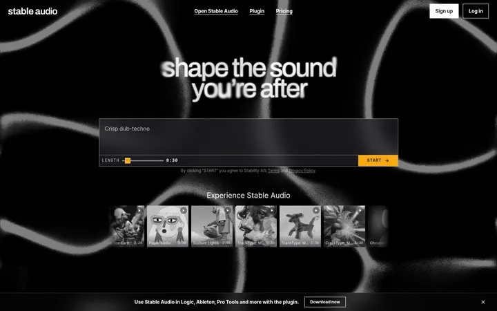
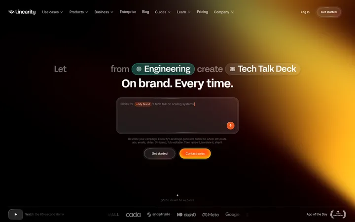
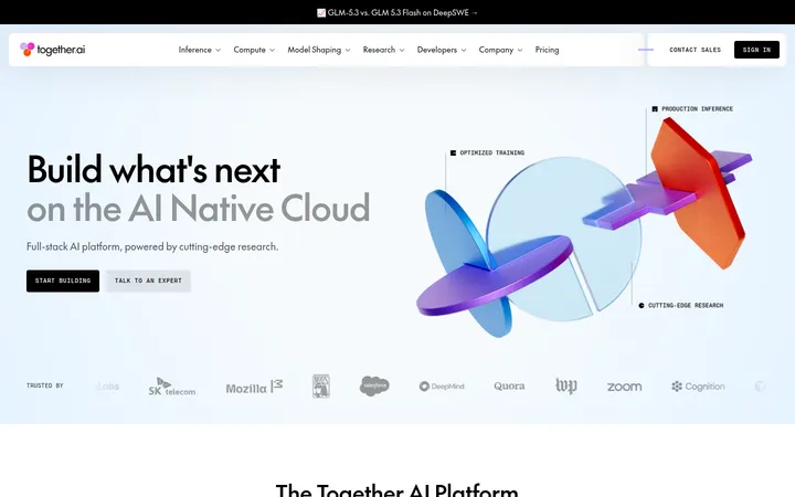
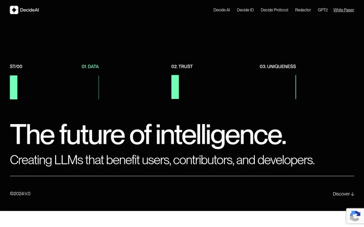
North star · Use the dark canvas and cinematic imagery as the stage; reserve lavender for clear, focused interaction.
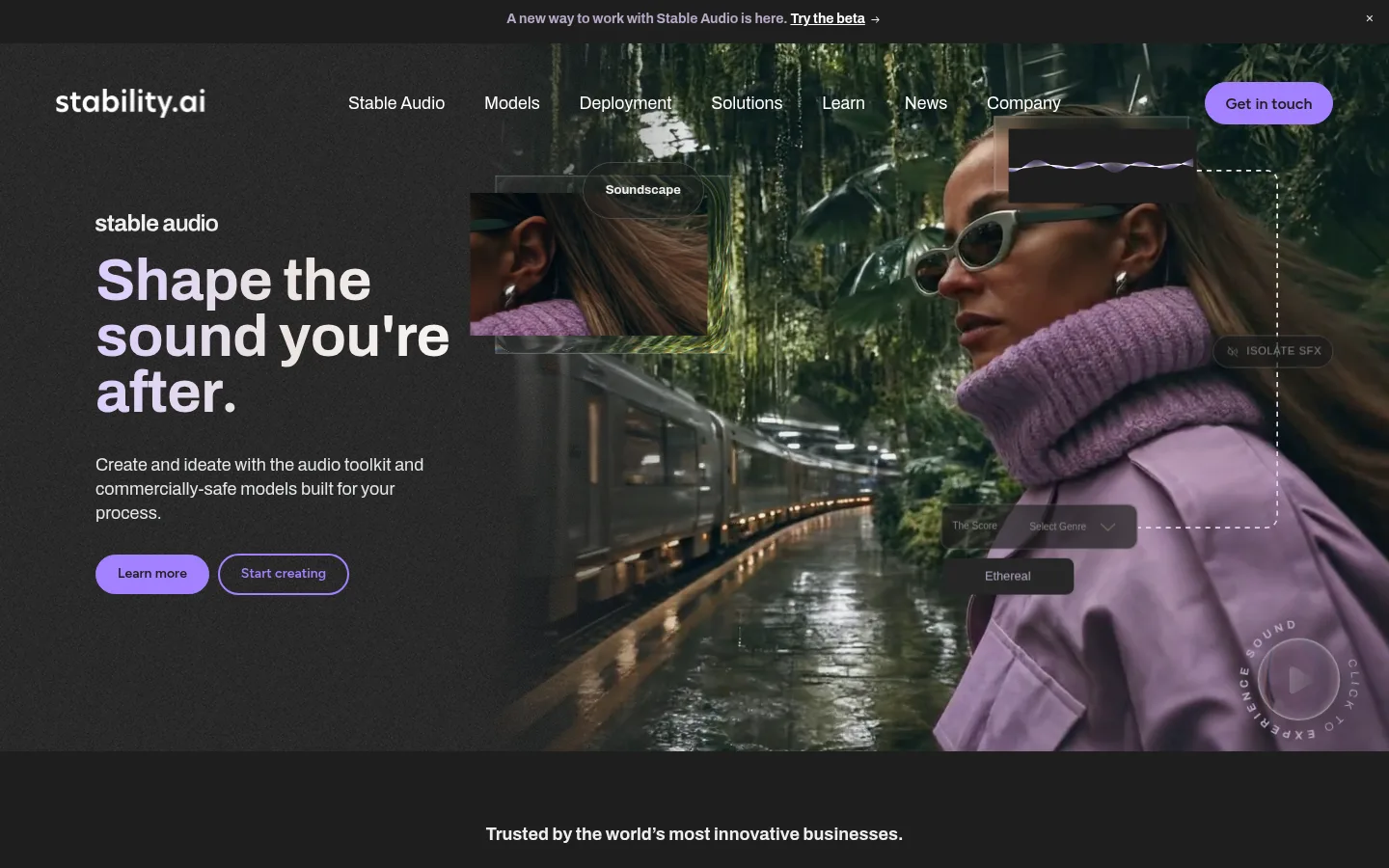
The visual system is built around a near-black canvas (#1e1e1e), with bright white headings and lavender (#a381ff) reserved for primary actions, selected links, and fine outlines. A broad warm off-white band (#ede5e1) distinguishes the enterprise offer from the darker editorial sections, while gradients soften that transition. Archivo carries nearly all of the site’s typography: bold, compact headlines contrast with readable regular-weight body copy. Figtree appears on selected buttons, giving calls to action a slightly distinct voice. The opening viewport uses a cinematic, full-bleed image with text anchored on the left; later sections alternate centered messaging, image-led cards, and a three-column news feed. The measured content width is 1127px, with a comfortable section rhythm and generous gaps around key statements. Cards remain visually restrained, using thin gray borders and subtle inset highlights rather than heavy drop shadows.
Primary family for headlines, body copy, navigation, links, and most page text.
Aa 设计
Figtree
网络字体 · 字重 600 · 占比 2%
免费替代:Inter
Selected primary and secondary CTA labels.
Aa 设计
Inter
系统字体 · 字重 400 · 占比 1%
免费替代:Inter
Minor system-font fallback for small portions of text.
角色
示例
字号
字重
行高
字距
一级标题
Hero headline introducing the featured creative product or message.
Stability AI
45px
700
normal
0
二级标题
Major section statements and prominent editorial headings.
Stability AI
42px
700
0.98
0
三级标题
News, case-study, and feature-card headlines.
Stability AI
32px
700
1.05
0
四级标题
Smaller subheads within content and solution blocks.
The quick brown fox 敏捷的狐狸
26px
700
1.18
0
正文
Descriptions, explanatory copy, and supporting section text.
The quick brown fox 敏捷的狐狸
18px
400
1.34
0
辅助文字
Dates, image labels, and compact metadata.
The quick brown fox 敏捷的狐狸
13px
400
1.29
0
按钮
CTA labels, usually semibold and centered.
The quick brown fox 敏捷的狐狸
14px
600
normal
0
导航
Main navigation and announcement-bar text.
The quick brown fox 敏捷的狐狸
17.5px
400
1.3
0
链接
Prominent news and editorial links.
The quick brown fox 敏捷的狐狸
20px
600
1.2
0
间距与布局
基准单位 2px · 密度:适中
95px版块间距
11px元素间距
91px卡片内边距
1127px内容最大宽度
2px
10px
11px
12px
15px
16px
18px
20px
21px
22px
26px
29px
30px
41px
58px
80px
Use a centered content frame with a measured maximum width of 1127px, while allowing hero media and select imagery to run full bleed. The opening composition aligns copy left over a darkened image; subsequent blocks use centered messaging, three-column cards, and broad horizontal section bands. Maintain a comfortable density: generous separation between major sections, tighter gaps inside cards, and clear transitions between dark and pale surfaces. The page’s cadence alternates immersive media with concise text-led pauses.
圆角与层次
按钮 · 9999px
输入框 · 9999px
卡片 · 8px
图片 · 50%
导航 · 50%
链接 · 11px
inset · card, other
inset · other
The page is mostly flat, with section color and media framing creating hierarchy instead of heavy shadows. Cards use a measured gray hairline border and modest rounded corners. Subtle white inset highlights appear on selected cards or media treatments; avoid broad, elevated drop shadows.
组件
下面的预览按实测的按钮、输入框、徽标、卡片样式重建(字体用替代字体)。
Announcement bar
A narrow dark strip above navigation carries a centered update link and a small dismiss control.
Primary CTA
Lavender pill button with dark text, a fine lavender border, and semibold Figtree or Archivo label.
Hero media composition
Full-width cinematic image paired with left-aligned white copy and layered product-like labels or controls.
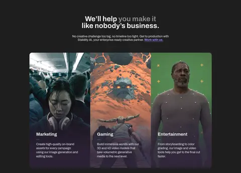
Feature cards
Image-led cards introduce marketing, gaming, and entertainment use cases with concise white copy.
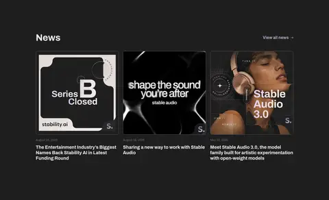
News cards
Three-column editorial feed with image thumbnails, dates, and bold linked headlines on the dark canvas.
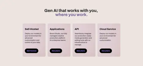
Enterprise solution band
Warm off-white section with centered heading and four pale solution cards, each using a compact dark pill CTA.
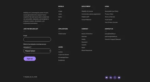
Footer form
Dark footer combines grouped navigation links with email and selection inputs outlined in white.
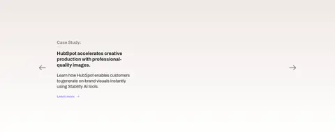
Imagery · Lead with cinematic, photographic creative work: people, environments, and generative-media examples are shown as immersive hero imagery or tightly framed card art. Overlay interface-like labels and subtle controls sparingly to suggest creative tools without competing with the subject. News thumbnails and case-study visuals remain image-forward; dark gradients help text sit legibly over media. Use real product or campaign imagery, not decorative illustration as the main visual language.
Keep the primary canvas near-black and let imagery carry visual variety.
Use lavender for high-priority actions and selective link emphasis.
Set headlines in bold Archivo with compact, close leading.
Create a clear contrast between dark editorial sections and the pale solution band.
Use large image areas with restrained overlaid labels.
Keep cards thin-bordered and visually integrated with their section.
✕ 不该做
Do not use lavender as a large background field.
Do not flatten the page into a sequence of identical cards.
Do not add heavy shadows or glossy effects across the interface.
Do not crowd hero imagery with decorative UI overlays.
Do not replace the warm pale section with an unrelated saturated color.
Do not use all-caps display typography as the dominant headline style.
给 AI 的提示词
想快速出一个同风格的新页面,把这段话连同 DESIGN.md 一起发给 AI。
Build a new Stability AI page using Studio Charcoal (#1e1e1e) as the main canvas, Gallery White (#ffffff) for high-contrast text, and Creative Lavender (#a381ff) only for primary actions and selective links. Include a cinematic, image-led hero with left-aligned copy, then alternate dark editorial sections with a broad Warm Porcelain (#ede5e1) solution band. Use Archivo for headings, navigation, and body copy, with Figtree for selected CTA labels. Keep the content centered within the measured 1127px maximum width, while allowing hero media to bleed beyond it. Use bold compact headlines, comfortable section spacing, three-column editorial or case-study layouts, and restrained gray hairline borders. Favor photographic creative media over decorative illustration. Keep surfaces mostly flat and use only subtle inset highlights where layering helps.