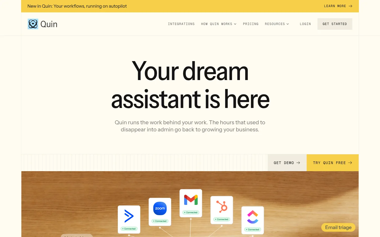
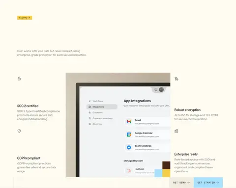
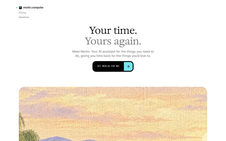
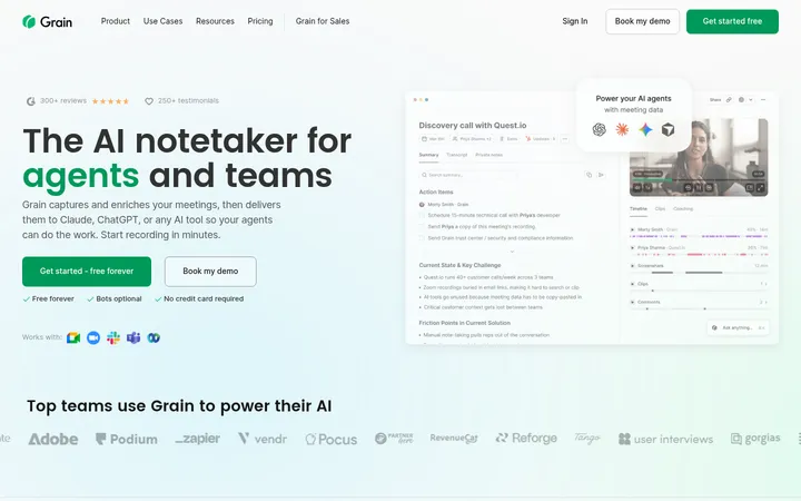
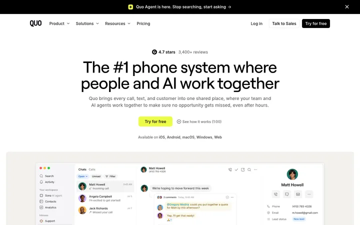
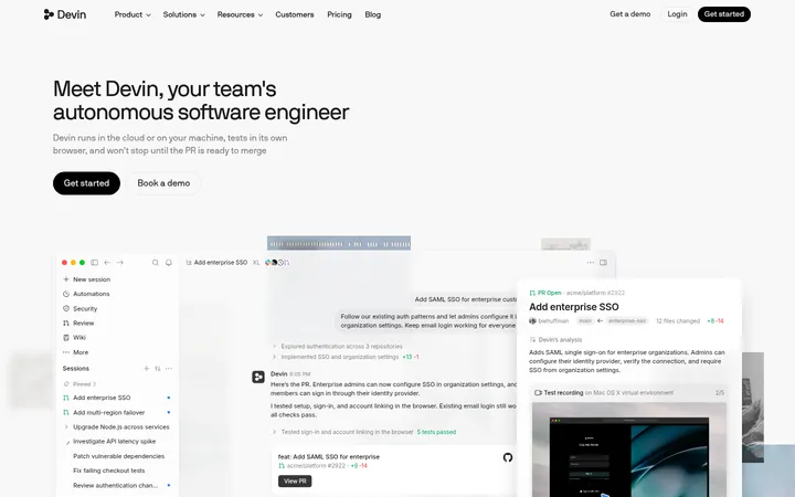
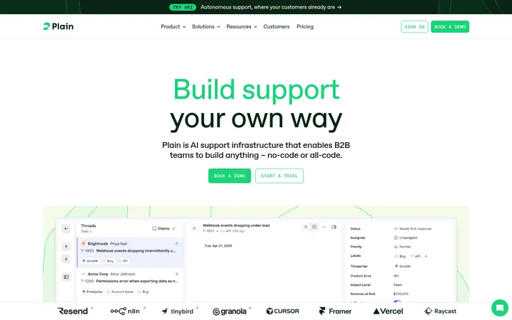
Quin以克制的纸感配色、醒目的无衬线标题和真实产品画面,塑造清晰而亲和的AI助手品牌。首页通过暖白底色与亮黄、浅蓝、深色区块交替,让产品信息和转化入口一目了然。
North star · Keep the paper-warm canvas and crisp, square-edged grid consistent, using saturated color bands to signal important actions and shifts in content.
The page is built on a warm ivory canvas rather than pure white, with near-black typography and muted paper-toned borders establishing a calm editorial baseline. Signal Yellow marks the announcement strip, primary trial actions, labels, and full-width benefit sections; Light Sky Blue appears as a secondary emphasis, especially in a customer-story band and small interface accents. Large Instrument Sans headlines are centered in the hero and used with concise supporting copy, while Geist Mono handles uppercase navigation, eyebrow labels, and button text. The layout sits within a measured 1278px maximum width, uses visible column divisions and fine hairlines, and alternates spacious headline-led areas with denser grids, product imagery, and dark pricing or resource sections. Photography and interface mockups are framed as broad, rectangular panels, often set against warm wood tones. Components remain flat and square-edged; contrast and section color, rather than shadows or rounded cards, organize the experience.
配色 点色块复制色值。用途说明来自对页面的实测位置(背景、文字、描边、按钮)与截图判读。
品牌色
Carbon Ink
#141414
Primary text, navigation, dark resource and pricing bands, and dark CTA backgrounds.
Roasted Umber
#492812
Full-width talk-to-Quin section and dark brown interface or button accents.
强调色
Signal Yellow
#f7cf49
Announcement bar, trial buttons, labels, and full-width benefits and closing CTA bands.
Sky Blue
#a9e1ff
Customer-story section and small interface or decorative highlights.
Muted Azure
#93c2dc
Sparse blue accent detail; secondary to the more visible light-blue brand accent.
Antique Gold
#d5b341
Minor gold-toned border or interface detail, not a dominant section color.
表层色
Soft Parchment
#d5d0c1
Muted testimonial-card fill and occasional subdued text on dark surfaces.
Warm Paper
#fffcf2
Main page canvas, light cards, and alternate text on dark sections.
Linen
#f0ecdf
Secondary section backgrounds, integration band, buttons, and pale borders.
中性色
Olive Ash
#68655b
Subtle section details and subdued border-like marks; not a primary brand field.
Graphite Gray
#545454
Muted links, navigation text, and the gray Quin-replaces comparison strip.
Soft Black
#222222
Secondary dark heading and body text where near-black is softened.
Stone Taupe
#a19c8c
Low-emphasis section details and border treatments.
Weathered Oak
#9c8a79
Minor warm detail, likely from imagery or restrained section ornament.
文字 背景 对比度 WCAG #141414 Carbon Ink#fffcf2 Warm Paper17.95:1 AAA #141414 Carbon Ink#f0ecdf Linen15.59:1 AAA #141414 Carbon Ink#492812 Roasted Umber1.4:1 不达标 #d5d0c1 Soft Parchment#fffcf2 Warm Paper1.5:1 不达标 #d5d0c1 Soft Parchment#141414 Carbon Ink11.95:1 AAA #d5d0c1 Soft Parchment#f0ecdf Linen1.3:1 不达标
字体 字号阶梯:Augmented Fourth(比例约 1.431,正文 16px)。示例用免费替代字体渲染,数值为实测。
Aa 设计
Instrument Sans Variable 网络字体 · 字重 400 / 500 · 占比 95%
免费替代:Inter
Display and interface sans for headings, body copy, links, and buttons.
Aa 设计
Geist Mono 网络字体 · 字重 400 · 占比 5%
免费替代:IBM Plex Mono
Monospaced uppercase navigation, eyebrow labels, captions, and compact CTA text.
角色 示例 字号 字重 行高 字距 特大标题 Oversized hero or campaign headline.
Quin
96px 500 1.1 -0.033em 一级标题 Primary page and major section headings.
Quin
56px 500 1.1 -0.023em 二级标题 Section headlines and strong customer statements.
Quin
44px 500 1.25 -0.018em 三级标题 Feature and card headings.
Quin
32px 500 1.25 -0.002em 四级标题 Smaller card or feature titles.
Quin
28px 500 1.25 -0.003em 正文 Explanatory copy, descriptions, and testimonials.
The quick brown fox 敏捷的狐狸
16px 400 1.5 0 辅助文字 Small uppercase labels and metadata.
The quick brown fox 敏捷的狐狸
14px 400 1 0.086em 按钮 Compact uppercase CTA labels.
The quick brown fox 敏捷的狐狸
12px 400 1 0.1em 导航 Uppercase utility navigation links.
The quick brown fox 敏捷的狐狸
12px 400 1 0.107em 眉题 Section category labels above headings.
The quick brown fox 敏捷的狐狸
14px 400 1 0.086em 代码 Compact mono-style technical or metadata label.
const style = 1;
14px 400 1 0.086em
间距与布局 基准单位 8px · 密度:紧凑
32px 版块间距
8px 元素间距
8px 卡片内边距
1278px 内容最大宽度
1px
6px
8px
12px
16px
24px
28px
32px
40px
48px
64px
96px
Use a centered page frame capped at the measured 1278px, with thin vertical rules and broad, clearly separated section bands. The hero is centered and spacious above a full-width product visual; subsequent areas alternate left-aligned feature layouts, multi-column task grids, split testimonial panels, logo rows, and dark or saturated full-bleed sections. Measured spacing is based on an 8px unit and a compact density; retain strong breathing room around major headlines while keeping utility grids tighter. Mix centered and start-aligned headings according to each section’s editorial purpose.
圆角与层次
没有测到阴影:页面是扁平的,层次靠底色和描边区分。
The design is predominantly flat, with square edges and no measured shadow system or radius scale. Separate content through background bands, thin borders, hairlines, and grid rules rather than floating cards. Layered product photography and interface mockups provide the main depth; keep buttons and panels crisp, avoiding soft, elevated SaaS-card styling.
组件 下面的预览按实测的按钮、输入框、徽标、卡片样式重建(字体用替代字体)。
Announcement strip A full-width Signal Yellow (#f7cf49) message bar with compact copy and a small uppercase, mono-style learn-more link.
Utility navigation Brand mark at left and compact uppercase Geist Mono links across the top; use fine rules to define the header boundary.
Primary CTA Square-cornered button with uppercase Geist Mono text; the free-trial action uses Signal Yellow (#f7cf49) with Carbon Ink (#141414) text.
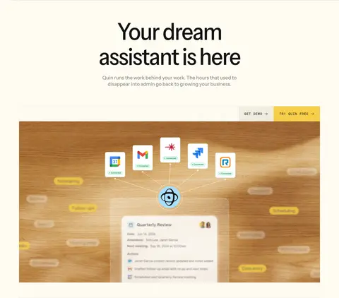
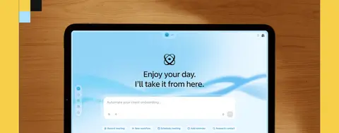
Product hero visual Broad, rectangular interface or device imagery below the headline and CTA row, presented as a product demonstration rather than a decorative card.
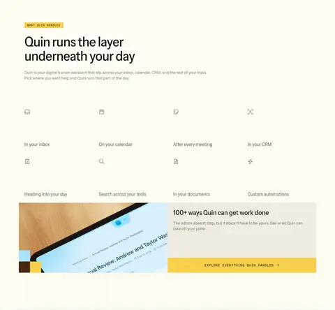
Feature grid A compact multi-column set of assistant tasks with small line icons and short labels, followed by a larger split product-and-copy panel.
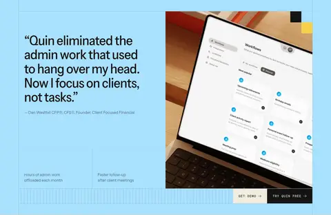
Testimonial panel Large customer quote in a contrasting pale blue band, paired with a rectangular product visual and concise supporting metrics.
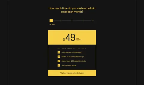
Pricing panel Dark, flat pricing area with yellow emphasis for price and trial actions, compact benefit rows, and a separate enterprise strip.
Imagery · Use large rectangular product screenshots and device mockups alongside warm, natural workplace photography. Screens and interface captures should read clearly as real product evidence, framed with minimal decoration and often placed over wood-toned surfaces. Small app logos and interface icons support the integration story. The page’s strongest visual colors are the measured section backgrounds; do not treat photographic wood, clothing, or mockup content as core brand palette.
页面版块 共 14 个版块,按页面从上到下排列,每个都标了类型、布局和交互套路。
首页
首屏 主视觉
Centered headline and copy above a full-width product visual, with a right-aligned CTA row.
功能网格 助手功能
Start-aligned heading followed by a four-column task grid and a split feature panel.
数据亮点 客户成效
Quote and metrics on the left, product imagery on the right in a light-blue band.
集成生态 工具集成
Centered heading above a horizontal grid of integration logos and a see-all link.
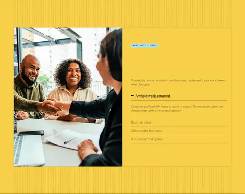
图文交替 使用收益
Three-column yellow band with a large photo beside explanatory benefit content.
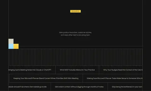
内容列表 资源文章
Centered introduction above a dense, multi-column list of article links on black.
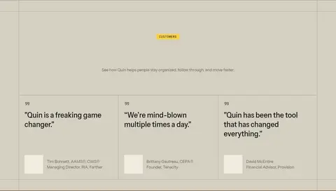
用户评价 客户评价
Centered intro above a four-column set of pale testimonial cards.
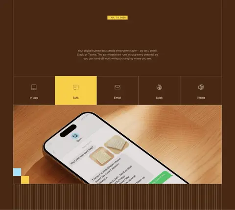
产品展示 多端沟通
Centered intro, channel selector row, and large device image on a deep brown band.
功能网格 安全保障
Start-aligned heading, central interface image, and security points arranged around it.
对比表 替代工具
Short gray full-width strip with a right-aligned heading and a compact list of alternatives.
价格方案 价格介绍
Centered pricing introduction on a full-width dark section.
价格方案 个人方案
Single-column dark pricing module with a prominent price, range control, and benefit list.
价格方案 企业方案
A low, full-width enterprise strip with summary, automation benefits, and contact link.
行动号召 最终转化
Two-column closing band in yellow, with centered headline and product imagery.
该做与不该做 ✓ 该做 Use Warm Paper (#fffcf2) as the primary canvas. Reserve Signal Yellow (#f7cf49) for clear emphasis and conversion moments. Use Carbon Ink (#141414) for strong text and dark section bands. Alternate background colors to distinguish major content sections. Set utility labels and navigation in tracked uppercase mono. Frame product screens and photography as broad rectangular panels. ✕ 不该做 Do not introduce colors outside the measured palette. Do not use rounded, pill-shaped buttons or cards. Do not add drop shadows as a default elevation treatment. Do not turn every section into a centered card grid. Do not use mono typography for long body paragraphs. Do not mistake photographic wood tones for brand surface colors. 给 AI 的提示词 想快速出一个同风格的新页面,把这段话连同 DESIGN.md 一起发给 AI。
复制 Build a new Quin-style SaaS page with a calm Warm Paper canvas (#fffcf2), Carbon Ink text (#141414), and crisp square-edged sections. Use Signal Yellow (#f7cf49) for the main conversion action and selected full-width emphasis; introduce Linen (#f0ecdf), Sky Blue (#a9e1ff), and Roasted Umber (#492812) as distinct section bands rather than scattered decoration. Set large, tightly tracked Instrument Sans-like headings and readable body copy; use tracked uppercase mono for navigation, labels, and buttons. Organize content in a centered frame with thin grid rules, alternating split layouts and compact feature grids. Use clear rectangular product imagery and authentic workplace photography. Keep surfaces flat: rely on color, hairlines, and imagery for hierarchy, not rounded cards or shadows.
DESIGN.md Tailwind v4 CSS 变量 Design Tokens
---
title: "Quin design system"
variant: extended
source: https://www.heyquin.io/
captured_at: 2026-10-12
theme: light
industry: ai
generator: Design DNA (https://four.wiralomi.com/style/heyquin-io)
ai_generated: true
ai_label: "本文件由 AI 辅助生成:数值取自公开网页的实测样式,命名、用途说明与建议为模型解读。商标归原所有者。 / AI-assisted content"
---
# Quin · Design System
> A warm paper canvas for a capable digital assistant
**Theme:** light · **Industry:** ai · **Source:** https://www.heyquin.io/ · **Captured:** 2026-10-12 (1440×900 desktop)
_AI-assisted content: values are measured from the public page at capture time; names, roles and guidance are model-written interpretations. Trademarks belong to their owners._
Quin pairs a restrained, paper-like palette with oversized sans-serif headlines and vivid product imagery. Its long homepage alternates quiet editorial sections with saturated yellow, sky-blue, and dark bands to make product benefits and conversion points easy to scan.
## North star
Keep the paper-warm canvas and crisp, square-edged grid consistent, using saturated color bands to signal important actions and shifts in content.
## Overview
The page is built on a warm ivory canvas rather than pure white, with near-black typography and muted paper-toned borders establishing a calm editorial baseline. Signal Yellow marks the announcement strip, primary trial actions, labels, and full-width benefit sections; Light Sky Blue appears as a secondary emphasis, especially in a customer-story band and small interface accents. Large Instrument Sans headlines are centered in the hero and used with concise supporting copy, while Geist Mono handles uppercase navigation, eyebrow labels, and button text. The layout sits within a measured 1278px maximum width, uses visible column divisions and fine hairlines, and alternates spacious headline-led areas with denser grids, product imagery, and dark pricing or resource sections. Photography and interface mockups are framed as broad, rectangular panels, often set against warm wood tones. Components remain flat and square-edged; contrast and section color, rather than shadows or rounded cards, organize the experience.
## Colors
| Name | Hex | Token | Group | Role |
|---|---|---|---|---|
| Soft Parchment | ` | `--color-soft-parchment` | surface | Muted testimonial-card fill and occasional subdued text on dark surfaces. |
| Carbon Ink | ` | `--color-carbon-ink` | brand | Primary text, navigation, dark resource and pricing bands, and dark CTA backgrounds. |
| Warm Paper | ` | `--color-warm-paper` | surface | Main page canvas, light cards, and alternate text on dark sections. |
| Signal Yellow | ` | `--color-signal-yellow` | accent | Announcement bar, trial buttons, labels, and full-width benefits and closing CTA bands. |
| Linen | ` | `--color-linen` | surface | Secondary section backgrounds, integration band, buttons, and pale borders. |
| Sky Blue | ` | `--color-sky-blue` | accent | Customer-story section and small interface or decorative highlights. |
| Olive Ash | ` | `--color-olive-ash` | neutral | Subtle section details and subdued border-like marks; not a primary brand field. |
| Graphite Gray | ` | `--color-graphite-gray` | neutral | Muted links, navigation text, and the gray Quin-replaces comparison strip. |
| Roasted Umber | ` | `--color-roasted-umber` | brand | Full-width talk-to-Quin section and dark brown interface or button accents. |
| Soft Black | ` | `--color-soft-black` | neutral | Secondary dark heading and body text where near-black is softened. |
| Stone Taupe | ` | `--color-stone-taupe` | neutral | Low-emphasis section details and border treatments. |
| Muted Azure | ` | `--color-muted-azure` | accent | Sparse blue accent detail; secondary to the more visible light-blue brand accent. |
| Antique Gold | ` | `--color-antique-gold` | accent | Minor gold-toned border or interface detail, not a dominant section color. |
| Weathered Oak | ` | `--color-weathered-oak` | neutral | Minor warm detail, likely from imagery or restrained section ornament. |
### Semantic aliases
`--color-canvas` → ` (Warm Paper) · `--color-surface` → ` (Carbon Ink) · `--color-surface-2` → ` (Linen) · `--color-surface-3` → ` (Roasted Umber) · `--color-surface-4` → ` (Soft Parchment) · `--color-text` → ` (Carbon Ink) · `--color-text-muted` → ` (Soft Parchment) · `--color-text-subtle` → ` (Warm Paper) · `--color-border` → ` (Linen) · `--color-accent` → ` (Signal Yellow) · `--color-accent-2` → ` (Sky Blue) · `--color-accent-3` → ` (Muted Azure)
### Contrast (WCAG 2.x)
| Text | Background | Ratio | Level |
|---|---|---|---|
| ` | ` | 17.95:1 | AAA |
| ` | ` | 15.59:1 | AAA |
| ` | ` | 1.4:1 | fail |
| ` | ` | 1.5:1 | fail |
| ` | ` | 11.95:1 | AAA |
| ` | ` | 1.3:1 | fail |
| ` | ` | 8.54:1 | AAA |
| ` | ` | 17.95:1 | AAA |
| ` | ` | 1.15:1 | fail |
| ` | ` | 12.82:1 | AAA |
## Typography
| Family | Token | Source | Weights | Role | Free substitute |
|---|---|---|---|---|---|
| Instrument Sans Variable | `--font-body` | webfont | 400, 500 | Display and interface sans for headings, body copy, links, and buttons. | Inter |
| Geist Mono | `--font-mono` | webfont | 400 | Monospaced uppercase navigation, eyebrow labels, captions, and compact CTA text. | IBM Plex Mono |
- **Instrument Sans Variable:** Use measured weights 400 and 500; large headlines have tight negative tracking, with sentence case for display and body.
- **Geist Mono:** Use weight 400, uppercase treatment, and visibly expanded tracking for small utility text.
### Type scale — Augmented Fourth (ratio ≈ 1.431, base 16px)
| Role | Size | Weight | Line height | Letter spacing | Case | Family | Used for |
|---|---|---|---|---|---|---|---|
| display | 96px | 500 | 1.1 | -0.033em | — | Instrument Sans Variable | Oversized hero or campaign headline. |
| h1 | 56px | 500 | 1.1 | -0.023em | — | Instrument Sans Variable | Primary page and major section headings. |
| h2 | 44px | 500 | 1.25 | -0.018em | — | Instrument Sans Variable | Section headlines and strong customer statements. |
| h3 | 32px | 500 | 1.25 | -0.002em | — | Instrument Sans Variable | Feature and card headings. |
| h4 | 28px | 500 | 1.25 | -0.003em | — | Instrument Sans Variable | Smaller card or feature titles. |
| body | 16px | 400 | 1.5 | 0 | — | Instrument Sans Variable | Explanatory copy, descriptions, and testimonials. |
| caption | 14px | 400 | 1 | 0.086em | uppercase | Geist Mono | Small uppercase labels and metadata. |
| button | 12px | 400 | 1 | 0.1em | uppercase | Geist Mono | Compact uppercase CTA labels. |
| nav | 12px | 400 | 1 | 0.107em | uppercase | Geist Mono | Uppercase utility navigation links. |
| eyebrow | 14px | 400 | 1 | 0.086em | uppercase | Geist Mono | Section category labels above headings. |
| code | 14px | 400 | 1 | 0.086em | uppercase | Geist Mono | Compact mono-style technical or metadata label. |
OpenType features in use: `"kern", "ss01", "ss03", "ss05", "ss07", "ss08", "ss12"` .
## Spacing & layout
- Base unit **8px**, density **compact**.
- Scale (most used values): 1, 6, 8, 12, 16, 24, 28, 32, 40, 48, 64, 96 px.
- Section rhythm 32px · element gap 8px · card padding 8px · max content width 1278px.
Use a centered page frame capped at the measured 1278px, with thin vertical rules and broad, clearly separated section bands. The hero is centered and spacious above a full-width product visual; subsequent areas alternate left-aligned feature layouts, multi-column task grids, split testimonial panels, logo rows, and dark or saturated full-bleed sections. Measured spacing is based on an 8px unit and a compact density; retain strong breathing room around major headlines while keeping utility grids tighter. Mix centered and start-aligned headings according to each section’s editorial purpose.
## Shape & elevation
- No box shadows measured: the page is flat.
- Motion: standard transition `0.2s ease` on interactive elements.
The design is predominantly flat, with square edges and no measured shadow system or radius scale. Separate content through background bands, thin borders, hairlines, and grid rules rather than floating cards. Layered product photography and interface mockups provide the main depth; keep buttons and panels crisp, avoiding soft, elevated SaaS-card styling.
## Imagery
Use large rectangular product screenshots and device mockups alongside warm, natural workplace photography. Screens and interface captures should read clearly as real product evidence, framed with minimal decoration and often placed over wood-toned surfaces. Small app logos and interface icons support the integration story. The page’s strongest visual colors are the measured section backgrounds; do not treat photographic wood, clothing, or mockup content as core brand palette.
## Components
### Announcement strip
A full-width Signal Yellow (### Utility navigation
Brand mark at left and compact uppercase Geist Mono links across the top; use fine rules to define the header boundary.
### Primary CTA
Square-cornered button with uppercase Geist Mono text; the free-trial action uses Signal Yellow (### Product hero visual
Broad, rectangular interface or device imagery below the headline and CTA row, presented as a product demonstration rather than a decorative card.
### Feature grid
A compact multi-column set of assistant tasks with small line icons and short labels, followed by a larger split product-and-copy panel.
### Testimonial panel
Large customer quote in a contrasting pale blue band, paired with a rectangular product visual and concise supporting metrics.
### Pricing panel
Dark, flat pricing area with yellow emphasis for price and trial actions, compact benefit rows, and a separate enterprise strip.
### Measured component styles
- **Primary button** (“Taking client relationships from fixing ”): background ## Do
- Use Warm Paper (## Don't
- Do not introduce colors outside the measured palette.
- Do not use rounded, pill-shaped buttons or cards.
- Do not add drop shadows as a default elevation treatment.
- Do not turn every section into a centered card grid.
- Do not use mono typography for long body paragraphs.
- Do not mistake photographic wood tones for brand surface colors.
## Agent prompt
Build a new Quin-style SaaS page with a calm Warm Paper canvas (## Page sections (top to bottom)
| # | Type | Layout | UX patterns | UI patterns |
|---|---|---|---|---|
| 1 | hero | Centered headline and copy above a full-width product visual, with a right-aligned CTA row. | Product introduction, Demo and free-trial actions | Announcement strip, Large centered heading, Product mockup |
| 2 | feature-grid | Start-aligned heading followed by a four-column task grid and a split feature panel. | Task discovery, Explore feature details | Eyebrow label, Icon-and-label grid, Split image and copy |
| 3 | stats | Quote and metrics on the left, product imagery on the right in a light-blue band. | Customer proof, Outcome metrics, Demo action | Large quote, Image split, Metric captions |
| 4 | integrations | Centered heading above a horizontal grid of integration logos and a see-all link. | Integration discovery, See all integrations | Linen section band, Logo row, Hairline dividers |
| 5 | feature-split | Three-column yellow band with a large photo beside explanatory benefit content. | Benefit scanning, Progressive details | Full-width yellow background, Photo and text split, Stacked benefit rows |
| 6 | content-feed | Centered introduction above a dense, multi-column list of article links on black. | Browse resources, Open editorial content | Dark section, Mono eyebrow, Hairline content grid |
| 7 | testimonials | Centered intro above a four-column set of pale testimonial cards. | Compare customer perspectives, Read testimonials | Quote cards, Subtle dividers, Customer attribution |
| 8 | product-showcase | Centered intro, channel selector row, and large device image on a deep brown band. | Select communication channel, View product in context | Dark umber section, Tabbed channel row, Large device visual |
| 9 | feature-grid | Start-aligned heading, central interface image, and security points arranged around it. | Review security assurances, Request a demo | Certification labels, Central product image, Paired CTAs |
| 10 | comparison | Short gray full-width strip with a right-aligned heading and a compact list of alternatives. | Recognize existing tools, Compare alternatives | Graphite background, Compact text list |
| 11 | pricing | Centered pricing introduction on a full-width dark section. | Understand trial offer, Continue to plan details | Dark background, Yellow eyebrow, Centered copy |
| 12 | pricing | Single-column dark pricing module with a prominent price, range control, and benefit list. | Estimate workload, Review plan value, Start free trial | Price highlight, Slider, Benefit rows, Yellow CTA |
| 13 | pricing | A low, full-width enterprise strip with summary, automation benefits, and contact link. | Review enterprise fit, Contact sales | Dark strip, Inline benefits, Outlined contact action |
| 14 | cta | Two-column closing band in yellow, with centered headline and product imagery. | Request a demo, Start free trial | Full-width yellow background, Product image, Paired CTAs |
## Source CSS custom properties (selected)
```css
--background-colors--background-primary: