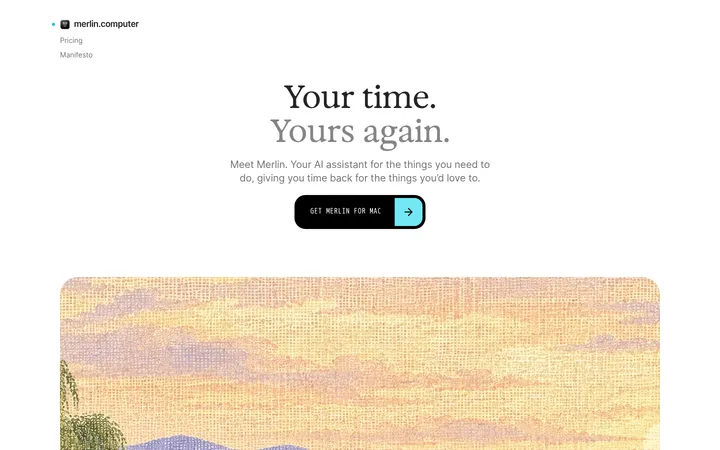
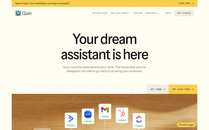
North star · Keep the page calm and editorial, using crisp dark type and real product UI as the primary source of visual detail.
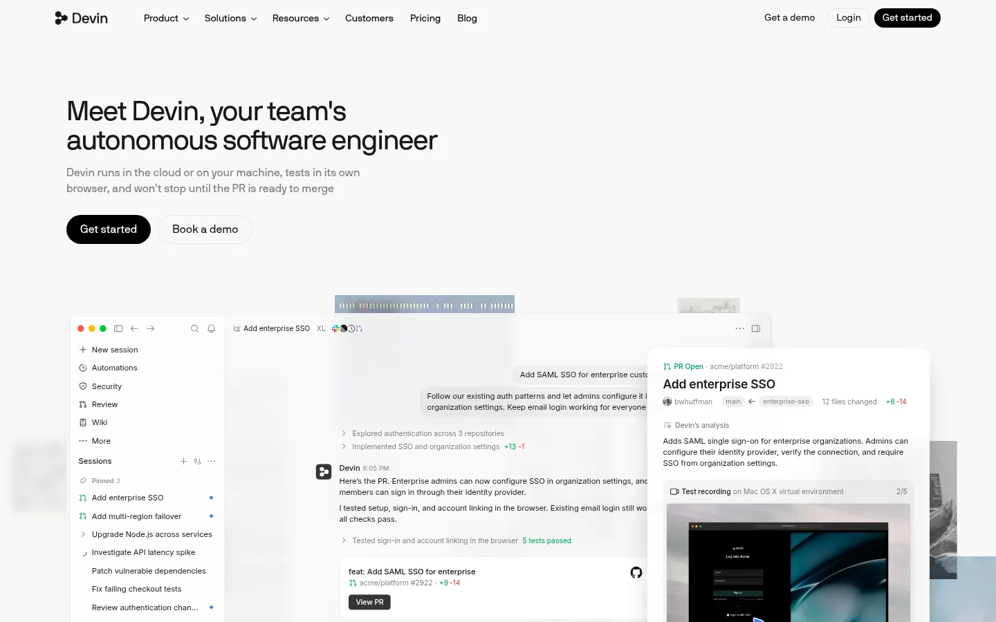
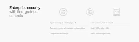
The page uses a near-white canvas (#f8f8f8) throughout, letting dark text and product screenshots provide most of the contrast. White surfaces and very light gray hairlines distinguish interface cards without breaking the calm, continuous background. Black pill-shaped CTAs form the strongest interface accent; blue, green, orange, and purple appear sparingly in links, product UI, and a model-spectrum gradient rather than as broad brand blocks. Display and heading typography uses nbInternationalPro with a light, compact editorial feel, while Inter handles body copy and denser product details. The hero is left-aligned and pairs a concise proposition with a large layered product demonstration. Below, alternating feature showcases, a four-step workflow, integrations, release notes, security points, and a centered CTA create a clear narrative. Generous whitespace separates these modules, while compact labels and screenshots preserve technical specificity.
配色
点色块复制色值。用途说明来自对页面的实测位置(背景、文字、描边、按钮)与截图判读。
品牌色
强调色
表层色
中性色
功能色
页面底色 · Soft Canvas表层 · Clean White主文字 · Core Ink次要文字 · Muted Graphite弱文字 · Footer Gray描边 · Quiet Divider强调 · Signal Blue强调 2 · Model Green强调 3 · Model Orange
Body copy, feature headings, captions, badges, and product-interface text.
Aa 设计
nbInternationalPro
网络字体 · 字重 400 · 占比 28%
免费替代:DM Sans
Display and section headings, navigation, links, and button labels.
Aa 设计
SFMono-Regular
系统字体 · 字重 400 · 占比 4%
免费替代:Roboto Mono
Code-like labels and snippets inside product representations.
Aa 设计
lato
网络字体 · 字重 500 / 800 / 700 · 占比 2%
免费替代:Lato
Minor supporting interface text where present.
Aa 设计
SF Pro
系统字体 · 字重 400 / 510 / 590 · 占比 2%
免费替代:Inter
System-rendered interface details and embedded product UI.
角色
示例
字号
字重
行高
字距
特大标题
Oversized hero or prominent campaign-style headline.
Devin
64px
400
1
-0.03em
一级标题
Primary hero headline.
Devin
40px
400
1.04
-0.03em
二级标题
Major section headings across the long page.
Devin
32px
400
1.2
-0.02em
三级标题
Feature-card and secondary subsection headings.
The quick brown fox 敏捷的狐狸
22px
600
1.27
-0.015em
四级标题
Compact supporting headings and UI subheads.
The quick brown fox 敏捷的狐狸
20px
400
1.2
-0.01em
正文
Explanatory paragraphs and descriptive copy.
The quick brown fox 敏捷的狐狸
14px
400
1.43
-0.005em
辅助文字
Small labels, metadata, and image captions.
The quick brown fox 敏捷的狐狸
13px
400
1.38
-0.005em
按钮
Primary and secondary CTA labels.
The quick brown fox 敏捷的狐狸
16px
400
1.5
0
导航
Header navigation labels.
The quick brown fox 敏捷的狐狸
14px
400
1.4
0
链接
Text links and product-resource actions.
The quick brown fox 敏捷的狐狸
16px
400
1.4
0
代码
Technical snippets embedded in product UI.
const style = 1;
12px
400
1.5
0.01em
间距与布局
基准单位 4px · 密度:适中
60px版块间距
4px元素间距
—卡片内边距
1246px内容最大宽度
1px
2px
3px
4px
5px
6px
8px
10px
12px
14px
16px
20px
36px
60px
Use a centered content frame capped at the measured 1246px maximum width, with left-aligned content and a comfortable, open density. The header stays compact; the hero gives text and product demonstration room to breathe. Follow with varied two- and three-column showcases, then a sequence of alternating image-and-copy workflow blocks. The integrations and security sections use compact columns, while release notes pair a heading with a list. Preserve the measured 60px section rhythm and 4px base spacing logic; keep the final CTA centered above a quiet multi-column footer.
圆角与层次
按钮 · 9999px
卡片 · 12px
图片 · 3px
徽标 · 6px
导航 · 9999px
xl · card, other
hairline · card, other
md · card
sm · card
The overall treatment is nearly flat: light canvas, fine pale borders, and subtle shadows separate interface cards from the page. Layer product panels selectively to suggest working screens and review cards. Reserve stronger depth for the hero’s overlapping mockups, and avoid heavy shadows or large decorative outlines.
组件
下面的预览按实测的按钮、输入框、徽标、卡片样式重建(字体用替代字体)。
Pill CTA
Use a black, fully rounded Get started button with white nbInternationalPro text; pair it with a light, fine-bordered Book a demo action.
Header navigation
Keep the Devin mark and compact text links on one line, with utility actions and a filled CTA aligned at the far end.
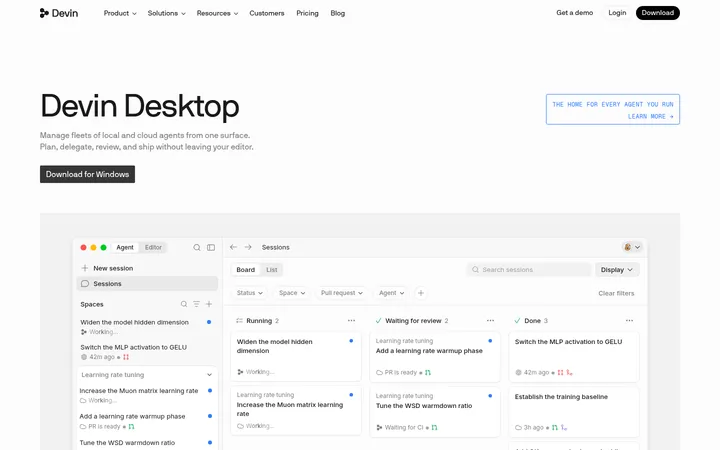
Hero product showcase
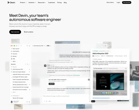
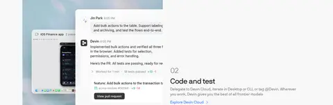
Pair a left-aligned headline and muted supporting copy with overlapping browser, PR, and desktop product-interface panels.
Feature showcase cards
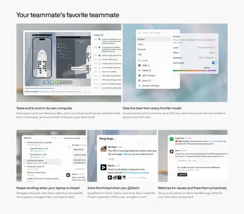
Use broad screenshot-led modules with concise headings and supporting copy, shifting between multi-column and alternating split layouts.
Workflow steps
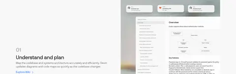
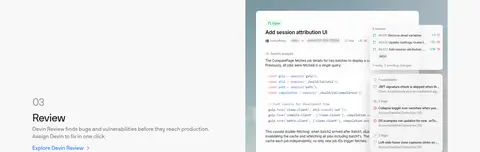
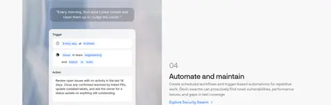
Present numbered stages with short descriptions, text links, and large product screenshots that alternate sides.
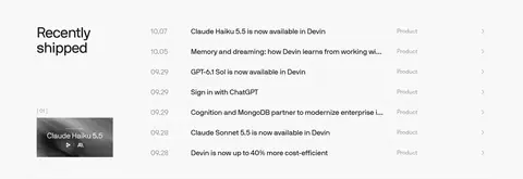
Release list
Show dated product updates as compact rows with separators, a category label, and a small featured thumbnail.
Footer link columns
Close with the Devin wordmark and subdued Company, Legal, and Connect link groups.
Imagery · Use product-interface screenshots and realistic software mockups as the dominant visual material, not decorative photography. Frame browser, desktop, and mobile views in layered white panels, with gentle overlap and occasional soft, atmospheric color visible within the mockups. Keep screenshots crisp, legible, and large enough to communicate workflow details. Supporting icons remain thin and understated; avoid turning interface imagery into full-bleed colorful backgrounds.
Set core marketing headings in nbInternationalPro.
Keep explanatory copy muted and compact.
Use #000000 for the primary filled CTA.
Let product screenshots carry the visual detail.
Separate modules with whitespace and fine rules.
✕ 不该做
Do not introduce saturated full-width color bands.
Do not use gradient as the page-wide background.
Do not add decorative photography unrelated to software.
Do not make every section a uniform card grid.
Do not overuse shadows around simple content.
Do not promote screenshot-only colors into the core palette.
给 AI 的提示词
想快速出一个同风格的新页面,把这段话连同 DESIGN.md 一起发给 AI。
Build a new Devin-style page with a quiet, light canvas in Soft Canvas (#f8f8f8), Core Ink (#191919) typography, white interface surfaces (#ffffff), and delicate Quiet Divider (#e9e9e9) rules. Use nbInternationalPro-like display headings and Inter-like readable body copy. Keep the header compact, the hero left-aligned, and the primary action a black (#000000) pill with white text. Organize content into spacious editorial modules rather than a uniform card grid: alternate explanatory copy with realistic product-interface screenshots, then use concise integration, update, and security blocks. Reserve Signal Blue (#317cff) and the green-orange-violet spectrum for small links or product details. Keep shadows restrained, edges subtly rounded, and product UI crisp and layered. End with a centered CTA and subdued multi-column footer.