North star · Let cinematic product imagery create impact, then return to a bright, uncluttered catalog with orange reserved for high-priority actions.
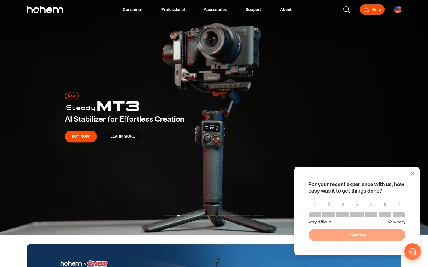
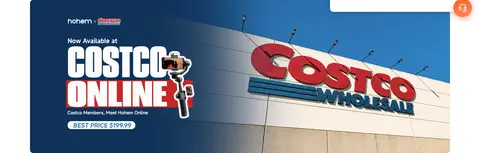
The visual strategy shifts between immersive product campaigns and a quiet, bright storefront. The hero uses near-black cinematic imagery as a dramatic stage for stabilizer hardware, with white navigation and copy and vivid orange purchase actions. Below it, a white canvas and occasional very pale gray surfaces let product cards, a retail banner, editorial photography, and service links breathe without competing for attention. OPPO Sans 4.0 supplies a modern, compact voice across headings, body copy, and navigation; stronger weights make product names and calls to action legible over imagery. Layouts move from full-bleed campaign media to a centered product-card grid, a wide blog feature, a press-logo row, and a multi-column footer. Rounded controls and media corners soften the technical product category. Use measured palette colors for interface chrome; darker and cooler colors in the screenshot largely belong to campaign photography rather than the core UI.
Site-wide interface, headings, product copy, and buttons.
角色
示例
字号
字重
行高
字距
一级标题
Campaign headline and leading product message.
Hohem
36px
600
normal
0
二级标题
Major section titles and prominent feature headings.
Hohem
32px
700
normal
0
三级标题
Product or editorial subsection headings.
Hohem
28px
400
normal
0
四级标题
Smaller card and service headings.
The quick brown fox 敏捷的狐狸
24px
400
normal
0
正文
Product descriptions, editorial copy, and supporting text.
The quick brown fox 敏捷的狐狸
18px
400
normal
0
辅助文字
Compact labels and secondary explanatory copy.
The quick brown fox 敏捷的狐狸
14px
400
normal
0
按钮
Primary and secondary calls to action.
The quick brown fox 敏捷的狐狸
18px
600
3.11
0
链接
Navigation, product links, and compact inline actions.
The quick brown fox 敏捷的狐狸
14px
400
normal
0
间距与布局
基准单位 8px · 密度:适中
64px版块间距
4px元素间距
—卡片内边距
1260px内容最大宽度
4px
8px
12px
16px
20px
32px
48px
64px
128px
Use a centered content frame capped at the measured 1260px maximum width, while campaign media can extend edge to edge. The page rhythm alternates full-bleed hero storytelling with inset content: a wide retail banner, a two-column product-card arrangement, editorial feature, press marks, service links, and a dense footer. Align catalog content consistently and keep the overall density comfortable. The measured spacing system is based on an 8px unit, with a 64px section gap; preserve generous separation rather than compressing sections.
圆角与层次
按钮 · 9999px
输入框 · 9999px
卡片 · 10px
图片 · 10px
链接 · 9999px
md · card
Most of the page is flat, using white space and subtle surface changes instead of stacked panels. Cards and media use measured 10px rounding, while buttons and some controls are pill-shaped. A measured medium shadow appears on a feedback panel, not as a general card treatment. Separate sections primarily through spacing and pale fills, with #e5e5e5 hairlines where borders are needed.
组件
下面的预览按实测的按钮、输入框、徽标、卡片样式重建(字体用替代字体)。
Campaign hero
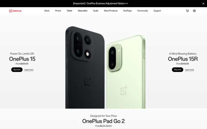
Full-bleed cinematic product campaign with white overlay navigation and copy, orange Buy Now action, and a quieter Learn More link.
Primary CTA
Pill-shaped #ff4d00 button with white text; prioritize purchase actions over secondary links.
Secondary CTA
Measured repeated Learn More button uses #afafaf with white text and a rounded capsule form.
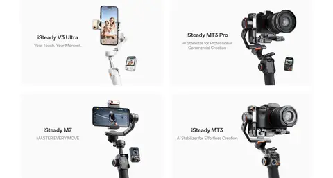
Product cards
Bright product tiles with hardware imagery, #333333 titles, muted supporting copy, and softly rounded media.
Editorial feature
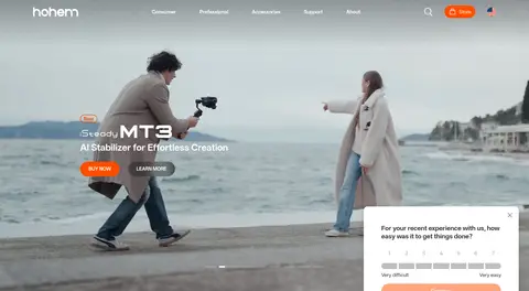
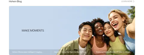
Wide lifestyle image-led blog feature with compact title and secondary Learn More affordance.
Service links
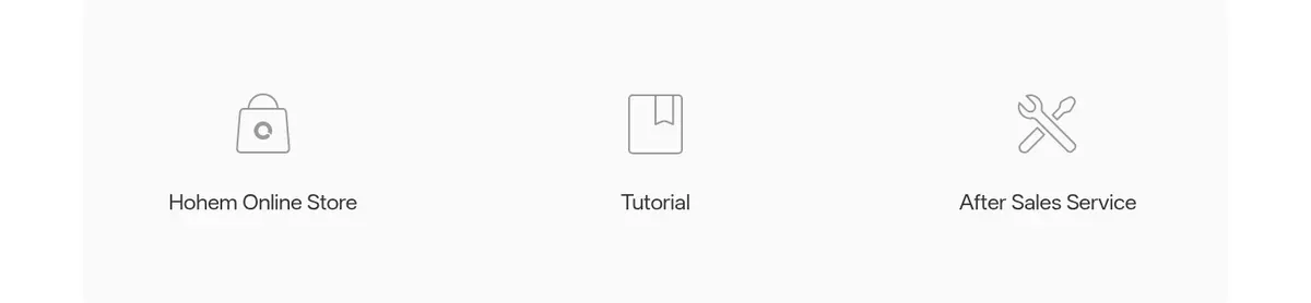
Three service destinations presented as a simple row with restrained line icons and ample breathing room.
Feedback overlay
White rounded survey panel layered over campaign content with a soft measured shadow and orange-tinted Continue control.
Imagery · Prioritize high-quality product photography and campaign video featuring smartphone and camera stabilizers in use. The hero can use cinematic, dark imagery with product hardware prominently framed; subsequent cards use bright, clean product cutouts against pale surfaces. Mix in lifestyle photography for editorial storytelling and a wide retail banner. Treat screenshot colors from scenes and product renders as image content, not interface palette.
Return to white and pale gray for catalog sections.
Use OPPO Sans 4.0 or a close sans-serif substitute.
Reserve rounded pills for buttons and compact controls.
Give product imagery generous room and consistent alignment.
✕ 不该做
Do not use campaign photography colors as interface tokens.
Do not make every action orange.
Do not add heavy card shadows throughout the page.
Do not crowd the product grid with dense copy.
Do not introduce decorative gradients absent from the measured interface.
Do not overuse borders where spacing can separate content.
给 AI 的提示词
想快速出一个同风格的新页面,把这段话连同 DESIGN.md 一起发给 AI。
Build a responsive consumer-electronics page in Hohem’s clean, product-led style. Use Gallery White (#ffffff) as the main canvas, Cloud Surface (#f7f7f7) for quiet section separation, Graphite Ink (#333333) for primary copy, and Signal Orange (#ff4d00) only for high-priority purchase actions. Set typography in OPPO Sans 4.0 or Inter, using weight and scale for hierarchy rather than decorative tracking. Open with a cinematic, full-width stabilizer campaign image and restrained overlay navigation. Follow with spacious product tiles, editorial lifestyle imagery, service links, and a structured footer. Keep cards and media softly rounded, controls pill-shaped, and most surfaces flat. Use generous measured spacing and a centered content frame, while allowing campaign media to bleed edge to edge. Treat scene colors as photography, not UI tokens.