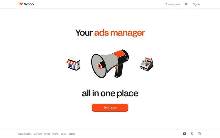
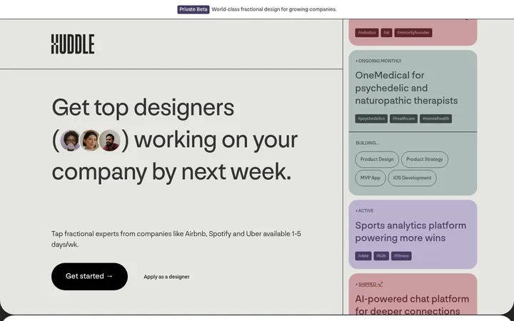
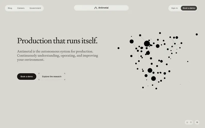
North star · Keep the canvas quiet and the typography decisive; use orange only to guide attention between clear product evidence and action.
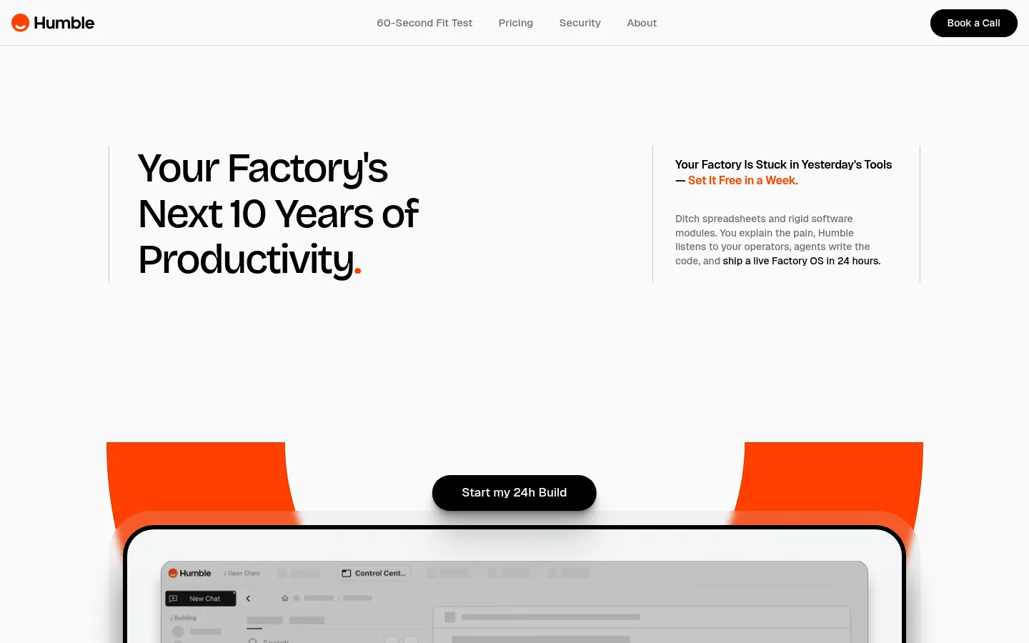
The visual strategy balances a near-white #fafafa canvas with black typography and a small, high-energy orange accent. The header is a restrained horizontal band; the hero uses a large, tightly tracked display headline beside compact supporting copy, then lets a product visual occupy the space below. Bricolage Grotesque gives headlines a distinctive, soft-edged editorial character, while Geist keeps navigation and explanatory copy practical and legible. Content shifts between sparse text-led moments, large interface mockups, and pale rounded cards. Factory imagery adds color and context, but its varied hues belong to illustrations and product media rather than the core palette. Generous vertical pauses separate sections, while compact copy blocks and card details preserve information density. Black pill CTAs provide clear action contrast; soft shadows and subtle hairlines distinguish layered UI without making the overall page feel heavy.
Primary body and navigation type for concise copy and interface labels.
Aa 设计
Bricolage Grotesque
网络字体 · 字重 500 · 占比 7%
免费替代:Plus Jakarta Sans
Display and heading type, especially the hero and section titles.
Aa 设计
sans-serif
系统字体 · 字重 400 · 占比 5%
免费替代:Arial
Small captions and fallback text.
Aa 设计
Geist Variable
网络字体 · 字重 400 · 占比 3%
免费替代:Inter
Variable-font body fallback in measured text.
Aa 设计
Inter
网络字体 · 字重 600 · 占比 3%
免费替代:Inter
Minor interface and heading fallback.
角色
示例
字号
字重
行高
字距
特大标题
Oversized hero statement and major campaign-style headings.
Humble
58px
500
1.1
-0.05em
一级标题
Primary page headline when not using the larger display treatment.
Humble
44px
500
1.1
-0.052em
二级标题
Section titles introducing major homepage content.
Humble
32px
500
1.2
-0.03em
三级标题
Feature and subsection headings.
The quick brown fox 敏捷的狐狸
24px
500
1.2
-0.03em
四级标题
Compact card or feature headings.
The quick brown fox 敏捷的狐狸
20px
500
0.7
-0.02em
正文
Explanatory paragraphs, card copy, and product descriptions.
The quick brown fox 敏捷的狐狸
13px
500
1.4
0
辅助文字
Small annotations, metadata, and fine-print labels.
The quick brown fox 敏捷的狐狸
12px
400
normal
0
导航
Header navigation links and concise menu labels.
The quick brown fox 敏捷的狐狸
15px
500
1.3
0
间距与布局
基准单位 4px · 密度:紧凑
32px版块间距
10px元素间距
—卡片内边距
—内容最大宽度
4px
8px
10px
14px
16px
24px
32px
38px
40px
42px
Use a broad centered desktop composition with substantial side gutters and a compact horizontal navigation bar. The hero is a split editorial arrangement: headline and short proof copy sit in distinct columns, followed by a large centered product visual. Below, alternate full-width media, text-and-interface splits, and stacked comparison cards. Keep copy blocks narrow and interfaces prominent. Section rhythm is spacious and deliberately uneven, with long blank pauses between major content groups; individual cards remain information-dense. Do not invent a fixed max width from the measurements.
圆角与层次
按钮 · 9999px
卡片 · 30px
图片 · 40px
导航 · 4px
lg · card
md · card
md · other
lg · card
The page is mostly flat, with subtle hairlines and pale surfaces doing most of the separation. White cards use soft, low-opacity layered shadows and generous rounded corners; device mockups can carry much stronger image-specific depth. Reserve visible layering for product evidence and primary actions rather than adding shadows to every section.
组件
下面的预览按实测的按钮、输入框、徽标、卡片样式重建(字体用替代字体)。
Header navigation
A narrow pale top band with the brand mark at left, compact Geist links centered, and a black rounded Book a Call action at right.
Hero statement
Large Bricolage Grotesque headline with tight tracking, a slim vertical divider, and a separate compact supporting-copy column.
Primary CTA
Black pill-shaped action with white text and a soft shadow; repeat consistently for high-intent actions.
Product media frame
Large interface or device image in a strongly rounded frame, sometimes layered over the signature orange hero graphic.
Comparison cards
Pale, generously rounded cards contrast a muted 'Today' state with a highlighted Humble outcome and subtle separators.
Feature showcase
A concise text introduction paired with broad product UI imagery, repeated down the page with ample separation.
Imagery · Mix product-interface captures with illustrated factory scenes and human-at-work imagery. The hero places a prominent device mockup over a strong orange geometric shape; later sections use large, softly framed interface panels and comparison cards. Media can contain colors outside the palette: treat those as illustration or product content, not brand tokens. Keep imagery crisp but visually subordinate to the message.
该做与不该做
✓ 该做
Use #fafafa as the dominant page canvas.
Set prominent headings in Bricolage Grotesque with tight tracking.
Keep body copy compact and use Geist for navigation and interface text.
Use #ff4000 selectively for emphasis and signature visual accents.
Make black pill CTAs the clearest action on pale backgrounds.
Pair concise text with tangible product UI or factory imagery.
✕ 不该做
Do not turn orange into a full-page background color.
Do not crowd the hero with dense explanatory paragraphs.
Do not use heavy borders around every card or section.
Do not treat illustration colors as additions to the brand palette.
Do not use equal visual weight for every heading and caption.
Do not fill the generous section pauses with decorative content.
给 AI 的提示词
想快速出一个同风格的新页面,把这段话连同 DESIGN.md 一起发给 AI。
Build a new Humble-style manufacturing AI page with a calm #fafafa Gallery White canvas, Machine Ink #000000 headlines, and restrained Signal Orange #ff4000 emphasis. Use Bricolage Grotesque for large, tightly tracked editorial headings and Geist for compact navigation, body copy, and UI labels. Create a slim header, a split hero statement with a short supporting column, and a prominent product interface visual. Use black pill-shaped CTAs, pale Soft Alloy #f1f1f1 or Warm Stone #ecebe8 surfaces, generous rounded cards, and understated shadows. Alternate concise text blocks with substantial product screenshots and factory imagery. Preserve long, deliberate whitespace between major sections; keep each card’s information compact. Colors inside screenshots and illustrations are media, not palette extensions.