North star · Keep the page calm and editorial, using precise dark rules and generous white space to frame colorful, rounded product-card imagery.
The visual system balances an editorial grid with friendly, tactile product imagery. A light stone canvas (#e5e6e1) defines the hero, while white process sections create breathing room; thin dark rules articulate the hero grid and separate content without relying on shadow. Nng is used throughout in a restrained, mostly regular weight: large, loosely set headlines lead, while light body copy and compact labels keep explanations quiet. The hero places the headline and CTA on the left and a vertical stack of colorful work cards on the right. Later sections alternate text and product mockups, keeping the explanation readable and concrete. Muted lilac, dusty rose, and sage appear mainly in interface mockups and audience CTA panels rather than as a pervasive page-wide palette. Generous section spacing, large rounded section transitions, pill-shaped buttons, and crisp card outlines make the experience feel approachable but organized.
Site-wide display, headings, body copy, links, labels, and buttons.
角色
示例
字号
字重
行高
字距
特大标题
Oversized hero headline and high-impact promotional statements.
Huddle
69px
400
1.3
-0.021em
一级标题
Primary page headline and prominent section heading.
Huddle
44px
400
1.25
-0.011em
二级标题
Main headings for process steps and audience calls to action.
Huddle
40px
400
1.35
-0.008em
三级标题
Secondary headings within feature or testimonial content.
Huddle
29px
400
1.22
0
四级标题
Compact card and supporting content headings.
The quick brown fox 敏捷的狐狸
22px
400
1.3
0
正文
Light explanatory paragraphs and process descriptions.
The quick brown fox 敏捷的狐狸
17.5px
300
1.5
0
辅助文字
Small metadata, labels, and compact badge text.
The quick brown fox 敏捷的狐狸
12px
400
1.42
0
按钮
Text inside rounded primary and section-level CTA buttons.
The quick brown fox 敏捷的狐狸
16px
400
1.25
0
链接
Inline navigation, secondary actions, and footer links.
The quick brown fox 敏捷的狐狸
15px
400
1.58
0
间距与布局
基准单位 4px · 密度:宽松
60px版块间距
32px元素间距
19px卡片内边距
1150px内容最大宽度
2px
4px
5px
6px
8px
10px
12px
14px
16px
18px
20px
24px
32px
40px
48px
144px
A spacious desktop composition sits within a measured 1150px page maximum. The hero uses a strong two-column split, with the headline and CTA on the left and a narrow, stacked project-card rail on the right. Its dark hairlines give the grid a precise editorial feel. Below, white process sections alternate between one- and two-column arrangements, with consistent left-aligned copy and product imagery. Large vertical gaps and rounded transitions separate major bands; the final dark area groups audience CTAs and footer content. Overall density is low, with compact labels against expansive content regions.
圆角与层次
按钮 · 9999px
卡片 · 24px
徽标 · 4px
链接 · 50%
没有测到阴影:页面是扁平的,层次靠底色和描边区分。
The page is largely flat: no measured shadows or gradients. Thin black borders and hairlines define the hero grid and outlined mockup cards. Layering comes from overlapping or stacked product cards and portraits, plus rounded section boundaries; pill buttons gain emphasis through solid fills rather than elevation.
组件
下面的预览按实测的按钮、输入框、徽标、卡片样式重建(字体用替代字体)。
Announcement strip
A narrow white top band with a compact purple Private Beta badge and one-line announcement.
Hero split
Stone Canvas background; oversized left-aligned headline, supporting paragraph, black pill CTA, and secondary designer link beside a vertical project-card rail.
Project cards
Rounded pastel interface mockups with compact status labels, small tags, and crisp dividers; colors function as illustrative UI.
Process step
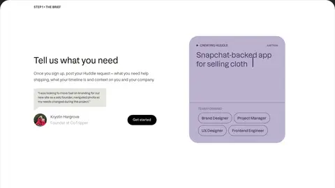
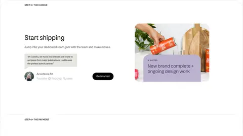
White section with a small numbered step label, clear heading, concise body copy, testimonial and profile detail, plus product-screen imagery.
Pill CTA
High-contrast rounded button; black with white text is common, while a warm Cocoa and Honey Gold variant appears in the hero.
Audience panels
Two large, rounded company and designer panels use warm gold and sage fills with concise copy and a compact CTA.
Footer
Dark charcoal band organizes About, join, and useful links into quiet columns with a prominent Huddle wordmark.
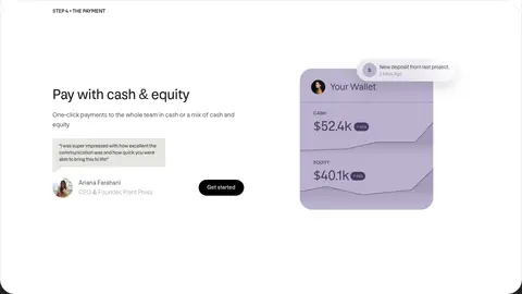
Imagery · Imagery centers on interface mockups: rounded project cards, team profile portraits, workflow screens, and a wallet panel. The hero shows stacked cards cropped by the viewport, while process sections pair a single interface scene with customer quotes or profile cutouts. A later card includes product photography. Pastel lilac, rose, and sage belong chiefly to these mockups, keeping the site canvas restrained.
Use Stone Canvas (#e5e6e1) as the hero’s calm grounding surface.
Keep headlines large, left-aligned, and visually dominant.
Separate major regions with thin, crisp dark rules.
Use colorful pastels mainly inside mockups and audience panels.
Give process copy ample white space and pair it with real interface examples.
Make primary actions pill-shaped and high contrast.
✕ 不该做
Do not turn the whole page into a saturated color field.
Do not add shadows or gradients that are absent from the measured system.
Do not crowd the hero with multiple competing calls to action.
Do not use the mockup palette as the default text or canvas palette.
Do not center-align every section; preserve the left-led editorial rhythm.
Do not replace thin borders with heavy decorative framing.
给 AI 的提示词
想快速出一个同风格的新页面,把这段话连同 DESIGN.md 一起发给 AI。
Build a new Huddle-style page as a spacious, editorial landing page for a collaborative design service. Use Stone Canvas (#e5e6e1) for the hero and Gallery White (#ffffff) for content sections; set primary text in Soft Charcoal (#232323) and use True Black (#000000) for crisp rules and common CTA pills. Use Nng or a close sans-serif substitute, with large regular-weight, subtly tight-tracked headlines and lighter supporting copy. Create a clear split hero with copy and action on the left and stacked, rounded product cards on the right. Use Lilac Haze (#bbb2ce), Dusty Rose (#cb9da2), and Sage Mist (#aebbba) chiefly within interface mockups. Keep process sections left-aligned, spacious, and alternating in layout. Avoid shadows and gradients; rely on fine borders, generous gaps, and rounded transitions.