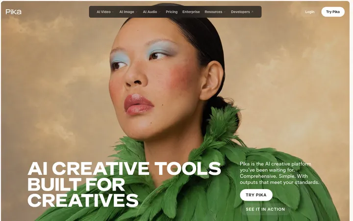
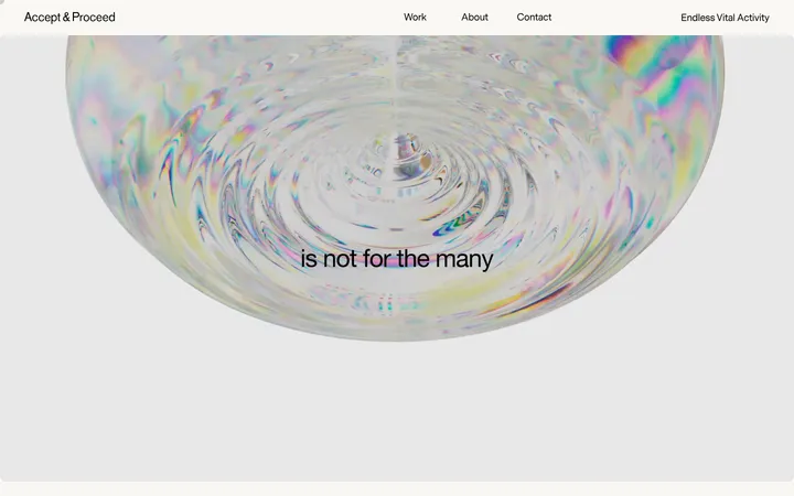
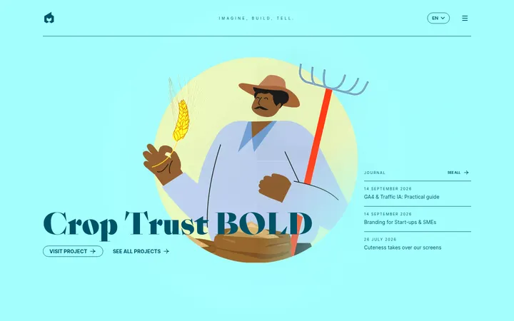
Hyper Tria 以克制的编辑式版面、醒目的大字和沉浸式影像展示品牌作品。以鲜绿联系横幅和黑色页脚点亮大面积留白的作品展示。
North star · Use a quiet white-and-black editorial framework to make oversized type, project imagery, and a single green contact moment feel unmistakable.
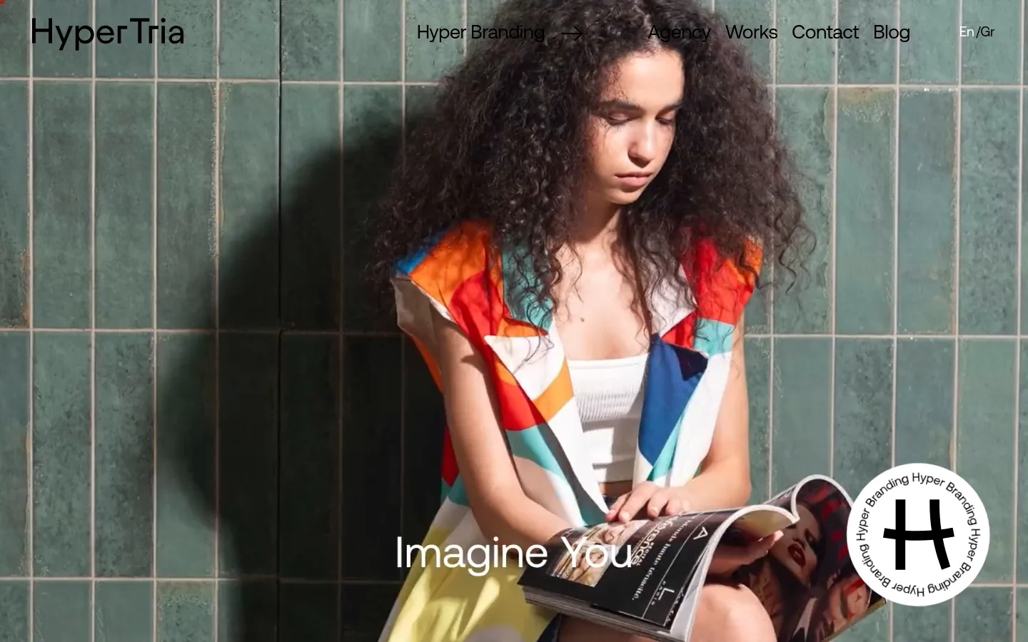
The page balances a mostly white canvas and black typography with striking, full-bleed project photography. The measured greens—#409b3f and #0fa64b—act as vivid brand punctuation, most clearly in the contact band; other saturated hues in the screenshots belong to project imagery rather than the core interface palette. Aeonik Regular carries the identity across large, tightly tracked display headlines and calm supporting copy. Portfolio stories alternate generous white space, sparse text, and prominent images, creating an editorial rhythm rather than a dense agency directory. The opening is an immersive video or image-led hero with navigation laid directly over it. Project compositions vary in alignment and scale, while the oversized “CONTACT US” treatment turns the transition to the footer into a clear call to action. Keep surfaces flat and corners square; let photography, scale, and whitespace provide the drama.
配色
点色块复制色值。用途说明来自对页面的实测位置(背景、文字、描边、按钮)与截图判读。
强调色
表层色
中性色
页面底色 · Gallery White表层 · Ink Black主文字 · Ink Black次要文字 · Gallery White强调 · Studio Green强调 2 · Signal Green
Display headlines, project titles, navigation, and supporting text throughout the page.
角色
示例
字号
字重
行高
字距
特大标题
Oversized statements and prominent contact display text.
Hyper Tria
90px
400
1
0
一级标题
Primary project or portfolio headline.
Hyper Tria
75px
300
0.9
-0.053em
二级标题
Project section heading or supporting statement.
Hyper Tria
35px
400
1.11
0.01em
三级标题
Compact project and content headings.
Hyper Tria
30px
500
1
0
四级标题
Secondary explanatory headings.
The quick brown fox 敏捷的狐狸
27px
400
1.48
-0.02em
正文
Agency description and project supporting copy.
The quick brown fox 敏捷的狐狸
20px
400
1.45
-0.01em
辅助文字
Small project labels, metadata, and footer details.
The quick brown fox 敏捷的狐狸
13px
400
2.23
0.02em
导航
Top-level navigation and menu labels.
The quick brown fox 敏捷的狐狸
27px
400
1.48
-0.02em
链接
Large contact link or prominent project link.
Hyper Tria
90px
400
1
0
间距与布局
基准单位 1px · 密度:宽松
100px版块间距
—元素间距
—卡片内边距
1148px内容最大宽度
2px
5px
8px
9px
10px
15px
20px
23px
25px
26px
28px
42px
44px
45px
50px
59px
The page uses a spacious, predominantly single-column portfolio flow within a measured maximum width of 1148px, interrupted by full-bleed media. Project content alternates image and text placement rather than repeating a rigid card grid. Large left-aligned headlines and open white areas keep each case study distinct. The contact band spans the content width, followed by a compact, two-column black footer. Maintain generous section separation and low information density; use the measured spacing scale without adding unmeasured dimensions.
圆角与层次
没有测到阴影:页面是扁平的,层次靠底色和描边区分。
The interface reads as flat: the measured data reports no shadows, gradients, or radius scale. White project sections sit directly on the canvas, with imagery providing depth and visual contrast. Keep edges square and use the green band and black footer as clear color blocks rather than raised cards.
组件
下面的预览按实测的按钮、输入框、徽标、卡片样式重建(字体用替代字体)。
Overlay navigation
Place the Hyper Tria wordmark and compact links over the immersive opening media; use dark type where the image allows.
Project feature
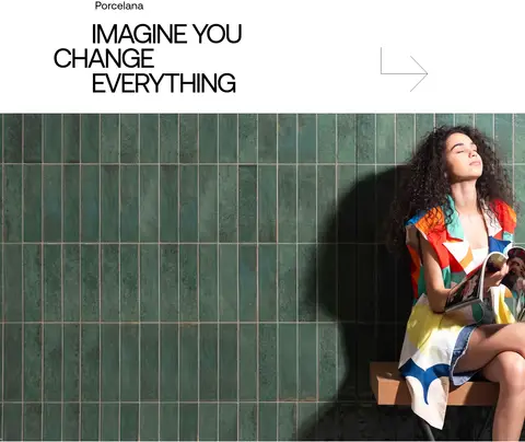
Pair a prominent project image with a short label and oversized black headline on white, varying image and text alignment.
Project arrow link
Use a thin, minimal directional arrow beside project copy as a restrained cue to explore the case study.
Contact band
Set a repeated, oversized contact phrase on the measured #409b3f green strip, creating a high-contrast transition.
Inverse footer
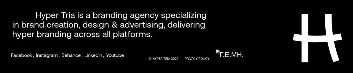
Use a black footer with white agency description, compact social and legal links, and a prominent brand mark.
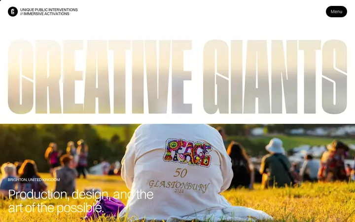
Imagery · Large campaign photography and video lead the experience, including a full-viewport opening image and broad project imagery. Project visuals retain their own art direction, color, and product treatment; do not mistake their oranges, greens, or other saturated colors for interface tokens. Frame images boldly, often at large scale, and pair them with minimal project naming and directional arrow marks.
Keep the main canvas white and the type predominantly black.
Let full-bleed campaign imagery lead the opening and selected portfolio moments.
Use oversized Aeonik-style headlines with tight tracking.
Alternate project image and text placement to create editorial rhythm.
Reserve #409b3f for a distinct contact moment.
Preserve generous whitespace around project labels and headlines.
✕ 不该做
Do not turn the portfolio into a dense, uniform card grid.
Do not use illustration colors as interface palette tokens.
Do not add gradients, shadows, or rounded card treatments.
Do not make every section a full-bleed image.
Do not compete with project artwork using extra interface accents.
Do not shrink the contact call to action into a conventional button.
给 AI 的提示词
想快速出一个同风格的新页面,把这段话连同 DESIGN.md 一起发给 AI。
Build a new creative-agency page in Hyper Tria’s editorial portfolio style. Use Gallery White (#ffffff) as the main canvas and Ink Black (#000000) for typography and the inverse footer. Keep Studio Green (#409b3f) as a restrained, prominent contact-band accent; treat Signal Green (#0fa64b) as secondary, not a general surface. Use Aeonik Regular or a close sans-serif substitute such as DM Sans, pairing oversized tightly tracked headlines with clean supporting copy. Start with immersive, full-bleed campaign media and understated overlay navigation. Structure the work as spacious, asymmetric project features with large images, short labels, and minimal arrow links. Finish with a bold contact moment and compact black footer. Keep surfaces flat, corners square, and whitespace generous; let the imagery supply its own colors.