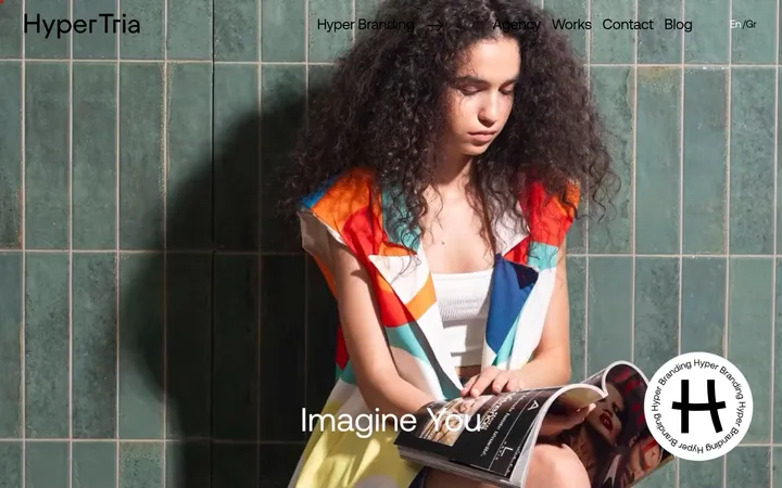
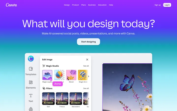
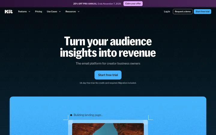
North star · Keep the interface quiet and spacious so oversized typography and vivid creative media remain the focal point.
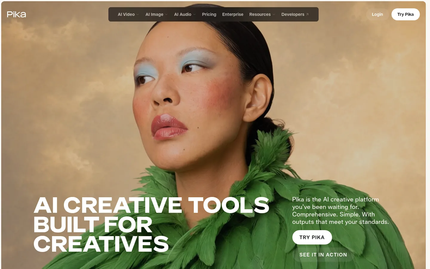
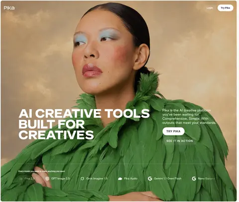
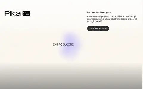
The page uses a warm off-white canvas (#faf8f4) as its visual anchor, letting vivid creator imagery carry most of the color. Near-black surfaces and white text create a deliberate contrast in the lower research and news sections, while the neutral palette keeps interface elements quiet. Telka Extended sets uppercase, emphatic display and main headings; Telka handles navigation, body copy, labels, and controls. The first screen is a full-bleed video or image composition with the headline and supporting copy layered over it. Below, broad intervals of whitespace separate concise product demonstrations, audience-focused media cards, and a developer membership feature. Rounded media and pill-shaped CTAs soften the otherwise crisp editorial layout. Fine borders, not prominent shadows, define selected dark-mode cards and navigation treatments. Accent hues appear mainly in creative media or branded content, not as a dominant interface color.
Navigation, body copy, section headings, captions, buttons, links, and labels.
Aa 设计
Telka Extended
网络字体 · 字重 400 / 500 / 700 · 占比 8%
免费替代:Space Grotesk
Display and main campaign headings, including the oversized hero statement.
角色
示例
字号
字重
行高
字距
特大标题
Oversized uppercase hero and campaign display headlines.
Pika
72.5px
700
0.9
0
一级标题
Primary uppercase page or section headline, especially the hero.
Pika
54px
500
1.04
0.01em
二级标题
Feature and editorial section headings.
Pika
28px
400
1.25
0.02em
三级标题
Product and media feature titles.
The quick brown fox 敏捷的狐狸
26px
400
1.2
0
四级标题
Smaller subsection headings and promotional titles.
The quick brown fox 敏捷的狐狸
24px
500
1.25
0.02em
正文
Introductory and explanatory copy beside creative media.
The quick brown fox 敏捷的狐狸
20px
400
1.25
0.02em
辅助文字
Card descriptions, metadata, and supporting labels.
The quick brown fox 敏捷的狐狸
16px
400
1.35
0.02em
按钮
Uppercase CTA labels with strong letter spacing.
The quick brown fox 敏捷的狐狸
16px
500
0.94
0.1em
导航
Header navigation and top-level site links.
The quick brown fox 敏捷的狐狸
17px
400
1
0
链接
Uppercase text links and secondary CTA labels.
The quick brown fox 敏捷的狐狸
16px
500
0.94
0.1em
眉题
Small uppercase section labels and pre-headings.
The quick brown fox 敏捷的狐狸
16px
500
0.94
0.1em
间距与布局
基准单位 8px · 密度:宽松
108px版块间距
12px元素间距
—卡片内边距
—内容最大宽度
2px
4px
6px
8px
12px
16px
20px
21px
24px
32px
36px
48px
64px
108px
The page alternates full-bleed media with centered or modular content areas. The hero layers its heading and copy over a large image or video; later sections use card grids, stacked product rows, and a split developer promotion. Content alignment shifts between centered introductions and left-aligned editorial blocks. Generous section gaps create a slow, spacious rhythm, while dense media galleries and news cards bring local variation. Keep the canvas open rather than adding persistent panels or an invented fixed-width grid.
圆角与层次
按钮 · 9999px
卡片 · 16px
图片 · 12px
导航 · 8px
链接 · 12px
inset · nav
The page is predominantly flat: section backgrounds and whitespace establish hierarchy instead of shadows. Use fine, restrained borders for select dark cards and navigation elements. Layer hero text and subtle scrims directly over media; reserve rounded treatments for cards, media, and pill-shaped CTAs rather than adding floating panels.
组件
下面的预览按实测的按钮、输入框、徽标、卡片样式重建(字体用替代字体)。
Pill CTA
Use a white fill with near-black text for the primary CTA; secondary actions can use a transparent fill and fine light border. Keep labels uppercase and tracked.
Floating navigation
Place the compact site links over the hero media, with dark translucent treatment and subtle inset definition. Pair with light branding and a high-contrast Try Pika pill.
Hero overlay
Set the large uppercase headline low on the media, with a concise supporting paragraph and primary action arranged alongside it.
Product feature row
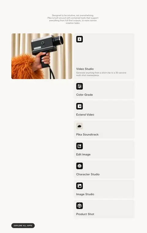
Show a rounded preview beside a quiet, light product information panel; stack additional tools as compact, labeled rows.
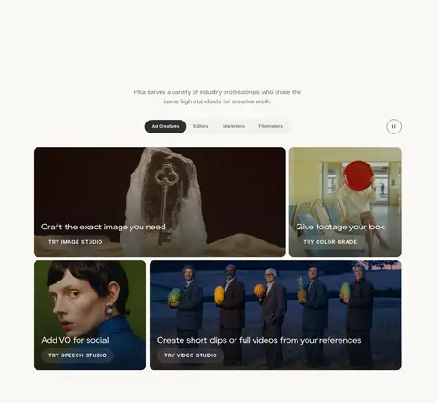
Creative media card
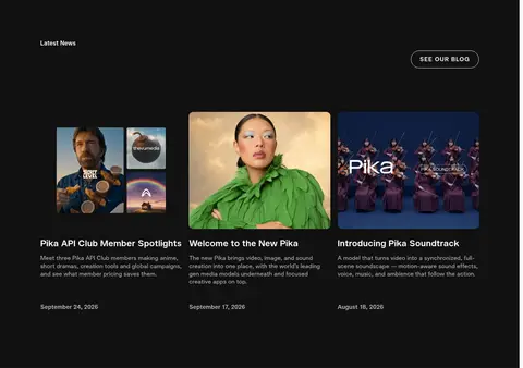
Use rounded image or video cards with short white overlay copy and a dark gradient scrim where needed for contrast.
Dark editorial feed
Group research and news content on near-black sections with white headings, muted descriptions, subtle dividers, and image-led article cards.
Footer link columns
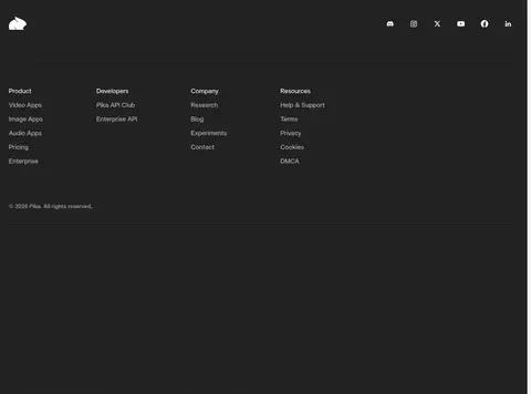
Set resource links in grouped columns on charcoal, with muted labels and a restrained horizontal divider.
Imagery · Use cinematic, full-bleed creator imagery and video as the main source of color and atmosphere. Product examples appear in rounded media cards with short overlaid labels and subtle dark scrims for legibility. The hero features a tightly framed portrait with textured styling; later cards show varied creative outputs. Treat image colors as content rather than extending them into the interface palette.
Let creator media dominate the hero and feature areas.
Use the warm off-white canvas for light sections.
Switch to near-black for editorial and news bands.
Use Telka Extended for confident uppercase display headlines.
Keep supporting copy concise and visually secondary.
Use rounded media and pill-shaped CTA treatments.
Separate major sections with generous whitespace.
✕ 不该做
Do not turn illustration colors into persistent brand UI colors.
Do not crowd the hero with interface panels.
Do not rely on heavy shadows to create hierarchy.
Do not apply uppercase display styling to all body text.
Do not add decorative gradients as a dominant brand motif.
Do not make every section dark or card-heavy.
Do not invent measurements absent from the supplied data.
给 AI 的提示词
想快速出一个同风格的新页面,把这段话连同 DESIGN.md 一起发给 AI。
Build a new Pika-style page with an editorial, media-led composition. Use Gallery Cream (#faf8f4) for the main canvas, Soft Black (#111111) and Charcoal (#222222) for selected inverse sections, Warm Gray (#757472) for muted light-theme copy, and white (#ffffff) for text over imagery and primary CTA fills. Keep accent colors inside creative media rather than treating them as interface chrome. Use Telka or a close sans-serif substitute for interface text and Telka Extended-style uppercase display headings. Pair full-bleed video or photography with spacious product rows and rounded media cards. Keep controls pill-shaped, borders fine, and shadows minimal. Alternate calm light sections with dark editorial bands, using concise copy and substantial whitespace to preserve the page’s visual rhythm.