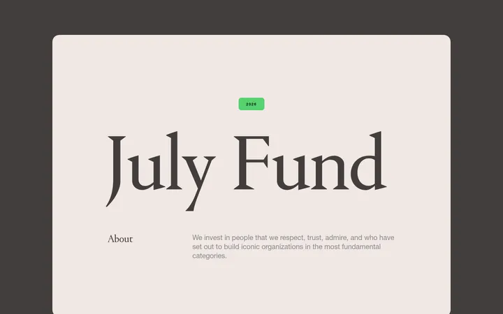
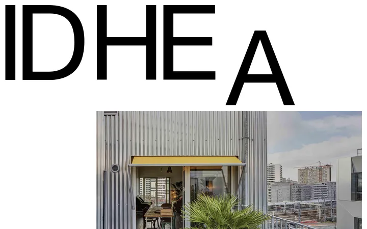
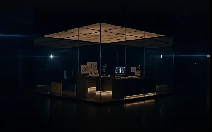
North star · Keep the warm yellow canvas continuous and let oversized, dark typography and expressive imagery define each section without adding decorative UI.
The page is anchored by a pale butter-yellow canvas (#f9e5b1) that continues across the hero and lower content, making the whole homepage feel like one composed editorial surface. Dark charcoal (#1d1e21) carries the wordmark, navigation, headings, body copy, rules and primary CTA. Lausanne is used throughout, with unusually large, regular-weight display and heading text balanced by compact supporting copy and heavier link labels. The layout alternates text and imagery rather than boxing every section into cards: the hero pairs its statement with a black-and-cream illustration, while later sections use portfolio and team photography alongside more drawn artwork. Fine dark dividers mark section transitions without introducing heavy panels or shadows. Most content sits directly on the canvas; small pale surfaces appear selectively in a portfolio card and graphic details. The result is warm, distinctive and restrained, with generous open areas and a strong contrast between oversized typography and smaller explanatory text.
All page typography: display and section headings, body copy, navigation, links and buttons.
角色
示例
字号
字重
行高
字距
特大标题
Oversized brand and hero display statements.
Dovetail
72px
400
1
-0.01em
一级标题
Primary page or major section headings.
Dovetail
48px
400
1.17
-0.005em
二级标题
Supporting section statements and prominent editorial copy.
Dovetail
32px
400
1.5
-0.005em
三级标题
Emphasized subheadings and compact feature titles.
Dovetail
28px
600
1
0.007em
正文
Paragraphs, explanatory copy and supporting text.
The quick brown fox 敏捷的狐狸
20px
400
1.4
0.01em
按钮
Prominent CTA labels.
Dovetail
28px
600
1
0.007em
导航
Header navigation links.
The quick brown fox 敏捷的狐狸
20px
400
1.4
0.01em
链接
Emphasized inline and section-level calls to action.
The quick brown fox 敏捷的狐狸
22px
700
1.36
0.005em
间距与布局
基准单位 8px · 密度:紧凑
32px版块间距
8px元素间距
30px卡片内边距
1376px内容最大宽度
3px
4px
8px
9px
12px
14px
15px
16px
20px
24px
28px
32px
40px
48px
56px
72px
Use a broad, centered content area with a measured page maximum width of 1376px. The page reads as a sequence of full-width canvas sections, generally aligned to the left, with content arranged in two-column hero and feature compositions and a multi-item portfolio strip. Keep section boundaries clear with fine rules rather than separate colored bands. The measured spacing system is based on an 8px unit; maintain a compact overall density while leaving conspicuous open space around major statements and imagery.
圆角与层次
按钮 · 16px
卡片 · 16px
图片 · 16px
没有测到阴影:页面是扁平的,层次靠底色和描边区分。
The visual language is predominantly flat: the measured page has no shadows or gradients, and most sections sit directly on the shared canvas. Use thin dark rules to separate content groups. Reserve rounded corners for image media, the portfolio card and controls; do not create layered, elevated panels.
组件
下面的预览按实测的按钮、输入框、徽标、卡片样式重建(字体用替代字体)。
Header navigation
Place the oversized wordmark at the left, compact text links toward the right and the symbolic mark at the far edge, all in Charcoal Ink on Butter Canvas.
Hero CTA
A dark, rounded pill with Porcelain Cream text; keep the label prominent and pair it with a large statement and contrasting illustration.
Section divider
Use a fine Charcoal Ink horizontal rule to mark transitions between sections while preserving the continuous canvas.
Editorial text link
Use Charcoal Ink, bold Lausanne styling and a short underline or small directional arrow where shown; avoid button-like filled backgrounds.
Portfolio carousel
Show company imagery in a horizontal sequence of rounded thumbnails with concise names and simple outlined circular previous/next controls.
Portfolio prompt card
Use a restrained Periwinkle Mist surface with rounded corners and dark copy to highlight the invitation to recommend a company.
Team image pair
Present large rounded team and studio photographs side by side beneath the section heading and supporting text.
Imagery · Mix monochrome, hand-drawn editorial illustrations with documentary-style portfolio and team photography. The hero illustration is a high-contrast black-and-cream scene placed opposite the headline; later drawn artwork supports the investment-focus quote and closing statement. Portfolio images appear as a horizontal row of rounded thumbnails, while team and studio photographs use larger rounded rectangles. Keep imagery natural and avoid glossy product-render treatments.
Keep Butter Canvas (#f9e5b1) as the dominant continuous page background.
Use Charcoal Ink (#1d1e21) for primary text, marks and dividing rules.
Let large, regular-weight typography lead the hero and section introductions.
Pair text with the page’s expressive illustration or documentary photography.
Separate major content groups with restrained hairline rules.
Use rounded corners selectively on media, cards and controls.
✕ 不该做
Do not introduce unmeasured colors into the interface palette.
Do not turn every section into a card or colored band.
Do not add shadows, gradients or layered elevation.
Do not replace the editorial imagery with glossy 3D renders.
Do not force headings or navigation into uppercase.
Do not crowd the canvas with dense controls or decorative UI.
给 AI 的提示词
想快速出一个同风格的新页面,把这段话连同 DESIGN.md 一起发给 AI。
Build a new Dovetail page that feels like an open editorial composition, not a dashboard. Use Butter Canvas (#f9e5b1) as the continuous background, Charcoal Ink (#1d1e21) for typography, marks and fine dividers, and Porcelain Cream (#fef9f3) only for light contrast such as CTA lettering. Typeset everything in Lausanne, or a close sans-serif substitute, with large regular headlines and confident smaller link labels. Use an asymmetric text-and-image composition, combining monochrome hand-drawn illustration with natural documentary photography. Keep the measured spacing system and wide centered page area; give major content room to breathe. Prefer direct-on-canvas layouts and thin rules over panels, with Periwinkle Mist (#dfe4f3) reserved for a selective card surface. Keep corners rounded only where the reference uses them. Add no shadows or gradients.