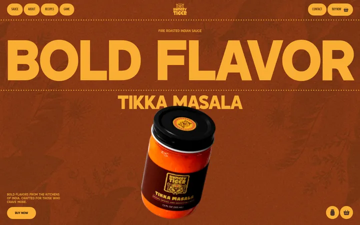
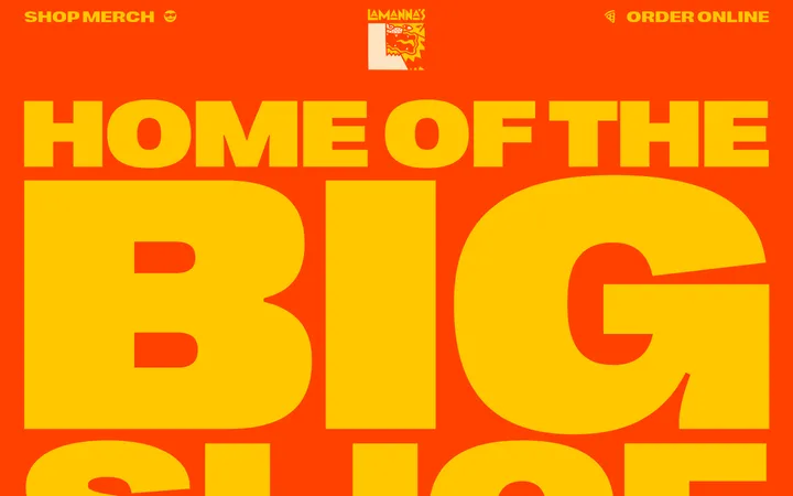
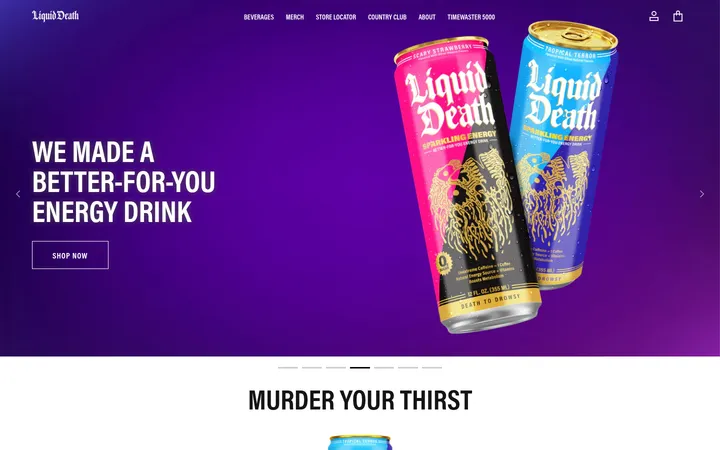
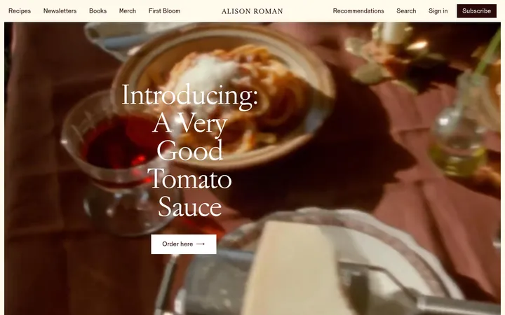
North star · Build every section around the burgundy canvas, using oversized condensed red display type and appetizing imagery as the primary contrast.
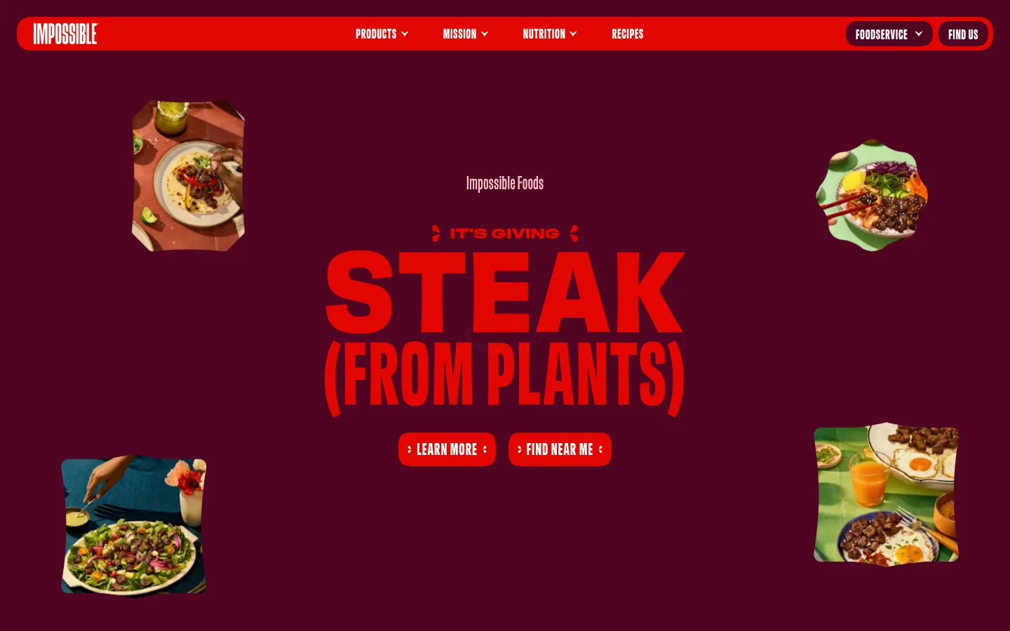
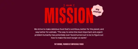
The page is anchored by a deep burgundy canvas (#4f0423), carrying almost every content section from the hero through the newsletter. A darker plum surface (#260212) separates the footer and supports selected cards, while white and pale pink (#ffc7c6) keep text, outlines and occasional panels readable. Saturated red (#e10600) provides the sharpest emphasis, especially in the navigation, headline artwork and compact calls to action. Typography is the main visual engine: a custom condensed sans-serif uses uppercase, tightly stacked display headlines, with restrained, readable sentence-case body copy. The hero balances a centered typographic campaign with scattered, irregularly cropped food images. Product packs and recipe photography then anchor browsing sections, while content, FAQ and mission blocks alternate between centered displays and practical text-led layouts. Spacing is compact within controls and cards but generous between major content moments, allowing the single-color canvas to unify a long page without making it feel static.
配色
点色块复制色值。用途说明来自对页面的实测位置(背景、文字、描边、按钮)与截图判读。
品牌色
强调色
表层色
中性色
页面底色 · Burgundy Stage表层 · Gallery White表层 2 · Plum Shadow表层 3 · Soft Media表层 4 · Rose Frost主文字 · Gallery White次要文字 · Rose Frost描边 · Rose Frost强调 · Rose Frost强调 2 · Signal Red
Site-wide display, navigation, body, link, and caption typography.
角色
示例
字号
字重
行高
字距
特大标题
Oversized campaign headlines and prominent visual statements.
Impossible Foods
161px
700
0.73
0
一级标题
Primary page or campaign title, set in uppercase display type.
Impossible Foods
154px
700
0.73
0
二级标题
Major section titles such as product, recipe, and FAQ headings.
Impossible Foods
150px
700
0.73
0
三级标题
Secondary display headings and prominent content labels.
Impossible Foods
127px
700
0.73
0
四级标题
Smaller uppercase feature and card headings.
Impossible Foods
48px
500
0.9
0
正文
Paragraphs, product descriptions, and explanatory copy.
The quick brown fox 敏捷的狐狸
18px
400
1.4
0
辅助文字
Recipe metadata, image notes, and small supporting labels.
The quick brown fox 敏捷的狐狸
14px
400
1.4
0
导航
Main uppercase navigation labels and menu controls.
The quick brown fox 敏捷的狐狸
20px
700
0.9
0.02em
链接
Inline links and text-led secondary actions.
The quick brown fox 敏捷的狐狸
18px
400
1.4
0
眉题
Short uppercase labels above display headings.
The quick brown fox 敏捷的狐狸
24px
700
0.9
0.03em
间距与布局
基准单位 2px · 密度:紧凑
40px版块间距
6px元素间距
—卡片内边距
1240px内容最大宽度
1px
2px
4px
5px
6px
7px
8px
10px
14px
16px
18px
20px
24px
26px
32px
40px
The measured page max width is 1240px, with a compact underlying spacing scale and a 40px section gap. The opening viewport is a full-bleed hero with centered campaign typography and food imagery positioned around it. Later sections shift between centered product and recipe browsing, text-led mission and FAQ blocks, and split newsletter content. A consistent burgundy field ties the distinct layouts together; the footer is a separate darker band. Keep alignment intentional and content groups closely composed, while allowing major headline sections and photographic moments to breathe.
圆角与层次
按钮 · 50%
卡片 · 38px
导航 · 15px
没有测到阴影:页面是扁平的,层次靠底色和描边区分。
The measured data reports no shadows or gradients, so keep the page mostly flat. Separate zones through the darker plum footer, contrasting pale panels, and solid CTA fills rather than ambient shadows. Cards and navigation can use the measured rounded treatments; pink hairlines are a small, visible outline detail rather than a general border system.
组件
下面的预览按实测的按钮、输入框、徽标、卡片样式重建(字体用替代字体)。
Top navigation
Compact bright-red rounded horizontal bar with a white wordmark, bold uppercase menu labels, and darker rounded action controls.
Campaign hero
Centered oversized uppercase campaign headline with compact red CTA pills and scattered, irregularly cropped food photography.
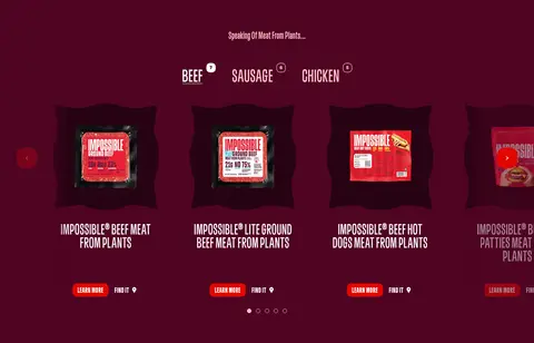
Product carousel
Centered category selector above a horizontal package-image row, with uppercase product names and compact learn-more and find-it actions.
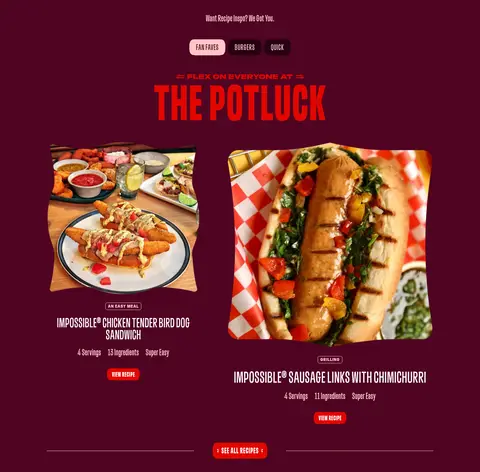
Recipe feature
Large food photography paired with uppercase condensed recipe titles, small metadata, and bright-red recipe buttons.
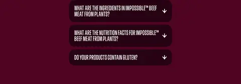
FAQ accordion
Stacked dark plum rounded question rows with white uppercase condensed copy and a right-aligned downward indicator.
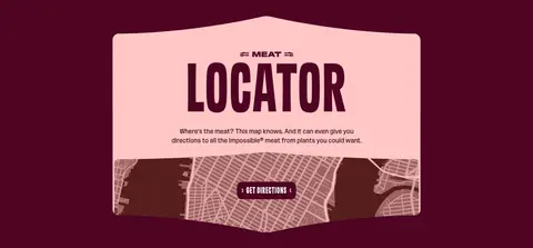
Meat locator panel
Pale pink, softly rounded feature panel with dark headline text and a map image anchored across its lower area.
Newsletter form
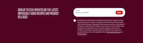
Two-column signup area with compact uppercase copy, a white pill-shaped email field, and red submit button.
Footer
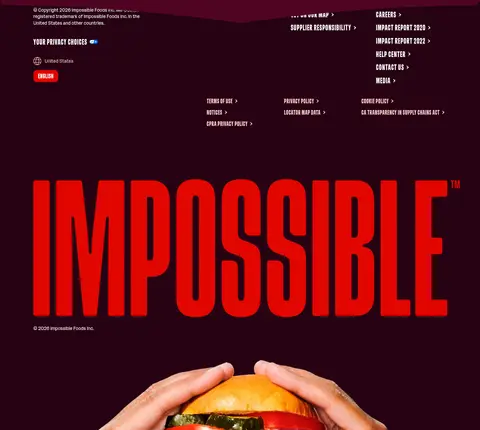
Deep plum footer band with a large red wordmark, grouped small white links, locale controls, and legal copy.
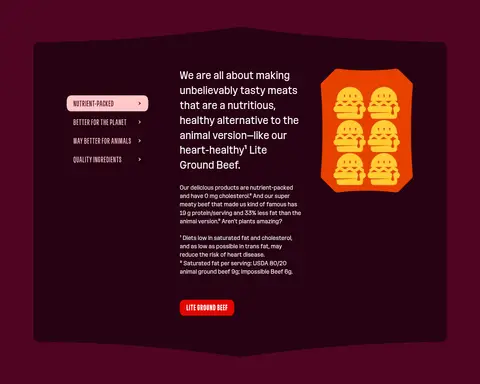
Imagery · Use appetizing, brightly lit food photography and clear product-pack shots as the counterpoint to the dark burgundy field. The hero treats food photos as small, irregularly cropped floating frames around the central campaign headline. Recipe sections use larger rectangular meal photography; product browsing emphasizes package imagery. Graphic illustrations and iconography can support ingredient or locator content, but should not replace the food photography as the page's visual draw.
Reserve #e10600 for high-impact headlines and clear actions.
Set display headlines in bold, condensed uppercase type.
Use white for readable navigation and body text.
Let food and product photography add warm, varied color.
Use #260212 to distinguish the footer and selected inset surfaces.
✕ 不该做
Don't introduce unmeasured brand colors.
Don't replace the burgundy canvas with a neutral page background.
Don't set every text block in oversized display type.
Don't add gradients or decorative shadows.
Don't crowd campaign headlines with too many interface elements.
Don't use product illustrations in place of the prominent real food photography.
给 AI 的提示词
想快速出一个同风格的新页面,把这段话连同 DESIGN.md 一起发给 AI。
Create a new Impossible Foods-style page with a continuous #4f0423 Burgundy Stage canvas and a compact, rounded navigation bar. Use #e10600 Signal Red for campaign emphasis and CTAs, #ffffff Gallery White for navigation and readable copy, and #ffc7c6 Rose Frost for occasional highlights or a contrasting feature panel. Use a condensed sans-serif similar to Oswald: bold uppercase display headlines, restrained uppercase navigation, and clear regular-weight body text. Let oversized typography lead, then balance it with vivid, appetizing food photography and product imagery. Compose content in compact cards or grouped controls, with generous transitions between major sections. Use #260212 Plum Shadow for a distinct footer or inset surface. Keep the design mostly flat; avoid gradients and unmeasured decorative effects.