North star · Treat every section like a bold food poster: lead with oversized type, saturated colour fields, and purposeful cutout imagery.
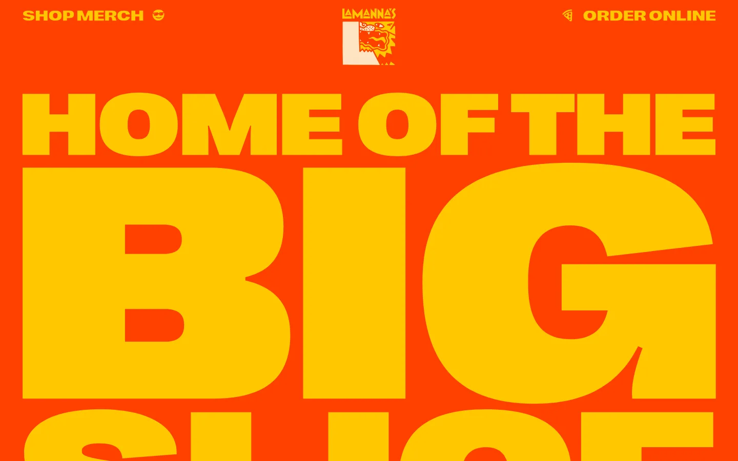
The page is driven by a vivid vermilion canvas (#ff4100) and saturated golden yellow (#ffc700), creating a high-energy palette that carries through the navigation, hero lettering, and recurring decorative details. Blush pink (#fdbeba) and white (#ffffff) create contrast in selected content and footer areas; the screenshot shows a pale pink introduction block with cream-like illustrated shapes, so judge these quieter surfaces as intentional section changes rather than the overall brand canvas. Right Grotesk Spatial Black anchors the page with huge, tightly set display headlines, while Nimbus Sans Extended supports readable body copy. The layout alternates expansive color fields with full-bleed food and merchandise photography, punctuated by repeated ticker-like strips and starburst buttons. Shadowed, offset headline treatments and cutout imagery add a tactile, poster-like quality. Generous section breaks let each colour panel and oversized message read as its own graphic moment.
Oversized hero slogan and main graphic statements.
Lamanna Bakery
132px
400
0.83
-0.003em
一级标题
Primary hero headline, especially the stacked “Home of the Big Slice” message.
Lamanna Bakery
130px
400
0.77
-0.002em
二级标题
Major section titles, including the bakery introduction and menu.
Lamanna Bakery
100px
400
0.9
-0.001em
三级标题
Secondary promotional and content-section headlines.
Lamanna Bakery
90px
400
0.76
-0.001em
四级标题
Smaller section headings and feature titles.
Lamanna Bakery
70px
400
0.86
-0.001em
正文
Introductory copy, food descriptions, and supporting text.
The quick brown fox 敏捷的狐狸
21px
400
1.48
0
导航
Uppercase primary navigation links.
Lamanna Bakery
30px
400
1
-0.02em
链接
Prominent menu and action links.
Lamanna Bakery
32px
400
1.16
0
间距与布局
基准单位 2px · 密度:宽松
120px版块间距
—元素间距
—卡片内边距
1354px内容最大宽度
1px
6px
10px
15px
20px
30px
43px
50px
60px
100px
120px
130px
The page uses full-width colour bands and media rather than a persistent card grid. Content is centred within a measured page maximum of 1354px, with expansive headline compositions and image-led sections. At the top, navigation sits along the edges with the logo centred; the hero fills the viewport with stacked display lettering. Large measured section gaps create a deliberate pause between featured blocks, while the overall density stays spacious despite the busy graphic details. Text is typically centred in promotional panels, with split layouts used where food or merch photography needs room.
圆角与层次
按钮 · 50%
没有测到阴影:页面是扁平的,层次靠底色和描边区分。
The system is mostly flat: saturated section fills and sharp colour transitions do the structural work instead of card shadows or gradients. Large headline lettering sometimes receives a pronounced offset shadow, creating a printed, dimensional poster effect. Buttons use a measured 50% radius, while repeated ticker bands and decorative motifs provide layering without conventional bordered cards.
组件
下面的预览按实测的按钮、输入框、徽标、卡片样式重建(字体用替代字体)。
Edge-to-edge hero
Fill the opening view with Pizza Flame (#ff4100), a centred brand mark, edge-positioned navigation, and enormous Golden Crust (#ffc700) display lettering.
Starburst CTA
Use a circular or spiked promotional badge for actions such as ordering, with bold contrast and compact centred lettering.
Ticker strip
Repeat a short phrase and small decorative marks across a narrow Golden Crust (#ffc700) band between large sections.
Poster headline
Set section titles in the heavy display face and use a distinct offset shadow to make the lettering feel printed and dimensional.
Food cutout
Place large, isolated food photography alongside or beneath text, with small illustrated accents around the image.
Promotional colour panel
Give menu or brand-story content a full-width colour block, centred title, concise supporting copy, and a distinctive CTA.
Imagery · Use cutout-style photography of pizza, baked goods, and branded merchandise as the visual counterpoint to flat colour fields. Food images are large and isolated, integrated into illustrated sections with playful doodles, starbursts, or hand-drawn accents. Keep photography vivid and appetizing, with clean edges and bold framing; avoid generic lifestyle imagery. Illustrations support the bakery’s exuberant visual language rather than defining the core palette.
Use Pizza Flame (#ff4100) and Golden Crust (#ffc700) as the unmistakable core palette.
Make the main headline oversized, bold, and visually dominant.
Build clear full-width colour bands instead of a conventional stack of cards.
Pair vivid food cutouts with illustrated flourishes and poster-like titles.
Use blush panels sparingly to mark a clear change of section.
Keep navigation and calls to action easy to locate amid the visual energy.
✕ 不该做
Do not dilute the orange-yellow contrast with a muted, neutral-first palette.
Do not use small, understated display headings.
Do not make every section a bordered card or add generic shadows.
Do not crowd supporting copy into the oversized headline treatment.
Do not use unrelated lifestyle photography in place of food and branded merchandise.
Do not let decorative details obscure ordering or menu actions.
给 AI 的提示词
想快速出一个同风格的新页面,把这段话连同 DESIGN.md 一起发给 AI。
Build a new page in Lamanna Bakery’s exuberant, poster-like visual style. Use Pizza Flame (#ff4100) for dominant full-width canvases and Golden Crust (#ffc700) for giant headlines, navigation emphasis, and graphic accents. Reserve Blush Icing (#fdbeba) for occasional soft section panels, with Bakery White (#ffffff) used sparingly as a light surface. Use an exceptionally heavy display face for stacked headlines, extended sans-serif body copy, and compact condensed lettering for prominent links. Organize the page as spacious, full-bleed colour bands with clear section breaks, not a card grid. Add appetizing food cutouts, small playful illustrations, ticker strips, and starburst CTAs. Preserve legibility and keep menu, order, and shop actions immediately recognizable. Avoid gradients, restrained minimalism, and generic corporate components.