Eat Real Food 将营养指南呈现为鲜明的公共健康倡导页面,以近黑红色背景、超大奶油白标题和醒目的红色数据强调核心信息。页面通过宽松的长篇章节推进,最终呈现大型食物指南插画,并切换至浅色资源区。
North star · Use oversized, tightly composed editorial headlines and generous dark negative space to make the campaign message unmistakable.
The page builds its identity around a deep oxblood-black canvas (#110000) and warm cream (#fdfbee), using the contrast to make large, centered headlines feel declarative and urgent. Gray-mauve text softens supporting copy without losing its subdued tone; bright red appears sparingly in statistical blocks and selected emphasis, rather than as a general interface color. The display face Die Grotesk D creates compact, heavy headlines, while Die Grotesk A carries body copy and Geist Mono gives government labels and small metadata a technical, uppercase character. The opening is a centered campaign statement above a wide, rounded video frame; subsequent dark sections alternate between centered messaging, measured statistics, and substantial negative space. A striking cream-colored food-guide panel interrupts the dark run with oversized editorial typography and vivid food artwork. The resources area continues that light surface treatment. Borders stay restrained, and the page relies on scale, contrast, media, and spacing rather than shadows.
Bold brand and headline text where the measured styles use this face.
Aa 设计
Die Grotesk A
网络字体 · 字重 500 / 700 / 400 · 占比 38%
免费替代:Inter
Body copy and campaign button labels.
Aa 设计
Die Grotesk D
网络字体 · 字重 700 · 占比 21%
免费替代:Inter
Display headlines, including the hero and section headings.
Aa 设计
Geist Mono
网络字体 · 字重 400 · 占比 2%
免费替代:IBM Plex Mono
Government banner, eyebrow labels, navigation, and compact metadata.
角色
示例
字号
字重
行高
字距
特大标题
Oversized campaign display headline, especially the opening message.
Eat Real Food
170px
700
0.86
0
一级标题
Primary hero headline and major page-level statement.
Eat Real Food
155px
700
0.84
0
二级标题
Large section headline, including the health data section.
Eat Real Food
96px
700
0.96
0
三级标题
Subsection or prominent feature heading.
Eat Real Food
48px
700
0.92
0
四级标题
Smaller section or food-category heading.
Eat Real Food
44px
700
1.02
0
正文
Campaign explanation, supporting descriptions, and button text.
The quick brown fox 敏捷的狐狸
16px
500
1.18
0
辅助文字
Small uppercase labels and compact media or data notes.
The quick brown fox 敏捷的狐狸
12px
400
1.4
0.06em
导航
Government banner and other navigation-style labels.
The quick brown fox 敏捷的狐狸
12px
400
1.4
0.06em
眉题
Section preheadings such as the health-data label.
The quick brown fox 敏捷的狐狸
12px
400
1.4
0.06em
代码
Compact mono metadata where this role is applied.
const style = 1;
12px
400
1.4
0.06em
间距与布局
基准单位 8px · 密度:宽松
128px版块间距
16px元素间距
—卡片内边距
922px内容最大宽度
4px
8px
10px
12px
16px
20px
24px
28px
32px
40px
52px
80px
128px
144px
The measured page max width is 922px, with a spacious overall density and single-column campaign sections alongside a three-column statistics area. The hero and health headline are centered; the large infographic and resources content shift to left-aligned editorial layouts. Keep sections visually expansive, with the measured 128px section gap and 16px element gap guiding the rhythm. Full-bleed media is used within the opening section, while light content sits in a clearly bounded, broad panel.
圆角与层次
按钮 · 24px
图片 · 24px
没有测到阴影:页面是扁平的,层次靠底色和描边区分。
The interface is mostly flat: there are no measured shadows or gradients defining the design. Separation comes from strong dark-to-cream section changes, open space, and restrained hairlines. Media and the food-guide panel provide visual depth through their content rather than stacked UI effects. Buttons use a dark fill and a fine measured border.
组件
下面的预览按实测的按钮、输入框、徽标、卡片样式重建(字体用替代字体)。
Government banner
A narrow centered official-government label at the top, set in uppercase Geist Mono with cream text and a fine horizontal divider.
Campaign hero
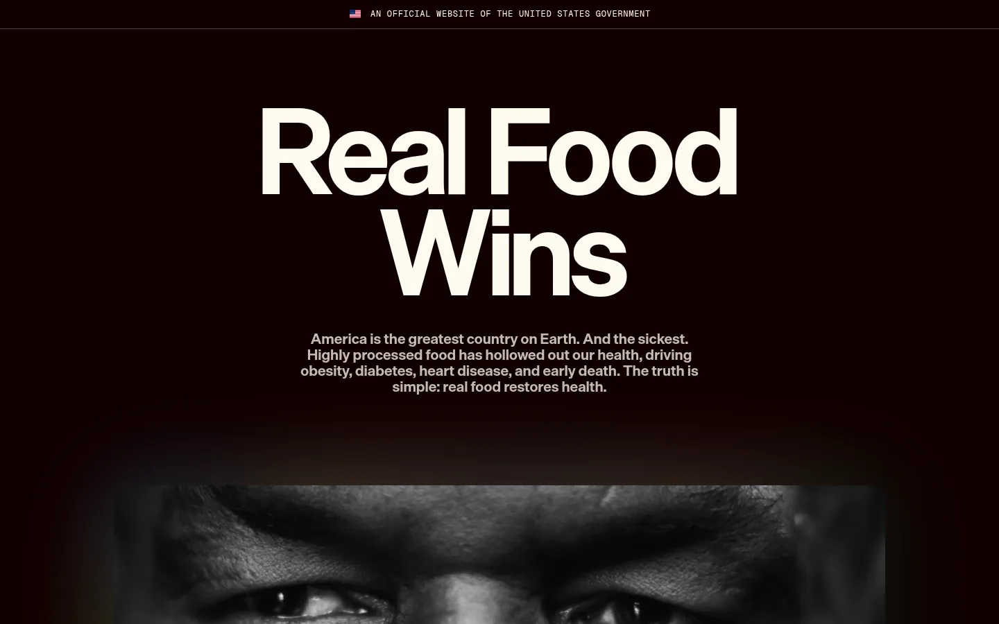
Centered, oversized bold display headline and compact centered body copy on the dark canvas, followed by a wide media frame.
Video control
A dark, pill-shaped outlined control overlays the hero video; the measured button uses a 48px radius and a fine #403232 border.
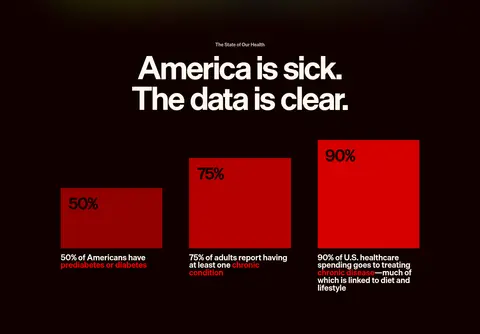
Health statistics
Three-column data presentation with large red percentage blocks, dark text on the blocks, and compact supporting descriptions.
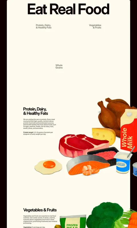
Food-guide panel
A large cream editorial surface pairing a bold title and food-category copy with vivid, oversized food illustrations.
Resources section
A light-background closing area with a left-aligned heading and introduction, plus a two-column resource layout with linked items.
Imagery · The opening uses a wide video frame with a rounded edge and a darkened, cinematic presentation; its blurred preview colors belong to the media, not the core brand palette. The central food-guide graphic is a large, cream-backed editorial composition with colorful food illustrations that extend beyond the focal text areas. Keep food artwork vivid and tactile, but preserve clear hierarchy between illustration and explanatory copy.
Keep the main campaign canvas near-black and red-toned.
Use cream for high-contrast display headlines and light panels.
Reserve vivid red for data and selective emphasis.
Set major headings in bold Die Grotesk-style display sans.
Use mono uppercase styling for official labels and eyebrows.
Preserve generous vertical space between campaign sections.
✕ 不该做
Do not turn the page into a conventional light dashboard.
Do not use bright red as a general-purpose interface background.
Do not add shadows or decorative gradients that are not measured.
Do not crowd the oversized headlines with nearby content.
Do not treat illustration colors as brand palette colors.
Do not replace the editorial campaign rhythm with uniform cards.
给 AI 的提示词
想快速出一个同风格的新页面,把这段话连同 DESIGN.md 一起发给 AI。
Build a new public-health campaign page in the Eat Real Food visual style. Use Oxblood Night (#110000) as the dominant canvas, with Warm Parchment (#fdfbee) for high-contrast headlines and occasional broad light panels. Keep Signal Red (#ff0101) and Campaign Red (#d50000) selective, especially for data emphasis rather than general UI. Set display headlines in a bold Die Grotesk D-like sans, supporting copy in a Die Grotesk A-like sans, and small uppercase labels in spaced Geist Mono. Favor centered hero messaging, expansive vertical breathing room, and a mix of full-width media, clear statistics, and editorial food imagery. Keep borders fine and shadows absent. Build a memorable long-form narrative, then use a light resources section as a deliberate visual transition.