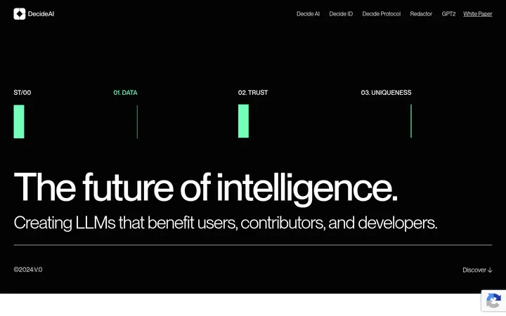
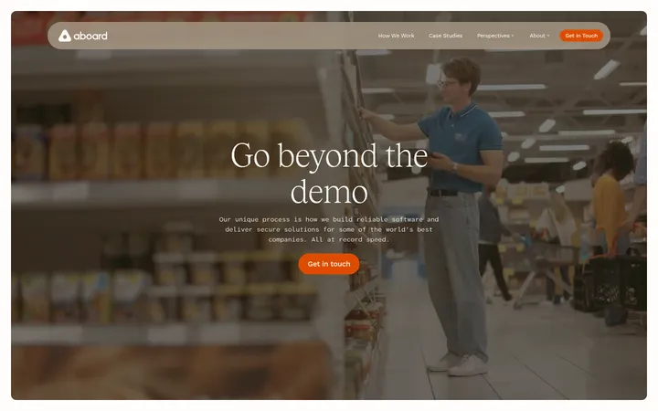
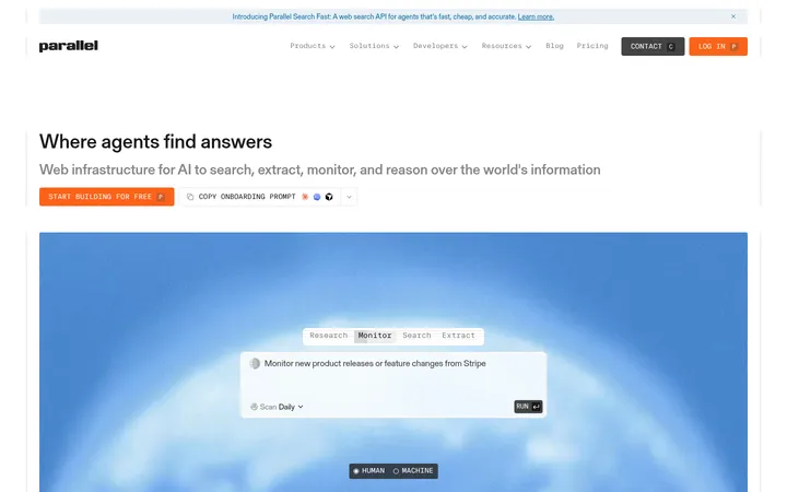
页面以明亮留白、清晰排版和模块化信息介绍 AI 平台,并用色彩鲜明的 3D 图形展现技术感。深靛蓝研究区块与大面积白色及浅蓝渐变形成鲜明对比。
North star · Keep the interface bright and spacious, using precise typography and colorful technical imagery while reserving deep indigo for focused contrast.
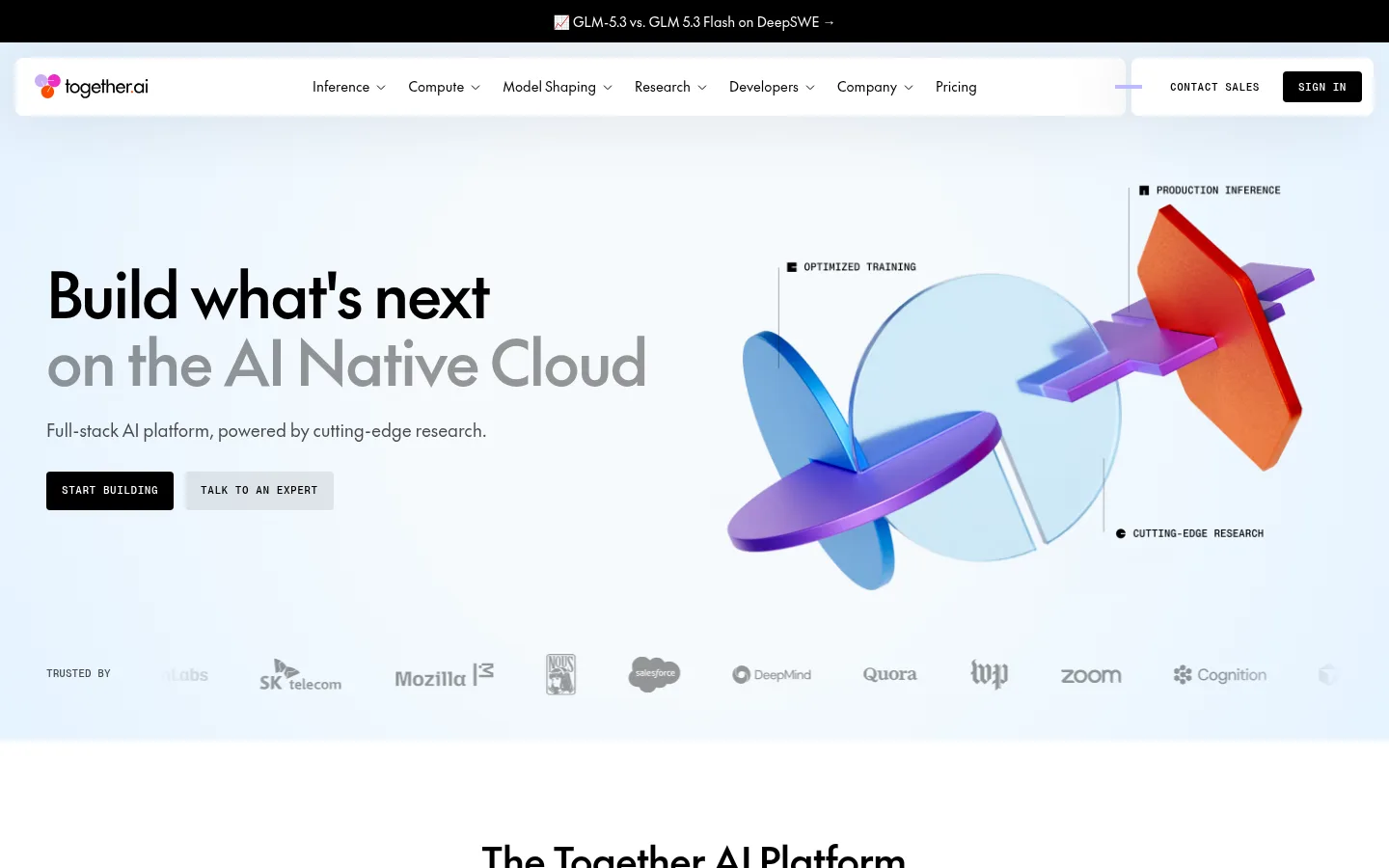
The page’s visual identity is defined by a white canvas and a pale, cool-blue hero wash, with a single deep-indigo research section as a strong mid-page contrast. Keep the measured palette authoritative: the orange, purple, and blue visible in hero and editorial artwork belong to imagery rather than a general UI accent system. The Future provides rounded, confident headings and readable body text; PP Neue Montreal Mono is reserved for compact uppercase labels and CTA text, giving the interface a technical counterpoint. The layout moves from a spacious hero into centered product navigation and a dense research card band, then returns to white for customer stories and editorial updates. Use large, clean content bands, orderly columns, and thin dividers rather than decorative framing. Product screenshots, customer video stills, logos, and sculptural 3D illustrations provide variation while maintaining restrained interface chrome.
Eyebrows, captions, code-like labels, and uppercase CTA text
角色
示例
字号
字重
行高
字距
特大标题
Large hero headline and high-impact page statements.
Together AI
64px
500
1.1
-0.03em
一级标题
Primary section headings, including the platform introduction.
Together AI
40px
500
1.2
-0.02em
二级标题
Secondary section titles and prominent content headings.
Together AI
28px
500
1.15
-0.015em
三级标题
Card titles and smaller feature or story headings.
The quick brown fox 敏捷的狐狸
22px
500
1.15
-0.01em
正文
Introductory copy, descriptions, and standard content.
The quick brown fox 敏捷的狐狸
18px
500
1.3
-0.01em
辅助文字
Compact uppercase labels and supporting metadata.
The quick brown fox 敏捷的狐狸
11px
500
1.4
0.005em
导航
Main navigation links and menu items.
The quick brown fox 敏捷的狐狸
14px
400
1.4
0
眉题
Small uppercase section labels and category markers.
The quick brown fox 敏捷的狐狸
11px
500
1
0.05em
代码
Technical-style uppercase labels and compact metadata.
const style = 1;
11px
500
1.4
0.005em
间距与布局
基准单位 8px · 密度:宽松
100px版块间距
8px元素间距
—卡片内边距
1344px内容最大宽度
2px
4px
6px
8px
16px
20px
24px
32px
40px
88px
Use a wide desktop canvas with a measured maximum content width of 1344px and a spacious vertical rhythm. The hero aligns headline and actions left against a large right-side visual; the platform intro and customer-story section center their headings, while research and news content use more structured columns. Separate major sections with broad white or pale-blue bands, then use the dark research band as a deliberate pause. Keep cards and content aligned to clear column edges, with a generous section gap and compact spacing inside navigation and controls.
圆角与层次
按钮 · 4px
导航 · 8px
链接 · 4px
xl · nav
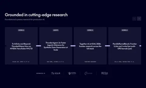
Most content sits on flat white or pale surfaces, with fine, restrained borders rather than prominent shadows. Navigation is a distinct floating white panel with subtle depth. The research cards use dark tonal surfaces against the indigo band; avoid adding elevation to every content tile.
组件
下面的预览按实测的按钮、输入框、徽标、卡片样式重建(字体用替代字体)。
Top announcement
A slim black strip above the navigation with a centered, compact announcement link in light text.
Floating navigation
White, rounded navigation panels with the logo, compact sans-serif links, dropdown indicators, and a black SIGN IN button.
Hero actions
Pair a black uppercase monospace START BUILDING CTA with a pale secondary action beside the headline.
Platform tabs
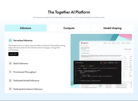
A centered product section uses a horizontal category selector; the active Inference item is highlighted in pale cyan.
Research cards
Dark cards sit in a wide row on the indigo research band, using compact category labels and restrained white copy.
Customer stories
A broad lead video card sits beside narrower customer-story cards, using image-led layouts and white text over the lower image.
Editorial feed
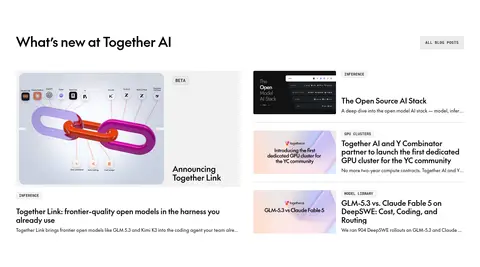
A larger featured story pairs with a compact stack of news items, thumbnails, uppercase categories, and concise copy.
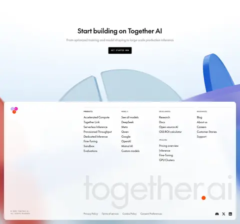
Imagery · Use large, sculptural 3D forms in the hero and CTA area, with translucent blue shapes and vivid colored accents treated as illustration rather than interface palette. Product UI screenshots appear inside feature content; customer stories use photographic video stills, and the news area combines editorial thumbnails with text. Keep imagery crisp and rectangular or simply cropped, without heavy overlays outside story-card captions.
Keep white and pale blue as the primary page canvas.
Use deep indigo for a focused research contrast band.
Set headlines in The Future or a close geometric sans-serif.
Use mono typography for uppercase labels and CTA buttons.
Let colorful 3D artwork carry visual energy.
Maintain clear column alignment across content bands.
✕ 不该做
Do not make the whole homepage dark.
Do not treat illustration colors as global UI accents.
Avoid heavy shadows on cards and content sections.
Do not crowd the hero with extra interface chrome.
Avoid decorative borders around every tile.
Do not use oversized body copy where compact labels suffice.
给 AI 的提示词
想快速出一个同风格的新页面,把这段话连同 DESIGN.md 一起发给 AI。
Build a new AI-platform page in Together AI’s bright, research-led visual style. Use Gallery White (#ffffff) as the main canvas, with Cloud Mist (#f6fafd) and Glacier Tint (#e5f3ff) for soft atmospheric gradients. Use Ink Black (#000000) for copy and compact primary actions; reserve Research Indigo (#010120) for one focused dark section. Use The Future-like sans-serif headings and body, paired with a PP Neue Montreal Mono-like face for uppercase labels and buttons. Structure the page as spacious, aligned bands with a clear hero, modular product content, and image-led customer or editorial stories. Make colorful 3D artwork the expressive focal point, not a source for extra UI colors. Prefer thin rules and flat surfaces, adding subtle depth only to floating navigation.