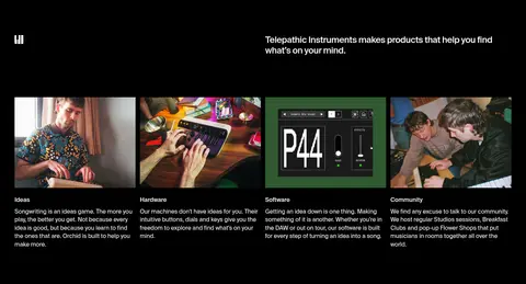
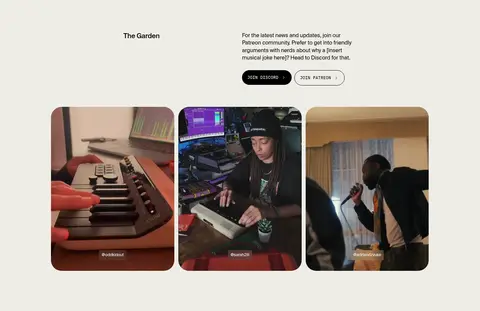
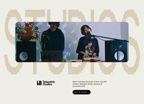
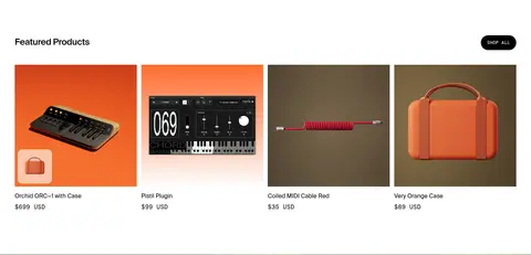
North star · Let cinematic music imagery lead, then use restrained type, flat color blocks and clear product layouts to make the page effortless to browse.
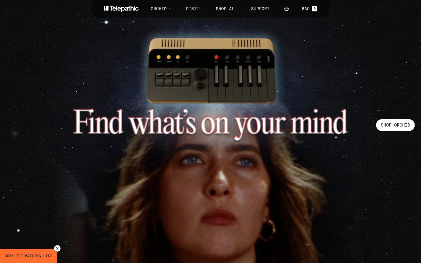
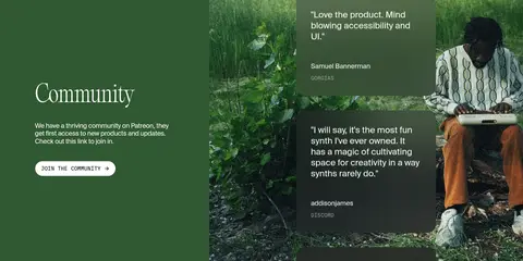
The page opens with a cinematic, full-bleed hero: near-black space, a musician and a centered instrument sit behind a large, delicate serif headline. A slim dark navigation bar and compact monospaced labels frame the imagery without competing with it. The rest of the page alternates clean white product and editorial sections with black content bands and a warm cream Garden and studio area. Forest-green community content adds a grounded contrast, while vivid orange appears sparingly in the mailing-list CTA and product photography; those image colors should not be mistaken for a sitewide background palette. Suisse Intl provides neutral, readable body text, while Suisse Intl Mono handles uppercase navigation, captions and controls. A separate ultralight editorial display face gives the hero its distinctive voice. Sections use broad image-led compositions, simple grids, generous breathing room around featured content and little visible ornament. The result feels cinematic but remains easy to browse and shop.
Headings, product names, body copy, and general interface text.
Aa 设计
Suisse Intl Mono
网络字体 · 字重 400 · 占比 16%
免费替代:IBM Plex Mono
Navigation, buttons, captions, product labels and compact utility text.
角色
示例
字号
字重
行高
字距
特大标题
Oversized editorial hero statement.
Telepathic Instruments
64px
400
1
-0.02em
一级标题
Primary page or section heading.
The quick brown fox 敏捷的狐狸
24px
400
1.25
0
二级标题
Product, feature and subsection headings.
The quick brown fox 敏捷的狐狸
20px
500
1.2
-0.02em
正文
Descriptions, editorial copy and testimonials.
The quick brown fox 敏捷的狐狸
16px
400
1.4
0
辅助文字
Uppercase metadata and compact section labels.
The quick brown fox 敏捷的狐狸
12px
400
1
0
按钮
Uppercase CTA and form-control labels.
The quick brown fox 敏捷的狐狸
12px
400
1
0
导航
Uppercase primary navigation and footer links.
The quick brown fox 敏捷的狐狸
14px
400
1.43
0
代码
Compact uppercase utility-style labels.
const style = 1;
12px
400
1
0
间距与布局
基准单位 8px · 密度:紧凑
40px版块间距
8px元素间距
40px卡片内边距
1360px内容最大宽度
4px
6px
8px
12px
14px
16px
24px
36px
40px
56px
64px
96px
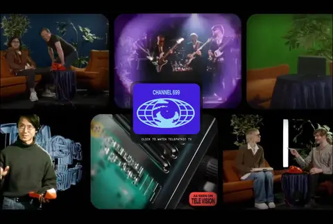
Use a wide, fluid canvas with a measured maximum width of 1360px and compact overall density. The hero and video mosaic run edge to edge; product and editorial sections return to aligned content grids. The measured page moves between two-, three-, four- and five-column compositions, with left-aligned section headings and image-led cards. Keep section transitions clear through changes in surface color and media composition rather than decorative dividers. Preserve the measured 40px section gap and 8px element rhythm where those values apply.
圆角与层次
按钮 · 9999px
卡片 · 24px
图片 · 32px
导航 · 2px
链接 · 9999px
没有测到阴影:页面是扁平的,层次靠底色和描边区分。
The measured system has no shadows, so rely on flat surfaces and image contrast instead of artificial depth. Use restrained borders on forms and selected controls. Layer overlapping cards or hero media only when needed to organize content; the hero’s atmosphere should come from photography and darkness, not a shadow effect.
组件
下面的预览按实测的按钮、输入框、徽标、卡片样式重建(字体用替代字体)。
Primary navigation
A dark, compact top bar with white monospaced uppercase links, a wordmark and small utility controls. Keep it visually quiet over the cinematic hero.
Hero CTA
A small white pill-style shop link positioned beside the oversized serif hero statement; it uses uppercase monospaced text.
Product feature cards
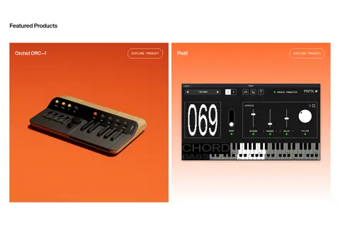
Two-column product imagery with a simple title and compact uppercase explore link. Let the product image, including its backdrop, carry the color.
Testimonial cards
Quote cards use a measured #324d32 fill, white Suisse Intl text and generous measured card padding; keep decoration minimal.
Mailing-list prompt
A small #ff6c2f announcement button appears as a distinctive orange accent; avoid expanding the color into unrelated site surfaces.
Newsletter form
Dark sign-up band with an oversized display graphic, supporting copy, region choices and compact mono controls; inputs use #a3a3a3 borders.
Store product grid
Four compact merchandise cards show distinct product images, titles and prices, with a separate small shop-all control.
Imagery · Lead with full-bleed, cinematic video or photography: musicians, expressive faces, instruments and performance scenes. Product cards use clean, distinct product imagery, including vivid orange backdrops, while other media ranges from studio footage to community portraits. Keep imagery large and immersive, using rounded media and cards selectively rather than applying one uniform treatment to every image.
Let cinematic musician and instrument imagery dominate the hero.
Use black, white and cream as the main section surfaces.
Reserve forest green for community-focused content.
Use monospaced uppercase type for navigation and controls.
Keep product names and shopping actions easy to scan.
Use orange sparingly for the mailing-list CTA or product imagery.
✕ 不该做
Do not turn incidental photo colors into global interface colors.
Do not add gradients or shadows absent from the measured design.
Do not use a generic sans-serif for the main editorial display.
Do not crowd the hero with extra controls or explanatory copy.
Do not apply rounded cards to every section or image.
Do not replace the clean alternating surfaces with ornamental dividers.
给 AI 的提示词
想快速出一个同风格的新页面,把这段话连同 DESIGN.md 一起发给 AI。
Build a new page in Telepathic Instruments’ visual style. Use Gallery White (#ffffff), Studio Black (#000000), and Garden Cream (#efede6) as the main alternating surfaces, with Forest Green (#305831) reserved for community content. Keep Signal Orange (#ff6c2f) as a sparse CTA accent, not a global background. Lead with large, cinematic musician or instrument imagery, a delicate editorial serif headline, and compact Suisse Intl Mono-style uppercase controls. Use clean, left-aligned content grids for product and editorial sections, and allow media to span the full canvas where it matters. Favor flat color blocks and image contrast over shadows. Keep product cards legible and functional, use Suisse Intl-style sans serif for body copy, and preserve clear section rhythm and generous room around featured content.