North star · Keep the page almost entirely black, using delicate white type, generous breathing room, and imagery as the main source of colour.
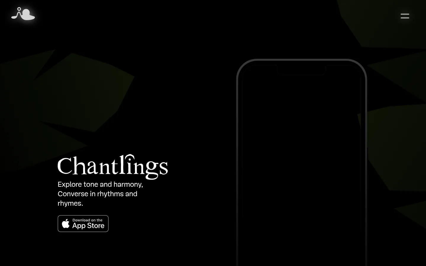
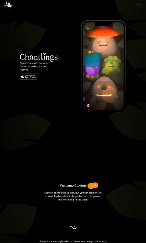
The visual strategy is built around a true black canvas (#000000), letting white (#ffffff) typography and luminous product imagery emerge from the dark. Warm amber (#ffaa20) is reserved for a small inline collaboration link, while orange (#ff8800) marks the compact “NEW!” badge; neither colour becomes a broad background system. Mija webfont supplies a light, distinctive voice: oversized, delicate serif-like display lettering contrasts with clean, small supporting copy. The hero places text to the left of a tall phone mock-up, with the app artwork providing the page’s richest colour. Farther down, centered explanatory passages alternate with offset feature copy, photography, and a hand-drawn system diagram. A recurring, low-contrast organic silhouette texture gives continuity without competing with content. The layout is intentionally spacious and vertically paced, with sparse controls, no card-heavy UI, and a restrained footer.
Used across headings, body copy, links, buttons, and navigation.
角色
示例
字号
字重
行高
字距
一级标题
Large, light Chantlings hero title.
IORAMA
32px
100
1.06
0
二级标题
Light section headings for the main content narrative.
The quick brown fox 敏捷的狐狸
25px
100
0.8
0
三级标题
Supporting feature headings such as Harmonious and Connected.
The quick brown fox 敏捷的狐狸
24px
100
1.42
0
正文
Introductory and explanatory paragraphs.
The quick brown fox 敏捷的狐狸
20px
300
1
0
按钮
NEW! badge and prominent button-like labels.
The quick brown fox 敏捷的狐狸
25px
100
0.8
0
链接
Inline collaboration link and text navigation.
The quick brown fox 敏捷的狐狸
24px
100
1.5
0
间距与布局
基准单位 2px · 密度:宽松
100px版块间距
10px元素间距
—卡片内边距
1250px内容最大宽度
10px
12px
15px
18px
22px
23px
24px
38px
40px
46px
65px
86px
100px
105px
108px
140px
A spacious, single-column scroll with a measured page max width of 1250px. The opening hero balances left-aligned title and copy against a tall phone mock-up on the right; subsequent sections use centered text, alternating offset feature blocks, and centered media or diagrams. The measured section gap is 100px and element gap is 10px, producing an unhurried vertical rhythm. Keep the overall density low and let the dark canvas separate each content moment.
圆角与层次
按钮 · 9999px
没有测到阴影:页面是扁平的,层次靠底色和描边区分。
The measured system has no shadows or gradients, and no general border palette. Keep the page predominantly flat; the phone frame and small outlined App Store badge are the notable edge treatments. Organic background silhouettes sit behind content at low contrast, adding depth through imagery rather than UI elevation.
组件
下面的预览按实测的按钮、输入框、徽标、卡片样式重建(字体用替代字体)。
Hero
Left-aligned Chantlings title and short introduction paired with a tall phone showcase; preserve substantial negative space.
App Store badge
Compact outlined download badge below the hero copy, presented as a crisp white-on-dark asset.
NEW badge
Small rounded orange pill with white text; measured background #ff8800 and white foreground.
Feature narrative
Sparse text-led blocks for Harmonious, Lyrical, and Connected, offset across the page rather than contained in cards.
Collaboration link
Inline Heart of Noise link in amber #ffaa20 within centered white copy.
Process diagram
Thin, low-contrast hand-drawn flow diagram on black, used as an editorial media element rather than a boxed card.
Footer
Minimal row of social icons, Newsletter/Press/Terms/Contact links, and copyright on the black canvas.
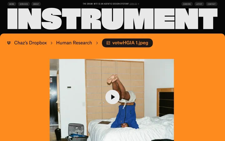
Imagery · A tall phone mock-up is the hero’s central product proof, showing colorful character artwork against the dark page. Later content includes a cinematic photo of a person interacting with a device and a thin, hand-drawn technical diagram. Maintain dark framing and subdued contrast; the bright colour belongs mainly inside the app artwork, not in decorative page UI.
Place product imagery within large areas of negative space.
Keep feature copy light, short, and vertically paced.
✕ 不该做
Do not introduce broad coloured section bands.
Do not turn the layout into a card grid.
Do not add unmeasured shadows or gradients.
Do not use saturated colours outside product artwork.
Do not crowd the hero with navigation or controls.
Do not make typography heavy or shouty.
给 AI 的提示词
想快速出一个同风格的新页面,把这段话连同 DESIGN.md 一起发给 AI。
Build a new page in the Chantlings visual style: use Stage Black (#000000) for the dominant canvas and Soft White (#ffffff) for nearly all text. Keep Amber Note (#ffaa20) for occasional inline links and Signal Orange (#ff8800) for a rare small badge only. Use a light, expressive display face paired with restrained supporting copy; Mija webfont is the measured family, with Cormorant Garamond as a free substitute. Compose a spacious hero with text beside a tall product visual, then create a slow vertical sequence of centered narrative, offset feature copy, and editorial media. Keep a subtle organic dark backdrop behind content, but let product imagery supply the colour. Prefer flat surfaces, sparse outlines, and generous negative space over cards, shadows, or decorative UI.