North star · Keep the page grounded in a near-black canvas, then use luminous gradients, condensed display type, and lime actions as deliberate focal points.
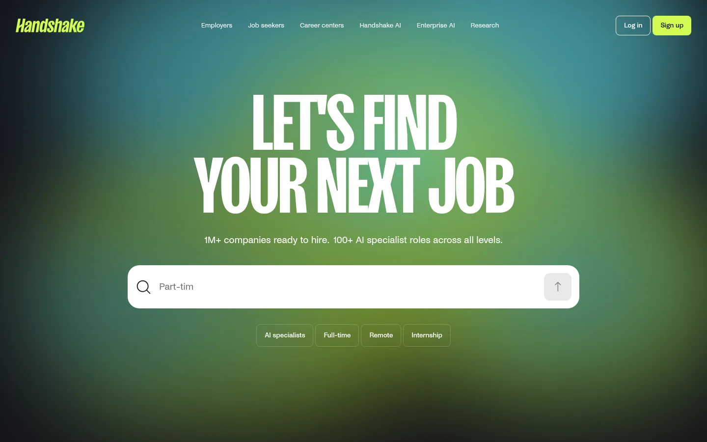
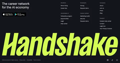
The page is anchored by a near-black canvas (#14151c), with most content kept on that dark field so the bright hero gradient and lime actions have immediate contrast. In the opening viewport, a diffuse cyan-to-lime glow sits behind a centered, condensed all-caps headline; the gradient fades toward the dark edges rather than forming a hard panel. Lime (#d3fb52) marks the primary signup and opportunity actions, while cyan (#7af3ff) appears as a secondary glow and within colorful product imagery. NoiGrotesk handles navigation, body copy, and regular headings with restrained tracking; SansPlomb is reserved for the dramatic display wordmark/headline treatment. The layout is spacious and centered in the hero, then alternates two-column feature content with broad dark intervals. Opportunity links use subtle hairlines instead of raised cards. Product mockups bring rounded, bright surfaces into the otherwise flat dark page, and the footer returns to restrained text columns with an oversized lime wordmark.
Navigation, body copy, regular headings, links, and buttons throughout the page.
Aa 设计
SansPlomb
网络字体 · 字重 600 · 占比 1%
免费替代:Bebas Neue
Oversized display headline and dramatic brand-wordmark treatment.
角色
示例
字号
字重
行高
字距
特大标题
Oversized condensed uppercase hero headline and dramatic wordmark.
Handshake
160px
600
0.8
-0.025em
一级标题
Primary section heading, including the AI career network proposition.
Handshake
40px
400
1.1
-0.025em
二级标题
Secondary feature and section headings.
Handshake
32px
400
1.1
-0.025em
三级标题
Feature titles and prominent opportunity group headings.
Handshake
28px
400
1.1
-0.025em
四级标题
Compact opportunity and supporting content headings.
The quick brown fox 敏捷的狐狸
22px
400
1.4
-0.02em
正文
Introductory copy, feature descriptions, and opportunity details.
The quick brown fox 敏捷的狐狸
16px
400
1.4
-0.015em
辅助文字
Small supporting labels and low-priority metadata.
The quick brown fox 敏捷的狐狸
14px
400
1.4
-0.015em
按钮
Signup, explore, and feature action labels.
The quick brown fox 敏捷的狐狸
16px
500
1.1
-0.015em
导航
Header navigation links and footer navigation labels.
The quick brown fox 敏捷的狐狸
14px
400
1.4
-0.015em
链接
Opportunity-card links and inline informational links.
The quick brown fox 敏捷的狐狸
14px
500
1.4
-0.015em
间距与布局
基准单位 8px · 密度:宽松
120px版块间距
16px元素间距
—卡片内边距
1392px内容最大宽度
4px
8px
12px
16px
24px
40px
80px
140px
The hero is centered within a wide desktop composition, with a compact navigation row above a large headline, supporting line, and broad search control. The measured page max width is 1392px; the content below shifts into a three-column opportunity area and then two-column feature splits. Sections retain spacious vertical intervals, while the logo strip spans the width. The footer is denser, using three link columns alongside a prominent brand statement.
圆角与层次
按钮 · 8px
输入框 · 24px
图片 · 40px
导航 · 8px
链接 · 16px
没有测到阴影:页面是扁平的,层次靠底色和描边区分。
The interface is mostly flat, with no measured shadow system. Dark opportunity cards are separated by fine graphite borders rather than raised surfaces. Rounded search and media frames provide shape; colorful mockups and the hero glow create depth through gradients and contrast instead of shadows.
组件
下面的预览按实测的按钮、输入框、徽标、卡片样式重建(字体用替代字体)。
Header navigation
A compact horizontal row on the dark hero, with brand mark, understated white links, an outlined login action, and a lime signup button.
Hero search
A wide white rounded input with dark search icon and text, plus a pale inset submit control; it sits beneath the centered display headline.
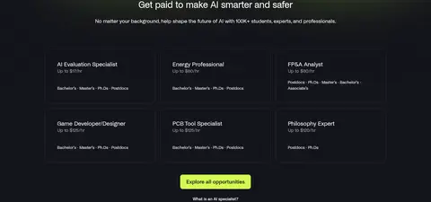
Opportunity links
Six text-led opportunities arranged in three columns and two rows, separated by thin #2b2d33 outlines; white titles and muted supporting details.
Primary CTA
Lime #d3fb52 fill, dark #14151c label, NoiGrotesk medium weight, and measured 8px corner radius.
Employer logo strip
A horizontally arranged row of subdued company marks on dark, slightly lighter rounded tiles.
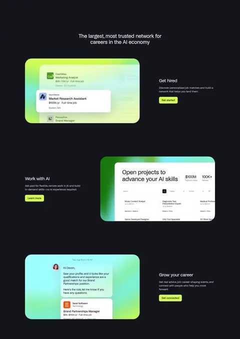
Feature split
Alternating text and rounded product mockup, with short copy, a lime action, and generous dark negative space.
Footer
Dark multi-column link groups paired with a large lime brand wordmark and compact app-store and legal details.
Imagery · Product imagery is presented as bright interface mockups rather than page-wide photography: job listings, project opportunities, and career conversations appear inside rounded rectangular frames. Cyan and lime glows surround several mockups, contrasting with the dark page. A horizontal employer-logo strip provides proof points. Keep screenshots legible and contained; their greens, teals, and pale surfaces belong to the illustrations, not the core interface palette.
Reserve #d3fb52 for high-priority actions and brand accents.
Apply cyan and lime gradients as localized atmospheric glows.
Set display messaging in condensed uppercase lettering.
Keep body copy and navigation clean, restrained, and readable.
Use hairline borders to define dark opportunity cards.
Let product mockups provide contained bursts of color.
✕ 不该做
Do not turn the whole page into bright gradient panels.
Do not use lime for long passages of text.
Do not add shadows as a substitute for the page's flat layering.
Do not treat mockup colors as the core interface palette.
Do not crowd the hero or feature sections with dense content.
Do not use display type for ordinary navigation or body copy.
给 AI 的提示词
想快速出一个同风格的新页面,把这段话连同 DESIGN.md 一起发给 AI。
Build a new Handshake-style page on a dominant #14151c Midnight Canvas. Use Gallery White #ffffff for primary text, Electric Lime #d3fb52 for the main action, and Glacier Cyan #7af3ff only for localized glows or illustrative accents. Keep a spacious desktop composition: compact header, centered oversized hero message, clear search or action control, then well-separated content blocks and alternating feature splits. Use a condensed uppercase display face for the focal headline and a clean grotesk such as Inter for body, navigation, and buttons. Make interface cards mostly flat with fine #2b2d33 Graphite Hairline borders; reserve rounded, luminous framing for product mockups. Maintain strong contrast, concise copy, and ample negative space, with a compact multi-column footer.