North star · Keep the page airy and product-led: use navy for structure, green for action, and pale surfaces to organize content.
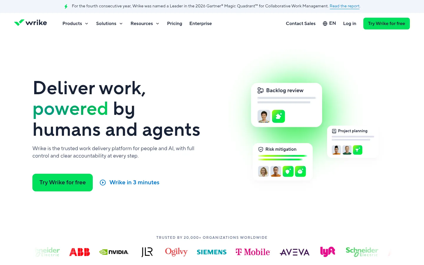
The homepage is anchored by white canvas and generous open space, with pale blue-gray bands separating feature groups and dark navy reserved for contrast-heavy areas such as the footer. Bright green is the signature signal: it marks primary CTAs, logo details, play controls, and soft glows around product visuals. Blue appears more selectively in links and secondary actions. TT Norms Pro gives headings a rounded, confident shape; bold, compact headline blocks sit above quieter gray body copy. A centered page frame organizes the long scroll into clear bands, while alternating card grids and split product stories keep the content varied. Screenshots and workplace photography carry the product narrative, supported by restrained gradients, rounded panels, and fine borders rather than heavy decoration.
Page-wide interface and editorial type, including headings, body copy, links, navigation, and buttons.
角色
示例
字号
字重
行高
字距
特大标题
Large hero headline and prominent section statements.
Wrike
64px
600
1.1
0
一级标题
Primary page headline and major top-level headings.
Wrike
48px
600
1.1
0
二级标题
Section titles introducing feature and solution bands.
Wrike
32px
600
1.2
0
三级标题
Feature-card and content-panel titles.
The quick brown fox 敏捷的狐狸
24px
600
1.2
0
四级标题
Smaller card headings and supporting labels.
The quick brown fox 敏捷的狐狸
20px
600
1.2
0
正文
Paragraphs, descriptions, and explanatory product copy.
The quick brown fox 敏捷的狐狸
16px
400
1.6
0
辅助文字
Compact supporting labels and fine-print content.
The quick brown fox 敏捷的狐狸
14px
400
1.4
0.014em
按钮
Primary and secondary CTA labels.
The quick brown fox 敏捷的狐狸
16px
600
1.5
0
导航
Main navigation labels.
The quick brown fox 敏捷的狐狸
20px
600
1.2
0
链接
Prominent text links and secondary actions.
The quick brown fox 敏捷的狐狸
20px
600
1.2
0
眉题
Uppercase section labels and compact overlines.
The quick brown fox 敏捷的狐狸
12px
600
1.3
0.125em
间距与布局
基准单位 8px · 密度:宽松
112px版块间距
16px元素间距
—卡片内边距
1220px内容最大宽度
3px
4px
6px
8px
10px
12px
14px
16px
18px
20px
24px
32px
48px
Use a centered, spacious desktop frame with a measured maximum width of 1220px and left-aligned hero copy. The page moves from a slim announcement strip and navigation into a broad two-column hero, then a logo row and stacked feature bands. Alternate card grids, split product showcases, horizontal solution cards, and centered content sections to pace the long scroll. Keep the overall density low, with a measured 112px section gap and 16px element gap; let product media occupy generous space.
圆角与层次
按钮 · 9999px
输入框 · 8px
卡片 · 12px
图片 · 12px
导航 · 8px
链接 · 20px
xl · card
xl · card
lg · media
Most content sits on flat white or pale surfaces, with hairline borders doing much of the separation. Feature cards use rounded corners and restrained, soft shadows; heavier lift is reserved for media and floating interface mockups. Use overlapping UI tiles and localized green glow for depth, not broad dark shadows.
组件
下面的预览按实测的按钮、输入框、徽标、卡片样式重建(字体用替代字体)。
Announcement strip
A narrow pale band above the navigation, with a green lightning accent, compact announcement copy, and a blue report link.
Primary CTA
Bright #00e05c pill-shaped free-trial buttons with #162136 semibold text; use the prominent larger treatment in the hero and signup sections.
Hero split
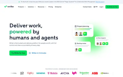
Large left-aligned headline and short supporting copy on the left; layered workflow cards and a soft green glow balance the right.
Feature cards
Pale #f2f5fa panels with rounded corners, concise headings, descriptive copy, blue text links, and product photography or UI.
Product showcase
Pair a text and capability list with a large workflow screenshot; keep tabs and supporting controls visually light.
Integration chips
Compact pale rounded labels with partner logos and names, arranged in orderly rows.
Dark signup footer
A #162136 full-width footer and CTA area with white text, green action accents, certification marks, and dense navigation columns.
Imagery · Combine real workplace photography with crisp product-interface screenshots and collaboration mockups. Use rounded media frames and pale panels, layering small UI cards and avatar details over imagery where shown. The hero's green glow and other gradient accents remain soft and localized; photography stays natural rather than heavily color-treated. Customer logos and testimonial video tiles provide proof points deeper in the page.
Keep white space generous between distinct content bands.
Use #162136 for core headings and readable interface text.
Reserve #00e05c for primary actions and high-signal details.
Use #f2f5fa to group cards and integration items.
Pair product screenshots with concise, useful explanations.
Use soft gradients only as localized green visual accents.
✕ 不该做
Do not make every section a dark or saturated color block.
Do not use green as the default body-text color.
Do not crowd the hero with extra navigation or dense copy.
Do not overuse shadows or decorative gradients.
Do not replace product visuals with generic abstract artwork.
Do not introduce colors outside the measured palette.
给 AI 的提示词
想快速出一个同风格的新页面,把这段话连同 DESIGN.md 一起发给 AI。
Build a polished enterprise work-management page in Wrike's visual style. Use Gallery White (#ffffff) as the main canvas, Midnight Ink (#162136) for headings and core text, and Signal Green (#00e05c) for primary CTAs and small action cues. Organize content in a centered frame, with a spacious two-column hero followed by distinct feature, product, integrations, proof, and footer bands. Use Mist Panel (#f2f5fa) for card grouping, Action Blue (#0073d3) for secondary links, and soft green gradients only around product media. Set typography in TT_Norms_Pro or a close sans-serif substitute such as Inter, with confident semibold headings and calm readable body copy. Combine authentic workplace photography and product-interface visuals in rounded panels; favor subtle borders and restrained shadows. Maintain clear hierarchy and ample separation between sections.