North star · Keep the interface calm and white, then let dark, detailed product showcases and friendly mascot moments provide the contrast and personality.
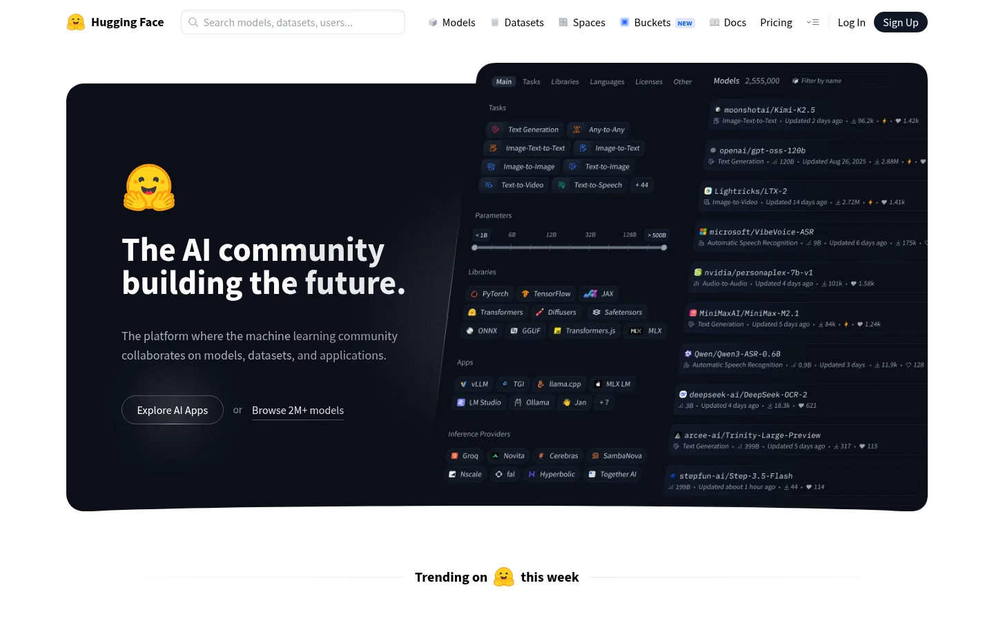
The page is built on a predominantly white canvas, with black headings and muted gray copy providing a clear, quiet reading hierarchy. Its defining contrast is the broad, rounded near-black hero: product-interface details sit beside a large, friendly headline, while the yellow Hugging Face mascot adds warmth without changing the restrained base palette. Source Sans Pro carries navigation, headings, body copy, and controls in straightforward sentence case; IBM Plex Mono appears in code-like product details. The layout alternates centered section introductions with compact product grids and larger interface showcases, leaving generous white space between major stories. Thin pale-gray borders define cards and separators instead of heavy shadows. Pastel pink, lavender, and blue hues occur as soft media or gradient accents, while colorful logos and mascots belong to illustrations and product content rather than the core interface palette.
Primary interface typeface for navigation, headings, copy, links, and buttons.
Aa 设计
IBM Plex Mono
网络字体 · 字重 400 · 占比 6%
免费替代:IBM Plex Mono
Code-like snippets and compact technical details inside product previews.
角色
示例
字号
字重
行高
字距
一级标题
Main hero headline; large, bold, tightly composed two-line statement.
Hugging Face
48px
700
1
0
二级标题
Major section headings, including community and product-story introductions.
Hugging Face
30px
700
1.2
0
三级标题
Feature and card titles within the showcase sections.
The quick brown fox 敏捷的狐狸
24px
600
1.33
0
四级标题
Compact subsection and product-card headings.
The quick brown fox 敏捷的狐狸
20px
700
1.25
0
正文
Explanatory copy, card descriptions, and supporting product text.
The quick brown fox 敏捷的狐狸
16px
400
1.5
0
辅助文字
Small metadata, timestamps, labels, and supporting notes.
The quick brown fox 敏捷的狐狸
14px
400
1.25
0
按钮
Compact control labels and primary action text.
The quick brown fox 敏捷的狐狸
14px
600
1.43
0
导航
Header navigation links and footer category links.
The quick brown fox 敏捷的狐狸
16px
400
1.5
0
链接
Model, dataset, and resource links across listings.
The quick brown fox 敏捷的狐狸
16px
400
1.5
0
代码
Technical snippets and code-like details inside product previews.
const style = 1;
15px
400
1.6
0
间距与布局
基准单位 4px · 密度:适中
73px版块间距
8px元素间距
—卡片内边距
1248px内容最大宽度
2px
4px
6px
8px
10px
12px
14px
16px
24px
32px
40px
73px
A centered desktop composition uses a measured page maximum width of 1248px, with a compact horizontal navigation above the main content. The hero is a wide, dark product showcase; below it, three-column trending content gives way to centered section headings, cards, and larger interface previews. Later sections alternate product panels, open-source listings, and a full-bleed mascot illustration before a multi-column footer. Preserve the comfortable density and generous section rhythm; use the measured spacing system rather than crowding the content.
圆角与层次
按钮 · 8px
输入框 · 8px
卡片 · 12px
图片 · 8px
导航 · 4px
链接 · 26px
hairline · other, card
sm · link
inset · input
lg · button
The page reads mostly flat: thin pale borders outline cards, input fields, and separators, with little reliance on shadow. The dark hero panel supplies the strongest depth through contrast and layered interface content rather than elevation effects. Where needed, keep shadows restrained and preserve the clean white space around card groups.
组件
下面的预览按实测的按钮、输入框、徽标、卡片样式重建(字体用替代字体)。
Header navigation
A compact horizontal bar on white, with the mascot and wordmark, search input, product links, and a dark pill-shaped sign-up action.
Hero product showcase
A broad near-black panel pairs a large white headline and muted copy with a dense model-discovery interface preview.
Trending columns
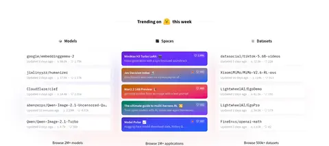
Three side-by-side model, Spaces, and dataset lists use compact metadata and lightweight separators beneath a centered section label.
Feature preview cards
White product-story sections use thin pale outlines and interface captures to demonstrate collaboration, modalities, and profile features.
Enterprise showcase
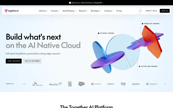
A dark product panel introduces paid compute and enterprise tools, followed by paired inference and compute cards.
Open-source directory
A spacious multi-column listing presents tools and projects with small colored marks, concise labels, and restrained card boundaries.
Mascot footer
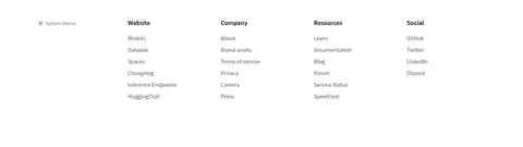
A wide crowd illustration bridges the open-source content and a five-column footer of categorized text links.
Imagery · Use product UI captures and interface-like mockups as the main visual material, framed in broad rounded dark or light panels. The yellow Hugging Face mascot recurs as a friendly accent, including the large footer crowd illustration. Keep photography secondary; avoid replacing the actual product-preview character with generic stock imagery. Subtle pastel gradients and colorful model or partner marks belong inside media and illustrations.
Reserve near-black panels for substantial product showcases.
Set interface text in Source Sans Pro or its measured substitute.
Use IBM Plex Mono only for technical snippets.
Keep card outlines pale and visually quiet.
Use the mascot and colorful marks as accents, not as substitutes for product UI.
✕ 不该做
Do not turn the full page into a dark theme.
Do not invent bright brand colors for buttons or links.
Do not use heavy shadows to separate ordinary cards.
Do not compress the generous breaks between major sections.
Do not style product previews as generic stock photography.
Do not apply pastel gradient tints as broad interface backgrounds.
给 AI 的提示词
想快速出一个同风格的新页面,把这段话连同 DESIGN.md 一起发给 AI。
Build a new Hugging Face-style page on a Gallery White (#ffffff) canvas, with Ink (#000000) headings and Slate Mist (#6a7282) supporting copy. Use Source Sans Pro throughout the interface and reserve IBM Plex Mono for code-like product details. Create a compact navigation, then make the main product story a broad Midnight Panel (#0b0f19) with bright text and a realistic, information-rich UI preview. Follow it with centered section introductions, compact multi-column lists, and bordered product-preview cards using Cloud Hairline (#f3f4f6) and Pale Border (#e5e7eb). Keep the overall composition open and comfortably spaced. Use the yellow mascot and colorful logos within illustrations or product media; keep Petal Tint (#feeaf5), Lilac Haze (#efeeff), Periwinkle Wash (#d2dbff), and Blush Glow (#ffeeee) as restrained media accents, not core controls.