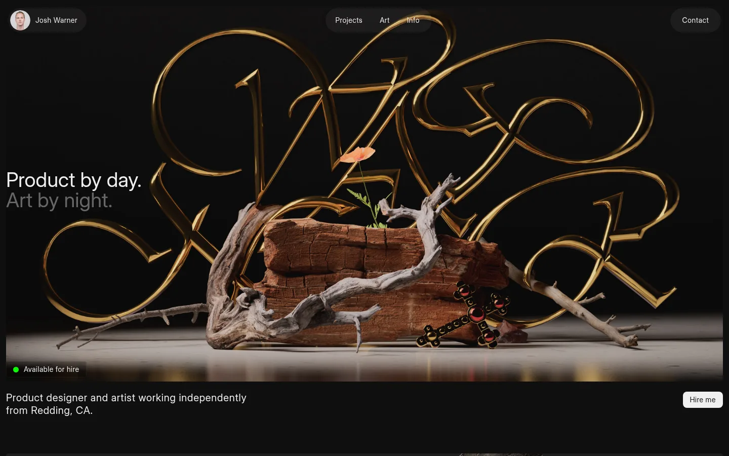
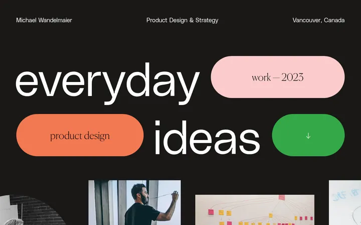
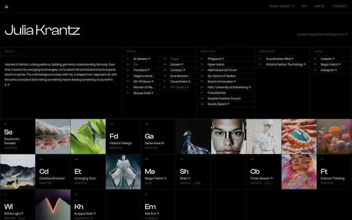
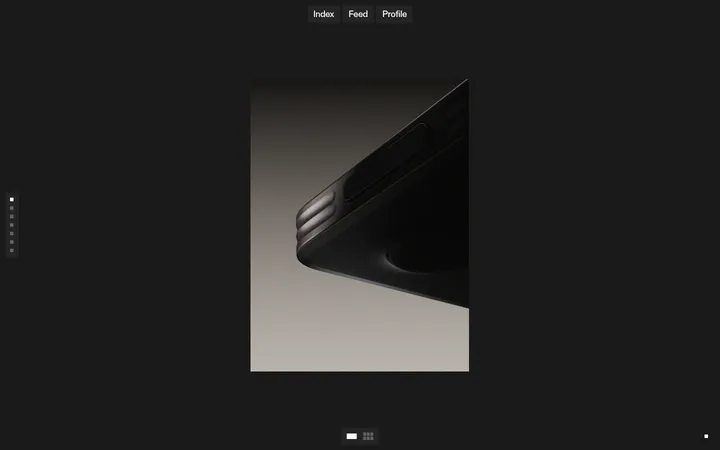
Josh Warner 的作品集以克制的近黑界面,衬托氛围感鲜明的大幅项目图像。清晰的文字层级与低调的交互控件,让设计、品牌和艺术作品成为视觉重点。
North star · Keep the interface nearly black and typographically quiet so large, carefully framed artwork remains the strongest visual voice.
The page uses a near-black canvas (#0f0f0f) throughout, with charcoal panels (#1a1a1a) separating the portrait-led navigation and full-width project visuals from the surrounding dark field. Bright text (#f0f0f0) carries the main message and concise labels; muted gray (#b8b8b8) softens secondary lines, including the second line of the hero statement. The measured type system uses Inter Display Regular at a consistent regular weight, with generous scale contrast between headline and body. Layout favors broad, image-led bands rather than boxed cards: a large hero composition introduces the designer, followed by stacked case-study imagery and a compact four-column skills overview. Spacing creates breathing room without decorative separators. Small pill-shaped navigation and availability treatments sit over or beside the work, while a light hiring button provides a crisp, high-contrast action. The warm gold lettering and earthy photographic tones belong to the hero artwork, not the interface palette.
Page-wide interface and content typography, from hero statement to project labels and skills copy.
角色
示例
字号
字重
行高
字距
一级标题
Primary hero statement introducing product design and art.
Josh Warner
40px
400
1
0
二级标题
Secondary headings for project and skills content.
Josh Warner
32px
400
1.2
0
正文
Introductory copy, project descriptions, and skills explanations.
The quick brown fox 敏捷的狐狸
20px
400
1.25
0.04em
辅助文字
Compact navigation, project labels, availability, and supporting metadata.
The quick brown fox 敏捷的狐狸
16px
400
1.56
0.04em
间距与布局
基准单位 2px · 密度:适中
60px版块间距
10px元素间距
—卡片内边距
1416px内容最大宽度
2px
4px
6px
8px
10px
12px
14px
16px
20px
24px
60px
The page uses a broad, centered composition with a measured maximum width of 1416px and full-bleed media that nearly spans the viewport. The hero places its statement beside or over the artwork, with navigation distributed across the top edge and a short introduction below. Case studies then form a single-column vertical sequence of large image bands. A later skills overview switches to four text columns. Comfortable spacing and a measured 60px section gap separate major content groups; smaller gaps keep compact labels and controls together.
圆角与层次
按钮 · 8px
图片 · 4px
链接 · 9999px
md · section
md · link, other
The page is mostly flat: dark canvas and image bands provide the structure, without prominent borders or card outlines. Small pill controls sit above the canvas with restrained shadowing. Preserve depth through image composition and subtle layering, not stacks of UI panels or heavy shadows.
组件
下面的预览按实测的按钮、输入框、徽标、卡片样式重建(字体用替代字体)。
Top navigation
Compact charcoal pills sit across the top: a portrait and name at left, section links near center, and a contact control at right.
Hero artwork
A full-width, dark studio composition anchors the first viewport, paired with a concise two-line statement and small availability indicator.
Hiring action
Small light button uses #f0f0f0 fill, 8px radius, and compact padding; keep its footprint modest beside the intro copy.
Case-study bands
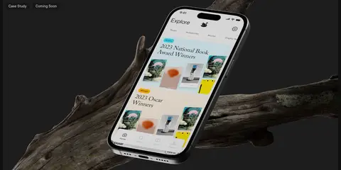
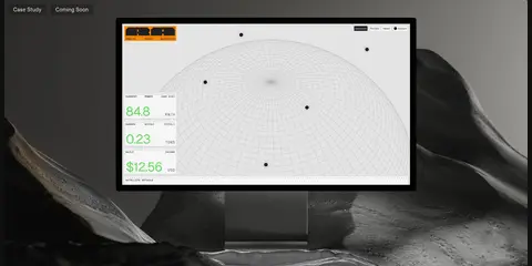
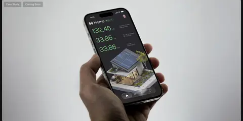
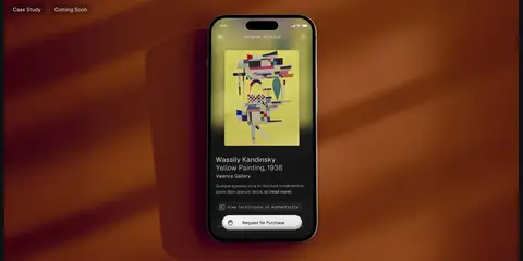
Four large, single-column image sections carry small case-study and coming-soon labels over photographic project mockups.
Skills overview
A brief introduction precedes four aligned text columns covering product design, graphic design, type design, and 3D art.
Identity link
A small rounded charcoal link combines a portrait with the designer’s name and uses a soft, restrained shadow.
Imagery · Large, cinematic project images dominate: the hero combines sculptural driftwood, metallic lettering, and a dark studio scene, while case studies show app and dashboard mockups in atmospheric settings. Imagery spans nearly the full content width and keeps its own photographic color and contrast. Warm browns and golds are prominent inside the artwork but should not become interface accents.
Let large project imagery lead each major section.
Use #f0f0f0 for primary text and the hiring action.
Reserve #b8b8b8 for secondary copy.
Keep navigation and metadata compact and pill-shaped.
Use regular-weight Inter-style typography with clear scale contrast.
✕ 不该做
Do not turn warm image colors into interface accents.
Do not add heavy card borders or stacked panel treatments.
Do not crowd the hero artwork with competing controls.
Do not use bold display typography where regular weight is measured.
Do not break the project sequence into a dense card grid.
Do not introduce gradients or extra palette colors.
给 AI 的提示词
想快速出一个同风格的新页面,把这段话连同 DESIGN.md 一起发给 AI。
Build a designer-portfolio page that follows Josh Warner’s restrained, image-led visual language. Use Studio Black (#0f0f0f) as the continuous canvas, Soft Chalk (#f0f0f0) for primary text and the hiring action, Quiet Gray (#b8b8b8) for secondary copy, and Charcoal Layer (#1a1a1a) for subtle navigation surfaces. Set type in regular-weight Inter or a close substitute, with a clear headline-to-caption hierarchy. Place compact pill navigation above a cinematic, wide hero image; follow it with a short intro, vertically stacked full-width project imagery, and a four-column skills overview. Keep interface decoration sparse, corners softly rounded, and spacing comfortable. Preserve colors inside supplied artwork rather than borrowing them for controls. Avoid heavy borders, gradients, and dense card layouts.