North star · Keep the warm cream canvas and playful display type in balance with simple, readable UI and generous breathing room.
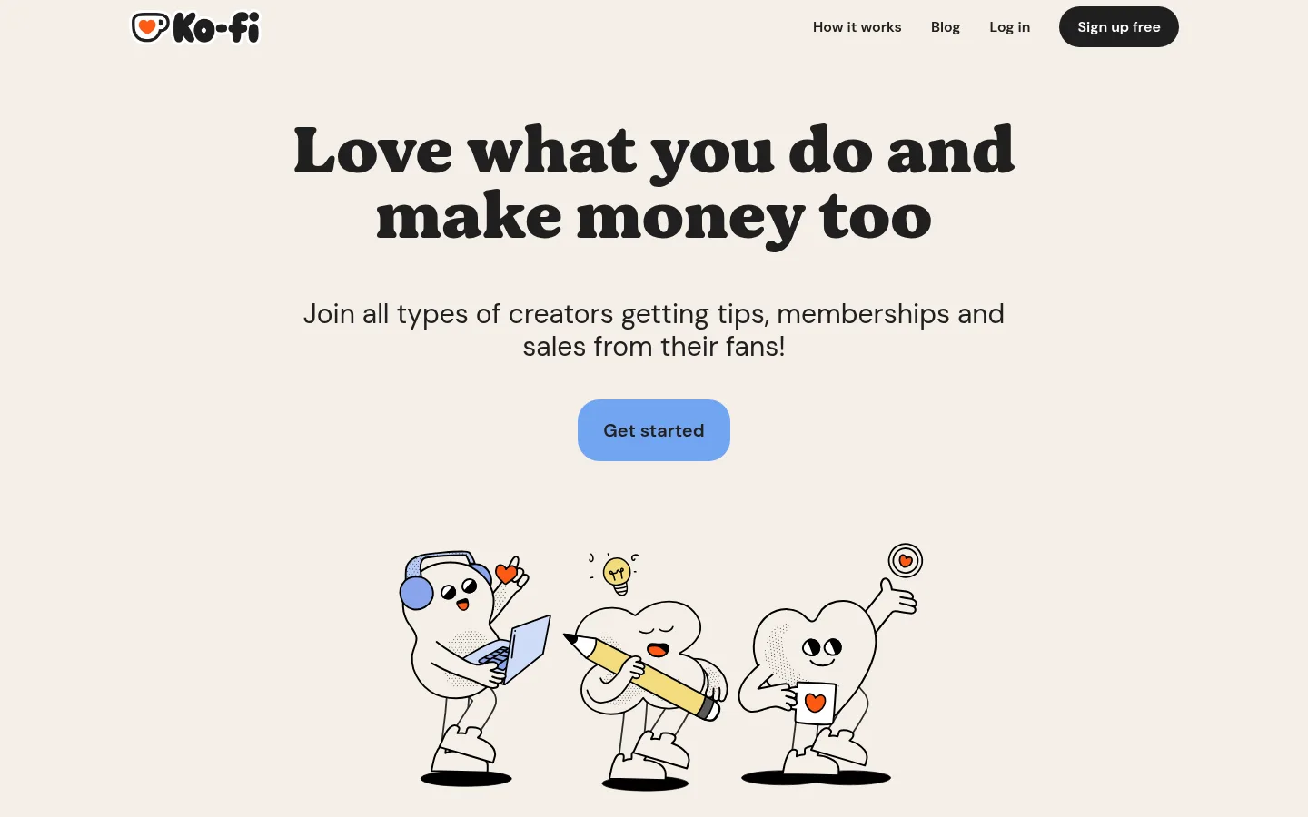
The page builds its identity around a warm cream canvas (#f4efe7), near-black typography, and restrained blue accents. A centered hero pairs a distinctive heavy display face with concise sans-serif copy, one blue primary action, and hand-drawn creator characters. The content alternates between open canvas sections and large white cards outlined in black, with rounded corners and a subtle dotted offset edge that gives the cards a tactile, printed feel. Creator examples and category chips add texture without disrupting the calm rhythm. Toward the bottom, blue FAQ and signup bands create a clear shift in mood while staying within the palette. DM Sans handles most interface and body text; the display face gives headlines their playful editorial character. Repeated pill controls, generous section separation, and centered compositions keep the long page legible and welcoming.
Main interface typeface for navigation, body copy, labels, links, and buttons.
Aa 设计
bogue-black
网络字体 · 字重 400 · 占比 4%
免费替代:Fraunces
Expressive display face for the hero and large editorial headlines.
角色
示例
字号
字重
行高
字距
特大标题
Oversized expressive display headline treatment.
Ko-fi
72px
400
1
0
一级标题
Hero headline and highest-level page title.
Ko-fi
60px
400
1
0
二级标题
Major section headings and prominent text links.
Ko-fi
30px
400
1.2
0
三级标题
Card and subsection headings.
The quick brown fox 敏捷的狐狸
24px
600
1.33
0
正文
Hero supporting copy and standard explanatory paragraphs.
The quick brown fox 敏捷的狐狸
20px
400
1.4
0
辅助文字
Small labels, creator metadata, and supporting notes.
The quick brown fox 敏捷的狐狸
16px
600
1.4
0
按钮
Primary and secondary action labels.
The quick brown fox 敏捷的狐狸
20px
600
1.4
0
导航
Header navigation and compact footer navigation.
The quick brown fox 敏捷的狐狸
16px
600
1.4
0
链接
Prominent inline or standalone informational links.
Ko-fi
30px
400
1.2
0
间距与布局
基准单位 4px · 密度:宽松
96px版块间距
8px元素间距
24px卡片内边距
648px内容最大宽度
8px
10px
16px
20px
24px
28px
32px
40px
80px
96px
The hero is centered on a narrow content column, with a compact top navigation and ample open space around the headline, CTA, and illustration. Below it, the page alternates centered creator-category content with large rounded feature cards. The measured content max width is 648px, and the spacious section rhythm is driven by a 96px section gap. The lower FAQ and signup/footer regions use full-width blue bands; the footer itself sits in a white rounded panel. Keep alignment calm and avoid dense layouts.
圆角与层次
按钮 · 9999px
卡片 · 9999px
图片 · 40px
没有测到阴影:页面是扁平的,层次靠底色和描边区分。
The interface is mostly flat, with no measured shadow system. Use crisp black outlines to define large white cards and a restrained dotted offset edge for tactile depth. Rounded card frames, white panels, and contrasting section bands provide the layering; avoid floating, shadow-heavy UI.
组件
下面的预览按实测的按钮、输入框、徽标、卡片样式重建(字体用替代字体)。
Header navigation
Compact horizontal brand and link row; use near-black DM Sans labels and a dark rounded signup action.
Hero CTA
A centered blue pill action using #72a4f2 with #202020 text, semibold DM Sans, and generous internal padding.
Feature card
Large white panel with a strong black outline, generous padding, rounded corners, and occasional dotted offset edge.
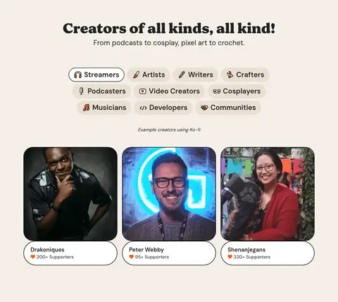
Creator category chips
Small rounded category controls with warm beige backing, dark semibold text, and simple creator-related icons.
Creator profile cards
Rounded photography frames paired with white, black-outlined name and supporter-count labels.
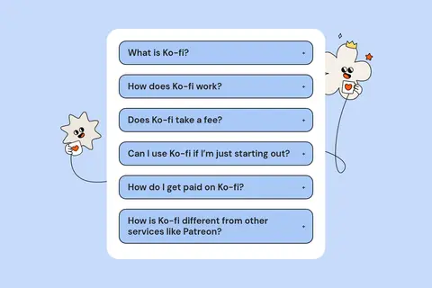
FAQ accordion
A white rounded container on a pale blue band, with stacked blue rounded question rows and simple expand indicators.
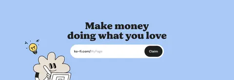
Signup and footer band
Blue closing section with a centered signup prompt and a broad white footer panel containing grouped link columns.
Imagery · Hand-drawn, black-outlined characters lead the hero and recur as decorative companions in later sections. Creator examples use real profile photography in rounded image frames, while product imagery and sample page previews sit inside outlined white cards. Keep illustrations charming and lightly imperfect; treat photography as supporting proof, not the dominant visual language.
Keep the warm cream canvas as the dominant page background.
Reserve the display face for short, prominent headlines.
Use DM Sans for readable interface and body text.
Give major sections generous vertical separation.
Use blue for key actions and distinct lower-page bands.
Frame content with rounded corners and deliberate dark outlines.
✕ 不该做
Do not replace the warm neutral canvas with a stark white page.
Do not use blue as a competing full-page background.
Do not add heavy shadows or glossy gradients.
Do not crowd the hero with extra controls or dense copy.
Do not use the display face for long paragraphs.
Do not make the illustrations look like polished 3D product renders.
给 AI 的提示词
想快速出一个同风格的新页面,把这段话连同 DESIGN.md 一起发给 AI。
Build a new creator-platform page in Ko-fi's warm, playful visual style. Use Warm Canvas (#f4efe7) as the main field, Soft Ink (#202020) for text, and Clean Paper (#ffffff) for rounded content cards. Set display headlines in an expressive, heavy serif-like face and use DM Sans or a close sans-serif for body text and controls. Keep the layout centered and spacious, with a narrow content column, generous section breaks, and concise copy. Use Action Blue (#72a4f2) for the primary pill CTA; reserve Ko-fi Blue (#aac9f7) and Sky Band (#c7dbfa) for distinct section bands. Add friendly hand-drawn illustrations, occasional creator photography, and crisp black card outlines with subtle dotted edging. Keep controls rounded, legible, and visually calm.