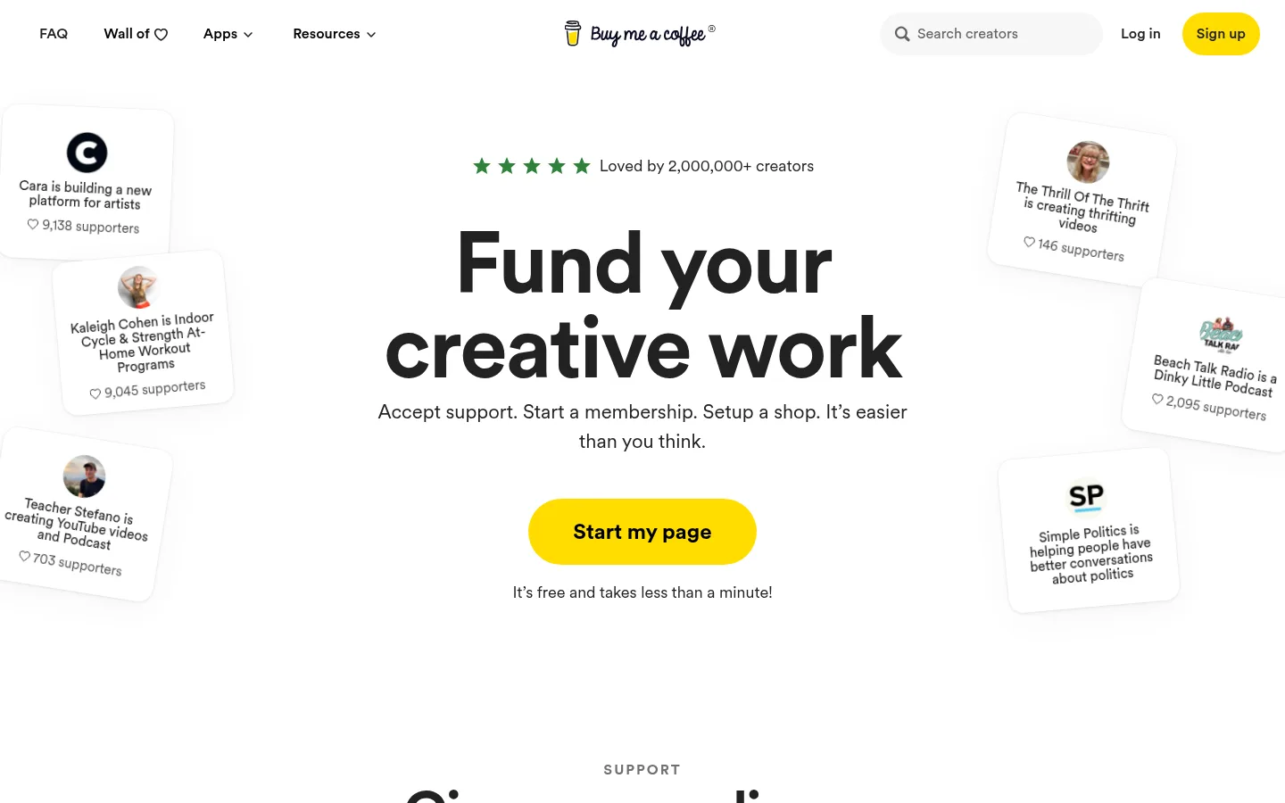
页面以宽松亲和的视觉呈现 Buy Me a Coffee,突出创作者收款、会员订阅和商店销售等功能。醒目的居中标题、亮黄色行动按钮与悬浮式产品示例,让服务显得直观易懂。
North star · Keep the page bright and creator-friendly: pair confident centered typography with generous whitespace and tangible, softly elevated product examples.
The visual strategy pairs a predominantly white canvas with near-black typography and generous open space, keeping the creator-focused message easy to scan. A warm off-white surface appears in the footer, while muted gray supports secondary copy and subtle pale borders define selected edges. The hero is centered and typographically bold, with an emphatic yellow CTA that stands out in the screenshot; treat that yellow as a visible interface accent rather than infer an unmeasured hex value. Circular typography gives headings a soft, modern voice, while the measured display and H1 treatments use tight negative tracking. The page unfolds as a single-column sequence of centered feature stories, each supported by compact product-interface imagery. Cards and creator examples float around the hero and feature mockups, adding depth without turning the page into a dense dashboard. Consistent whitespace separates sections, and the final benefits area shifts into a compact multi-column layout before a quiet footer.
General interface and heading typography, including measured display and H2 roles.
Aa 设计
Circular Book
网络字体 · 字重 400 · 占比 35%
免费替代:Nunito Sans
Body copy and captions across explanatory sections.
Aa 设计
Circular Bold
网络字体 · 字重 400 / 500 / 700 · 占比 16%
免费替代:Nunito Sans
Display and H1 headings, with strong emphasis in the hero and feature titles.
Aa 设计
Circular Medium
网络字体 · 字重 400 · 占比 6%
免费替代:Nunito Sans
Navigation and link text, including measured FAQ links.
角色
示例
字号
字重
行高
字距
特大标题
Oversized hero headline, bold with tight tracking.
Buy Me a Coffee
96px
400
0.99
-0.025em
一级标题
Primary page and major feature headings.
Buy Me a Coffee
64px
400
1.25
-0.031em
二级标题
Section-level headings and supporting feature titles.
The quick brown fox 敏捷的狐狸
24px
400
1.33
0
正文
Explanatory paragraphs beneath feature headings.
The quick brown fox 敏捷的狐狸
20px
400
1.2
0
辅助文字
Small notes and supporting interface labels.
The quick brown fox 敏捷的狐狸
15px
400
1.07
0
链接
Navigation and inline informational links.
The quick brown fox 敏捷的狐狸
16px
400
1.5
0
眉题
Uppercase feature category labels above headings.
The quick brown fox 敏捷的狐狸
16px
700
1
0.125em
间距与布局
基准单位 8px · 密度:适中
64px版块间距
8px元素间距
12px卡片内边距
936px内容最大宽度
2px
4px
6px
8px
9px
12px
14px
16px
20px
24px
28px
32px
48px
64px
96px
The page follows a single-column, centered storytelling flow, with a measured maximum content width of 936px. The hero gives its headline, description, CTA, and reassurance line a strong central axis, while creator cards sit as loose edge framing. Long feature sections alternate text with centered interface mockups; later benefits arrange into two- and three-column groups. Sections have generous vertical separation, keeping density comfortable. A shallow warm footer closes the otherwise white page.
圆角与层次
卡片 · 16px
图片 · 50%
徽标 · 2px
链接 · 16px
lg · card
xl · other, card
lg · card, other
xl · text
Most of the page remains flat and white. Product cards and testimonial-style creator examples use soft, broad shadows to separate them from the canvas without heavy outlines. Rounded card corners support the friendly tone; pale borders are subtle. Layer mockups sparingly, reserving stronger floating depth for the hero and featured interface examples.
组件
下面的预览按实测的按钮、输入框、徽标、卡片样式重建(字体用替代字体)。
Top navigation
A slim white header places FAQ and resource links on the left, the wordmark near center, and search, login, and sign-up controls on the right.
Hero CTA
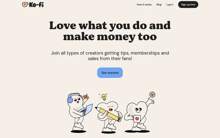
Centered headline and supporting copy lead to a prominent rounded yellow button, followed by a short reassurance line.
Floating creator cards
Small white supporter/profile cards frame the hero edges, with creator imagery, short descriptions, and support counts.
Feature showcase
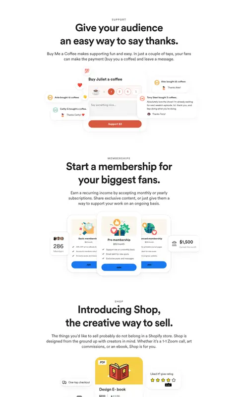
Centered eyebrow, title, and paragraph introduce a product area, followed by a compact interface mockup.
Benefit checklist
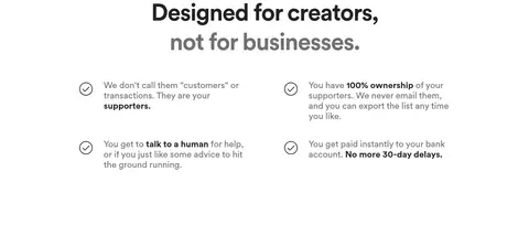
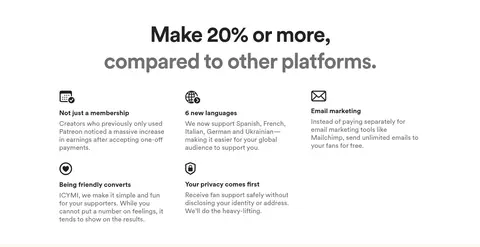
A centered comparison heading sits above concise benefit statements arranged in columns with simple outline icons.
Footer
A warm off-white closing band contains copyright, grouped navigation links, and social icons.
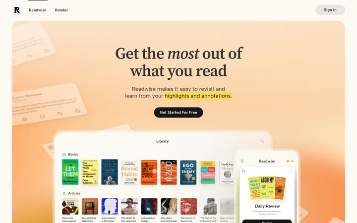
Imagery · Use product-interface mockups rather than relying on large atmospheric photography. Examples include support forms, membership cards, shop listings, and creator content previews, arranged as small floating compositions beneath centered copy. The hero’s supporter cards tilt and hover near the page edges, while feature mockups remain legible and grounded. Include creator portraits and colorful content thumbnails inside mockups; these are supporting product imagery, not the core page palette.
Use yellow prominently for the primary CTA, matching the screenshot.
Give product mockups soft elevation and rounded corners.
Separate feature stories with generous whitespace.
✕ 不该做
Do not make the page feel like a dense analytics dashboard.
Do not introduce large dark background bands.
Do not let decorative mockups overpower the page headline.
Do not use pale borders as prominent dividers.
Do not scatter accent colors across the main canvas.
Do not compress the long-form feature sections together.
给 AI 的提示词
想快速出一个同风格的新页面,把这段话连同 DESIGN.md 一起发给 AI。
Build a new page in the Buy Me a Coffee visual style: bright, warm, creator-focused, and easy to scan. Use Gallery White (#ffffff) as the main canvas, Soft Ink (#222222) for strong text, Quiet Slate (#717171) for supporting copy, and Warm Paper (#faf8f0) for a subtle closing surface. The screenshot uses a vivid yellow primary CTA; match its visual prominence without inventing a measured hex. Use rounded Circular-like sans typography, with bold tightly tracked headings and uppercase eyebrow labels. Center the hero and feature introductions, then place compact, readable product-interface mockups beneath them. Add soft elevation to floating cards, keep decorative imagery secondary, and preserve generous vertical breathing room. Finish with a compact multi-column benefits area and quiet footer.