North star · Use deep blue and ink as immersive section fields, then let compact TT Norms typography and clear white content bands make the platform easy to scan.
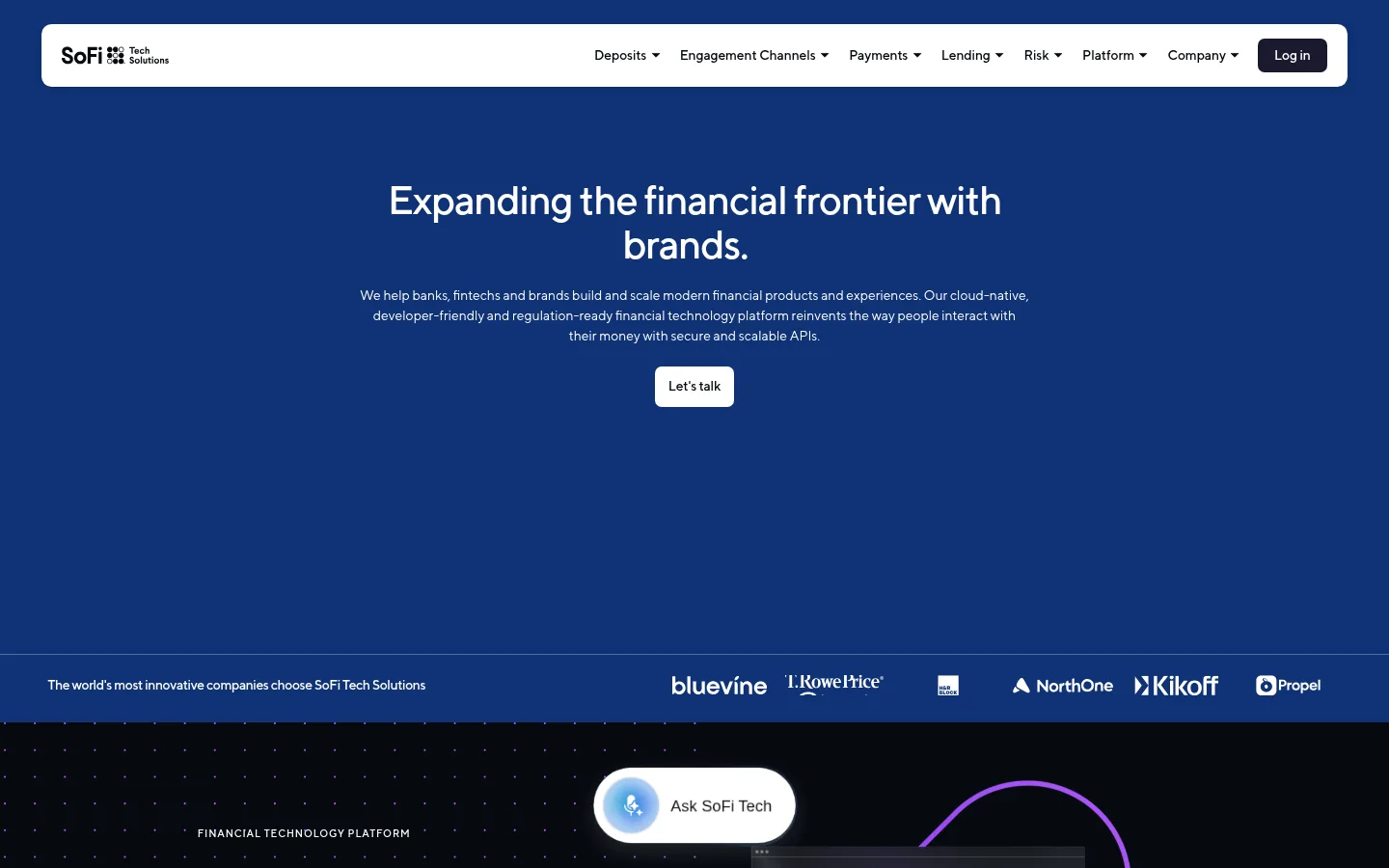
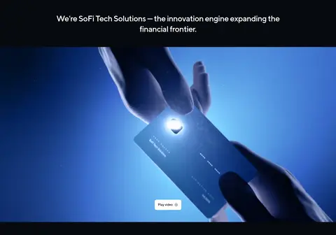
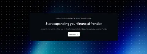
The visual strategy balances an expansive, saturated blue opening with near-black platform storytelling and white editorial sections. The measured canvas lavender-white (#f5f6ff) is present in the hero’s underlying section treatment, while the screenshot makes the deep blue field the dominant first impression; treat that blue as a visual field rather than inventing a new palette value. TT Norms carries the page throughout: medium-weight, tightly tracked headings contrast with small, calmly set body copy and uppercase eyebrow labels. Layout alternates full-bleed media and dark bands with centered, contained content, offset cards, and two-column solution groupings. Product screenshots, card imagery, customer logos, and video provide evidence and texture; dot patterns and luminous gradients remain supporting details. Generous open areas around the hero and people feature contrast with denser footer navigation. Rounded white navigation and CTA surfaces, subtle hairlines, and minimal shadow keep the interface polished without making it feel ornamental.
配色
点色块复制色值。用途说明来自对页面的实测位置(背景、文字、描边、按钮)与截图判读。
品牌色
强调色
表层色
中性色
页面底色 · Lavender Canvas表层 · Midnight Ink表层 2 · Gallery White表层 3 · Deep Space表层 4 · Night Navy主文字 · Midnight Ink次要文字 · Gallery White描边 · Gallery White强调 · Link Blue强调 2 · Glacier Blue强调 3 · Action Blue
Site-wide headings, body copy, navigation, buttons, links, and eyebrow labels.
角色
示例
字号
字重
行高
字距
一级标题
Centered hero headline and primary page statement.
SoFi Tech Solutions
41.5px
500
1.1
-0.03em
二级标题
Major section titles, including solutions and platform messaging.
SoFi Tech Solutions
34.5px
500
1.3
-0.03em
三级标题
Feature, product, and card headings.
SoFi Tech Solutions
28px
500
1.3
-0.03em
四级标题
Subsection labels and smaller solution headings.
The quick brown fox 敏捷的狐狸
21px
500
1.3
-0.03em
正文
Supporting descriptions, explanatory copy, and navigation text.
The quick brown fox 敏捷的狐狸
14px
400
1.5
0
辅助文字
Small metadata, statistics labels, and fine-print copy.
The quick brown fox 敏捷的狐狸
12px
400
1.5
0
按钮
CTA labels such as Let's talk and Cyberbank Core.
The quick brown fox 敏捷的狐狸
14px
500
1.5
-0.01em
链接
Learn more links and inline navigation actions.
The quick brown fox 敏捷的狐狸
14px
500
1.09
-0.01em
眉题
Uppercase section markers such as FINANCIAL TECHNOLOGY PLATFORM.
The quick brown fox 敏捷的狐狸
10.5px
500
1.5
0.092em
间距与布局
基准单位 1px · 密度:适中
56px版块间距
7px元素间距
82px卡片内边距
697px内容最大宽度
3px
4px
5px
7px
9px
10px
14px
17px
21px
28px
42px
43px
49px
56px
69px
Build a long, editorial homepage with full-bleed hero and media bands alternating with contained white content areas. The measured page max width is 697px, with comfortable density, a 56px section gap, and a 7px element gap; preserve those measured values where applicable rather than extrapolating new spacing tokens. Center the hero message, then shift to left-aligned section headings, offset paired cards, and two-column solution content. Use broad negative space in the opening and people sections, then a denser multi-column footer.
圆角与层次
按钮 · 7px
卡片 · 14px
导航 · 10px
md · nav
The page is mostly flat, using strong colour bands rather than stacked shadowed cards. A white navigation panel has a subtle measured shadow and rounded corners; cards rely on their contrasting fills and soft corners. Use fine dividers sparingly, including the restrained hairline between the hero and logo strip.
组件
下面的预览按实测的按钮、输入框、徽标、卡片样式重建(字体用替代字体)。
Floating navigation
White rounded navigation panel over the blue hero, with compact dropdown labels and a dark Log in button; measured nav radius is 10px.
Hero CTA
Centered white Let's talk button with dark text and a measured button radius of 7px.
Customer logo strip
A thin, separated band beneath the hero pairs a short customer-proof statement with a horizontal run of white logos.
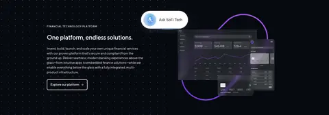
Dark platform feature
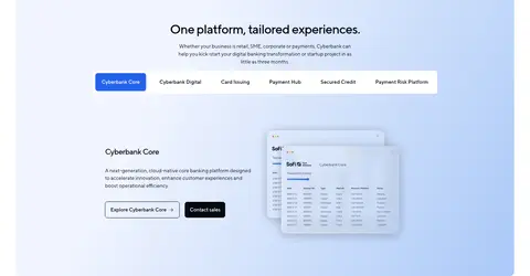
Near-black full-bleed section with an uppercase eyebrow, explanatory copy, outlined action, dotted background, and floating product UI imagery.
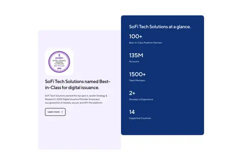
Proof cards
Offset recognition and statistics cards contrast a pale lilac card with a saturated blue metrics card; measured card radius is 14px.
Solution list
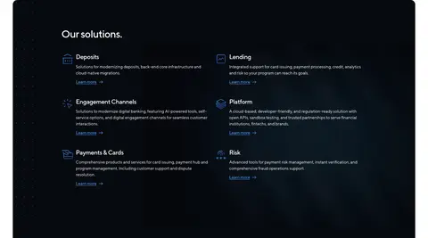
Dark rounded panel groups six solution areas into two columns, each with a small icon, title, brief copy, and blue link.
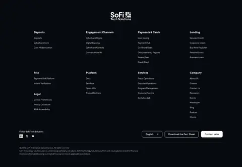
Footer navigation
Near-black footer arranges dense link groups in columns, then places social links, utility actions, and legal copy below.
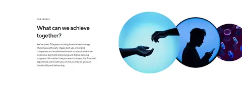
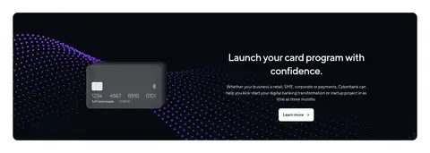
Imagery · Use product UI mockups, card-program visuals, customer logos, and cinematic video as proof of platform capabilities. Full-bleed media sits in dark sections with dotted patterns and luminous blue or purple accents; editorial areas use circular people photography and contained card imagery. Keep imagery crisp and high-contrast, and do not mistake illustration-only purple or bright details for core brand colours.
Lead with a confident blue field and a centered, concise message.
Use TT Norms or a close sans-serif substitute consistently.
Alternate dark full-bleed storytelling with white editorial sections.
Keep calls to action visibly distinct with measured accent or white fills.
Use customer marks and product visuals as credibility evidence.
Reserve uppercase, tracked styling for eyebrow labels.
✕ 不该做
Do not add palette colours beyond the measured hex values.
Do not make every section a card or add heavy shadows.
Do not use oversized body text or loose, decorative typography.
Do not let product mockup colours redefine the brand palette.
Do not crowd the hero; preserve its broad open field.
Do not flatten the long page into one uniform background.
给 AI 的提示词
想快速出一个同风格的新页面,把这段话连同 DESIGN.md 一起发给 AI。
Create a new fintech platform page using SoFi Tech Solutions’ measured visual language. Use Platform Blue (#0f3275) as the immersive brand field, Midnight Ink (#070a10) and Deep Space (#03081a) for product storytelling, Gallery White (#ffffff) for clear content bands, and Lavender Canvas (#f5f6ff) for pale transitions. Keep typography in TT Norms or Inter, with medium-weight tightly tracked headings, compact body copy, and uppercase tracked eyebrows. Alternate full-bleed media with contained editorial layouts; use product UI, people photography, customer marks, and restrained dotted textures as supporting evidence. Make CTAs clear with white or Action Blue (#2563eb) fills. Keep cards flat, use measured rounded treatments, subtle hairlines, and generous whitespace. Avoid invented colours, decorative excess, and uniform section layouts.