North star · Let bright product photography and bold Helvetica do the work, using white space, deep green bands, and restrained orange accents to keep the storefront clear.
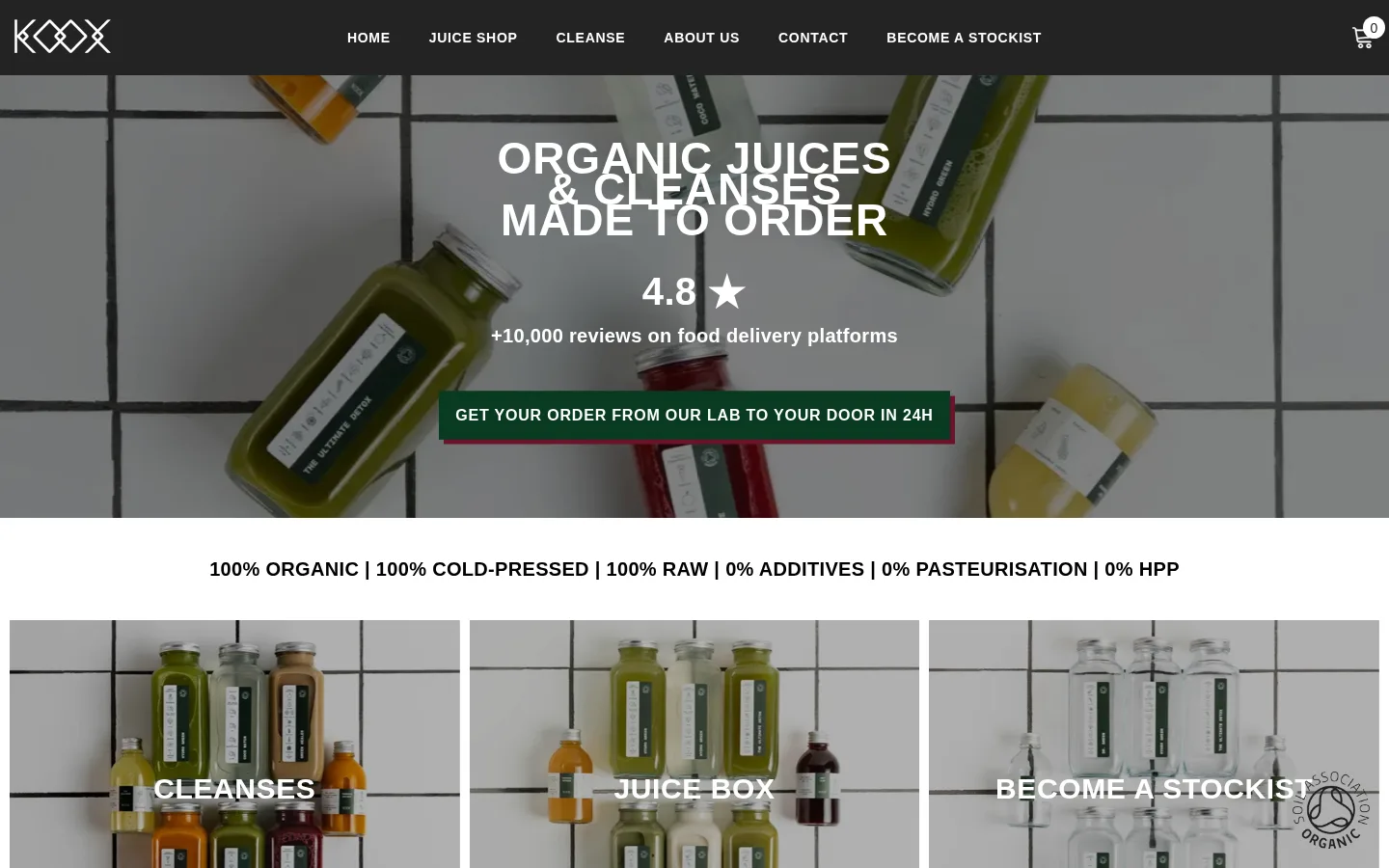
The visual system is led by Gallery White (#ffffff), which carries the hero, editorial content, and open space between sections. Product photography supplies most of the visual texture; its bottle colors and tiled backdrops are imagery, not additional brand colors. Helvetica is used throughout, with very heavy, tightly composed display headings, uppercase navigation, and compact product labels. The hero overlays centered white messaging and a deep green CTA on a darkened full-width juice photograph. Below it, three photographic category tiles lead into a clean cleanse-card section. A pale gray (#efefef) product catalog creates a distinct shopping band, while deep green (#113722) returns for promotions and review proof. Orange (#d25a24) is reserved for links and small product details; burgundy (#6b1229) appears as a CTA accent and offset link shadow. Layouts stay mostly flat, using fine borders rather than elevated cards. The black footer closes the page with compact navigation and a newsletter form.
Used across headings, body copy, navigation, links, buttons, and product labels.
角色
示例
字号
字重
行高
字距
一级标题
Centered hero headline over the full-width juice photograph.
Koox
46px
900
0.7
0.02em
二级标题
Uppercase section titles, including the cleanse heading.
Koox
40px
900
0.6
0.02em
三级标题
Feature and supporting headlines within editorial sections.
Koox
32px
900
0.88
0.02em
四级标题
Secondary feature titles and supporting content headings.
Koox
30px
700
1.03
0.02em
正文
Descriptions, review text, explanatory copy, and footer content.
The quick brown fox 敏捷的狐狸
16px
400
1.63
0.02em
辅助文字
Compact product details, supporting labels, and small metadata.
The quick brown fox 敏捷的狐狸
14px
400
2.5
0
按钮
Uppercase calls to action and newsletter submit control.
The quick brown fox 敏捷的狐狸
16px
700
1.5
0.05em
导航
Uppercase primary navigation and footer navigation labels.
The quick brown fox 敏捷的狐狸
14px
700
1.71
0.05em
链接
Prominent uppercase cleanse names and other product links.
The quick brown fox 敏捷的狐狸
20px
600
1.2
0.02em
眉题
Short uppercase introductory labels and promotional copy.
The quick brown fox 敏捷的狐狸
16px
700
1.5
0.05em
间距与布局
基准单位 1px · 密度:宽松
100px版块间距
5px元素间距
—卡片内边距
1170px内容最大宽度
1px
5px
7px
10px
11px
13px
15px
17px
20px
27px
30px
40px
The desktop layout uses a wide centered content area, measured at a 1170px maximum, within a full-width page canvas. The header is a dark horizontal bar; the hero and several promotional sections span broadly across the viewport. Category cards use three columns, the cleanse showcase is centered, and the juice catalog is a denser multicolumn product grid. Most editorial content is centered, while the footer switches to four left-aligned columns. Sections have a spacious rhythm, with large gaps separating product and editorial bands.
圆角与层次
卡片 · 5px
链接 · 4px
hairline · link
The page is predominantly flat: white and gray section bands do most of the grouping rather than raised cards. Product cards use faint #f5f5f5 borders, and the main CTA is given a small offset #6b1229 shadow. Avoid broad soft shadows or layered, floating panels.
组件
下面的预览按实测的按钮、输入框、徽标、卡片样式重建(字体用替代字体)。
Dark navigation bar
A black, full-width header with a white Koox wordmark, centered uppercase Helvetica links, and a compact cart icon at the right.
Photographic hero
Full-bleed bottle photography with a dark overlay, centered bold white headline and review proof, plus a #113722 CTA with a #6b1229 offset accent.
Category image tiles
Three side-by-side photographic tiles for cleanses, juice boxes, and stockists, with centered, uppercase white labels.
Cleanse links
A centered collection heading followed by four concise uppercase cleanse links; category names use #d25a24 and product titles use black.
Juice product grid
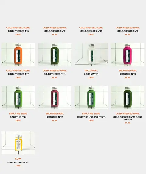
A #efefef shopping band containing small bottle photographs, compact uppercase product labels, and orange category and price details.
Review proof band
A full-width #113722 section centered around the London rating headline, 4.8/5 score, star, and supporting review count.
Newsletter footer
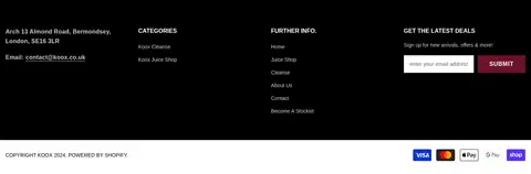
A black four-column footer with contact details, compact navigation, muted text, and a white email input beside a burgundy submit button.
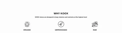
Imagery · Photographic juice bottles anchor the hero, category tiles, and product catalog. The hero image is full-bleed and darkened to keep centered white text readable; category images retain their tiled setting and receive centered white labels. Individual catalog items are presented as straightforward product photos, while small line-art marks and icons support the organic and raw feature claims. Treat screenshot colors in the photographs as image content, not as additions to the interface palette.
Keep the hero message centered over full-width product photography.
Use white as the primary canvas and preserve generous gaps between sections.
Reserve #113722 for strong promotional and proof bands.
Use #d25a24 for links and compact product details.
Keep catalog labels small, uppercase, and closely tied to product images.
✕ 不该做
Do not turn the interface into a colorful gradient-led design.
Do not apply product-photo colors as extra UI brand colors.
Avoid rounded, floating cards and large soft shadows.
Do not crowd the editorial sections or remove the white space.
Avoid using orange for large surfaces or primary hero backgrounds.
Do not use decorative typefaces in place of the Helvetica system.
给 AI 的提示词
想快速出一个同风格的新页面,把这段话连同 DESIGN.md 一起发给 AI。
Build a new Koox-style food and beverage page as a clean, spacious storefront. Use Gallery White (#ffffff) for the canvas, black for the navigation and footer, and Forest Green (#113722) for a few full-width promotional or proof bands. Set type in Helvetica or Arial: bold, uppercase headings and navigation, with smaller readable body and product text. Use a centered, wide content area, then vary the rhythm between broad photographic sections, a three-column category row, and a denser product grid on Mist Gray (#efefef). Keep product photography natural and prominent; do not treat colors inside the photographs as UI tokens. Use Citrus Rust (#d25a24) sparingly for links and product details, and Berry Burgundy (#6b1229) only as a restrained button accent. Favor flat surfaces, fine borders, and generous open spacing over elevated cards.