North star · Let spacious, quiet typography and soft color bands frame authentic rider and vehicle footage as the primary story.
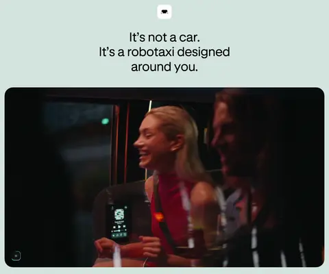
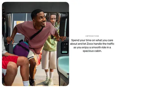
The page uses a restrained palette to make its vehicle footage feel vivid without competing with the brand: white and pale mint sections alternate with a deep blue-green band, while near-black anchors headings and the final footer. A small mint-to-lavender-to-blue conic gradient appears as an accent rather than a defining page background. Typography is clean, rounded sans-serif, with large centered statements, compact uppercase labels, and readable body copy. The hero begins on a pale mint field, placing a short headline above a broad, rounded video. Further down, centered introductions alternate with image-and-copy compositions and paired cards. Generous vertical breathing room keeps the long page from feeling crowded; section transitions are mostly made with background color, not dividers. Photography and video carry the emotional story, including riders in the cabin, vehicle close-ups, city scenes, and team imagery. Rounded media and cards soften the technical subject matter.
Primary sans-serif for body copy, navigation, labels, and many headings.
Aa 设计
__gtStandardL_53dfc7
网络字体 · 字重 400 · 占比 17%
免费替代:Inter
Display and selected headline face, including the hero statement.
角色
示例
字号
字重
行高
字距
特大标题
Oversized hero or campaign statement.
Zoox
120px
400
1.1
0
一级标题
Primary page headline, notably the centered hero message.
Zoox
56px
400
1.15
0
二级标题
Section-level statement headings.
Zoox
50px
400
0.6
0
三级标题
Feature and content-card headings.
Zoox
40px
700
0.75
0
四级标题
Supporting display headings in feature sections.
Zoox
36px
400
1.2
0
正文
Explanatory copy and editorial link rows.
The quick brown fox 敏捷的狐狸
20px
400
1.5
-0.001em
辅助文字
Small uppercase section labels and CTA text.
The quick brown fox 敏捷的狐狸
12px
700
1.3
-0.002em
导航
Compact uppercase navigation labels.
The quick brown fox 敏捷的狐狸
12px
700
1.3
-0.002em
间距与布局
基准单位 2px · 密度:适中
60px版块间距
16px元素间距
36px卡片内边距
1400px内容最大宽度
1px
4px
5px
7px
10px
12px
14px
15px
16px
20px
22px
24px
40px
60px
80px
100px
The page is a long, single-column sequence of broad section bands, with content generally centered and media often spanning the available width. The measured page max width is 1400px. Comfortable density and generous section gaps create pauses between the hero, editorial features, city section, company stories, and content feed. Paired cards and split image/text compositions provide variation; the article area shifts to a multi-column listing. Rounded corners unify large media and cards. The layout favors open whitespace over visible grid lines.
圆角与层次
按钮 · 12px
输入框 · 18px
卡片 · 36px
图片 · 16px
导航 · 16px
链接 · 16px
lg · nav
The visual system is mostly flat: color bands, whitespace, and rounded media define hierarchy instead of stacked shadows. The measured navigation shadow is very subtle. Newsletter inputs use a thin dark teal outline on white, while cards rely on their pale mint or dark fill and rounded silhouette rather than prominent borders.
组件
下面的预览按实测的按钮、输入框、徽标、卡片样式重建(字体用替代字体)。
Hero video
Centered headline on a pale mint field, followed by a broad rounded video frame.
Editorial feature split
Large image paired with a concise section label, body copy, and compact uppercase link.
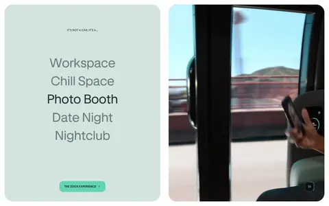
Experience card
Rounded pale mint feature card with a large statement and an adjacent video panel.
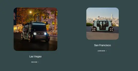
City links
Two location tiles within a deep teal band, using vehicle imagery and simple city labels.
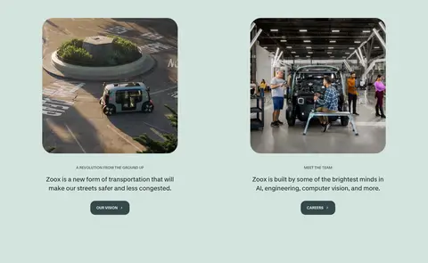
Story cards
Paired image-led company cards on pale mint, each with a short label, description, and CTA.
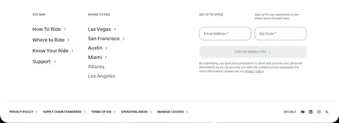
Newsletter form
White email and ZIP-code inputs with a 1px #283738 outline and rounded corners.
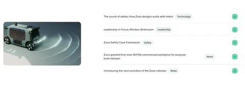
Editorial feed
Image alongside compact article rows, category labels, and small mint arrow controls.
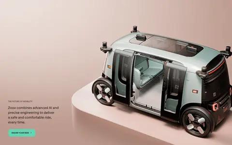
Imagery · Large video and photographic assets do most of the storytelling: riders inside the cabin, vehicle exterior and interior views, city locations, and team or factory scenes. Media is presented in broad, rounded frames or paired card layouts, often with the image carrying most of the visual weight. The page uses real-world lighting and cinematic scenes rather than flat illustration; the hero video is the first major visual after the headline.
Use Soft Mint (#d3e4df) for signature light section bands.
Keep hero statements centered and visually quiet.
Let large vehicle and rider media lead each feature.
Use Deep Teal (#34484a) for the city-focused dark band.
Reserve Signal Mint (#34ffc5) for restrained accent details.
Use compact uppercase labels to introduce sections.
✕ 不该做
Don’t turn the page into a dense dashboard or product grid.
Don’t add gradients as dominant section backgrounds.
Don’t use heavy shadows to separate every card.
Don’t compete with the photography using decorative graphics.
Don’t introduce unmeasured colors or arbitrary spacing values.
Don’t make navigation or captions oversized.
给 AI 的提示词
想快速出一个同风格的新页面,把这段话连同 DESIGN.md 一起发给 AI。
Build a new Zoox-style page with a calm, rider-first visual hierarchy. Use Gallery White (#ffffff) as the light canvas, Soft Mint (#d3e4df) for brand section fields, and Deep Teal (#34484a) for a distinct dark content band; keep text in True Black (#000000) or Night Ink (#0d1212). Treat Signal Mint (#34ffc5), Periwinkle Glow (#c7c6ff), and Sky Glow (#a7cfff) as small gradient accents only. Use a clean sans-serif close to Inter, with large regular-weight statements, compact bold uppercase labels, and readable body copy. Organize content as spacious full-width section bands, centered introductions, paired image-and-copy features, and rounded media cards. Prioritize authentic rider, vehicle, and city photography or video. Keep borders thin, shadows rare, and decoration subordinate to the imagery. Follow measured spacing and component values rather than inventing new ones.