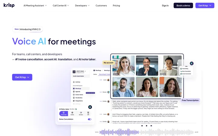
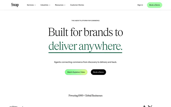
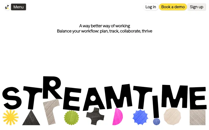
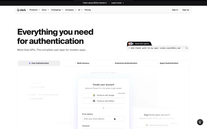
North star · Let generous white space and oversized black type lead; use purple for actions and gradients only as selective product-story accents.
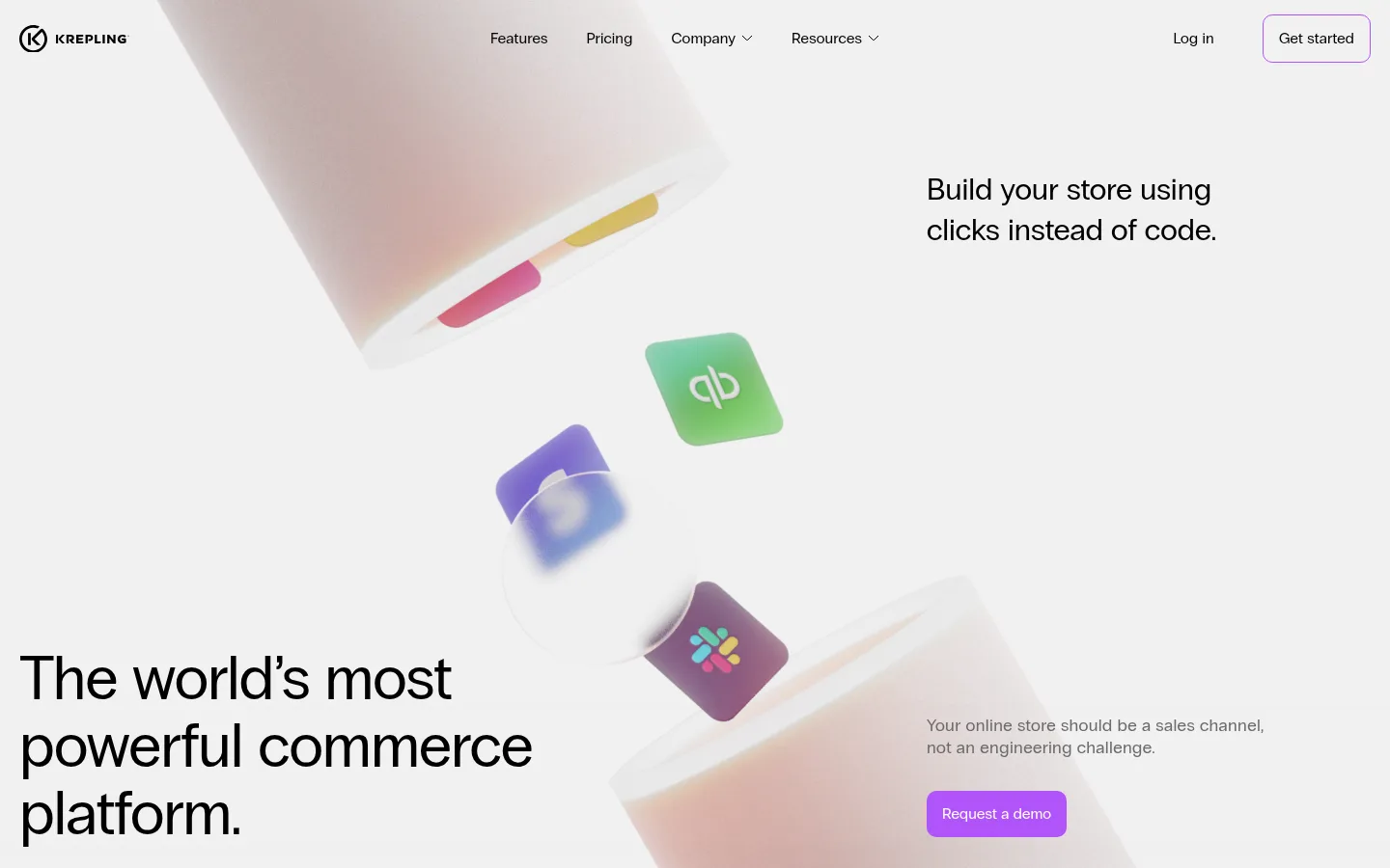
The visual strategy is built around contrast between a nearly all-white canvas and selective, high-impact elements. Black carries navigation, headings, and a small set of feature panels; muted grays keep supporting copy subordinate. Purple is reserved for the primary demo action and a fine outline on the secondary CTA, while pastel pink-to-lilac and blue-to-mint gradients appear as emphasis inside workflow and storefront storytelling rather than as broad page backgrounds. A single regular-weight sans-serif keeps the typography direct: very large, lightly tracked headings anchor the page, with compact body text beside or beneath them. The layout is unusually spacious, with long vertical pauses separating section titles, gradient visual blocks, and feature content. The opening composition combines a floating commerce-product illustration with offset headline and CTA copy. Most other sections remain flat and open, punctuated by rounded black panels that make feature descriptions feel like focused product moments.
Single sans-serif family used across headings, body copy, navigation, and buttons.
角色
示例
字号
字重
行高
字距
特大标题
Oversized display messaging for major visual statements.
Krepling
96px
400
1.1
-0.01em
一级标题
Primary hero headline and top-level page statement.
Krepling
80px
400
1.1
-0.01em
二级标题
Large section headings such as Workflows and Storefront.
Krepling
64px
400
1.1
-0.01em
三级标题
Feature titles within product-story sections and cards.
Krepling
32px
400
1.3
0
正文
Supporting descriptions beside hero and feature content.
The quick brown fox 敏捷的狐狸
18px
400
1.3
0.02em
辅助文字
Compact explanatory details and secondary copy.
The quick brown fox 敏捷的狐狸
16px
400
1.3
0.01em
导航
Header links and navigation labels.
The quick brown fox 敏捷的狐狸
16px
400
1.3
0.01em
间距与布局
基准单位 4px · 密度:宽松
240px版块间距
10px元素间距
—卡片内边距
930px内容最大宽度
4px
10px
12px
14px
16px
18px
20px
21px
32px
48px
192px
Use a spacious, vertically scrolling composition with a measured page max width of 930px for constrained content. Keep the header light and horizontal, then let the hero occupy a broad, asymmetrical composition with media and copy in separate zones. Alternate centered section labels, large visual blocks, and left-aligned feature copy rather than repeating a dense card grid. Preserve the measured generous section rhythm and restrained element spacing; avoid filling the long gaps with extra UI. Keep alignment simple and content density low.
圆角与层次
按钮 · 10px
卡片 · 14px
导航 · 14px
没有测到阴影:页面是扁平的,层次靠底色和描边区分。
The page is mostly flat, with no measured shadows. Use clean surfaces and restrained outlines rather than layered cards. Feature panels are solid black with rounded corners and white copy; buttons use rounded corners, with a purple fill for the primary action and a fine purple outline for the secondary action.
组件
下面的预览按实测的按钮、输入框、徽标、卡片样式重建(字体用替代字体)。
Header navigation
A sparse horizontal row of black links, with brand mark at left and Log in plus outlined Get started at right.
Primary CTA
Purple-filled Request a demo button with white 16px regular text, a 10px radius, and measured 14px by 16px padding.
Secondary CTA
Transparent Get started button with black 16px text, a 1px Action Violet outline, 10px radius, and matching button padding.
Feature panel
Black feature surface with white text and a measured 14px radius; use sparingly for product capability highlights.
Gradient visual block
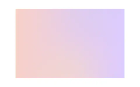
A soft, horizontal pastel gradient used as a standalone product-story visual, framed by generous white space.
Section marker
A large black rounded-square mark sits beside a prominent section title, as seen with Workflows and Dashboard.
Imagery · The hero uses a soft, floating 3D-style arrangement of commerce and integration tiles, partly cropped by the viewport and washed against a light background. Later sections use simple pastel gradient rectangles and sparse product-story visuals. Treat imagery as a supporting focal point, not a background texture: keep it isolated, softly lit, and surrounded by white space. Avoid adding photographic imagery where the page shows abstract product visuals.
Set major headings in large, regular-weight black sans-serif.
Reserve Action Violet for prominent calls to action and fine outlines.
Use pastel gradients as isolated narrative accents.
Create long, deliberate pauses between major sections.
Keep feature copy concise and visually subordinate to its title.
✕ 不该做
Do not turn every section into a card grid.
Do not spread gradients across the full page background.
Do not add heavy shadows or decorative borders.
Do not introduce extra typefaces or bold-heavy typography.
Do not crowd the hero with dense navigation or supporting copy.
Do not treat illustration colors as general-purpose interface colors.
给 AI 的提示词
想快速出一个同风格的新页面,把这段话连同 DESIGN.md 一起发给 AI。
Build a new page in Krepling's visual style: start with a Gallery White (#ffffff) canvas, sparse black navigation, and generous open space. Use one regular sans-serif family, with large, lightly tracked black headings and concise gray supporting copy. Arrange content asymmetrically or in simple centered feature moments rather than dense grids. Use Action Violet (#b154f9) for the main CTA, with a white label; keep secondary actions transparent with a thin violet outline. Introduce gradients only as isolated product-story visuals, drawing from Peach Haze (#f8d1c9), Lilac Mist (#ddccff), Sky Wash (#8dc8ff), and Mint Glow (#9dffca). Use black (#000000) sparingly for focused feature panels with white text. Keep surfaces flat, corners softly rounded, and section transitions spacious.