North star · Keep the interface nearly white and editorially quiet, letting real product imagery provide the color and visual energy.
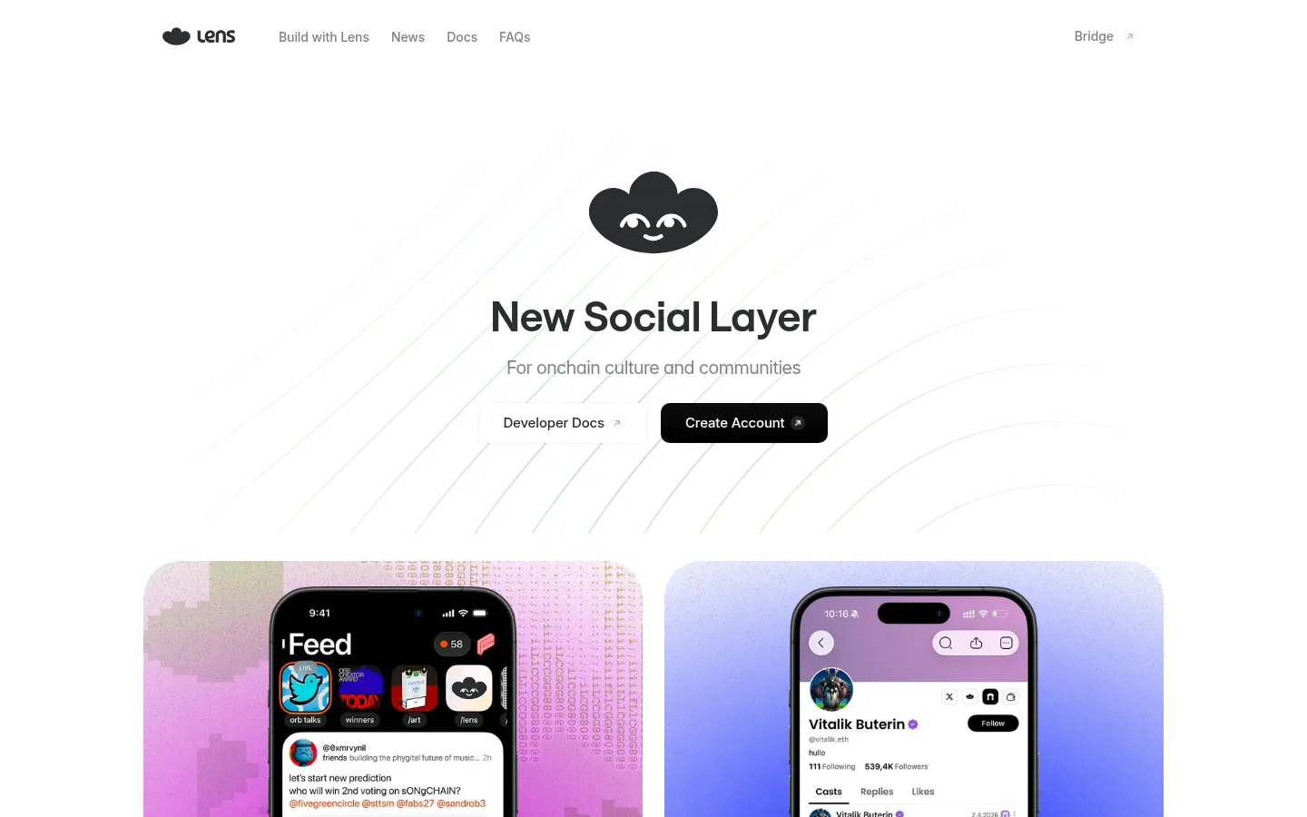
The page uses white as its dominant canvas, with charcoal headings and subdued gray supporting copy keeping attention on the message. Pale lavender-gray surfaces frame app cards, while saturated pink, violet, and blue appear mainly in product screenshots and illustrations rather than as interface-wide brand accents. Saans gives headlines a rounded, contemporary character; Inter handles navigation, body copy, and compact labels. The hero is centered and deliberately quiet, with a small mascot above the headline and fine curved lines behind its calls to action. Large app previews provide the visual counterweight below. Subsequent sections retain white backgrounds, centered headings, and compact content groups. Generous open areas separate the showcase, app directory, ecosystem metrics, and footer, while card corners and pill-like navigation soften the otherwise clean geometry. Buttons are black, clear, and restrained, with subtle shadows rather than prominent borders.
Navigation, body copy, captions, labels, and utility links.
Aa 设计
saans
网络字体 · 字重 500 / 600 · 占比 6%
免费替代:Inter
Hero and section headings, plus selected app-card copy.
角色
示例
字号
字重
行高
字距
一级标题
Centered hero headline.
Lens
46px
600
1.2
0
二级标题
Major section headings, including Explore Apps.
Lens
28px
500
1.35
0
三级标题
Smaller headings within feature or content groups.
The quick brown fox 敏捷的狐狸
21px
500
1.4
0
四级标题
Supporting subheads and card-level headings.
The quick brown fox 敏捷的狐狸
20px
400
1.45
-0.025em
正文
Descriptions and explanatory page copy.
The quick brown fox 敏捷的狐狸
16px
400
1.4
-0.022em
辅助文字
Compact app labels, metrics, and footer details.
The quick brown fox 敏捷的狐狸
12px
400
1
-0.042em
导航
Top navigation and primary menu items.
The quick brown fox 敏捷的狐狸
14px
500
normal
-0.006em
眉题
Small uppercase category labels above content.
The quick brown fox 敏捷的狐狸
11px
500
1.45
0.06em
间距与布局
基准单位 4px · 密度:紧凑
32px版块间距
4px元素间距
—卡片内边距
1082px内容最大宽度
4px
6px
12px
16px
18px
24px
32px
48px
Use a centered content frame with a measured maximum width of 1082px, while keeping section backgrounds full-width and white. The navigation is a compact horizontal row; the hero is centered, followed by paired wide product previews. Later content shifts into a multi-column app directory and three-part statistics row, then a two-column footer. Keep the overall density compact within each group, but use generous blank intervals between major sections. Align section titles centrally and let cards establish the local grid.
圆角与层次
按钮 · 10px
卡片 · 40px
图片 · 50%
导航 · 9999px
链接 · 8px
hairline · link
hairline · button
md · link
md · button
Favor flat white sections and pale surfaces over heavy elevation. Cards are defined mainly by their large rounded silhouettes and light contrast against the canvas. Reserve subtle, low-opacity shadows for buttons and compact links; use fine hairlines sparingly and avoid stacked, dramatic layers.
组件
下面的预览按实测的按钮、输入框、徽标、卡片样式重建(字体用替代字体)。
Compact header
Place the Lens mark and small Inter navigation links in a restrained horizontal row; keep the Bridge link separated at the far end.
Centered hero
Stack a small mascot, centered Saans headline, muted supporting line, and paired documentation and account actions.
Primary action
Use a black button with white Inter text, a 10px radius, and a subtle measured hairline shadow.
Product preview cards
Show two large, 40px-radius product panels with colorful app imagery and compact bottom information strips.
App directory
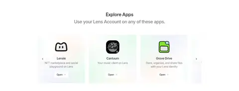
Present application entries in a compact multi-column arrangement with small icons, short descriptions, and Open links.
Ecosystem metrics
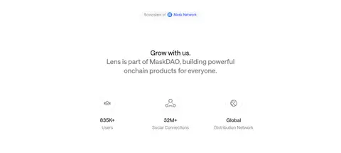
Center a concise heading above three evenly distributed icon-and-number metrics with muted supporting labels.
Footer
Keep the brand mark on one side and grouped navigation links on the other, followed by a quiet copyright line.
Imagery · Use large, rounded product-preview panels featuring authentic app screens and phone mockups. Their pink, violet, and blue backdrops supply the strongest color, so keep surrounding UI neutral. A small dark mascot and restrained curved-line illustration anchor the hero; ecosystem marks and app icons remain small, crisp accents rather than oversized decoration.
Use Soft Charcoal for the strongest text hierarchy.
Reserve Lavender Haze for subtle card or control surfaces.
Let colorful product screenshots carry most of the visual saturation.
Center the hero and major section headings.
Use black, understated calls to action with white labels.
Preserve generous whitespace between content groups.
✕ 不该做
Do not introduce unmeasured interface palette colors.
Do not turn illustration colors into full-width section backgrounds.
Do not crowd the hero with navigation or extra copy.
Do not add heavy shadows, thick borders, or dense card chrome.
Do not make supporting text compete with the primary heading.
Do not use oversized decorative elements throughout the page.
给 AI 的提示词
想快速出一个同风格的新页面,把这段话连同 DESIGN.md 一起发给 AI。
Build a new Lens-style page as a bright, restrained canvas. Use Gallery White (#ffffff) for the main background, Soft Charcoal (#2c2d30) for primary text, Quiet Slate (#808183) for secondary copy, and Lavender Haze (#f4f1f6) only for pale surfaces and fine borders. Set headings in Saans or a close substitute and interface text in Inter. Keep the top navigation compact, then center the hero with a small brand illustration, clear headline, short muted subtitle, and paired actions. Follow with rounded, image-led product panels; keep any vivid color inside real product visuals rather than adding decorative interface accents. Use centered section titles, compact app grids, simple metrics, and a sparse footer. Favor flat surfaces, subtle shadows, clean spacing, and concise copy.