North star · Keep the interface nearly black and understated so one vivid, cinematic product image and a precise violet CTA carry the visual focus.
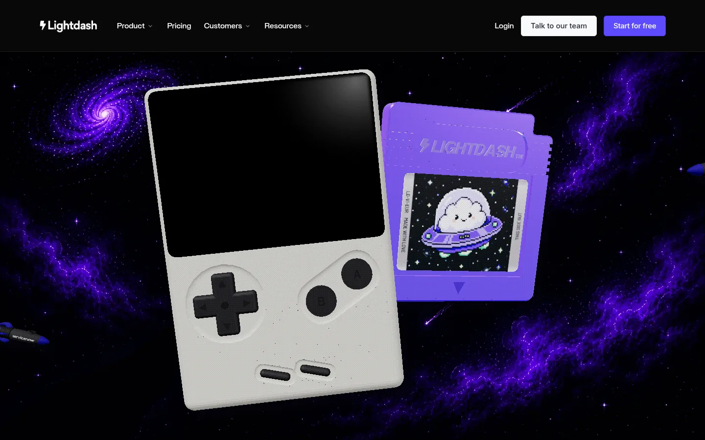
The page is defined by a near-black canvas and a large, cinematic product image rather than by a succession of visible content sections. The navigation sits in a distinct black band, with the Lightdash mark and compact links in white; a pale secondary action and saturated violet primary CTA provide the key interface accents. The hero image stages a handheld console and branded cartridge against deep space, with vivid purple nebulae and stars. Those brighter image colours are illustrative rather than a replacement for the restrained interface palette. Britti Sans Medium anchors the site’s body and navigation, with Inter used for captions; both read cleanly at compact scale. The layout uses a wide, centered composition and comfortable spacing, giving the artwork room to dominate while keeping navigation concise. Rounded CTA corners are subtle; the overall treatment favors flat dark surfaces and image-led depth over visible borders or shadows.
配色
点色块复制色值。用途说明来自对页面的实测位置(背景、文字、描边、按钮)与截图判读。
强调色
表层色
中性色
功能色
页面底色 · Night Canvas表层 · Gallery White表层 2 · Black Panel表层 3 · Charcoal Panel主文字 · Gallery White次要文字 · Muted Graphite强调 · Signal Violet
General body copy where present beyond the visible first viewport.
The quick brown fox 敏捷的狐狸
16px
500
2
0.01em
辅助文字
Compact supporting labels and caption-sized content.
The quick brown fox 敏捷的狐狸
15px
500
1.2
0
导航
Header links, login, and navigation actions.
The quick brown fox 敏捷的狐狸
16px
500
2
0.01em
间距与布局
基准单位 2px · 密度:适中
—版块间距
10px元素间距
—卡片内边距
1280px内容最大宽度
2px
4px
5px
8px
10px
12px
14px
16px
20px
24px
32px
The measured page width is capped at 1280px, while the opening composition reads as a broad, nearly full-bleed hero beneath a single horizontal navigation row. Navigation content is distributed across the width: brand and links on the left, login and actions on the right. The screenshot shows a comfortable, uncluttered header and a dense hero image that fills the remaining viewport. The section measurement reports four columns, but the visual evidence is a single continuous composition rather than a visible card grid.
圆角与层次
按钮 · 6px
没有测到阴影:页面是扁平的,层次靠底色和描边区分。
The visible interface is mostly flat: a black navigation band sits above the image without prominent shadows or borders. Depth comes from the hero artwork’s overlapping objects, lighting, and atmospheric background. CTA corners are subtly rounded; avoid adding card-like elevation to the restrained header.
组件
下面的预览按实测的按钮、输入框、徽标、卡片样式重建(字体用替代字体)。
Top navigation
A black horizontal header with the Lightdash mark, compact product and resource links, login, and two right-aligned actions.
Primary CTA
“Start for free” uses measured #5e4cff, a 6px radius, and compact padding; keep it the strongest interface accent.
Secondary CTA
“Talk to our team” is a pale button with dark text, measured 6px radius, and restrained contrast against the dark header.
Hero artwork
Full-width cosmic 3D scene featuring a handheld console and branded game cartridge, with saturated violet space imagery.
Imagery · A large 3D-rendered handheld console and cartridge sit against a starfield with saturated purple nebulae. The objects are tilted and layered, with the console foregrounded and cartridge behind it; the black screen and cosmic backdrop create contrast. Treat this as bespoke hero artwork, not as a source for expanding the interface palette.
Do not treat illustration colors as interface tokens.
Do not make the navigation visually louder than the hero.
给 AI 的提示词
想快速出一个同风格的新页面,把这段话连同 DESIGN.md 一起发给 AI。
Build a new page in Lightdash’s restrained, dark product-led style. Use Night Canvas (#07060f) and near-black surfaces (#080808, #0c0c0c) for the interface, with Gallery White (#ffffff) for legible navigation and Signal Violet (#5e4cff) only for the primary action. Keep the header compact and horizontal: brand and concise links to the left, login and paired actions to the right. Use Britti Sans Medium for navigation and body copy, with Inter for small captions. Give the main content a wide, image-led composition and comfortable breathing room; favor a single polished product visual over a busy grid. If using cosmic purple imagery, keep it within the artwork. Favor flat surfaces, subtle CTA rounding, and clear contrast over decorative borders, shadows, or gradients.