North star · Keep the page calm and white-led, reserving saturated gradients for immersive product moments and violet for clear actions.
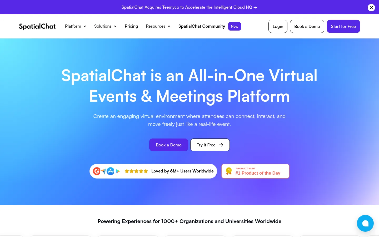
The visual identity is built on a white canvas, dark readable headings, muted gray supporting copy, and a strong violet CTA. The hero is the key exception: a luminous cyan-to-blue-to-violet field carries centered white typography and gives the page its immersive, event-like character. Satoshi is used throughout, with large, calm headings and compact body copy; capitalization is restrained outside the measured title treatment. The page alternates centered explanation and logos with left-right product feature blocks, then shifts into pale gray section bands for platform categories, metrics, testimonials, and FAQs. Product imagery is prominent and presented in rounded, dark-framed interface captures rather than decorative illustration. Cards remain mostly flat, defined by delicate gray borders and subtle shadows. Generous section breaks and repeated violet buttons keep the extensive content scannable without losing the consistent product-led rhythm.
All page typography, including navigation, headings, body copy, buttons, and links.
角色
示例
字号
字重
行高
字距
特大标题
Largest hero or high-impact display statements.
SpatialChat
60px
700
1.3
0
一级标题
Primary page and major section headings.
SpatialChat
48px
500
1.3
0
二级标题
Prominent section titles such as platform and proof headings.
SpatialChat
44px
500
1.3
0
三级标题
Feature and supporting section headings.
SpatialChat
40px
500
1.3
0
四级标题
Card or subsection titles within feature content.
SpatialChat
32px
500
1.3
0
正文
Explanatory paragraphs and feature descriptions.
The quick brown fox 敏捷的狐狸
18px
400
1.5
0
辅助文字
Compact supporting labels and testimonial details.
The quick brown fox 敏捷的狐狸
16px
400
1.4
0
按钮
CTA labels and compact action controls.
The quick brown fox 敏捷的狐狸
16px
500
1.5
0
导航
Header navigation links and menu labels.
The quick brown fox 敏捷的狐狸
16px
500
1.6
0
链接
Inline links and secondary navigation actions.
The quick brown fox 敏捷的狐狸
16px
500
1.5
0
间距与布局
基准单位 4px · 密度:适中
80px版块间距
16px元素间距
14px卡片内边距
1200px内容最大宽度
2px
4px
6px
8px
10px
12px
14px
15px
16px
20px
24px
25px
32px
40px
60px
64px
The measured content uses a 1200px maximum-width frame with comfortable density and a 4px base spacing unit. The navigation and hero begin with centered alignment; the homepage then alternates centered logo and product sections with two-column feature stories. Pale bands distinguish selected content groups. Repeated section breaks create a spacious long-scroll rhythm, while cards, metric tiles, and FAQ rows keep dense information organized. A consistent 16px element gap supports compact internal groupings.
圆角与层次
按钮 · 12px
卡片 · 16px
图片 · 50%
导航 · 8px
lg · card
hairline · button
md · card
sm · card
The interface favors flat white and pale-gray surfaces. Fine gray borders define cards and media, while cards receive restrained soft shadows rather than strong elevation. Product screenshots have darker frames and stronger visual weight, separating them from surrounding copy. Rounded corners soften CTA buttons, navigation controls, and cards without making the page feel ornamental.
组件
下面的预览按实测的按钮、输入框、徽标、卡片样式重建(字体用替代字体)。
Announcement bar
A full-width violet strip above the navigation, with centered white linked text and a close control.
Primary CTA
Violet fill, white medium-weight Satoshi label, 12px radius, and measured vertical padding of 12px.
Navigation
White horizontal header with brand mark, compact text links, outlined secondary actions, and a violet free-start action.
Feature card
Pale-gray surface, fine #e5e7eb border, rounded corners, and concise dark heading with supporting text.
Product media
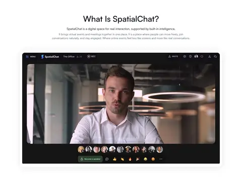
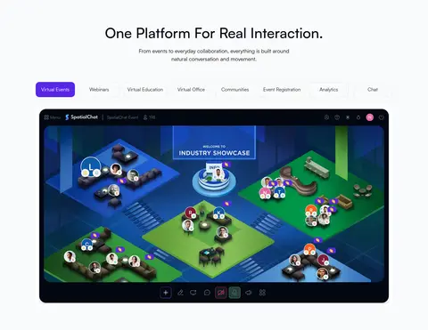
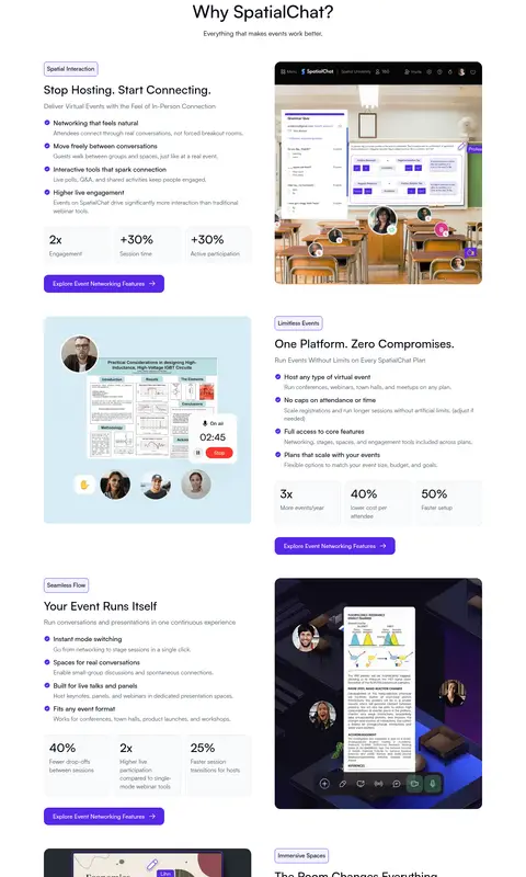
Large rounded, dark-framed virtual event or meeting screenshot, shown beside or beneath explanatory copy.
Proof tiles
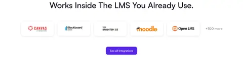
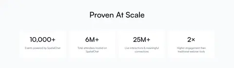
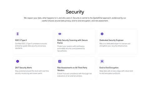
Logo, metric, or testimonial content grouped in clean cards with ample white space and subtle separators.
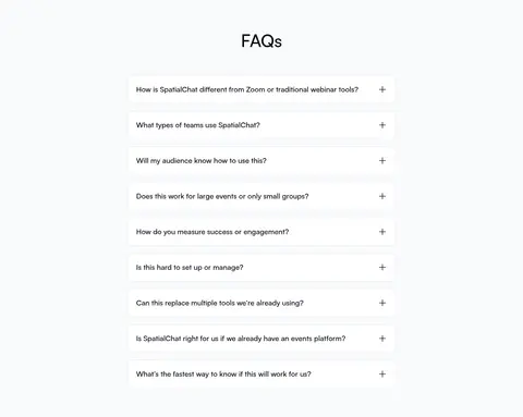
FAQ row
A simple question row on a pale section band, separated by light rules and ending in a plus affordance.
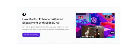
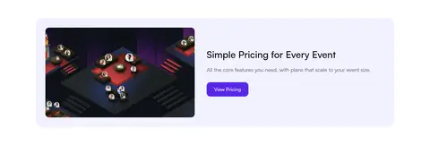
Imagery · Product imagery is the main visual proof: dark-framed screenshots show virtual rooms, meetings, and event interfaces, often with participant avatars and controls. A video-style interface capture anchors the early product explanation. Customer logos, testimonial cards, and event photography add evidence and human context. Images sit in rounded media frames; the hero itself is primarily a broad gradient field rather than a photographic backdrop.
Use white as the default canvas and let content breathe.
Reserve the blue-violet gradient for immersive hero-like moments.
Use #5727e7 consistently for the main action.
Set product screenshots in rounded, dark media frames.
Alternate centered introductions with paired feature layouts.
Use pale-gray bands to signal changes in content grouping.
✕ 不该做
Do not turn every section into a gradient panel.
Do not replace product evidence with generic decorative art.
Do not use heavy shadows or thick borders on ordinary cards.
Do not crowd the centered hero with extra content.
Do not introduce unrelated accent colors beyond the measured palette.
Do not make secondary copy compete with the headings or CTAs.
给 AI 的提示词
想快速出一个同风格的新页面,把这段话连同 DESIGN.md 一起发给 AI。
Build a new SpatialChat-style SaaS page with a bright, product-led feel. Use Gallery White (#ffffff) for the main canvas, Midnight Ink (#030712) for headings, Slate Copy (#4b5563) for supporting text, and Cloud Panel (#f9fafb) for selected section bands. Make the primary action Event Violet (#5727e7), with white text and rounded corners. Use a wide cyan-blue-violet gradient sparingly for an immersive hero or product moment, not as a default section background. Set all text in Satoshi or a close sans-serif substitute such as Manrope. Structure content with a centered intro, paired feature stories, product screenshots in dark rounded frames, customer proof, metrics, and a restrained FAQ. Keep borders delicate, shadows subtle, and spacing comfortable.