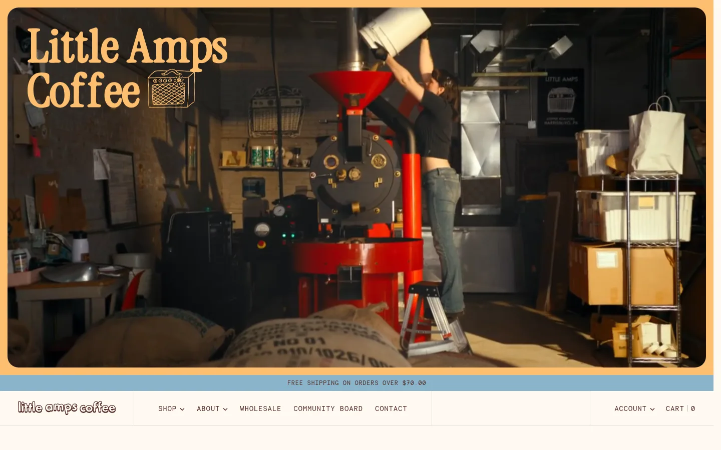
Little Amps 以奶油色与烘焙棕构建温暖基调,搭配鲜明字形、烘焙现场摄影和紧凑的商品陈列。首页将咖啡选购、社区内容、批发信息与品牌周边融为一体。
North star · Keep the warm paper-and-roast palette constant while letting candid coffee imagery and expressive display type give each compact section its own character.
The page builds its identity from a warm parchment canvas (#fff9f2), deep coffee-brown typography (#522c25), and unvarnished photographs of roasting and serving coffee. Orange-red (#c03001), golden orange (#c46500), and soft yellow (#febf6f) act as small, high-visibility accents for calls to action, highlighted words, and product controls; pale blue (#89b4ca) appears as a distinctive band and occasional button treatment. Display headings use the custom Little Amps face with tight tracking, while Inclusive Sans keeps descriptions readable and Necto Mono gives navigation and labels a utilitarian, all-caps character. The page alternates full-width photographic features with tightly packed product and story grids, using thin warm-gray rules to distinguish blocks without adding heavy shadows. Hand-drawn coffee illustrations add an informal counterpoint to real product and community photography.
Display headings, featured product names, and expressive navigation branding.
Aa 设计
Necto Mono
网络字体 · 字重 400 / 500 · 占比 7%
免费替代:Space Mono
Navigation, eyebrows, labels, and compact calls to action.
Aa 设计
Roboto Mono
网络字体 · 字重 400 · 占比 2%
免费替代:Roboto Mono
Minor monospace details and small utility text.
角色
示例
字号
字重
行高
字距
一级标题
Hero and primary display headline styling.
Little Amps Coffee
45px
500
1
-0.1em
二级标题
Major section headings and promotional feature titles.
Little Amps Coffee
41px
500
1
-0.1em
三级标题
Product-feature and editorial card headings.
The quick brown fox 敏捷的狐狸
21.5px
500
1
-0.1em
四级标题
Smaller titled content blocks, often capitalized.
The quick brown fox 敏捷的狐狸
20px
500
1
-0.1em
正文
Compact explanatory paragraphs and product descriptions.
The quick brown fox 敏捷的狐狸
13px
400
1.1
0
辅助文字
Product metadata, dates, and image captions.
The quick brown fox 敏捷的狐狸
12px
400
1.1
0
链接
Expressive product names and prominent text links.
The quick brown fox 敏捷的狐狸
21.5px
500
1
-0.1em
眉题
Uppercase section labels and category markers.
The quick brown fox 敏捷的狐狸
12px
400
1
0.05em
代码
Small uppercase monospace utility labels.
const style = 1;
12px
400
1
0.05em
间距与布局
基准单位 2px · 密度:紧凑
40px版块间距
2px元素间距
36px卡片内边距
—内容最大宽度
2px
3px
4px
5px
6px
7px
8px
10px
12px
15px
16px
20px
24px
30px
36px
90px
A long, vertically stacked storefront uses a full-width video hero, a slim announcement strip, and a compact horizontal navigation bar before moving into content. Product areas mix a large feature tile with a narrow featured item and a four-column merchandise grid; later sections alternate two-column promotions and multi-column community cards. Most sections align to the viewport with consistent side gutters, while product and story cards are separated by fine rules. The measured page has a compact density, with short gaps inside blocks and clearer breathing room between major bands.
圆角与层次
按钮 · 2px
卡片 · 8px
图片 · 3px
链接 · 8px
没有测到阴影:页面是扁平的,层次靠底色和描边区分。
The interface is largely flat: no measured shadows, and borders are sparse, thin, and warm-toned. Card identity comes from pale fills, image framing, and spacing rather than floating layers. Rounded corners appear on cards and media, while buttons remain nearly square. Use overlapping only where a photograph or graphic naturally crosses a promotional composition.
组件
下面的预览按实测的按钮、输入框、徽标、卡片样式重建(字体用替代字体)。
Announcement bar
A narrow blue band carries centered, uppercase shipping copy in a small monospace style.
Store navigation
A pale horizontal bar combines the wordmark, uppercase Necto Mono menu links, subtle dividers, and account/cart utilities.
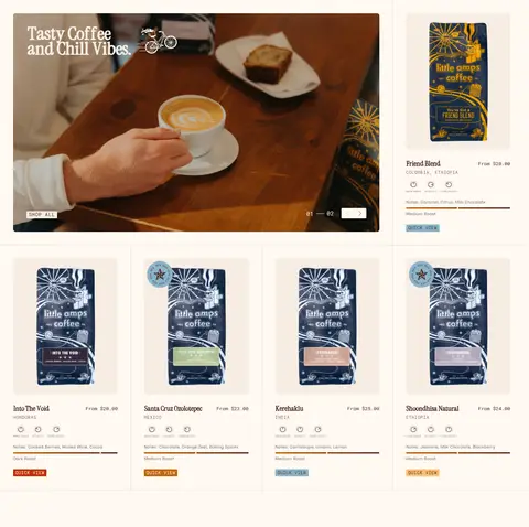
Featured coffee grid
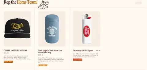
A large lifestyle feature sits beside a featured coffee card, followed by four compact product cards with names, notes, prices, and quick-view controls.
Quick-view button
Small uppercase Necto Mono label on a compact, 2px-radius control; red, copper, or honey fills vary across products.
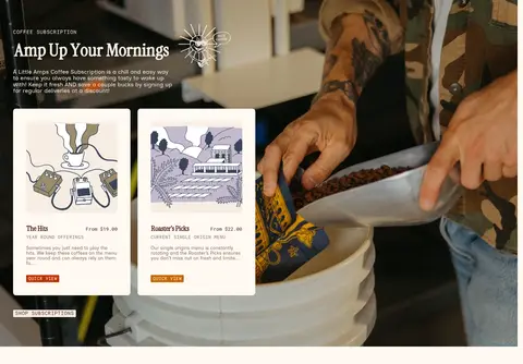
Photo-led promotion
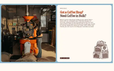
A broad coffee-making image carries a heading, short copy, and small product cards in a split promotional composition.
Community feed
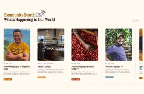
A row of editorial cards combines portrait or origin photography, compact date/category metadata, short titles, and small read-more links.
Brand footer
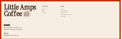
A large cream panel framed in red pairs an oversized wordmark with visit, company, and shop links above a thumbnail strip.
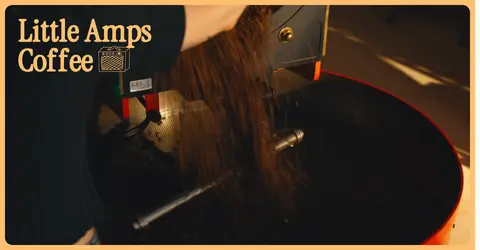
Imagery · Use candid, warmly lit footage and photography of roasting, pouring, packaging, and people in the coffee community. Hero and promotional imagery can run broad and immersive, while product photos stay isolated on pale backgrounds in orderly cards. Supplement photography with small hand-drawn coffee or music-inspired line illustrations; keep these illustrative colors secondary to the measured interface palette.
Use Parchment Cream (#fff9f2) as the dominant page canvas.
Set primary text and links in Roast Ink (#522c25).
Reserve the orange and honey accents for compact controls and emphasis.
Use the custom display face for expressive, closely tracked headings.
Pair product grids with candid coffee photography and concise metadata.
Separate dense cards with fine Warm Divider (#e6dad4) rules.
Use small hand-drawn illustrations as supporting details.
✕ 不该做
Do not replace the warm cream canvas with stark white.
Do not use large gradients or heavy drop shadows.
Do not make every section a uniform product grid.
Do not let decorative illustrations overwhelm product photography.
Do not use large blocks of uppercase monospace body copy.
Do not introduce unmeasured brand colors for interface elements.
给 AI 的提示词
想快速出一个同风格的新页面,把这段话连同 DESIGN.md 一起发给 AI。
Build a new Little Amps Coffee page as a warm, compact specialty-coffee storefront. Use Parchment Cream (#fff9f2) for the canvas, Roast Ink (#522c25) for core text, and Warm Divider (#e6dad4) for subtle separators. Apply Roaster Red (#c03001), Copper Orange (#c46500), and Honey Gold (#febf6f) sparingly to small actions and highlighted details; use Roastery Blue (#89b4ca) for an occasional band or control. Pair expressive, tightly tracked display headings with readable Inclusive Sans copy and uppercase Necto Mono labels. Organize content into varied full-width photo features, product grids, split promotions, and editorial community cards. Favor candid roasting and coffee-service photography, plus restrained hand-drawn illustrations. Keep surfaces flat, cards gently rounded, and product metadata concise; avoid gradients and heavy shadows.