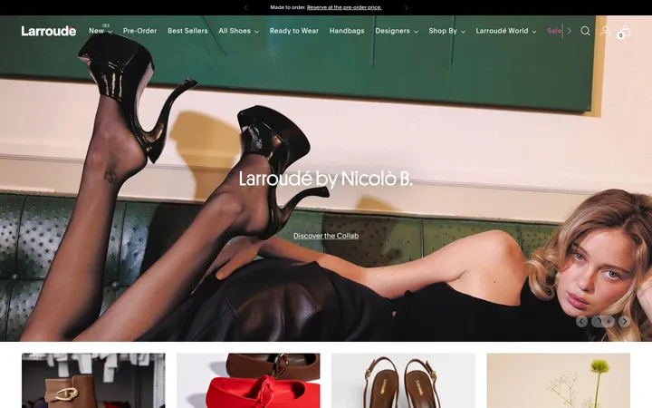
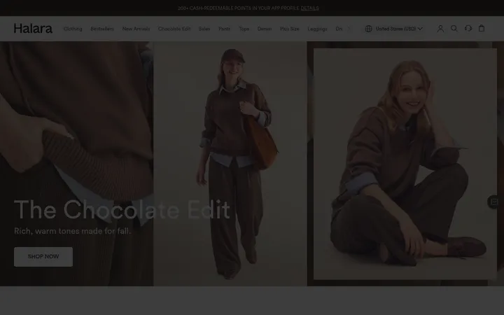
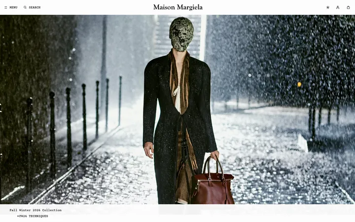
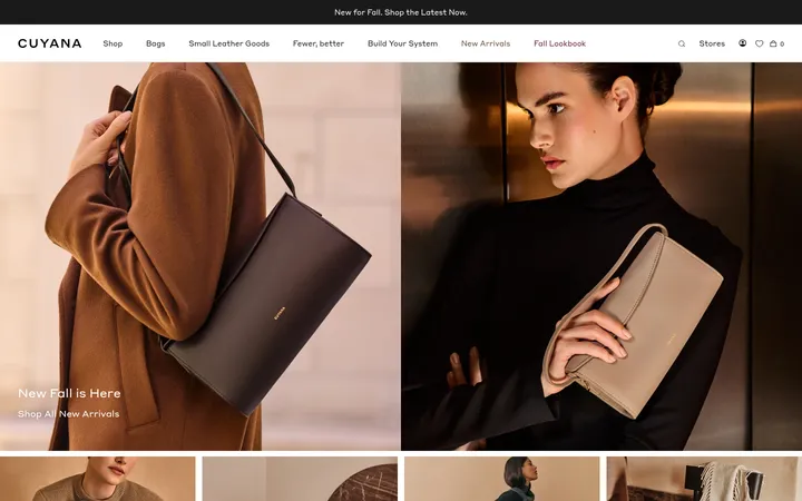
North star · Let refined editorial typography and warm footwear photography lead, while keeping the interface neutral, spacious, and easy to shop.
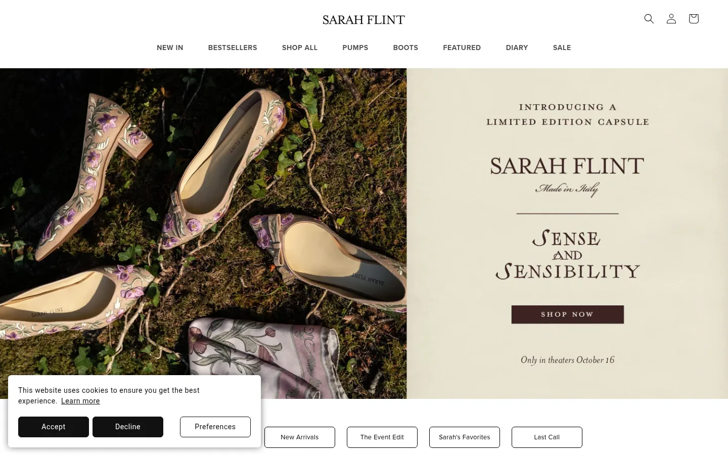
The page uses a white canvas as its visual anchor, with near-black typography and pale gray product-card surfaces keeping the storefront quiet and legible. The muted palette supports the imagery rather than competing with it: campaign photography supplies warm creams, browns, and deep botanical shadows, while the footer becomes a distinct dark information band. IvyPresto Display brings an editorial, feminine character to headings and product names; Proxima Nova handles navigation, labels, and controls with a more functional voice. The layout alternates broad campaign panels with centered category introductions and compact, multi-column shoe grids. Product photography is cleanly framed against light backgrounds, while lifestyle images add texture and context. Generous section separation lets these different image modes breathe. Borders and small badges mark interactions and product details without adding heavy decoration or elevation.
Editorial headings, product names, and prominent text links.
Aa 设计
proxima-nova
网络字体 · 字重 400 / 700 · 占比 47%
免费替代:Montserrat
Navigation, buttons, captions, labels, and functional storefront text.
角色
示例
字号
字重
行高
字距
一级标题
Primary campaign or page heading in editorial display serif.
Sarah Flint
40px
400
1.3
0.015em
二级标题
Section titles introducing categories and product collections.
Sarah Flint
30px
400
1.3
0.02em
三级标题
Product and secondary editorial headings.
The quick brown fox 敏捷的狐狸
24px
400
1.3
0.025em
四级标题
Smaller collection headings and supporting content titles.
The quick brown fox 敏捷的狐狸
18px
400
1.3
0.033em
正文
Editorial descriptions and supporting brand copy.
The quick brown fox 敏捷的狐狸
13px
400
1.5
0.077em
辅助文字
Compact product labels and image captions.
The quick brown fox 敏捷的狐狸
12px
400
0.83
0.083em
按钮
Shopping, newsletter, and carousel controls.
The quick brown fox 敏捷的狐狸
15px
400
1.2
0.067em
导航
Primary category navigation and utility menu labels.
The quick brown fox 敏捷的狐狸
14px
700
1.3
0.043em
链接
Product names and editorial text links.
The quick brown fox 敏捷的狐狸
16.5px
400
1.3
0.037em
眉题
Uppercase introductory labels above headings.
The quick brown fox 敏捷的狐狸
10px
700
1.2
0.13em
间距与布局
基准单位 1px · 密度:适中
50px版块间距
18px元素间距
—卡片内边距
780px内容最大宽度
1px
2px
4px
5px
6px
7px
10px
12px
16px
30px
50px
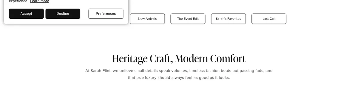
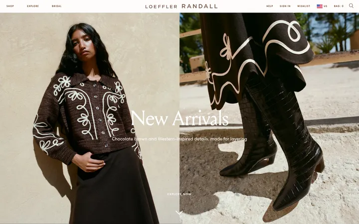
A centered header sits above a full-bleed split campaign hero. The rest of the page alternates centered category introductions, four-column image tiles, and four-column product grids with large photographic bands between them. Measured content max width is 780px; campaign media may span the viewport. The page uses a comfortable density and a measured 50px section gap, with headings commonly centered and the newsletter footer aligned in columns.
圆角与层次
图片 · 50%
徽标 · 2px
链接 · 6px
没有测到阴影:页面是扁平的,层次靠底色和描边区分。
The interface is predominantly flat: no measured shadow system or gradients define the page. Product cards rely on pale backgrounds, while thin gray outlines distinguish select media and badges. The cookie notice is visibly layered above the hero in the screenshot, but keep ordinary sections and cards unraised.
组件
下面的预览按实测的按钮、输入框、徽标、卡片样式重建(字体用替代字体)。
Primary navigation
White header with a centered wordmark, utility icons, and a horizontal category menu in bold Proxima Nova; keep links dark and unboxed.
Campaign hero
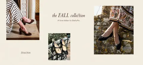
Full-bleed split composition pairing footwear photography with a pale editorial panel, serif display copy, and a restrained shop CTA.
Category tile
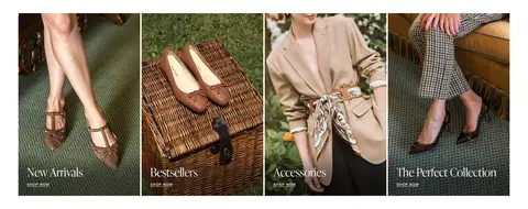
Four-image lifestyle row with image-led cards and small overlaid serif labels; use photography rather than ornamental card chrome.
Product card
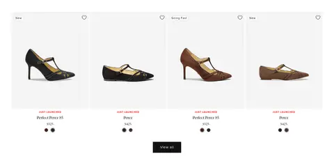
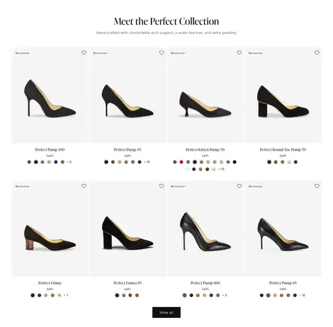
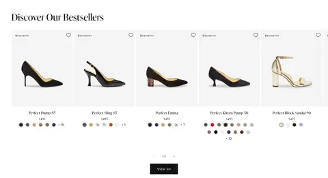
Footwear isolated on #f4f4f4, with small badge, serif product name, price, and compact color options below.
Product badge
Small, lightly filled badge with dark text and a fine #dddddd border; use for labels such as New or Bestseller.
Newsletter footer
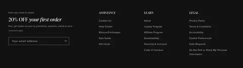
Dark #121212 footer band with offer copy, email input, and grouped assistance and policy links in subdued light text.
Text link
Dark serif product or editorial link; measured text links use #121212, with occasional understated outlined navigation-style links.
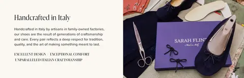
Imagery · Photography defines the page: isolated shoes sit on pale, low-detail card backgrounds, while full-width campaign panels show footwear in styled settings and brand-making scenes. Category tiles use cropped lifestyle shots that include models, outfits, and product context. The top campaign pairs a dark, textured shoe photograph with a light editorial text panel. No illustrative or 3D treatment defines the brand.
Keep the main canvas white and the interface palette restrained.
Use editorial serif type for collection titles and product names.
Let campaign photography carry warmth, texture, and color.
Keep product images clean against pale gray card surfaces.
Use dark sans-serif text for functional navigation and controls.
Separate major image and product sections with generous breathing room.
✕ 不该做
Do not introduce gradients or decorative shadows.
Do not use bright accent colors as large interface surfaces.
Do not crowd product cards with extra visual chrome.
Do not apply the footer's dark treatment to the whole page.
Do not force campaign photography into a uniform product-grid crop.
Do not replace the serif and sans-serif contrast with a single type voice.
给 AI 的提示词
想快速出一个同风格的新页面,把这段话连同 DESIGN.md 一起发给 AI。
Build a luxury footwear storefront page in the Sarah Flint visual style. Use Gallery White (#ffffff) as the canvas, Soft Ink (#121212) for core text and the dark newsletter footer, Porcelain Gray (#f4f4f4) behind isolated shoe photography, and fine neutral borders such as Fine Silver (#cccccc) only where useful. Pair an elegant editorial serif similar to Cormorant Garamond with a clean functional sans-serif similar to Montserrat. Structure the page with a quiet centered header, a split full-bleed campaign, image-led category tiles, airy product grids, and a dark multi-column footer. Keep product details restrained and readable; use small outlined badges and simple controls. Use warm lifestyle photography to supply color, and avoid gradients, heavy shadows, or oversized interface accents.