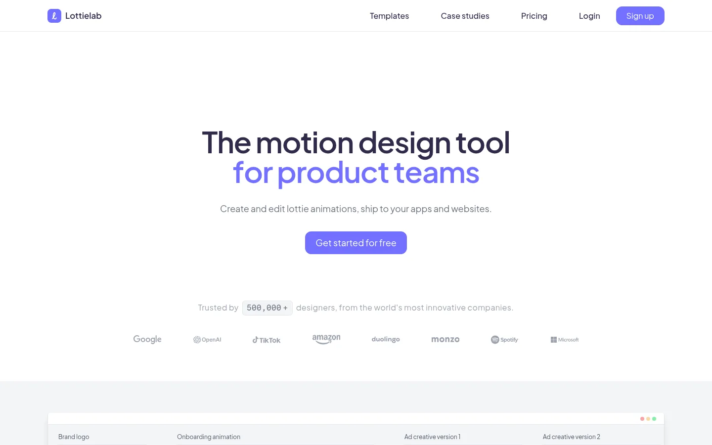
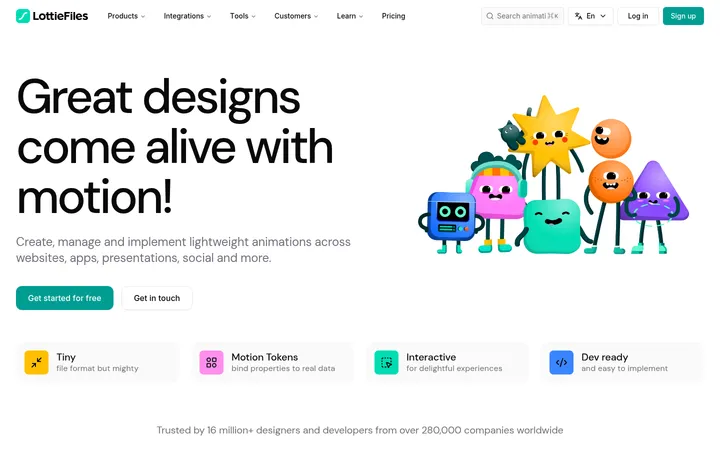
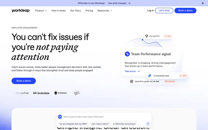
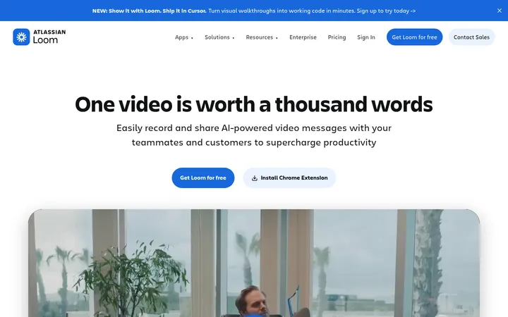
Lottielab以宽敞明亮的界面、克制的紫色点缀和精致的产品画面展示动画编辑工具。页面将居中的产品主张与功能说明、模板、用户评价及深色展示区结合起来。
North star · Keep the interface airy and product-led, using violet sparingly to guide attention through a sequence of clear demonstrations.
The page uses white as its dominant canvas, giving the product interface and centered hero message room to breathe. Soft gray bands distinguish the editor showcase and footer without turning the page into a stack of heavy cards. Violet is the signature action and emphasis colour: it appears on the primary buttons and selected words in headings, while most copy stays in deep charcoal or muted gray. Plus Jakarta Sans supplies a rounded, contemporary voice; bold, compact headlines contrast with quiet supporting text. Layouts alternate between centered statements, split feature explanations, and broad multi-column demonstrations, with generous vertical intervals between major topics. Product imagery is mostly interface-led: editor frames, animation previews, timelines, and template tiles explain the tool rather than decorative photography. A single deep-plum section creates a deliberate visual pause and frames colorful motion examples. Borders remain pale and subtle, keeping the experience crisp and product-focused.
配色 点色块复制色值。用途说明来自对页面的实测位置(背景、文字、描边、按钮)与截图判读。
品牌色
Motion Violet
#7270ff
Signature primary-button fill and selective heading emphasis.
强调色
Petal Pink
#ec4899
Appears in a measured gradient/text treatment; secondary to the core violet identity.
Coral Glow
#f87171
Appears in a measured gradient treatment, not as a primary interface colour.
Electric Blue
#1560fb
Small link or product-detail accent; not a dominant page colour.
Warm Sand
#e6b78b
Minor link or illustration accent, rather than a core brand surface.
表层色
Cloud Gray
#f6f6f6
Footer surface and light supporting media or link areas.
Midnight Plum
#1c1a2c
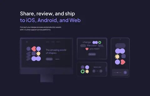
Full-width dark product showcase section.
中性色
Gallery White
#ffffff
Primary canvas for the hero, feature sections, templates, testimonials, and call-to-action.
Quiet Slate
#6b7280
Muted body copy and secondary explanatory text.
Deep Ink
#111827
Primary heading and body text on light backgrounds.
Pale Slate
#9ca3af
Low-emphasis testimonial copy and footer text.
Soft Graphite
#4b5563
Secondary text, supporting detail, and lower-priority labels.
Plum Ink
#2f2b4a
Navigation and link text, plus dark-toned headings.
Near Black
#030712
Rare dark text occurrence; not a defining page colour.
功能色
Hairline Gray
#e5e7eb
Fine outlines around cards, navigation, and interface elements.
文字 背景 对比度 WCAG #111827 Deep Ink#ffffff Gallery White17.74:1 AAA #111827 Deep Ink#f6f6f6 Cloud Gray16.41:1 AAA #111827 Deep Ink#1c1a2c Midnight Plum1.04:1 不达标 #6b7280 Quiet Slate#ffffff Gallery White4.83:1 AA #6b7280 Quiet Slate#f6f6f6 Cloud Gray4.47:1 AA-large #6b7280 Quiet Slate#1c1a2c Midnight Plum3.52:1 AA-large
字体 字号阶梯:Perfect Fifth(比例约 1.554,正文 16px)。示例用免费替代字体渲染,数值为实测。
Aa 设计
Plus Jakarta Sans 网络字体 · 字重 400 / 600 / 500 / 700 · 占比 100%
免费替代:DM Sans
Site-wide interface, navigation, headings, body copy, buttons, and captions.
角色 示例 字号 字重 行高 字距 特大标题 Large hero or campaign headline when prominent emphasis is needed.
Lottielab
60px 600 1 -0.025em 一级标题 Primary hero headline and major page-level statement.
Lottielab
48px 600 1 0 二级标题 Feature, template, testimonial, and conversion-section headings.
Lottielab
36px 600 1.11 0 正文 Feature explanations, supporting copy, and standard interface text.
The quick brown fox 敏捷的狐狸
16px 400 1.5 0 辅助文字 Small labels, compact notes, and testimonial attribution details.
The quick brown fox 敏捷的狐狸
14px 400 1.43 0 导航 Header navigation links.
The quick brown fox 敏捷的狐狸
16px 500 1.5 0 代码 Technical or code-like labels inside product demonstrations.
const style = 1;
16px 400 1.5 0.025em
间距与布局 基准单位 8px · 密度:宽松
96px 版块间距
2px 元素间距
24px 卡片内边距
1248px 内容最大宽度
2px
4px
8px
10px
16px
20px
24px
32px
40px
64px
96px
192px
Use a centered page frame capped at the measured 1248px maximum width, with broad whitespace around the content. The hero and template introduction are centered; feature content alternates between split layouts and multi-column demonstrations. Keep sections spacious, using the measured 96px section gap as the rhythm reference and a 24px card-padding reference. The page is intentionally low-density, with large uninterrupted white areas, occasional light-gray bands, and one full-width dark section.
圆角与层次 md · other
md · other
lg · other
The overall treatment is flat and restrained. Use pale measured hairlines to define cards and interface frames, with modest rounded corners. Layer product mockups clearly over their section backgrounds, but avoid heavy shadows; the measured shadows are subtle and should be reserved for occasional lifted media or emphasis.
组件 下面的预览按实测的按钮、输入框、徽标、卡片样式重建(字体用替代字体)。
Primary CTA Use Motion Violet (#7270ff) with white text, a 12px radius, and clear separation from nearby supporting copy.
Top navigation Keep the brand mark at the left and compact text links at the right; finish with a violet Sign up button and a fine lower hairline.
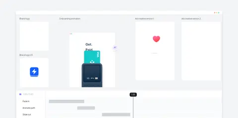
Product showcase Present the editor as a wide, pale-gray section with layered preview panels, animation frames, and a visible timeline.
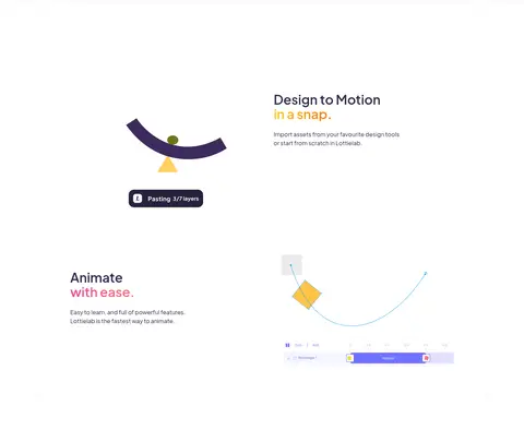
Feature split Pair a concise heading and explanatory copy with a product visual; alternate text and media alignment between feature rows.
Template gallery Combine a centered introduction and CTA with a tightly arranged, colorful set of visual template previews.
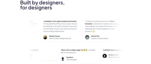
Testimonial cards Use restrained white cards with subtle #e5e7eb borders, muted testimonial copy, and compact author details.
Footer columns Set grouped product, resource, and company links on a #f6f6f6 surface, with understated text and a small brand mark.
Imagery · Prioritize crisp product-interface imagery: editor canvases, animation frames, timeline details, template previews, and interface cards. Place demonstrations in broad, clean frames and let their varied colorful assets supply visual interest. The dark showcase uses colorful examples against plum. Most visuals are illustrations or rendered UI rather than photography; keep surrounding surfaces quiet so the product remains legible.
页面版块 共 11 个版块,按页面从上到下排列,每个都标了类型、布局和交互套路。
首页
首屏 产品主视觉
Centered headline and description, primary CTA, then a compact trust statement and logo row.
产品展示 编辑器演示
Broad two-column product presentation with multiple animation preview panels and a timeline.
图文交替 快速设计动效
Alternating two-column feature rows, pairing concise copy with product illustrations.
集成生态 跨平台交付
Full-width dark section with left-aligned introduction and three product mockups.
其他 更多产品优势
Short left-aligned introduction on white, followed by a three-column benefits area.
功能网格 功能亮点
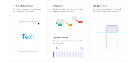
Three-column feature presentation with product illustrations beneath concise copy.
图集 模板精选
Centered heading and supporting line, followed by a browse CTA.
商品网格 模板画廊
Wide, compact mosaic of linked template preview tiles.
用户评价 用户评价
Left-aligned heading above a multi-column arrangement of testimonial cards.
行动号召 开始创作
Centered brand mark, heading, supporting copy, and primary CTA inside a spacious area.
页脚 页脚导航
Light-gray footer with brand mark, four link columns, and compact social or legal details.
该做与不该做 ✓ 该做 Use white as the dominant page canvas. Reserve violet for primary actions and selective emphasis. Alternate centered messaging with practical product demonstrations. Keep explanatory copy short and visually subordinate to headings. Use pale borders to define interface frames and cards. Give major sections generous breathing room. ✕ 不该做 Do not flood the page with saturated accent colours. Do not add dense, decorative backgrounds behind product UI. Do not rely on photography when product visuals explain the feature. Do not make every section a boxed card grid. Do not use heavy shadows as the default elevation treatment. Do not crowd the hero with extra navigation or competing messages. 给 AI 的提示词 想快速出一个同风格的新页面,把这段话连同 DESIGN.md 一起发给 AI。
复制 Build a new Lottielab-style page with Plus Jakarta Sans and a spacious, product-led layout. Use Gallery White (#ffffff) as the main canvas, Cloud Gray (#f6f6f6) for quiet supporting bands, and Midnight Plum (#1c1a2c) for one purposeful contrast section. Apply Motion Violet (#7270ff) to the primary CTA and a few highlighted words, not as a broad background. Set headlines in a confident, compact weight; keep supporting copy muted and concise. Alternate centered introductions with split feature rows and wide editor demonstrations. Show interface frames, timelines, animation previews, or template tiles as the main imagery. Use subtle Hairline Gray (#e5e7eb) borders, modest rounded corners, and generous section spacing. Keep the overall page calm, clear, and focused on demonstrating how the product works.
DESIGN.md Tailwind v4 CSS 变量 Design Tokens
---
title: "Lottielab design system"
variant: extended
source: https://www.lottielab.com/
captured_at: 2026-10-12
theme: light
industry: design
generator: Design DNA (https://four.wiralomi.com/style/lottielab-com)
ai_generated: true
ai_label: "本文件由 AI 辅助生成:数值取自公开网页的实测样式,命名、用途说明与建议为模型解读。商标归原所有者。 / AI-assisted content"
---
# Lottielab · Design System
> A calm canvas for expressive motion design
**Theme:** light · **Industry:** design · **Source:** https://www.lottielab.com/ · **Captured:** 2026-10-12 (1440×900 desktop)
_AI-assisted content: values are measured from the public page at capture time; names, roles and guidance are model-written interpretations. Trademarks belong to their owners._
Lottielab presents its animation editor through a spacious, light interface, restrained violet accents, and polished product visuals. The page balances centered product messaging with practical feature explanations, templates, social proof, and a contrasting dark showcase.
## North star
Keep the interface airy and product-led, using violet sparingly to guide attention through a sequence of clear demonstrations.
## Overview
The page uses white as its dominant canvas, giving the product interface and centered hero message room to breathe. Soft gray bands distinguish the editor showcase and footer without turning the page into a stack of heavy cards. Violet is the signature action and emphasis colour: it appears on the primary buttons and selected words in headings, while most copy stays in deep charcoal or muted gray. Plus Jakarta Sans supplies a rounded, contemporary voice; bold, compact headlines contrast with quiet supporting text. Layouts alternate between centered statements, split feature explanations, and broad multi-column demonstrations, with generous vertical intervals between major topics. Product imagery is mostly interface-led: editor frames, animation previews, timelines, and template tiles explain the tool rather than decorative photography. A single deep-plum section creates a deliberate visual pause and frames colorful motion examples. Borders remain pale and subtle, keeping the experience crisp and product-focused.
## Colors
| Name | Hex | Token | Group | Role |
|---|---|---|---|---|
| Gallery White | ` | `--color-gallery-white` | neutral | Primary canvas for the hero, feature sections, templates, testimonials, and call-to-action. |
| Motion Violet | ` | `--color-motion-violet` | brand | Signature primary-button fill and selective heading emphasis. |
| Cloud Gray | ` | `--color-cloud-gray` | surface | Footer surface and light supporting media or link areas. |
| Quiet Slate | ` | `--color-quiet-slate` | neutral | Muted body copy and secondary explanatory text. |
| Hairline Gray | ` | `--color-hairline-gray` | semantic | Fine outlines around cards, navigation, and interface elements. |
| Deep Ink | ` | `--color-deep-ink` | neutral | Primary heading and body text on light backgrounds. |
| Pale Slate | ` | `--color-pale-slate` | neutral | Low-emphasis testimonial copy and footer text. |
| Soft Graphite | ` | `--color-soft-graphite` | neutral | Secondary text, supporting detail, and lower-priority labels. |
| Midnight Plum | ` | `--color-midnight-plum` | surface | Full-width dark product showcase section. |
| Plum Ink | ` | `--color-plum-ink` | neutral | Navigation and link text, plus dark-toned headings. |
| Near Black | ` | `--color-near-black` | neutral | Rare dark text occurrence; not a defining page colour. |
| Petal Pink | ` | `--color-petal-pink` | accent | Appears in a measured gradient/text treatment; secondary to the core violet identity. |
| Coral Glow | ` | `--color-coral-glow` | accent | Appears in a measured gradient treatment, not as a primary interface colour. |
| Electric Blue | ` | `--color-electric-blue` | accent | Small link or product-detail accent; not a dominant page colour. |
| Warm Sand | ` | `--color-warm-sand` | accent | Minor link or illustration accent, rather than a core brand surface. |
### Semantic aliases
`--color-canvas` → ` (Gallery White) · `--color-surface` → ` (Cloud Gray) · `--color-surface-2` → ` (Midnight Plum) · `--color-text` → ` (Deep Ink) · `--color-text-muted` → ` (Quiet Slate) · `--color-text-subtle` → ` (Pale Slate) · `--color-border` → ` (Hairline Gray) · `--color-accent` → ` (Motion Violet) · `--color-accent-2` → ` (Electric Blue) · `--color-accent-3` → ` (Warm Sand) · `--color-on-accent` → ` (Gallery White)
### Contrast (WCAG 2.x)
| Text | Background | Ratio | Level |
|---|---|---|---|
| ` | ` | 17.74:1 | AAA |
| ` | ` | 16.41:1 | AAA |
| ` | ` | 1.04:1 | fail |
| ` | ` | 4.83:1 | AA |
| ` | ` | 4.47:1 | AA-large |
| ` | ` | 3.52:1 | AA-large |
| ` | ` | 2.54:1 | fail |
| ` | ` | 2.35:1 | fail |
| ` | ` | 6.71:1 | AA |
| ` | ` | 3.83:1 | AA-large |
### Gradients
- `linear-gradient(to right, rgb(255, 255, 255), rgba(255, 255, 255, 0))`
- `linear-gradient(to left, rgb(255, 255, 255), rgba(255, 255, 255, 0))`
- `linear-gradient(to right, rgb(236, 72, 153), rgb(248, 113, 113))`
- `linear-gradient(to right, rgb(250, 204, 21), rgb(249, 115, 22))`
## Typography
| Family | Token | Source | Weights | Role | Free substitute |
|---|---|---|---|---|---|
| Plus Jakarta Sans | `--font-body` | webfont | 400, 600, 500, 700 | Site-wide interface, navigation, headings, body copy, buttons, and captions. | DM Sans |
- **Plus Jakarta Sans:** Use measured weights 400, 500, 600, and 700; headlines are bold and compact, while navigation and body copy remain sentence case.
### Type scale — Perfect Fifth (ratio ≈ 1.554, base 16px)
| Role | Size | Weight | Line height | Letter spacing | Case | Family | Used for |
|---|---|---|---|---|---|---|---|
| display | 60px | 600 | 1 | -0.025em | — | Plus Jakarta Sans | Large hero or campaign headline when prominent emphasis is needed. |
| h1 | 48px | 600 | 1 | 0 | — | Plus Jakarta Sans | Primary hero headline and major page-level statement. |
| h2 | 36px | 600 | 1.11 | 0 | — | Plus Jakarta Sans | Feature, template, testimonial, and conversion-section headings. |
| body | 16px | 400 | 1.5 | 0 | — | Plus Jakarta Sans | Feature explanations, supporting copy, and standard interface text. |
| caption | 14px | 400 | 1.43 | 0 | — | Plus Jakarta Sans | Small labels, compact notes, and testimonial attribution details. |
| nav | 16px | 500 | 1.5 | 0 | — | Plus Jakarta Sans | Header navigation links. |
| code | 16px | 400 | 1.5 | 0.025em | — | Google Sans Code | Technical or code-like labels inside product demonstrations. |
## Spacing & layout
- Base unit **8px**, density **spacious**.
- Scale (most used values): 2, 4, 8, 10, 16, 20, 24, 32, 40, 64, 96, 192 px.
- Section rhythm 96px · element gap 2px · card padding 24px · max content width 1248px.
Use a centered page frame capped at the measured 1248px maximum width, with broad whitespace around the content. The hero and template introduction are centered; feature content alternates between split layouts and multi-column demonstrations. Keep sections spacious, using the measured 96px section gap as the rhythm reference and a 24px card-padding reference. The page is intentionally low-density, with large uninterrupted white areas, occasional light-gray bands, and one full-width dark section.
## Shape & elevation
- Radius: button `12px` · card `8px` · media `50%` · badge `8px` · xs `4px` · sm `8px` · md `9px` · lg `12px`
- Shadow `md` (other): `rgba(0, 0, 0, 0) 0px 0px 0px 0px, rgba(0, 0, 0, 0) 0px 0px 0px 0px, rgba(0, 0, 0, 0.1) 0px 10px 15px -3px, rgba(0, 0, 0, 0.1) 0px 4px 6px -4px`
- Shadow `md-2` (other): `rgba(0, 0, 0, 0) 0px 0px 0px 0px, rgba(0, 0, 0, 0) 0px 0px 0px 0px, rgba(0, 0, 0, 0.1) 0px 4px 6px -1px, rgba(0, 0, 0, 0.1) 0px 2px 4px -2px`
- Shadow `lg` (other): `rgba(0, 0, 0, 0) 0px 0px 0px 0px, rgba(0, 0, 0, 0) 0px 0px 0px 0px, rgba(136, 135, 253, 0.2) 0px 20px 25px -5px, rgba(136, 135, 253, 0.2) 0px 8px 10px -6px`
- Motion: standard transition `0.5s cubic-bezier(0, 0, 0.2, 1)` on interactive elements.
The overall treatment is flat and restrained. Use pale measured hairlines to define cards and interface frames, with modest rounded corners. Layer product mockups clearly over their section backgrounds, but avoid heavy shadows; the measured shadows are subtle and should be reserved for occasional lifted media or emphasis.
## Imagery
Prioritize crisp product-interface imagery: editor canvases, animation frames, timeline details, template previews, and interface cards. Place demonstrations in broad, clean frames and let their varied colorful assets supply visual interest. The dark showcase uses colorful examples against plum. Most visuals are illustrations or rendered UI rather than photography; keep surrounding surfaces quiet so the product remains legible.
## Components
### Primary CTA
Use Motion Violet (### Top navigation
Keep the brand mark at the left and compact text links at the right; finish with a violet Sign up button and a fine lower hairline.
### Product showcase
Present the editor as a wide, pale-gray section with layered preview panels, animation frames, and a visible timeline.
### Feature split
Pair a concise heading and explanatory copy with a product visual; alternate text and media alignment between feature rows.
### Template gallery
Combine a centered introduction and CTA with a tightly arranged, colorful set of visual template previews.
### Testimonial cards
Use restrained white cards with subtle ### Footer columns
Set grouped product, resource, and company links on a ### Measured component styles
- **Primary button** (“Get started for free”): background ## Do
- Use white as the dominant page canvas.
- Reserve violet for primary actions and selective emphasis.
- Alternate centered messaging with practical product demonstrations.
- Keep explanatory copy short and visually subordinate to headings.
- Use pale borders to define interface frames and cards.
- Give major sections generous breathing room.
## Don't
- Do not flood the page with saturated accent colours.
- Do not add dense, decorative backgrounds behind product UI.
- Do not rely on photography when product visuals explain the feature.
- Do not make every section a boxed card grid.
- Do not use heavy shadows as the default elevation treatment.
- Do not crowd the hero with extra navigation or competing messages.
## Agent prompt
Build a new Lottielab-style page with Plus Jakarta Sans and a spacious, product-led layout. Use Gallery White (## Page sections (top to bottom)
| # | Type | Layout | UX patterns | UI patterns |
|---|---|---|---|---|
| 1 | hero | Centered headline and description, primary CTA, then a compact trust statement and logo row. | primary conversion action, customer trust proof | centered typography, violet CTA, brand logo row |
| 2 | product-showcase | Broad two-column product presentation with multiple animation preview panels and a timeline. | show product in use, preview animation workflow | soft gray band, layered editor panels, timeline strip |
| 3 | feature-split | Alternating two-column feature rows, pairing concise copy with product illustrations. | feature explanation, visual workflow proof | split layout, animation illustration, short heading |
| 4 | integrations | Full-width dark section with left-aligned introduction and three product mockups. | platform compatibility, share and ship | dark plum surface, colorful interface previews, three-column media |
| 5 | other | Short left-aligned introduction on white, followed by a three-column benefits area. | introduce benefits, set up feature list | white canvas, compact heading, spacious lead-in |
| 6 | feature-grid | Three-column feature presentation with product illustrations beneath concise copy. | scan feature benefits, connect copy to product UI | light card outlines, illustrated interface, multi-column grid |
| 7 | gallery | Centered heading and supporting line, followed by a browse CTA. | discover templates, browse collection | centered introduction, violet button, open white layout |
| 8 | product-grid | Wide, compact mosaic of linked template preview tiles. | browse visual options, open template | tile mosaic, mixed artwork, image-led links |
| 9 | testimonials | Left-aligned heading above a multi-column arrangement of testimonial cards. | social proof, review product experience | outlined cards, muted quotes, author portraits |
| 10 | cta | Centered brand mark, heading, supporting copy, and primary CTA inside a spacious area. | repeat primary action, reinforce adoption | centered composition, brand icon, violet CTA |
| 11 | footer | Light-gray footer with brand mark, four link columns, and compact social or legal details. | navigate resources, access product links | four-column link groups, pale gray surface, small text |
---
本文件由 AI 辅助生成:数值取自公开网页的实测样式,命名、用途说明与建议为模型解读。商标归原所有者。
Generated by Design DNA · https://four.wiralomi.com/style/lottielab-com