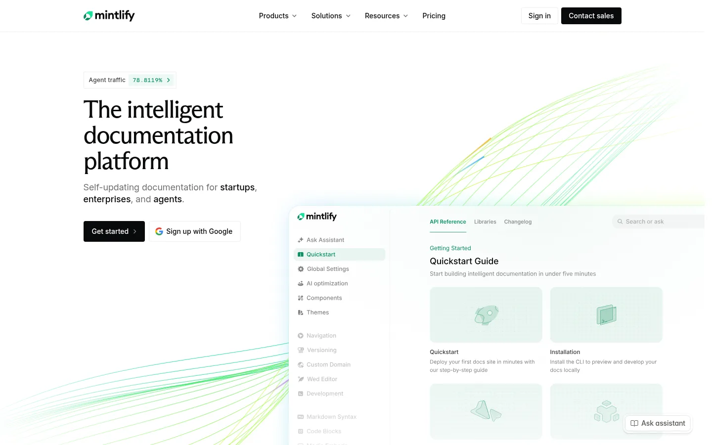
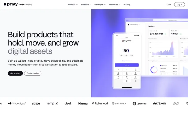
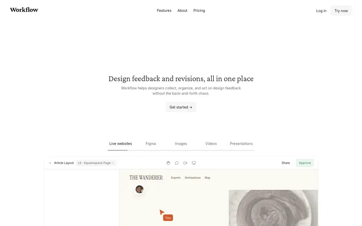
North star · Keep the page calm and editorial: anchor it in white space, near-black typography, and product visuals accented with precise mint-green signals.
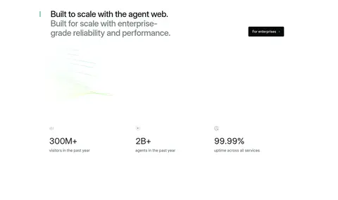
The page uses a white canvas and unusually generous open space to keep attention on concise headings and product screens. Near-black establishes the main hierarchy; muted grays carry supporting copy, while mint green appears in the logo, status cues, links, and fine flowing lines around interface imagery. The hero’s large serif headline creates an editorial contrast with the otherwise clean Inter-led interface. Paper Mono is reserved for compact labels and code-like details. Content is arranged in centered, broad sections: a split hero, customer logo grid, modular feature cards, case-study cards, metrics, testimonials, and a three-column updates feed. Pale warm-gray surfaces and delicate hairlines distinguish cards without making the page feel boxed in. Product imagery is mostly interface-led, with soft mint-tinted panels and fine gradient line motifs; vivid colors are concentrated in customer story artwork rather than the core UI.
Primary interface and content face for navigation, body copy, buttons, and most headings.
Aa 设计
paperMono
网络字体 · 字重 500 · 占比 15%
免费替代:IBM Plex Mono
Compact captions, code-like labels, and small technical metadata.
Aa 设计
arizonaFlare
网络字体 · 字重 500 / 400 · 占比 2%
免费替代:Instrument Serif
Distinctive oversized hero headline.
角色
示例
字号
字重
行高
字距
一级标题
Serif headline anchoring the hero.
Mintlify
50px
400
1.04
-0.04em
二级标题
Major section headings and editorial feature statements.
Mintlify
44px
400
1.09
-0.02em
三级标题
Feature-card and customer-story headings.
Mintlify
36px
500
1.11
-0.02em
四级标题
Secondary titles within cards and content blocks.
Mintlify
35px
500
1.14
-0.01em
正文
Descriptions, explanatory paragraphs, and customer quotes.
The quick brown fox 敏捷的狐狸
14px
400
1.71
0
辅助文字
Compact metadata, category labels, and technical cues.
The quick brown fox 敏捷的狐狸
12px
500
1
0.02em
按钮
Primary and secondary action labels.
The quick brown fox 敏捷的狐狸
14px
500
1.14
0
导航
Top-level navigation and footer navigation labels.
The quick brown fox 敏捷的狐狸
14px
500
1.14
0
链接
Customer stories, updates, and inline navigation links.
The quick brown fox 敏捷的狐狸
16px
400
1.5
0
代码
Small technical or code-like interface labels.
const style = 1;
12px
500
1
0.02em
间距与布局
基准单位 4px · 密度:适中
48px版块间距
4px元素间距
—卡片内边距
—内容最大宽度
4px
6px
8px
10px
12px
16px
20px
24px
28px
32px
40px
48px
Use a centered, broad content frame with a clear left alignment for section headings and generous horizontal breathing room. The hero is a two-column composition: copy at left and a large interface view with decorative lines at right. Follow with a compact customer logo grid, then varied modular card arrangements and wide case-study rows. Sections are separated mainly by open white space, not colored bands. Keep content density comfortable: cluster related proof within a section, but give each major block a distinct pause.
圆角与层次
按钮 · 4px
卡片 · 6px
导航 · 4px
链接 · 6px
inset · other
The visual system is largely flat: white space does most of the separation work. Use delicate gray hairlines and pale warm card backgrounds rather than pronounced shadows. Cards have softly rounded corners, and product screens can layer over decorative linework with subtle contrast, keeping the interface readable and calm.
组件
下面的预览按实测的按钮、输入框、徽标、卡片样式重建(字体用替代字体)。
Top navigation
Compact horizontal wordmark and links on white, with a restrained outlined Sign in action and near-black Contact sales button.
Hero
Left-aligned serif headline, muted supporting copy, dark Get started CTA, and a large documentation UI showcase with mint linework.
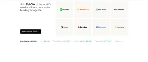
Customer logo grid
A short customer-proof statement paired with a tidy grid of company marks on pale, minimally separated tiles.
Feature gallery
A modular mix of wide and compact pale cards, each showing a product capability with concise labels and UI illustration.
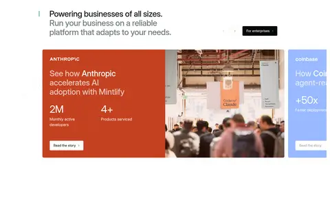
Case-study card
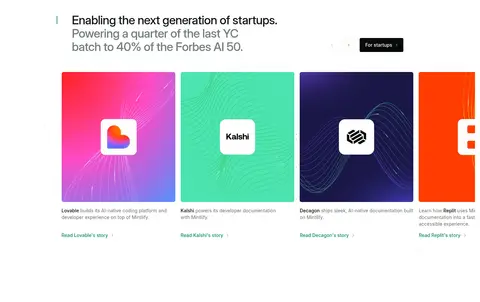
Horizontally presented customer stories with branded color fields or photography, short metrics, and a small story link.
Testimonial grid
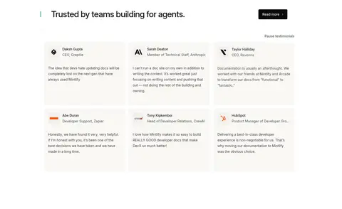
Multiple lightly surfaced quote cards with customer identity, role, and restrained copy hierarchy.
Updates feed
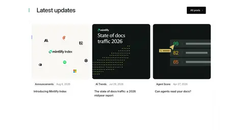
Three-column article cards with thumbnail artwork, small category/date metadata, and concise headlines.
Footer
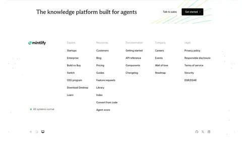
A short closing statement and CTA above a spacious multi-column link directory, brand mark, and system status.
Imagery · Lead with crisp documentation-product interface screenshots and UI mockups, framed as large light panels rather than device photography. Fine mint, lime, and blue linework arcs around or behind the screens. Customer stories use branded artwork and occasional photography, including vivid color fields; treat these as individual content assets rather than changing the restrained site-wide palette.
Use near-black for primary text and primary CTA backgrounds.
Reserve green for small brand cues, status, and fine decorative details.
Use serif typography selectively for the hero’s editorial emphasis.
Build feature areas from pale, softly rounded modular cards.
Let product UI imagery carry the visual detail.
Keep customer artwork’s vivid colors localized to its own cards.
✕ 不该做
Do not turn the page into a dark theme.
Do not use strong shadows to define every card.
Do not spread vivid customer-art colors across general UI controls.
Do not set long body paragraphs in the display serif or mono face.
Do not compress the space between major sections.
Do not decorate every surface with gradients or linework.
给 AI 的提示词
想快速出一个同风格的新页面,把这段话连同 DESIGN.md 一起发给 AI。
Build a polished SaaS homepage in Mintlify’s calm editorial style. Use Gallery White (#ffffff) as the dominant canvas, Carbon Ink (#08090a) for headings and solid CTAs, Slate Copy (#383939) and Quiet Gray (#6b6b6c) for supporting text, and Soft Divider (#f1f0ee) for subtle hairlines. Apply Mint Signal (#0c8c5e) sparingly to brand and status details; use Warm Paper (#f9f6f3) for selected cards. Pair an editorial serif hero headline with a clean Inter-like sans-serif system and occasional monospaced micro-labels. Build a split hero with a large documentation interface image and restrained fine gradient linework, then alternate customer proof, modular feature cards, case studies, metrics, testimonials, and updates. Preserve generous whitespace, gentle corners, flat surfaces, and clear content hierarchy. Keep bright colors confined to customer artwork.