North star · Let expressive lowercase type and real food-and-farm imagery lead, with warm canvas, deep-green contrast, and generous breathing room.
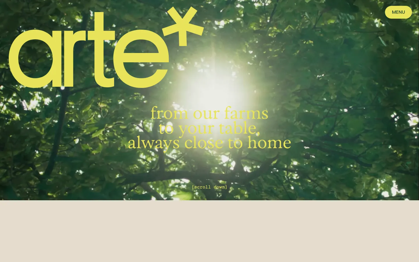
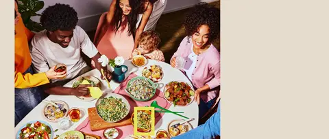
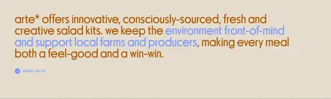
The visual identity balances a warm, pale oat canvas (#e5dccd) with dark greens and vivid yellow-green accents. The opening is cinematic: full-bleed farm footage provides a textured, leafy backdrop for a large lime wordmark and centered campaign line. Below, generous uninterrupted canvas space gives the centered introductory statement room to breathe, followed by a lifestyle photograph and compact brand copy. Parafina supplies the distinctive oversized, lowercase display voice; the measured headings and body copy share its unusual, rounded character. Poppins is reserved for compact uppercase navigation, links, and controls. Product storytelling shifts into a dark green band, where pale product lettering and package photography stand out against the field. The composition is spacious and vertically paced, with centered hero messaging, a left-aligned editorial section, and a multi-item product presentation. Rounded pill controls provide the clearest UI accents; the page otherwise feels flat and open.
Display, headings, and prominent lowercase brand messaging
Aa 设计
ExposureTrial
网络字体 · 字重 500 · 占比 8%
免费替代:Bodoni Moda
Secondary display or decorative text
Aa 设计
Poppins
网络字体 · 字重 500 · 占比 5%
免费替代:Poppins
Navigation, buttons, and uppercase links
角色
示例
字号
字重
行高
字距
特大标题
Oversized lowercase brand or campaign display lettering.
arte*
173px
500
0.8
0
一级标题
Large lowercase introductory and section headings.
arte*
104px
500
0.9
0
正文
Prominent lowercase supporting statements and editorial copy.
arte*
56px
500
0.9
0
辅助文字
Smaller lowercase product and ingredient descriptions.
arte*
30px
500
1.4
0
按钮
Uppercase pill-button labels.
The quick brown fox 敏捷的狐狸
16px
500
1.4
0
导航
Uppercase menu control text.
The quick brown fox 敏捷的狐狸
16px
500
1.4
0
链接
Uppercase editorial links such as “MORE ON US”.
The quick brown fox 敏捷的狐狸
16px
500
1.4
0
间距与布局
基准单位 8px · 密度:宽松
64px版块间距
40px元素间距
—卡片内边距
1380px内容最大宽度
1px
6px
10px
20px
24px
30px
40px
46px
56px
64px
143px
Use a spacious, vertically stacked page with a measured desktop max width of 1380px and a base spacing unit of 8px. The hero is full-bleed imagery, followed by a large, centered statement on the uninterrupted canvas. Keep the editorial image and copy left-aligned, then give the product showcase its own full-width dark band. Product content can form a multi-item grid; avoid dense framing and preserve large areas of open canvas between sections.
圆角与层次
按钮 · 9999px
链接 · 9999px
没有测到阴影:页面是扁平的,层次靠底色和描边区分。
The measured interface has no shadows or gradients. Keep surfaces visually flat, using broad canvas and color-block transitions rather than cards with elevation. No measured border color defines the system; rely on clean edges and rounded pill controls for UI shape. Layer campaign lettering directly over video and product photography.
组件
下面的预览按实测的按钮、输入框、徽标、卡片样式重建(字体用替代字体)。
Hero wordmark
Large, lowercase lime arte* lettering over full-bleed farm imagery; center the campaign message and keep a compact scroll cue near the bottom.
Menu pill
Uppercase Poppins label on a Citrus Glow (#e8e359) pill, with Deep Leaf (#214534) text.
Centered, lowercase Parafina headline in Harvest Blue (#3d549c) over the warm canvas.
Editorial story
Food-and-people photograph followed by left-aligned, multicolor brand copy and a small Periwinkle Link (#7997ff) text link.
Product showcase
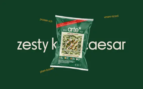
Full-width dark-green band, oversized pale product naming, package image, and small ingredient or benefit labels.
Imagery · Lead with immersive farm or greenhouse footage, framed edge to edge and dark enough for vivid lettering to remain legible. Pair it with candid food-and-people photography, then switch to clean product-package imagery on the deep-green showcase surface. Favor real produce, meals, farms, and packaging over illustrations; the package art itself may carry extra colors.
Use Oat Canvas (#e5dccd) as the main editorial background.
Set prominent messaging in lowercase Parafina or a close expressive substitute.
Make the hero footage full-bleed and let the wordmark dominate it.
Reserve Poppins uppercase for compact navigation, links, and controls.
Use Citrus Glow (#e8e359) and Deep Leaf (#214534) together on the menu pill.
Separate product storytelling with a broad dark-green surface and package imagery.
✕ 不该做
Don't introduce unmeasured brand colors.
Don't add gradients or decorative shadows.
Don't turn the open canvas into a dense card layout.
Don't use uppercase display headlines as the primary brand voice.
Don't let package-art colors redefine the page palette.
Don't place functional labels in the oversized display typeface.
给 AI 的提示词
想快速出一个同风格的新页面,把这段话连同 DESIGN.md 一起发给 AI。
Build a food-brand page in arte*’s spacious, editorial style. Use Oat Canvas (#e5dccd) for the main background, Harvest Ochre (#ab5700) for selected copy and the primary CTA, and Citrus Glow (#e8e359) for vivid controls or campaign text. Open with full-bleed farm footage and a large lowercase Parafina-style wordmark; overlay centered messaging with strong contrast. Follow with a roomy centered statement, then a left-aligned food photograph and short editorial copy. Introduce a full-width dark-green product band using Forest Green (#103d26) or Deep Leaf (#214534), with large pale product lettering and package imagery. Keep display typography lowercase and expressive; use Poppins-style uppercase labels for navigation and links. Favor flat color fields, rounded pill controls, clean section transitions, and generous whitespace over cards, borders, and shadows.