Pa'lais 将温暖的手绘视觉与鲜明的美食摄影、活泼色块结合起来。首页从品牌介绍延伸到食谱、产品、社群、门店查询、订阅和联系信息。
North star · Make every section feel like a page from a playful, hand-illustrated plant-food cookbook, anchored by deep blue and warm white.
The visual identity balances a warm, near-white canvas with confident deep-blue typography and large, irregular fields of green, orange, yellow, and sky blue. Use the measured palette for the interface, while recognizing that the screenshot's yellow and many other food and background hues primarily belong to photography and illustrations rather than the measured brand palette. Display headlines are oversized and expressive, mixing condensed, hand-drawn lettering with friendly handwritten styles; body copy is smaller, airy, and widely tracked. Navigation and buttons use compact, uppercase lettering. Layouts feel like a continuous illustrated editorial: full-width hero artwork gives way to centered copy, asymmetrical recipe and product compositions, social content, paired utility cards, and a strong-color newsletter band. Product packs, plated food, botanical sketches, and organic blob shapes create an approachable, handmade mood. Keep interface chrome restrained: buttons are pill-like, surfaces are mostly flat, and layering comes from overlapping imagery and occasional shadows rather than a rigid card system.
配色 点色块复制色值。用途说明来自对页面的实测位置(背景、文字、描边、按钮)与截图判读。
品牌色
Kitchen Blue
#234386
Primary brand color for headings, navigation, links, footer, and filled calls to action.
Garden Green
#a2d3a6
Newsletter section background and a supporting botanical accent.
强调色
Carrot Orange
#ed7328
Outlined action text and borders; use sparingly as a bright interface accent.
Sky Blue
#6aa8dc
Finder and question utility-card surfaces; secondary blue distinct from the core brand blue.
表层色
Canvas White
#ffffff
Main page canvas and text on deep-blue footer or blue-filled buttons.
Oat Cream
#fbf9f6
Warm pale section band that softens the white canvas.
中性色
Muted Periwinkle
#a3b1cd
Muted footer text and secondary low-emphasis details.
功能色
Media Black
#000000
Minor dark text or media detail; not a defining interface color.
文字 背景 对比度 WCAG #234386 Kitchen Blue#ffffff Canvas White9.47:1 AAA #234386 Kitchen Blue#fbf9f6 Oat Cream9.01:1 AAA #234386 Kitchen Blue#a2d3a6 Garden Green5.59:1 AA #ffffff Canvas White#fbf9f6 Oat Cream1.05:1 不达标 #ffffff Canvas White#234386 Kitchen Blue9.47:1 AAA #ffffff Canvas White#a2d3a6 Garden Green1.69:1 不达标
字体 字号阶梯:Augmented Fourth(比例约 1.406,正文 16px)。示例用免费替代字体渲染,数值为实测。
Aa 设计
Axiforma 网络字体 · 字重 400 · 占比 41%
免费替代:Nunito Sans
Captions and small supporting labels
Aa 设计
hwt-artz 网络字体 · 字重 400 · 占比 24%
免费替代:Bree Serif
Expressive display headings, especially smaller headline tiers
Aa 设计
ITC Avant Garde Std Bk 网络字体 · 字重 400 · 占比 16%
免费替代:Montserrat
Body copy and uppercase eyebrow text
Aa 设计
Sonder Sans Black Rough 网络字体 · 字重 400 / 600 · 占比 7%
免费替代:Bowlby One SC
Navigation, buttons, and short links
Aa 设计
Delivery Note DEMO 网络字体 · 字重 400 · 占比 7%
免费替代:Kalam
Large handwritten-style section headings
Aa 设计
Times New Roman 系统字体 · 字重 400 · 占比 3%
免费替代:Lora
Crawler-detected text within cards or fallback content
角色 示例 字号 字重 行高 字距 特大标题 Oversized hero statement in playful, condensed display lettering.
Pa'lais
88px 400 0.66 0 一级标题 Primary hero heading, split across compact stacked lines.
Pa'lais
86px 400 0.73 0 二级标题 Large handwritten section titles, such as recipe or product introductions.
Pa'lais
58px 400 0.9 0 三级标题 Secondary expressive headings for content sections.
Pa'lais
56px 400 0.86 0 四级标题 Supporting display headings with a distinct characterful face.
Pa'lais
46px 400 1 0.043em 正文 Readable explanatory paragraphs and product or brand descriptions.
The quick brown fox 敏捷的狐狸
16px 400 1.5 0.2em 辅助文字 Small supporting labels and image-related details.
The quick brown fox 敏捷的狐狸
12px 400 2.17 0 按钮 Compact, widely tracked calls to action.
The quick brown fox 敏捷的狐狸
12px 400 normal 0.133em 导航 Small uppercase primary navigation labels.
The quick brown fox 敏捷的狐狸
12px 400 normal 0.067em 链接 Compact uppercase links and secondary actions.
The quick brown fox 敏捷的狐狸
12px 400 normal 0.133em 眉题 Widely spaced uppercase labels introducing content.
The quick brown fox 敏捷的狐狸
12px 400 1 0.267em
间距与布局 基准单位 4px · 密度:紧凑
40px 版块间距
2px 元素间距
— 卡片内边距
1173px 内容最大宽度
4px
8px
10px
16px
24px
32px
40px
48px
56px
64px
128px
The homepage is a long, mostly single-column editorial scroll, with a centered content focus and occasional two- or three-column utility areas. The measured maximum content width is 1173px; broad hero and color-band sections sit alongside more contained copy and product groupings. Sections alternate between white space, illustrated compositions, product-led feature areas, and full-width color panels. Alignment shifts deliberately: centered headlines and newsletter content contrast with left-aligned footer columns. The measured spacing scale is compact, but generous open canvas around artwork prevents the page from feeling crowded.
圆角与层次 The page is predominantly flat, relying on broad color bands, artwork, and overlapping imagery for depth. Measured cards use small rounded corners, while prominent actions and links are pill-shaped; an outlined orange action adds contrast without a filled surface. Reserve shadows for occasional floating content or imagery, and keep section transitions clean rather than building a stack of boxed panels.
组件 下面的预览按实测的按钮、输入框、徽标、卡片样式重建(字体用替代字体)。
Header navigation Place the Pa'lais wordmark at the left, compact uppercase blue navigation across the top, and a filled blue Store Locator action.
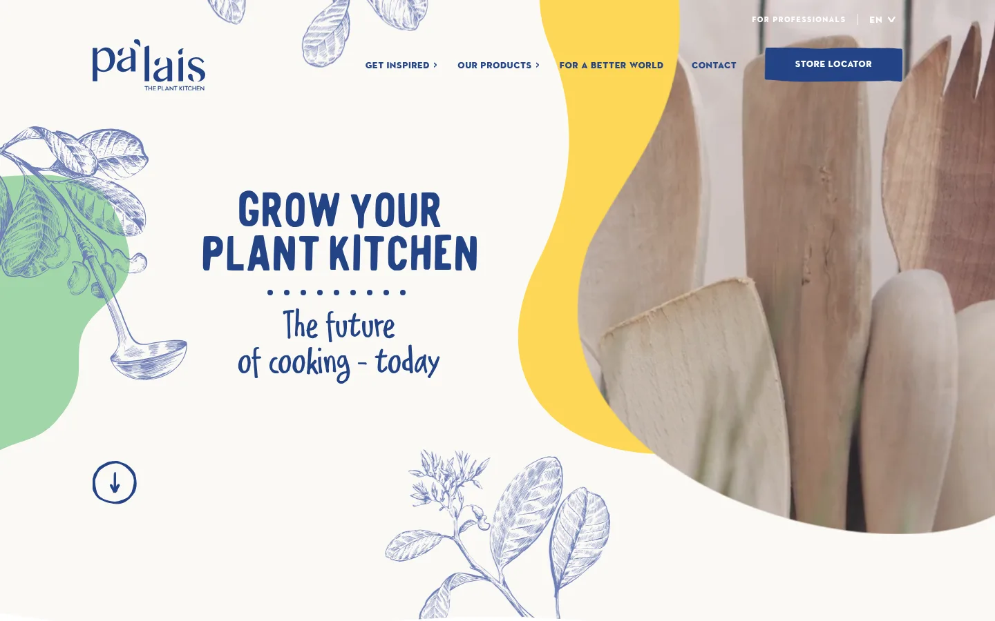
Hero composition Pair a large stacked blue headline and handwritten supporting line with botanical drawings, a green shape, and a cropped kitchen photograph framed by an organic yellow field.
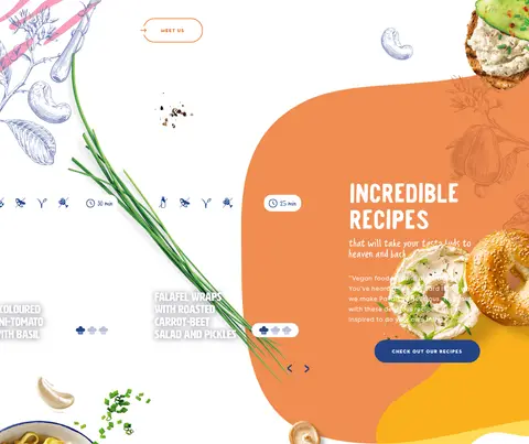
Recipe feature Use a generous food-led editorial composition with vivid orange and yellow shapes, small supporting copy, and a blue pill-shaped recipe CTA.
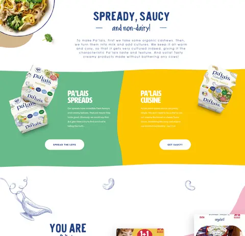
Product panels Present Pa'lais product packs against bold green and yellow color fields, with short copy and compact pill-shaped actions.
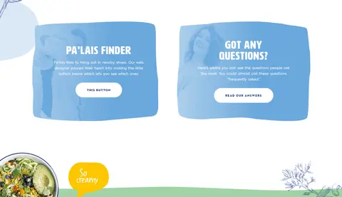
Utility cards Set the store finder and FAQ as paired sky-blue panels with centered white headings, short explanatory text, and white pill actions.
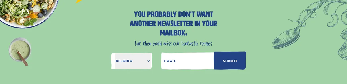
Newsletter form Use the Garden Green section band with centered copy, a country selector, email input, and a blue submit action.
Footer Use a deep Kitchen Blue footer with the logo, grouped navigation and contact details, muted supporting text, and social links.
Imagery · Combine close-up food and product-pack photography with loose botanical line drawings, hand-drawn decorative marks, and irregular color shapes. The hero uses a large cropped kitchen image framed by a bold organic yellow form; later product and recipe imagery feels abundant and editorial. Keep illustrations layered around content rather than confined to boxes. Warm photography colors are image content, not a reason to expand the measured interface palette.
页面版块 共 8 个版块,按页面从上到下排列,每个都标了类型、布局和交互套路。
该做与不该做 ✓ 该做 Anchor interface text and primary actions in Kitchen Blue (#234386). Keep the main canvas warm and open, using Canvas White (#ffffff) and Oat Cream (#fbf9f6). Use Garden Green (#a2d3a6) and Sky Blue (#6aa8dc) as distinct section surfaces. Mix display lettering with clear, widely tracked body copy and compact uppercase controls. Let botanical drawings overlap or frame content without obscuring it. Use food and packaging photography as vivid editorial focal points. ✕ 不该做 Don't turn every section into a bordered card grid. Don't use black as the dominant page text or surface color. Don't treat screenshot-only food and illustration colors as measured interface tokens. Don't replace the playful display type with a uniform corporate sans-serif. Don't crowd artwork, product photos, and copy into a rigid repeated layout. Don't make buttons visually heavy; keep actions compact and pill-shaped where measured. 给 AI 的提示词 想快速出一个同风格的新页面,把这段话连同 DESIGN.md 一起发给 AI。
复制 Build a new page in Pa'lais's playful, plant-food editorial style. Use Canvas White (#ffffff) as the main canvas, Kitchen Blue (#234386) for headings, navigation, links, and primary actions, and Oat Cream (#fbf9f6) for a subtle warm section band. Add Garden Green (#a2d3a6) and Sky Blue (#6aa8dc) as occasional full-section surfaces; use Carrot Orange (#ed7328) for restrained outlined actions. Mix oversized condensed or handwritten display headlines with airy, tracked body text and compact uppercase navigation. Compose sections with open space, botanical line drawings, irregular color shapes, and vivid food or product photography. Favor editorial asymmetry over a repetitive grid. Use pill-shaped actions and mostly flat surfaces, saving shadows for occasional floating imagery. Keep form and footer treatments simple and clearly legible.
DESIGN.md Tailwind v4 CSS 变量 Design Tokens
---
title: "Pa'lais design system"
variant: extended
source: https://www.palais.bio/
captured_at: 2026-10-12
theme: light
industry: food-beverage
generator: Design DNA (https://four.wiralomi.com/style/palais-bio)
ai_generated: true
ai_label: "本文件由 AI 辅助生成:数值取自公开网页的实测样式,命名、用途说明与建议为模型解读。商标归原所有者。 / AI-assisted content"
---
# Pa'lais · Design System
> Plant-based food with hand-drawn charm
**Theme:** light · **Industry:** food-beverage · **Source:** https://www.palais.bio/ · **Captured:** 2026-10-12 (1440×900 desktop)
_AI-assisted content: values are measured from the public page at capture time; names, roles and guidance are model-written interpretations. Trademarks belong to their owners._
Pa'lais pairs a warm, illustration-led identity with vivid food photography and expressive color fields. Its long homepage moves from a playful brand introduction through recipes and products to community, store-finding, newsletter, and contact content.
## North star
Make every section feel like a page from a playful, hand-illustrated plant-food cookbook, anchored by deep blue and warm white.
## Overview
The visual identity balances a warm, near-white canvas with confident deep-blue typography and large, irregular fields of green, orange, yellow, and sky blue. Use the measured palette for the interface, while recognizing that the screenshot's yellow and many other food and background hues primarily belong to photography and illustrations rather than the measured brand palette. Display headlines are oversized and expressive, mixing condensed, hand-drawn lettering with friendly handwritten styles; body copy is smaller, airy, and widely tracked. Navigation and buttons use compact, uppercase lettering. Layouts feel like a continuous illustrated editorial: full-width hero artwork gives way to centered copy, asymmetrical recipe and product compositions, social content, paired utility cards, and a strong-color newsletter band. Product packs, plated food, botanical sketches, and organic blob shapes create an approachable, handmade mood. Keep interface chrome restrained: buttons are pill-like, surfaces are mostly flat, and layering comes from overlapping imagery and occasional shadows rather than a rigid card system.
## Colors
| Name | Hex | Token | Group | Role |
|---|---|---|---|---|
| Canvas White | ` | `--color-canvas-white` | surface | Main page canvas and text on deep-blue footer or blue-filled buttons. |
| Kitchen Blue | ` | `--color-kitchen-blue` | brand | Primary brand color for headings, navigation, links, footer, and filled calls to action. |
| Carrot Orange | ` | `--color-carrot-orange` | accent | Outlined action text and borders; use sparingly as a bright interface accent. |
| Oat Cream | ` | `--color-oat-cream` | surface | Warm pale section band that softens the white canvas. |
| Muted Periwinkle | ` | `--color-muted-periwinkle` | neutral | Muted footer text and secondary low-emphasis details. |
| Garden Green | ` | `--color-garden-green` | brand | Newsletter section background and a supporting botanical accent. |
| Sky Blue | ` | `--color-sky-blue` | accent | Finder and question utility-card surfaces; secondary blue distinct from the core brand blue. |
| Media Black | ` | `--color-media-black` | semantic | Minor dark text or media detail; not a defining interface color. |
### Semantic aliases
`--color-canvas` → ` (Canvas White) · `--color-surface` → ` (Oat Cream) · `--color-surface-2` → ` (Kitchen Blue) · `--color-surface-3` → ` (Garden Green) · `--color-surface-4` → ` (Sky Blue) · `--color-text` → ` (Kitchen Blue) · `--color-text-muted` → ` (Canvas White) · `--color-text-subtle` → ` (Muted Periwinkle) · `--color-border` → ` (Carrot Orange) · `--color-accent` → ` (Kitchen Blue) · `--color-accent-2` → ` (Carrot Orange) · `--color-accent-3` → ` (Garden Green) · `--color-on-accent` → ` (Canvas White)
### Contrast (WCAG 2.x)
| Text | Background | Ratio | Level |
|---|---|---|---|
| ` | ` | 9.47:1 | AAA |
| ` | ` | 9.01:1 | AAA |
| ` | ` | 5.59:1 | AA |
| ` | ` | 1.05:1 | fail |
| ` | ` | 9.47:1 | AAA |
| ` | ` | 1.69:1 | fail |
| ` | ` | 2.16:1 | fail |
| ` | ` | 2.05:1 | fail |
| ` | ` | 4.38:1 | AA-large |
| ` | ` | 1.28:1 | fail |
## Typography
| Family | Token | Source | Weights | Role | Free substitute |
|---|---|---|---|---|---|
| Axiforma | `--font-axiforma` | webfont | 400 | Captions and small supporting labels | Nunito Sans |
| hwt-artz | `--font-hwt-artz` | webfont | 400 | Expressive display headings, especially smaller headline tiers | Bree Serif |
| ITC Avant Garde Std Bk | `--font-body` | webfont | 400 | Body copy and uppercase eyebrow text | Montserrat |
| Sonder Sans Black Rough | `--font-sonder-sans-black-rough` | webfont | 400, 600 | Navigation, buttons, and short links | Bowlby One SC |
| Delivery Note DEMO | `--font-display` | webfont | 400 | Large handwritten-style section headings | Kalam |
| Times New Roman | `--font-times-new-roman` | system | 400 | Crawler-detected text within cards or fallback content | Lora |
- **Axiforma:** Use for compact captions with a clean, neutral sans-serif voice.
- **hwt-artz:** Friendly, characterful display face; measured heading role uses noticeable tracking.
- **ITC Avant Garde Std Bk:** Regular weight; body copy is airy and tracked, while eyebrow labels are uppercase and widely spaced.
- **Sonder Sans Black Rough:** Compact uppercase utility type with wide tracking; measured interface weight is regular.
- **Delivery Note DEMO:** Use as an informal handwritten accent for expressive section titles.
- **Times New Roman:** Low-confidence measurement, likely incidental or fallback; avoid making it a prominent brand face.
### Type scale — Augmented Fourth (ratio ≈ 1.406, base 16px)
| Role | Size | Weight | Line height | Letter spacing | Case | Family | Used for |
|---|---|---|---|---|---|---|---|
| display | 88px | 400 | 0.66 | 0 | — | Sandman_Fill | Oversized hero statement in playful, condensed display lettering. |
| h1 | 86px | 400 | 0.73 | 0 | — | Sandman_Fill | Primary hero heading, split across compact stacked lines. |
| h2 | 58px | 400 | 0.9 | 0 | — | Delivery Note DEMO | Large handwritten section titles, such as recipe or product introductions. |
| h3 | 56px | 400 | 0.86 | 0 | — | Delivery Note DEMO | Secondary expressive headings for content sections. |
| h4 | 46px | 400 | 1 | 0.043em | — | hwt-artz | Supporting display headings with a distinct characterful face. |
| body | 16px | 400 | 1.5 | 0.2em | — | ITC Avant Garde Std Bk | Readable explanatory paragraphs and product or brand descriptions. |
| caption | 12px | 400 | 2.17 | 0 | — | Axiforma | Small supporting labels and image-related details. |
| button | 12px | 400 | normal | 0.133em | — | Sonder Sans Black Rough | Compact, widely tracked calls to action. |
| nav | 12px | 400 | normal | 0.067em | — | Sonder Sans Black Rough | Small uppercase primary navigation labels. |
| link | 12px | 400 | normal | 0.133em | — | Sonder Sans Black Rough | Compact uppercase links and secondary actions. |
| eyebrow | 12px | 400 | 1 | 0.267em | uppercase | ITC Avant Garde Std Bk | Widely spaced uppercase labels introducing content. |
## Spacing & layout
- Base unit **4px**, density **compact**.
- Scale (most used values): 4, 8, 10, 16, 24, 32, 40, 48, 56, 64, 128 px.
- Section rhythm 40px · element gap 2px · card padding — · max content width 1173px.
The homepage is a long, mostly single-column editorial scroll, with a centered content focus and occasional two- or three-column utility areas. The measured maximum content width is 1173px; broad hero and color-band sections sit alongside more contained copy and product groupings. Sections alternate between white space, illustrated compositions, product-led feature areas, and full-width color panels. Alignment shifts deliberately: centered headlines and newsletter content contrast with left-aligned footer columns. The measured spacing scale is compact, but generous open canvas around artwork prevents the page from feeling crowded.
## Shape & elevation
- Radius: button `9999px` · card `8px` · link `9999px` · xs `8px` · sm `16px` · md `32px` · pill `9999px`
- Shadow `lg` (link): `rgba(0, 0, 0, 0.05) 0px 20px 27px 0px`
- Shadow `xl` (card): `rgba(0, 0, 0, 0.16) -14px 10px 49px 0px`
The page is predominantly flat, relying on broad color bands, artwork, and overlapping imagery for depth. Measured cards use small rounded corners, while prominent actions and links are pill-shaped; an outlined orange action adds contrast without a filled surface. Reserve shadows for occasional floating content or imagery, and keep section transitions clean rather than building a stack of boxed panels.
## Imagery
Combine close-up food and product-pack photography with loose botanical line drawings, hand-drawn decorative marks, and irregular color shapes. The hero uses a large cropped kitchen image framed by a bold organic yellow form; later product and recipe imagery feels abundant and editorial. Keep illustrations layered around content rather than confined to boxes. Warm photography colors are image content, not a reason to expand the measured interface palette.
## Components
### Header navigation
Place the Pa'lais wordmark at the left, compact uppercase blue navigation across the top, and a filled blue Store Locator action.
### Hero composition
Pair a large stacked blue headline and handwritten supporting line with botanical drawings, a green shape, and a cropped kitchen photograph framed by an organic yellow field.
### Recipe feature
Use a generous food-led editorial composition with vivid orange and yellow shapes, small supporting copy, and a blue pill-shaped recipe CTA.
### Product panels
Present Pa'lais product packs against bold green and yellow color fields, with short copy and compact pill-shaped actions.
### Utility cards
Set the store finder and FAQ as paired sky-blue panels with centered white headings, short explanatory text, and white pill actions.
### Newsletter form
Use the Garden Green section band with centered copy, a country selector, email input, and a blue submit action.
### Footer
Use a deep Kitchen Blue footer with the logo, grouped navigation and contact details, muted supporting text, and social links.
### Measured component styles
- **Primary button** (“Store Locator”): background ## Do
- Anchor interface text and primary actions in Kitchen Blue (## Don't
- Don't turn every section into a bordered card grid.
- Don't use black as the dominant page text or surface color.
- Don't treat screenshot-only food and illustration colors as measured interface tokens.
- Don't replace the playful display type with a uniform corporate sans-serif.
- Don't crowd artwork, product photos, and copy into a rigid repeated layout.
- Don't make buttons visually heavy; keep actions compact and pill-shaped where measured.
## Agent prompt
Build a new page in Pa'lais's playful, plant-food editorial style. Use Canvas White (## Page sections (top to bottom)
| # | Type | Layout | UX patterns | UI patterns |
|---|---|---|---|---|
| 1 | hero | Full-width image-led opening with centered-left headline, top navigation, and decorative botanical artwork. | primary navigation, scroll cue | wordmark, blue store CTA, organic color shapes, illustrated botanicals |
| 2 | other | Narrow warm-cream transition band between the hero and the following content. | visual transition | warm cream surface, minimal decoration |
| 3 | feature-split | Open editorial composition with centered brand copy and food-led recipe artwork. | brand introduction, recipe CTA | hand-drawn details, organic orange and yellow forms, food photography |
| 4 | product-showcase | Centered product introduction followed by broad, side-by-side colored product panels. | product discovery, category actions | green and yellow panels, pack photography, pill buttons |
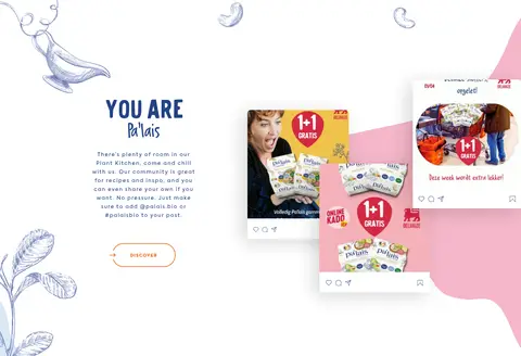
| 5 | content-feed | Centered community introduction with social-style content imagery arranged across the section. | community discovery, social links | social post imagery, hand-drawn decoration, editorial whitespace |
| 6 | feature-grid | Two-column utility area pairing store-finder and FAQ cards. | store lookup, FAQ navigation | sky-blue cards, centered white text, white pill actions |
| 7 | newsletter | Full-width green band with centered newsletter message and a compact inline form. | country selection, email signup | green background, white input fields, blue submit button |
| 8 | footer | Full-width deep-blue footer with the logo, grouped information columns, and lower legal links. | site navigation, contact information, social links | blue surface, white headings, muted secondary text |
## Source CSS custom properties (selected)
```css
--wp-block-synced-color: