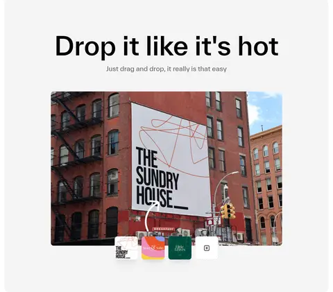
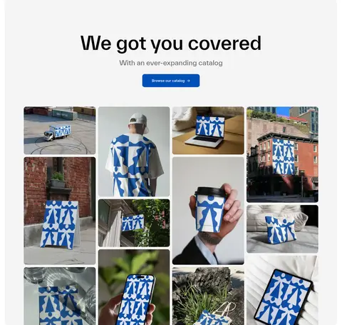
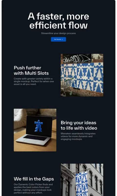
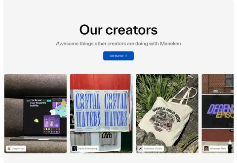
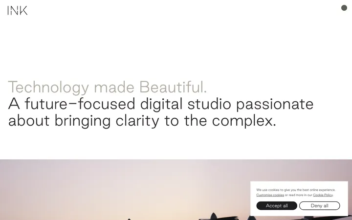
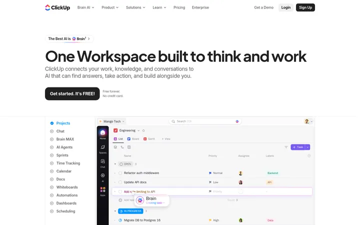
North star · Keep the interface quiet and spacious so oversized typography, real mockup imagery, and blue action buttons carry the story.
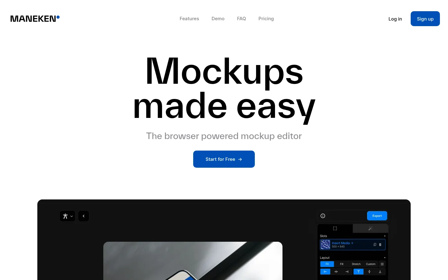
The page uses a mostly white canvas with a restrained palette: black typography, pale-gray section bands, and a single vivid blue for primary actions. A deep ink panel gives the feature story a strong visual pause; its white copy contrasts sharply against the dark surface. Large, centered TWKEverett headings establish an editorial voice, while Inter keeps navigation, body copy, and buttons compact and functional. The hero is deliberately sparse: headline, muted subheading, CTA, then a large product-editor visual. Below, broad section bands contain centered introductions and image-led demonstrations. Rounded media frames and cards soften the otherwise crisp geometry. Real mockup examples carry much of the color and texture, so surrounding interface chrome stays quiet. Generous vertical gaps separate distinct stories, with consistent alignment and restrained borders preserving a clean, product-first presentation.
配色
点色块复制色值。用途说明来自对页面的实测位置(背景、文字、描边、按钮)与截图判读。
强调色
表层色
中性色
功能色
页面底色 · Gallery White表层 · Soft Mist表层 2 · Deep Ink主文字 · Headline Black次要文字 · Gallery White弱文字 · Deep Ink描边 · Quiet Line强调 · Action Blue
Display and heading typography for the hero and section titles.
Aa 设计
Inter
网络字体 · 字重 500 / 600 · 占比 43%
免费替代:Inter
Navigation, body copy, buttons, and compact interface labels.
角色
示例
字号
字重
行高
字距
特大标题
Oversized hero display treatment, if used beyond the main heading.
Maneken
110px
500
1
0
一级标题
Main centered hero headline.
Maneken
77px
500
1
0
二级标题
Large centered section headlines.
Maneken
60px
500
1.2
0
三级标题
Feature and subsection headlines.
Maneken
55px
500
1.2
0
四级标题
Smaller supporting headings within feature content.
Maneken
28px
400
1.2
0
正文
Supporting descriptions and explanatory copy.
The quick brown fox 敏捷的狐狸
14px
500
1
0
按钮
Primary CTA labels and action text.
The quick brown fox 敏捷的狐狸
15px
500
1
0
导航
Header navigation links.
The quick brown fox 敏捷的狐狸
15px
500
1.25
0
间距与布局
基准单位 2px · 密度:适中
80px版块间距
6px元素间距
—卡片内边距
1240px内容最大宽度
3px
4px
6px
8px
10px
20px
22px
24px
30px
40px
45px
50px
55px
80px
140px
A wide, centered page uses a measured maximum content width of 1240px, with the hero aligned centrally and product visuals given generous room. Sections alternate between white, pale gray, and a single dark feature band. Large vertical gaps create a deliberate scroll rhythm; within sections, centered titles lead into image-led grids or alternating text-and-media layouts. The creator showcase uses a dense multi-column image arrangement, contrasting with the open hero and feature storytelling. Keep functional text and navigation compact against the oversized display typography.
圆角与层次
按钮 · 10px
卡片 · 8px
图片 · 10px
导航 · 14px
xl · media
xl · card
The overall interface is mostly flat, with pale section backgrounds and subtle hairlines doing the structural work. Media and mockup cards sit above their surroundings through pronounced, soft shadows, especially in showcase moments. Use rounded frames to distinguish imagery, but avoid adding heavy borders or shadows to ordinary text sections.
组件
下面的预览按实测的按钮、输入框、徽标、卡片样式重建(字体用替代字体)。
Primary CTA
Blue #0050b7 button with white Inter medium text and a 10px radius; use for signup, start, and catalog actions.
Header navigation
Compact black Inter links centered in a light header, balanced by the wordmark and login/signup actions.
Hero
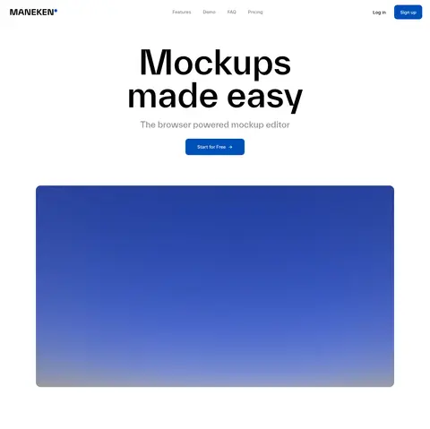
Centered oversized TWKEverett headline, muted supporting line, blue CTA, and a large editor visual below.
Pale showcase section
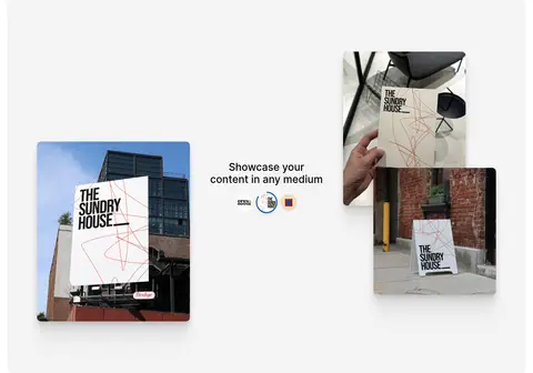
A #f4f4f4 band with a centered heading and product imagery arranged in a clean grid or split composition.
Dark feature band
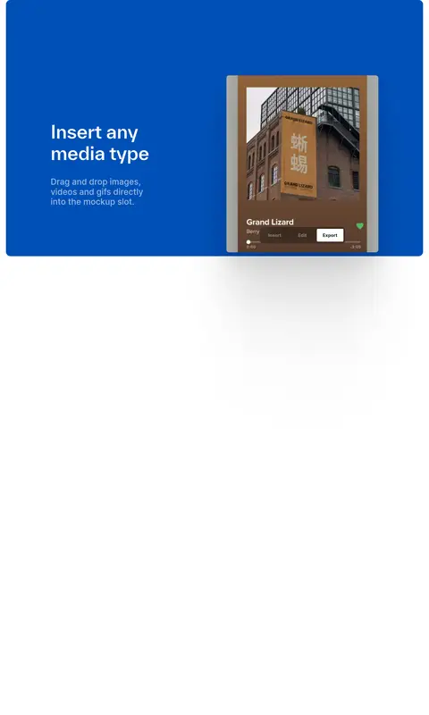
Deep #10151c background with white headings and supporting copy, alternating text and media across feature stories.
Media card
Rounded image or editor frame, typically with a soft, layered shadow and no prominent outline.
Creator gallery
A pale section presenting creator mockups as a dense multi-column image grid beneath a centered introduction.
Imagery · Use authentic mockup-editor screenshots, product demonstrations, and creator work as the page’s main visual content. Frame media in softly rounded rectangles with natural photographic color and minimal overlays. Favor large, clear examples over decorative illustration; creator and catalog sections can use dense image grids, while feature sections pair a single strong image with concise copy. The editor itself may contain vivid interface colors that belong to the product imagery, not the site palette.
Use #ffffff as the main canvas and preserve generous open space.
Set hero and section headings in a close geometric sans substitute for TWKEverett.
Reserve #0050b7 for clear primary actions.
Alternate white and #f4f4f4 bands to organize long-form content.
Use #10151c as a deliberate feature-story contrast panel.
Make mockup photography and editor previews the main visual evidence.
Keep navigation and supporting copy compact and easy to scan.
✕ 不该做
Do not introduce additional brand accent colors.
Do not fill the hero with decorative elements or dense copy.
Do not use heavy borders around ordinary sections.
Do not treat colors inside product mockups as site-wide palette colors.
Do not make every section dark or highly saturated.
Do not replace the spacious rhythm with a uniformly dense grid.
给 AI 的提示词
想快速出一个同风格的新页面,把这段话连同 DESIGN.md 一起发给 AI。
Build a new Maneken-style page for a creative mockup product. Use Gallery White (#ffffff) as the canvas, Headline Black (#000000) for major type, Soft Mist (#f4f4f4) for alternating content bands, and Deep Ink (#10151c) for one strong feature section. Keep Action Blue (#0050b7) for primary buttons only, with white button text. Use a geometric sans similar to Manrope for large centered headings and Inter for navigation, copy, and controls. Compose a spacious hero with a headline, muted supporting line, CTA, and prominent product visual. Follow with image-led demonstrations, split feature stories, and a creator gallery. Favor rounded media, subtle hairlines, and soft shadows on showcase assets; keep the surrounding interface flat and uncluttered.