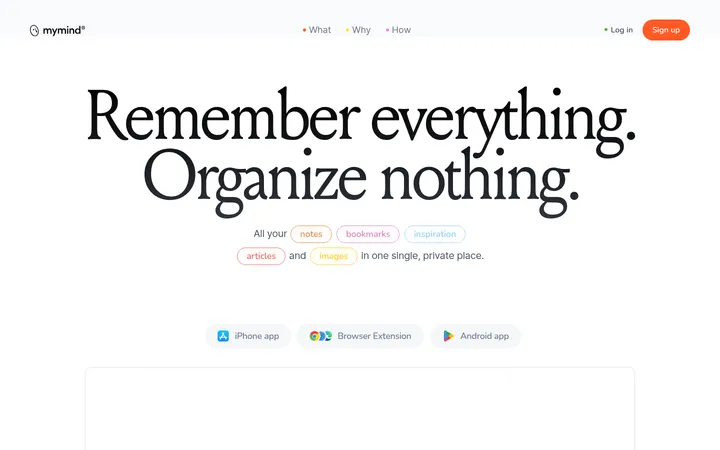
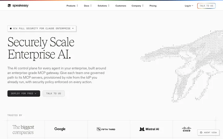
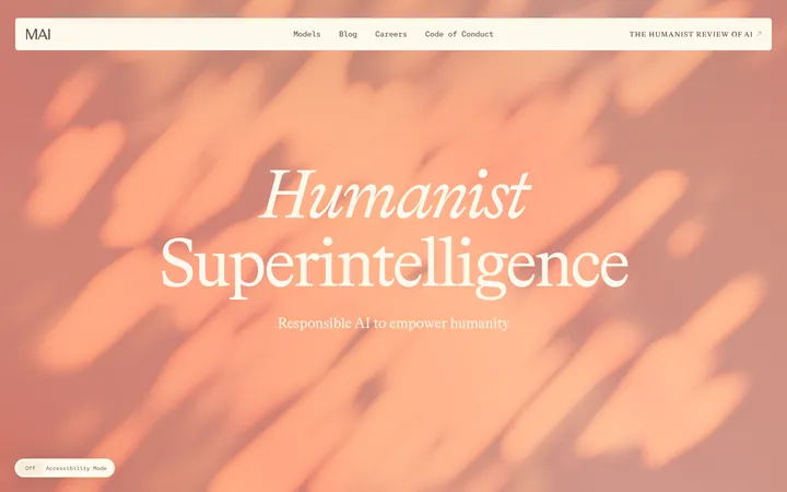
Memorisely 以清爽的白底页面展示 AI 设计课程与工作坊。醒目的居中标题、克制的深色按钮和实用课程图片,让长页面保持易读、易浏览。
North star · Keep the page predominantly white and quiet; use dark type, clear spacing, and practical learning imagery to make each section easy to scan.
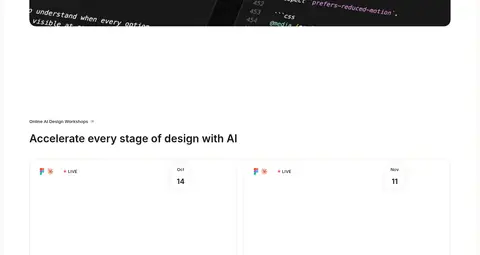
The page uses a white canvas as its defining visual foundation, with warm off-white panels and cards providing subtle separation instead of strongly coloured section bands. Near-black headings and buttons create contrast; muted grays carry supporting copy and navigation. Inter is used throughout, with confident semibold headings, compact body text, and a large, tightly tracked hero display. The hero is centered and spacious, while course listings, event cards, job listings, and testimonials shift into left-aligned or multi-column arrangements for efficient scanning. Imagery is practical rather than decorative: course thumbnails show instructors and interface overlays, while the skills product section features a dark code-like preview that stands out against the otherwise light page. Repeated generous gaps pace the long homepage. Soft card shadows and fine, low-contrast outlines add just enough layering without disrupting the flat, minimal composition.
All page typography, from hero display and section headings to body copy, captions, and links.
角色
示例
字号
字重
行高
字距
特大标题
Large centered hero headline.
Memorisely
56px
600
1.14
-0.04em
一级标题
Primary page and major section headings.
Memorisely
40px
600
1.2
0
二级标题
Section titles such as course and job headings.
Memorisely
32px
600
1.25
0
三级标题
Course titles and prominent card headings.
The quick brown fox 敏捷的狐狸
22px
600
1.45
0
四级标题
Smaller subheads and supporting content headings.
The quick brown fox 敏捷的狐狸
18px
600
1.44
0
正文
Paragraphs, course descriptions, and general explanatory copy.
The quick brown fox 敏捷的狐狸
14px
400
1.43
0
辅助文字
Compact metadata, ratings, and understated labels.
The quick brown fox 敏捷的狐狸
13px
400
1.38
0
链接
Navigation and inline text links.
The quick brown fox 敏捷的狐狸
14px
500
1.43
0
间距与布局
基准单位 2px · 密度:适中
80px版块间距
10px元素间距
16px卡片内边距
1264px内容最大宽度
2px
4px
6px
7px
8px
10px
11px
12px
16px
20px
32px
40px
The page follows a centered, single-column canvas with a measured maximum width of 1264px. The hero is centered, while most later section headings and content align left. Course cards form a responsive multi-column grid; workshops and testimonials use repeated card rows, and the job section combines introductory copy with listing content. A comfortable density and substantial section gaps create clear pauses across the long page. Keep card interiors consistently padded and use compact gaps between related elements.
圆角与层次
按钮 · 8px
卡片 · 12px
图片 · 50%
链接 · 28px
md · other
hairline · link
hairline · link
hairline · button
Most sections remain flat on the white canvas, with separation created through whitespace rather than borders or coloured bands. Cards use restrained shadows and subtle hairline treatment; avoid strong outlines or heavy elevation. The soft surfaces should feel like quiet layers, not floating panels.
组件
下面的预览按实测的按钮、输入框、徽标、卡片样式重建(字体用替代字体)。
Top navigation
Compact rounded white navigation capsule with the Memorisely mark and text links, lifted subtly from the page with a soft shadow.
Primary CTA
Near-black button with white text, an 8px radius, and measured vertical and horizontal padding; secondary actions remain light and understated.
Course cards
Rounded image-led cards with instructor imagery, tool overlays, a course title, concise description, and compact cohort metadata.
Skills product feature
Left-aligned product section with a title and short explanation above a wide dark code-like product preview and compact purchase actions.
Workshop listings
Open, lightly framed event cards that prioritize workshop title, date, format, and host details.
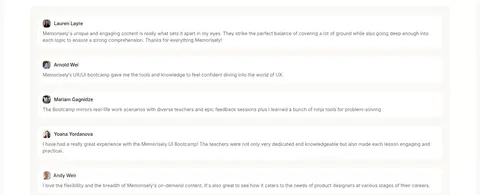
Testimonial cards
A calm stack of white review cards with small profile imagery, reviewer names, and muted testimonial copy.
Imagery · Use real instructor and learner photography within course thumbnails, often paired with visible interface or AI-tool overlays. Product previews may show dark code or design-system screens, providing contrast against the white page. Keep imagery contained in rounded card frames and avoid adding decorative illustration styles that are not evidenced by the page.
Keep the page canvas white and let whitespace establish section boundaries.
Use Soft Ink for major headings and primary CTA backgrounds.
Use muted gray for secondary copy, metadata, and links.
Center the hero message and keep later content sections easy to scan.
Use practical course photography and genuine-looking product interfaces.
Reserve stronger shadows for card surfaces and small floating navigation.
✕ 不该做
Do not introduce saturated brand colours as broad page backgrounds.
Do not use decorative gradients or ornamental illustrations as defining elements.
Do not crowd the hero or collapse the generous section rhythm.
Do not style every card as a strongly bordered or elevated panel.
Do not use oversized all-caps headings or a condensed display typeface.
Do not treat colours inside screenshots or thumbnails as the site palette.
给 AI 的提示词
想快速出一个同风格的新页面,把这段话连同 DESIGN.md 一起发给 AI。
Build a new Memorisely-style page with a white-first, quiet learning interface. Use Gallery White (#ffffff) as the main canvas, Warm Porcelain (#faf9f6) for occasional soft surfaces, and Soft Ink (#171717) for headings and primary CTA backgrounds. Set all copy in Inter, with semibold sentence-case headings and compact, readable supporting text in Reading Gray (#6e6e6e) or Quiet Gray (#878787). Center the hero, then use left-aligned content sections and responsive grids for courses or workshops. Let generous whitespace separate sections. Use rounded, image-led course cards with practical instructor and product-interface imagery; a dark code preview may provide a focused contrast point. Keep borders and shadows subtle, and use restrained near-black buttons rather than colourful calls to action. Prioritize clear scanning over decoration.