North star · Keep the interface quiet and editorial: warm cream space, precise black type, fine dividers, and product photography as the main color.
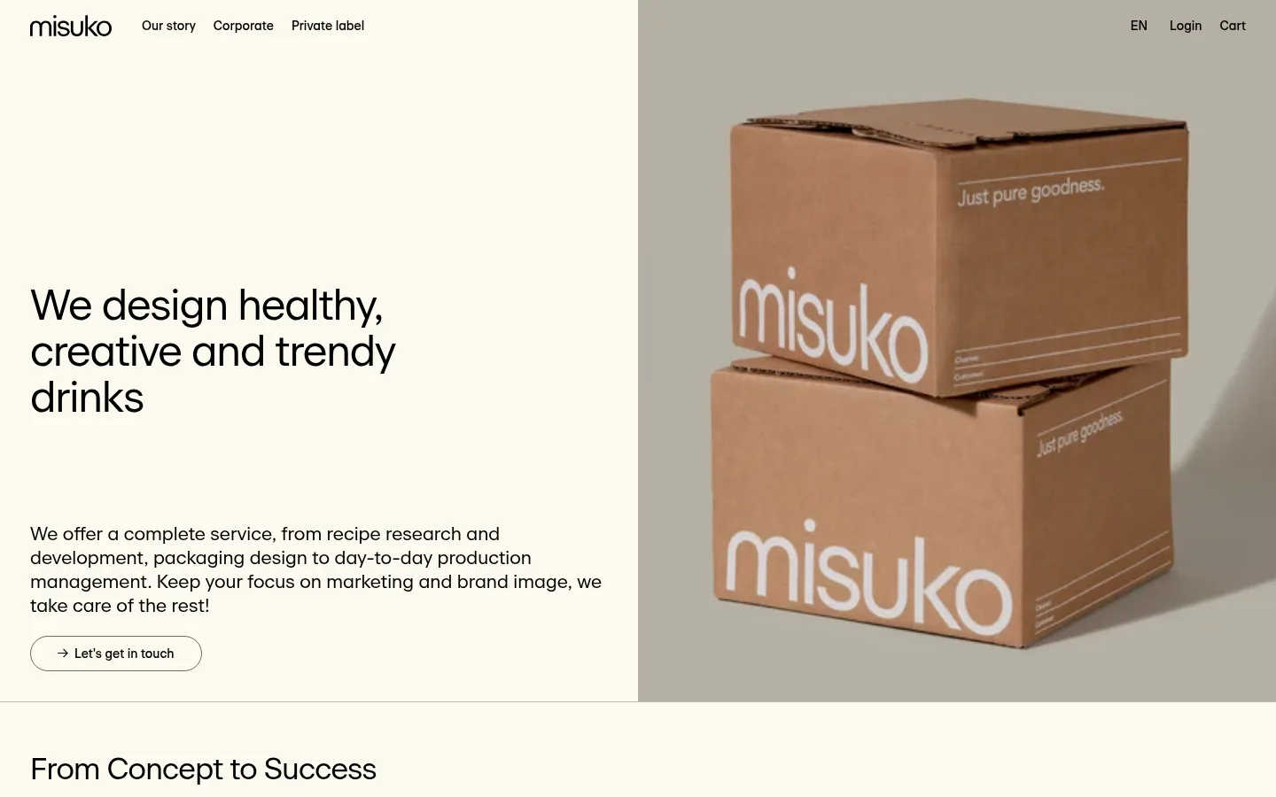
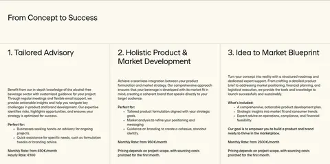
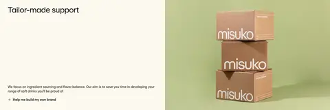
The page is built around a warm, low-contrast foundation: pale cream canvas and near-white sections carry most of the experience, with black text providing crisp hierarchy. A slightly deeper gray-beige band distinguishes testimonials, while thin gray borders mark form fields and section boundaries rather than creating heavy cards. Beausite sans-serif is used consistently, with regular-weight headings, compact body copy, and restrained negative tracking on large titles. The hero pairs a left-aligned text block and outlined contact button with a large photograph of branded cartons; later split sections alternate product imagery and copy. Service steps form a three-column editorial row, and customer stories and articles introduce quieter shifts in background and image density. Generous breathing room and a measured section rhythm give the long page a composed, tactile feel. Brown cartons and green product scenes are photographic content, not interface palette colors.
Site-wide typeface for headings, body copy, navigation, buttons, and links.
角色
示例
字号
字重
行高
字距
一级标题
Hero headline, set large and broken into short lines.
Misuko
48px
400
1.08
-0.024em
二级标题
Major section headings and feature-split titles.
Misuko
34px
400
1.12
-0.022em
三级标题
Service-step titles and smaller content headings.
The quick brown fox 敏捷的狐狸
21px
400
1.29
0
正文
Descriptions, service details, article summaries, and testimonials.
The quick brown fox 敏捷的狐狸
14px
400
1.36
0
按钮
Contact CTA, form actions, and other controls.
The quick brown fox 敏捷的狐狸
14px
500
1.36
0
导航
Primary navigation and footer navigation labels.
The quick brown fox 敏捷的狐狸
14px
400
1.79
0
链接
Inline actions, article links, and section-level calls to action.
The quick brown fox 敏捷的狐狸
14px
500
1.36
0
间距与布局
基准单位 1px · 密度:适中
34px版块间距
—元素间距
—卡片内边距
980px内容最大宽度
9px
11px
15px
17px
18px
20px
21px
25px
26px
27px
34px
36px
40px
58px
61px
Use a centered content framework capped at the measured 980px page width, with broad two-column hero and feature splits and a three-column advisory section. Keep headings and copy left-aligned; avoid centered marketing blocks except where testimonial treatment calls for it. The long page alternates open cream sections with occasional pale bands, separated by fine rules. Measured spacing uses a 1px base and a comfortable rhythm, with a 34px section gap; reproduce the generous visual breathing room without adding unmeasured dimensions.
圆角与层次
按钮 · 9999px
没有测到阴影:页面是扁平的,层次靠底色和描边区分。
The measured interface is predominantly flat, with no shadow system. Separate content through background changes and thin gray hairlines rather than floating cards. The CTA is an outlined pill with a restrained border; product and article imagery sit directly within the page grid, without conspicuous framing.
组件
下面的预览按实测的按钮、输入框、徽标、卡片样式重建(字体用替代字体)。
Site navigation
A slim header with the Misuko wordmark, left-side story and business links, and language, login, and cart controls aligned opposite.
Hero split
Left-aligned headline, compact service introduction, and outlined contact pill sit beside a large branded-carton photograph.
Service steps
An introductory heading precedes three editorial columns with numbered titles, explanatory copy, lists, and pricing details.
Feature split
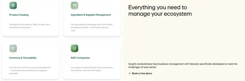
Alternating image-and-copy rows present service benefits and software features; keep text and image blocks visually open.
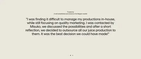
Testimonial band
A full-width oat-gray section centers a customer quote and attribution, with discreet pagination indicators.
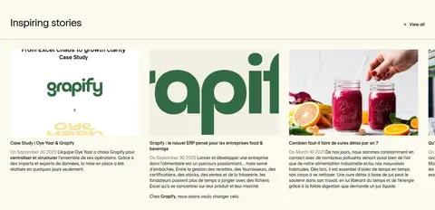
Article feed
A story heading and view-all link lead into a horizontally arranged, image-led article collection with compact summaries.
Newsletter footer
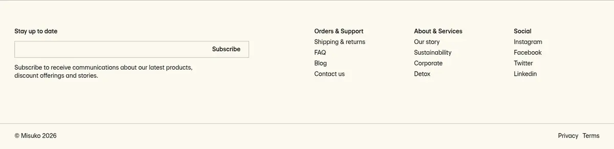
A simple email subscription form sits alongside grouped support, company, and social links, followed by a fine legal footer rule.
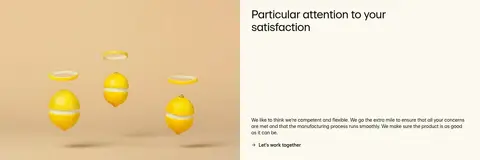
Imagery · Photography leads the visual storytelling: branded cartons dominate the hero, with further product and production images paired against service copy. Use large, cleanly framed photos in split layouts and let their natural kraft-brown, green, and citrus tones provide color. Article cards use image-led previews. The small software feature graphics are supporting content, not a reason to add interface gradients or new brand colors.
Use Cream Paper #fcf9ee as the dominant section background.
Keep text and navigation in Soft Ink #000000.
Use Beausite or a close clean sans-serif throughout.
Build open split sections around real product photography.
Separate sections with fine Quiet Graphite #bcbab2 rules.
Reserve Oat Stone #eae7dd for restrained background variation.
✕ 不该做
Do not add bright interface accent colors absent from the measured palette.
Do not treat carton brown or image greens as UI brand colors.
Do not add decorative shadows or layered floating cards.
Do not center every heading or paragraph.
Do not make the page feel dense with heavy borders or tight spacing.
Do not use uppercase display typography or exaggerated type weights.
给 AI 的提示词
想快速出一个同风格的新页面,把这段话连同 DESIGN.md 一起发给 AI。
Build a new Misuko page using the site's warm, editorial visual system. Use Cream Paper #fcf9ee as the primary background, Linen Canvas #f2efe3 where a subtly distinct surface is needed, and Soft Ink #000000 for all primary text. Use Oat Stone #eae7dd sparingly for a testimonial-style band; use Quiet Graphite #bcbab2 for fine dividers and Ash Taupe #6a6965 for understated outlines. Set a clean sans-serif close to Beausite, with natural casing, regular-weight headlines, and modestly heavier controls. Favor left-aligned copy, open two-column image-and-text sections, and carefully spaced content. Let authentic beverage and packaging photography provide the richer colors. Keep components flat, avoid shadows and invented accent colors, and use thin rules rather than boxed treatments to organize the page.