North star · Keep the interface crisp and restrained, and let warm real-world payment imagery provide the emotional color.
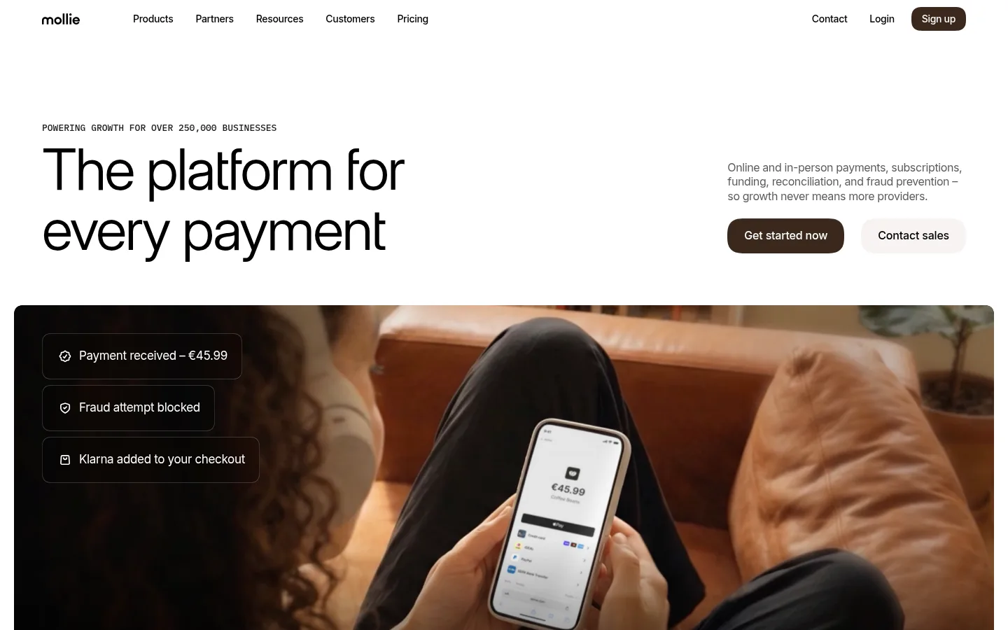
Mollie’s homepage balances a bright white canvas with warm, tactile product imagery. Black headlines and navigation provide strong contrast, while pale warm-neutral panels distinguish payment and account features without making the page feel segmented. Orange appears as a restrained signal in small links and visual details rather than a dominant interface colour; deep brown anchors the primary CTA and select dark media. Inter Variable gives headlines a clean, contemporary presence with tight tracking, while Adamina adds a subtle editorial contrast to body copy. IBM Plex Mono marks compact uppercase eyebrows, and Inter handles navigation and captions. The layout moves from a spacious, asymmetric hero into wide media, compact service links, softly rounded feature cards, customer stories, and a clear closing CTA. Images carry much of the warmth and personality, while the interface itself stays quiet, flat, and legible.
Uppercase eyebrow labels and compact technical markers.
角色
示例
字号
字重
行高
字距
特大标题
Oversized hero headline and prominent display statements.
Mollie
82px
400
1
-0.029em
一级标题
Primary page headline and major feature titles.
Mollie
56px
400
1.1
-0.02em
二级标题
Section titles and secondary feature headings.
Mollie
32px
400
1.2
-0.02em
正文
Editorial explanatory and supporting paragraphs.
The quick brown fox 敏捷的狐狸
16px
400
1.3
-0.006em
辅助文字
Small labels and supporting image or interface captions.
The quick brown fox 敏捷的狐狸
13px
400
1.3
-0.025em
导航
Header navigation and other compact navigation links.
The quick brown fox 敏捷的狐狸
14px
500
1.3
-0.023em
眉题
Uppercase section labels above key headings.
The quick brown fox 敏捷的狐狸
11px
500
1.3
0.03em
代码
Compact uppercase technical-style labels where needed.
const style = 1;
11px
500
1.3
0.03em
间距与布局
基准单位 2px · 密度:紧凑
40px版块间距
10px元素间距
10px卡片内边距
1320px内容最大宽度
1px
2px
3px
4px
6px
8px
9px
10px
12px
16px
20px
22px
24px
40px
49px
Use a centered, wide page frame, with the measured maximum width of 1320px, and generous side breathing room. The hero is asymmetric: a large left-aligned headline balances a smaller copy-and-actions column. Follow with broad media, compact link rows, and softly rounded cards arranged in varied-width grids. Alternate full-width warm panels with white sections; keep headings left-aligned or centered according to block purpose. Section transitions feel spacious, while local link lists and footer navigation remain compact.
圆角与层次
按钮 · 9999px
卡片 · 16px
图片 · 24px
导航 · 9999px
链接 · 16px
hairline · other
inset · other
lg · card
inset · button
The design is mostly flat, relying on white space and warm surface bands rather than prominent shadows. Cards use softly rounded corners and restrained boundaries. Dark media and product mockups create depth through photography and contrast; subtle inset highlights appear on selected controls, while hairlines stay quiet and sparse.
组件
下面的预览按实测的按钮、输入框、徽标、卡片样式重建(字体用替代字体)。
Header navigation
A light, uncluttered row with a compact wordmark, black Inter links, and a dark brown pill-shaped sign-up action.
Hero statement
Uppercase IBM Plex Mono eyebrow above an oversized, tightly tracked Inter Variable headline; supporting copy and paired actions sit in a separate column.
Primary action
Rounded deep-brown CTA with white text and a subtle inset highlight; pair with a pale warm-neutral secondary action.
Media hero
Wide, rounded photographic or video frame featuring payment in use, with restrained floating status labels where appropriate.
Feature cards
Warm Porcelain (#f7f4f1) panels with rounded corners, compact mono labels, black headings, and prominent payment or terminal imagery.
Footer directory
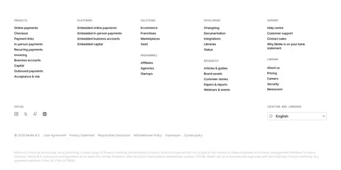
Dense multi-column link groups on a dark surface, with subdued grey secondary text and subtle dividers.
Imagery · Use large, rounded lifestyle and product photography showing payment in context: phones, terminals, cards, laptops, and real businesses. Warm natural light, rich browns, and subdued backgrounds echo the page’s neutral palette. Mix wide video-like hero media with cropped product panels, UI mockups, and customer-story imagery. Keep interface overlays legible and minimal; imagery, rather than decorative graphics, supplies most of the visual energy.
Set major headlines in Inter Variable with tight tracking.
Reserve IBM Plex Mono for compact uppercase eyebrows.
Use Warm Porcelain for selected feature panels.
Make the primary CTA a deep-brown rounded pill.
Let warm product photography carry the visual character.
✕ 不该做
Do not make orange the dominant interface colour.
Do not crowd the hero headline with supporting copy.
Do not add heavy shadows to every card.
Do not use decorative gradients as a substitute for product imagery.
Do not make every section a uniform card grid.
Do not use all-caps for long headlines or body copy.
给 AI 的提示词
想快速出一个同风格的新页面,把这段话连同 DESIGN.md 一起发给 AI。
Build a new fintech page in Mollie’s restrained, warm editorial style. Use Gallery White (#ffffff) as the main canvas, Pure Ink (#000000) for primary text, and Warm Porcelain (#f7f4f1) for selected feature panels. Keep Terracotta Glow (#d66733) and Mollie Orange (#e07122) as small accents; use Roasted Umber (#211006) for a prominent pill-shaped CTA. Set display headlines in Inter Variable with tight tracking, body copy in Adamina, and compact uppercase eyebrows in IBM Plex Mono. Compose a spacious, asymmetric introduction followed by broad product imagery and varied feature blocks. Use rounded media and cards, minimal elevation, quiet borders, and real-world payment photography in warm natural light. Preserve clear hierarchy and generous breathing room; avoid loud gradients, dense decoration, and generic repeated card grids.