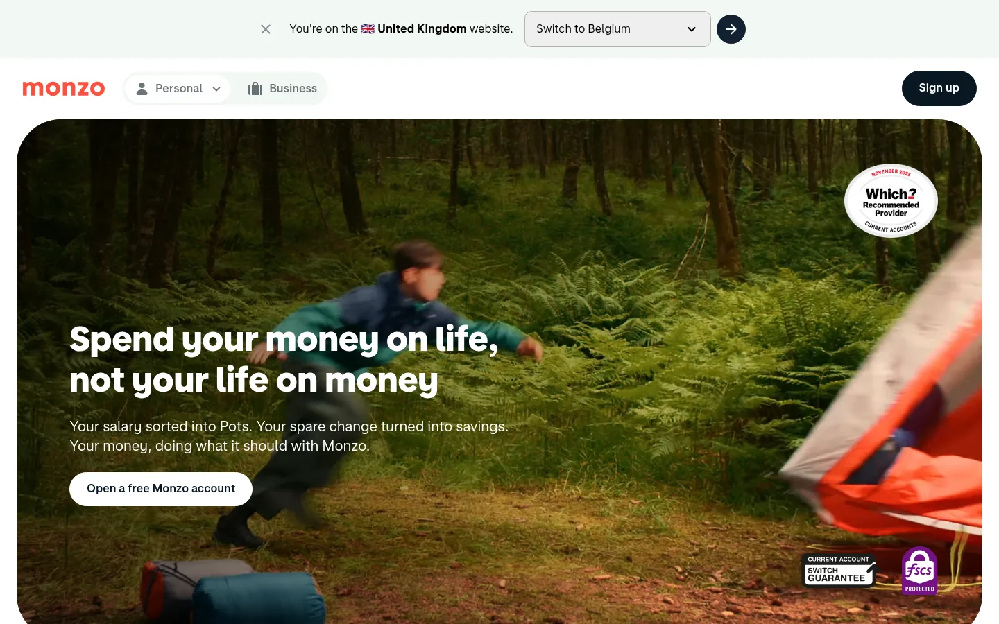
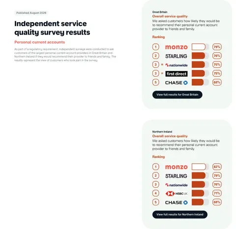
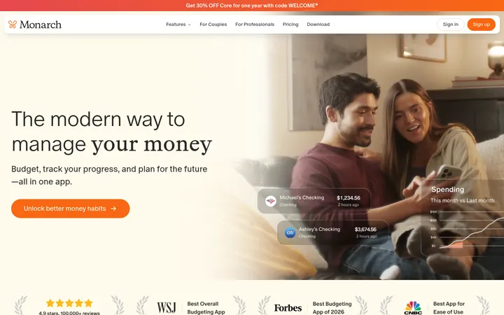
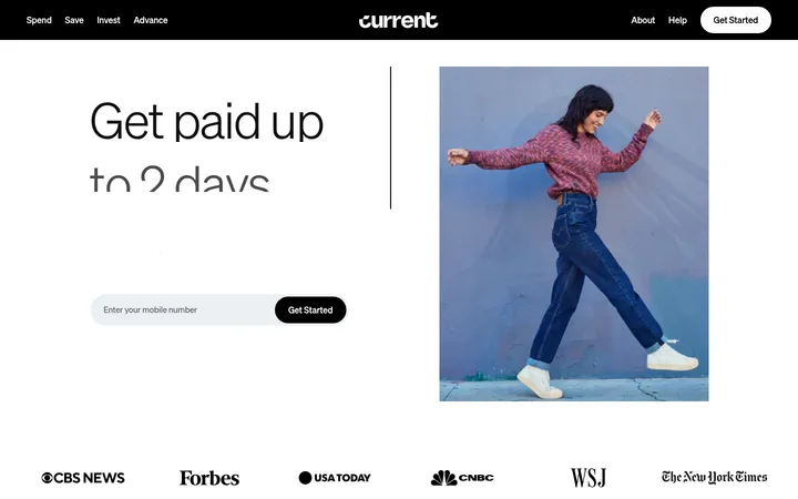
North star · Keep the interface calm and legible, then use rounded components, candid lifestyle imagery, and sparing coral to make banking feel human.
The page is built on a white canvas, with pale green-tinted panels creating gentle breaks between long runs of content. Coral is a recognizable brand accent, most visible in the wordmark and product imagery, rather than a dominant interface fill. Deep navy carries primary buttons, inverse cards, and high-contrast text; muted gray handles supporting copy and navigation. MonzoSansDisplay gives headings a bold, rounded presence, while MonzoSansText keeps body copy and controls straightforward and readable. The layout alternates spacious, centered introductions with multi-column feature cards and asymmetric split sections. Large lifestyle photographs and videos provide warmth and context, while close-up phone and card imagery explains the product. Rounded cards, pill-shaped controls, and restrained hairlines soften the interface. The overall strategy balances friendly personality with clear financial information: keep the canvas calm, make the hierarchy obvious, and let imagery supply most of the color and emotion.
配色
点色块复制色值。用途说明来自对页面的实测位置(背景、文字、描边、按钮)与截图判读。
品牌色
强调色
表层色
中性色
功能色
页面底色 · Gallery White表层 · Mint Haze表层 2 · Deep Harbour主文字 · Midnight Ink次要文字 · Slate Mist弱文字 · Gallery White描边 · Quiet Silver强调 · Hot Coral
Body copy, navigation, buttons, links, and captions.
Aa 设计
MonzoSansDisplay
网络字体 · 字重 700 / 800 / 600 · 占比 12%
免费替代:Nunito Sans
Large headings and section titles.
角色
示例
字号
字重
行高
字距
一级标题
Hero headline; bold display type over the opening film.
Monzo
49px
800
1.2
0
二级标题
Main section titles introducing feature and product groups.
Monzo
44px
800
1.2
0
三级标题
Subsection headings and prominent feature-card titles.
Monzo
39px
800
1.2
0
四级标题
Smaller card and supporting section headings.
Monzo
31px
700
1.2
0
正文
Explanatory paragraphs and primary interface copy.
The quick brown fox 敏捷的狐狸
16px
400
1.4
0
辅助文字
Legal notes, image captions, and compact supporting labels.
The quick brown fox 敏捷的狐狸
13px
400
1.4
0
导航
Header navigation and account controls.
The quick brown fox 敏捷的狐狸
16px
600
1.38
0
链接
Inline links and secondary text actions.
The quick brown fox 敏捷的狐狸
16px
400
1.4
0
间距与布局
基准单位 8px · 密度:适中
64px版块间距
8px元素间距
26px卡片内边距
1312px内容最大宽度
4px
8px
12px
16px
24px
32px
48px
64px
A broad, centered page uses a measured maximum width of 1312px, with a comfortable rhythm and section gaps measured at 64px. The page moves between full-width media, centered section introductions, multi-column card grids, and two-column feature splits. Headings generally align to the start in informational sections and center above promotional or carousel content. Cards have generous internal breathing room, and the long page stays varied through changes in alignment and media placement rather than dense decoration.
圆角与层次
按钮 · 9999px
输入框 · 10px
卡片 · 32px
图片 · 4px
导航 · 9999px
hairline · nav
The interface is mostly flat, with white space and pale panels separating content instead of pronounced shadows. Fine gray hairlines appear sparingly, while dark and pale filled cards create the main depth. Layering is reserved for hero text over video and product screens within their image compositions; pill controls and rounded card shapes provide most of the visual softness.
组件
下面的预览按实测的按钮、输入框、徽标、卡片样式重建(字体用替代字体)。
Primary CTA
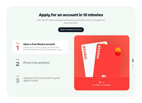
A dark, pill-shaped button with white MonzoSansText copy; used repeatedly for account-opening actions.
Outlined action
A light or transparent pill control with a dark outline and dark text for secondary actions such as learning more.
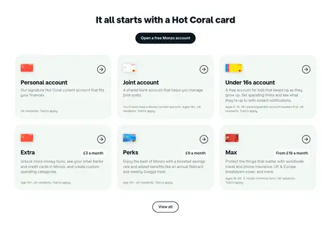
Feature card
A large rounded pale-green panel with dark heading and body copy, often paired with lifestyle or product media.
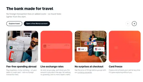
Product tile
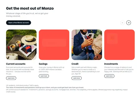
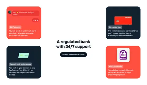
A rounded card combining a vivid image or coral product mock-up with a concise title and descriptive copy.
Inverse promotional panel
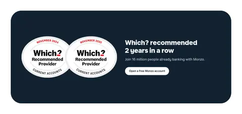
A deep navy rounded section using white text and product or award imagery for high-contrast promotion.
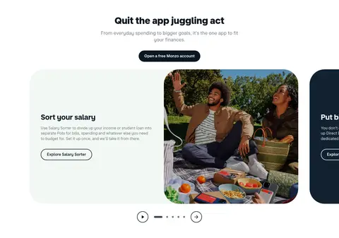
Carousel controls
Minimal circular arrow and pagination controls placed near horizontal feature-card sequences.
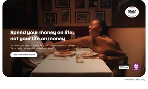
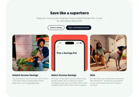
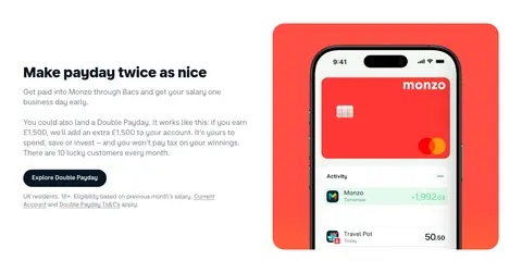
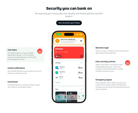
Imagery · Lifestyle photography and video lead the page, showing people in everyday settings and giving banking features a human context. Large hero media is cropped into a broad rounded frame, with white text layered over darker footage. Product imagery focuses on coral Monzo cards and phone screens, often placed inside clean cards or colored mock-up backgrounds. Photos and device visuals are vivid and varied; the surrounding interface remains restrained.
Reserve coral for brand accents and product moments.
Set headings in bold, rounded display typography.
Use deep navy for primary actions and strong contrast.
Alternate card grids with split and centered sections.
Pair feature explanations with relevant lifestyle or product imagery.
✕ 不该做
Do not fill every section with coral.
Do not crowd the page with dense decoration.
Do not use heavy shadows as the main separation method.
Do not make every section follow the same grid.
Do not use all-caps display headings.
Do not let supporting copy compete with the main headline.
给 AI 的提示词
想快速出一个同风格的新页面,把这段话连同 DESIGN.md 一起发给 AI。
Build a new Monzo-style banking page with a calm white canvas (#ffffff), pale Mint Haze panels (#f2f8f3), and Midnight Ink (#091723) for headline text and primary pill CTAs. Use Hot Coral (#ff4f40) as a selective brand signal, not a blanket section fill. Use bold rounded display headings and clear, regular sans-serif body copy. Keep the layout broad and airy, alternating centered introductions, feature grids, and asymmetric text-and-image splits. Use rounded cards, subtle hairlines, and minimal elevation. Let candid lifestyle photography and close-up phone or card imagery provide warmth and product context. Keep navigation simple, make the main action easy to spot, and use Deep Harbour (#112231) for occasional inverse promotional panels. Preserve clear hierarchy and concise, readable financial explanations.