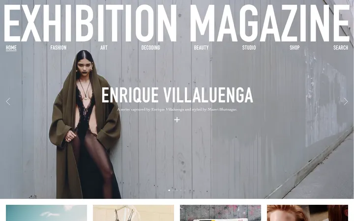
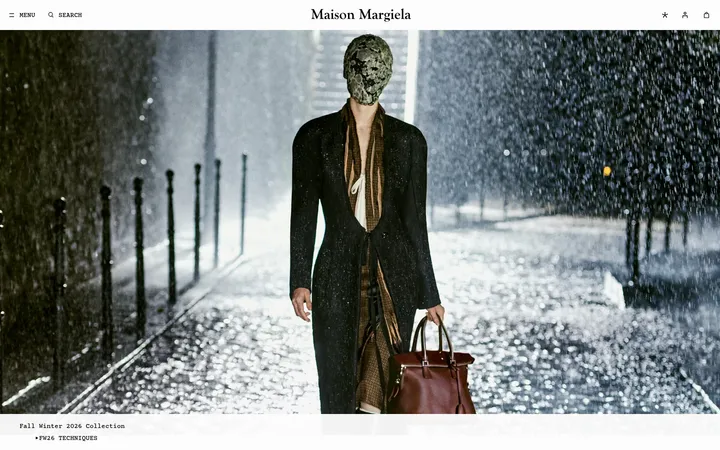
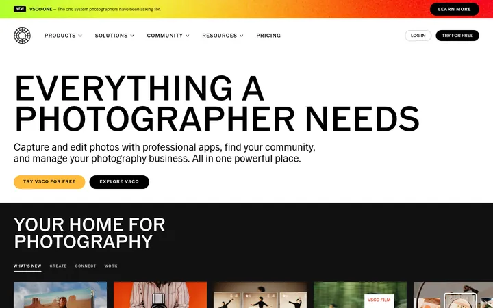
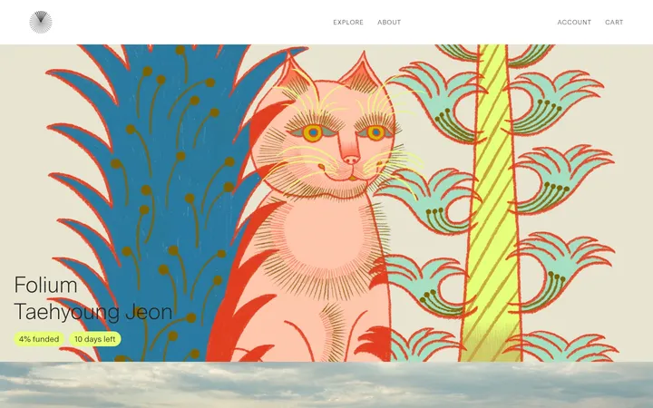
North star · Treat the homepage like a carefully edited magazine: let typography, imagery, and fine rules organize content while interface colour stays selective.
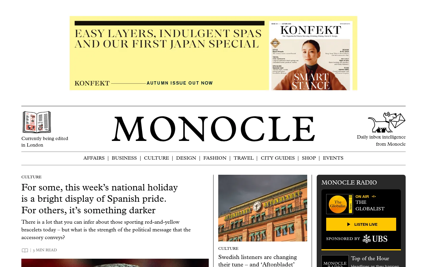
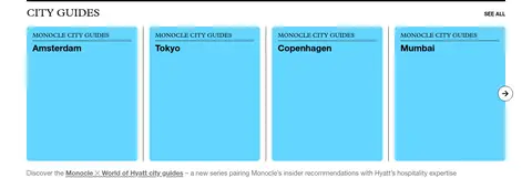
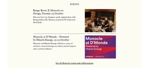
The page is built on a white canvas, with near-black type and hairline grey dividers establishing a crisp, print-like editorial frame. Plantin carries most reading: large story headlines, descriptions, captions and category headings feel literary without becoming ornate. Helvetica Neue provides the practical counterpoint for navigation and bold uppercase controls. Content alternates between tightly composed multi-column feeds, image-led story cards, product rows and open white intervals. Most colour comes from photography and illustrated assets rather than interface chrome. Sky cyan marks City Guides cards; warm ivory distinguishes Events; saturated yellow is reserved for radio actions and select campaign artwork. A large centered masthead and compact navigation create a recognizable opening, while recurring section labels, thin rules and consistent card boundaries help readers scan a long homepage. The black footer closes the page as a distinct, information-dense band.
配色
点色块复制色值。用途说明来自对页面的实测位置(背景、文字、描边、按钮)与截图判读。
品牌色
强调色
表层色
中性色
功能色
页面底色 · Paper White表层 · Guide Cyan表层 2 · Event Ivory表层 3 · Editorial Ink表层 4 · Soft Cream主文字 · Editorial Ink次要文字 · Paper White弱文字 · Caption Grey描边 · Rule Grey强调 · Guide Cyan强调 2 · Radio Yellow强调 3 · Link Blue
Navigation, bold story subheads, button labels, and compact utility text.
角色
示例
字号
字重
行高
字距
一级标题
Primary masthead and prominent lead-story headline.
Monocle
32px
400
1.2
0
二级标题
Uppercase editorial section headings.
Monocle
28px
400
1.25
0
三级标题
Bold sans-serif story or module subheadings.
The quick brown fox 敏捷的狐狸
24px
700
1.25
0
正文
Article descriptions and primary editorial reading text.
The quick brown fox 敏捷的狐狸
20px
400
1.25
0
辅助文字
Image captions, supporting notes, and secondary story details.
The quick brown fox 敏捷的狐狸
18px
400
1.44
0
按钮
Bold uppercase radio and utility calls to action.
The quick brown fox 敏捷的狐狸
16px
700
1.5
0
导航
Top-level section navigation and utility links.
The quick brown fox 敏捷的狐狸
16px
400
1
0
链接
Story titles and editorial links within content cards.
The quick brown fox 敏捷的狐狸
20px
400
1.25
0
间距与布局
基准单位 4px · 密度:紧凑
32px版块间距
4px元素间距
16px卡片内边距
1296px内容最大宽度
4px
8px
12px
16px
32px
A centered content frame reaches a measured maximum width of 1296px, with compact, modular spacing. The masthead spans the frame above a horizontal navigation row; the lead area then uses a strong editorial column alongside smaller story and radio columns. Lower modules shift among four-column story rows and denser multi-column grids. Thin rules define section starts and card edges. White space varies deliberately: tight within content cards, more generous around masthead and section transitions. The overall effect is information-rich but orderly.
圆角与层次
按钮 · 50%
卡片 · 8px
没有测到阴影:页面是扁平的,层次靠底色和描边区分。
The interface is predominantly flat, with no measured shadow system. Fine grey rules separate content columns and section boundaries; cards rely on image edges, spacing, and occasional measured rounded corners rather than raised surfaces. Keep layering restrained: dark radio panels and coloured guide cards provide contrast through fill, not shadow.
组件
下面的预览按实测的按钮、输入框、徽标、卡片样式重建(字体用替代字体)。
Masthead and section navigation
Large centered Monocle wordmark framed by thin horizontal rules, with small editorial identity blocks at the sides and a compact, centered sans-serif section menu.
Lead editorial feed
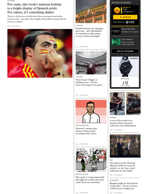
Large Plantin story headline and summary sit beside image-led secondary stories and a radio module; organize the area into clearly ruled columns.
Radio module
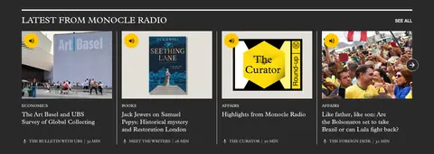
Use a dark charcoal or black panel, white Plantin labels, and a saturated yellow Listen Live action with black uppercase sans-serif text.
Story cards
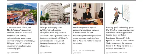
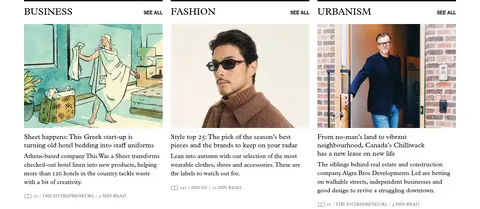
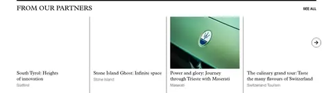
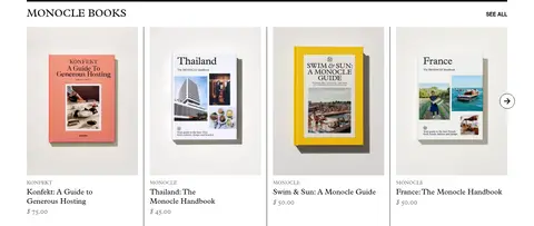
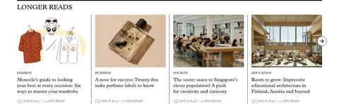
Pair editorial photography with small uppercase category labels, Plantin headlines, concise copy, and discreet metadata; separate adjacent cards with fine rules.
City Guide cards
Use measured Guide Cyan #64d5ff as a flat card background with black text and restrained, magazine-like city labels.
Section headers
Set prominent editorial section titles in uppercase Plantin and anchor content groups with thin grey or black rules.
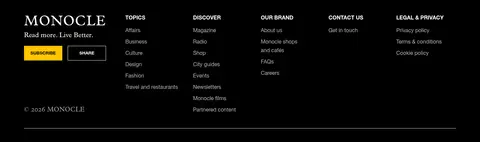
Dark footer
Close with a full black band, white Monocle identity, compact navigation columns, muted secondary labels, and yellow subscription emphasis.
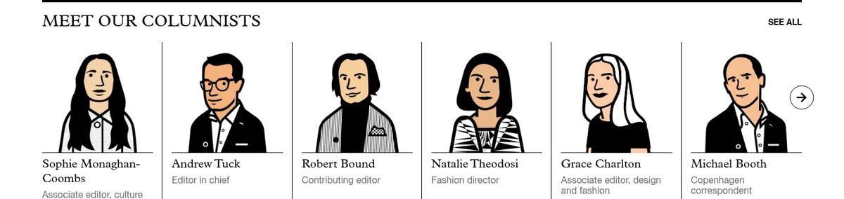
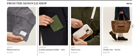
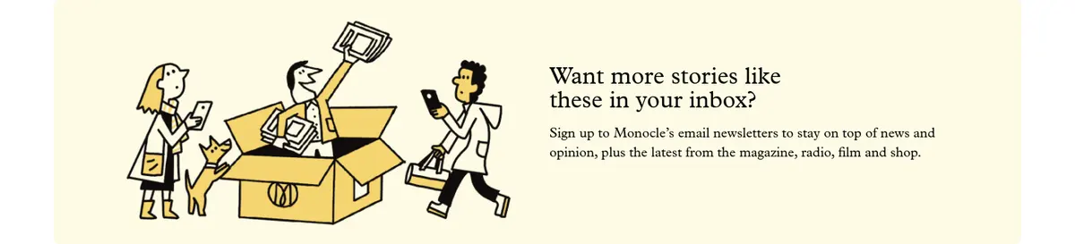
Imagery · Photography is the dominant content visual: editorial portraits, places, objects, architecture, and product images appear in consistently cropped cards. Images retain natural colour and are not covered by heavy filters or decorative frames. Illustrated portraits and drawings appear in selected editorial and newsletter modules, giving variety without changing the page’s print-oriented tone. Radio and magazine artwork can carry brighter colours inside their own modules.
Keep the canvas white and the editorial hierarchy high contrast.
Use Plantin-style serif typography for stories and long-form copy.
Reserve Helvetica Neue-style sans serif for navigation and controls.
Separate content groups with thin, understated rules.
Use bright colour only for specific content modules and actions.
Let photography remain natural and lead the card composition.
✕ 不该做
Do not turn every section into a coloured panel.
Do not add shadows or decorative gradients.
Do not replace fine rules with heavy card borders.
Do not make navigation louder than editorial headlines.
Do not use rounded, app-like UI styling across the page.
Do not apply tinted overlays to editorial photography.
给 AI 的提示词
想快速出一个同风格的新页面,把这段话连同 DESIGN.md 一起发给 AI。
Build a new editorial homepage in Monocle’s restrained, print-inspired style. Use Paper White (#ffffff) as the main canvas and Editorial Ink (#000000) for headlines, copy, and strong rules. Set story headlines and reading text in a Plantin-like serif; use a clean Helvetica Neue-like sans serif for navigation and bold uppercase controls. Organize content in a centered frame with a prominent masthead, compact horizontal navigation, and varied editorial columns. Use natural, tightly cropped photography, fine grey dividers, and concise metadata to keep a dense feed scannable. Apply Guide Cyan (#64d5ff) only to city-guide content, Event Ivory (#fdfcf3) to a distinct event block, and Radio Yellow (#ffc500) sparingly for audio actions. Keep surfaces flat, spacing compact, and the footer black.