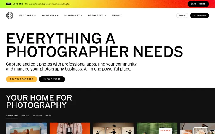
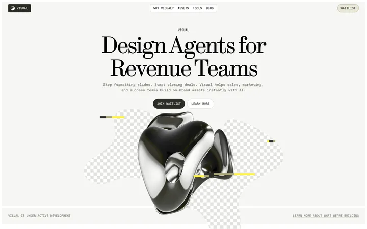
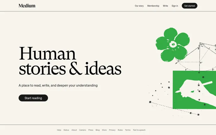
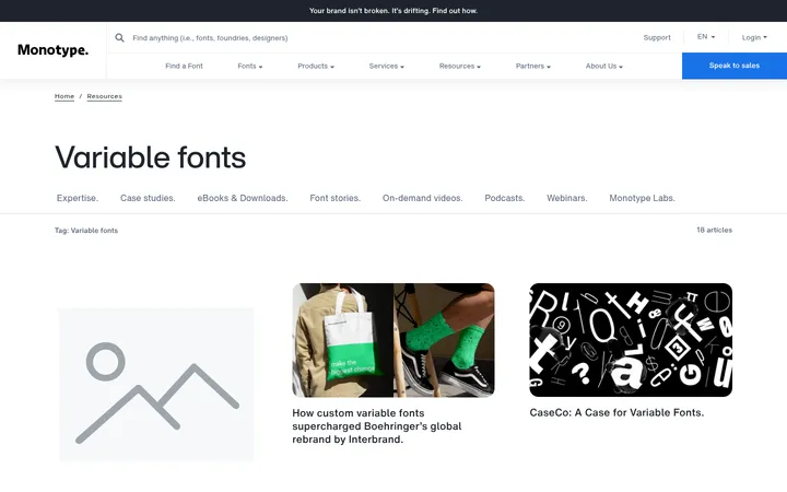
North star · Keep the interface quiet and monochrome so full-bleed book imagery and editorial typography carry the experience.
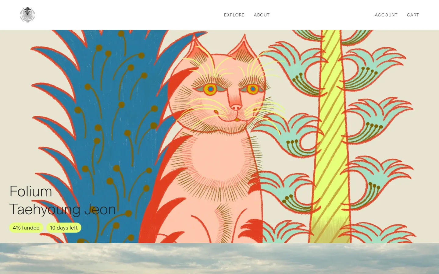
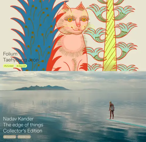
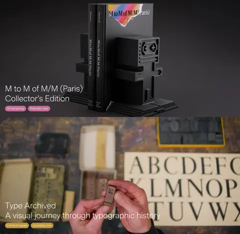
The visual system keeps the interface itself nearly monochrome: white is the main canvas, charcoal anchors dark sections and footer areas, and measured gray tones handle secondary text, borders, and the newsletter button. The vivid creams, blues, reds, and greens visible in the long hero imagery belong to the featured artwork and book photography, not to a general UI accent palette. Messina Sans is used throughout in light weights, with spacious, readable headlines and small uppercase labels that add a restrained publishing sensibility. The page is built around wide, full-bleed image features alternating with a white newsletter band and a dark footer. Overlay text sits directly over imagery rather than inside decorated cards. Generous open space and simple alignment give each title room to read, while hairline borders and flat controls keep the interface unobtrusive. The result makes the books and their artwork the strongest visual signals.
Site-wide display, headings, body, navigation, labels, and controls.
角色
示例
字号
字重
行高
字距
特大标题
Oversized editorial headline treatment where featured content calls for emphasis.
Volume
80px
300
1.18
0
一级标题
Primary title typography for featured books and page-level headings.
Volume
50px
300
1.18
-0.02em
正文
Newsletter copy and supporting descriptive text.
The quick brown fox 敏捷的狐狸
18px
350
1
0
辅助文字
Small uppercase metadata and compact supporting labels.
The quick brown fox 敏捷的狐狸
14px
300
1
0.07em
按钮
Uppercase sign-up action text.
The quick brown fox 敏捷的狐狸
14px
300
1
0.07em
导航
Header and account navigation links.
The quick brown fox 敏捷的狐狸
20px
300
1.18
0
眉题
Uppercase section labels and short metadata.
The quick brown fox 敏捷的狐狸
14px
300
1
0.07em
间距与布局
基准单位 2px · 密度:适中
45px版块间距
—元素间距
—卡片内边距
1380px内容最大宽度
4px
8px
10px
12px
13px
15px
17px
19px
24px
30px
45px
60px
The page uses a single-column editorial flow, with full-bleed feature imagery spanning the viewport and a measured page max width of 1380px for contained content. Navigation forms a slim horizontal band; featured books stack vertically rather than appearing in cards. A white newsletter section interrupts the image sequence, followed by a three-column utility footer. Alignment is predominantly left-led, with comfortable density and clear breathing room between major blocks.
圆角与层次
没有测到阴影:页面是扁平的,层次靠底色和描边区分。
The interface is essentially flat: no measured shadows or gradients. Separation comes from alternating image fields, white canvas, and a charcoal footer. Controls use simple square-cornered outlines and restrained fills; the only rounded treatment measured is a pill-shaped radius scale, visible in image-overlay status labels rather than the main form controls.
组件
下面的预览按实测的按钮、输入框、徽标、卡片样式重建(字体用替代字体)。
Top navigation
White horizontal header with a small emblem, widely separated navigation groups, and understated uppercase links; nav typography is light Messina Sans.
Featured book panels
Full-bleed image-led panels with large, left-aligned title overlays and short availability or preorder metadata.
Status labels
Compact pill-shaped funding, remaining-copy, and availability labels placed directly over featured imagery.
Newsletter form
Large editorial invitation above a bordered email field; the measured input uses a 1px #717171 border and the sign-up button uses #949494 with white uppercase text.
Footer
Charcoal inverse surface with three utility columns, subdued text, country selector, and a small return-to-top control.
Imagery · Large, edge-to-edge artwork and photography are the defining feature: an illustrated book cover, a cinematic waterside photograph, a dark product shot of a book object, and a close-up typographic archive scene. Text overlays sit low and to the left, with white or dark text chosen for contrast. Treat color-rich artwork as content imagery, not as a site-wide UI palette.
Let featured book imagery span the full viewport width.
Keep interface surfaces predominantly #ffffff and #272727.
Use light Messina Sans-style typography for headings and navigation.
Place concise title and availability metadata over image panels.
Keep newsletter controls rectangular, thin-bordered, and understated.
Use generous breathing room between editorial sections.
✕ 不该做
Do not turn the artwork palette into default UI accent colors.
Do not wrap every featured title in a card.
Do not add gradients, shadows, or decorative elevation.
Do not use heavy display weights or dense, compact text.
Do not make navigation visually louder than the featured books.
Do not replace the monochrome footer with a bright section.
给 AI 的提示词
想快速出一个同风格的新页面,把这段话连同 DESIGN.md 一起发给 AI。
Build a new Volume-style publishing page with a quiet monochrome interface and image-led editorial flow. Use Gallery White (#ffffff) for the main canvas and newsletter area, Charcoal Ink (#272727) for primary text and dark inverse surfaces, Quiet Graphite (#717171) for hairlines and subdued links, and Soft Pewter (#949494) sparingly for muted controls. Use a light sans-serif close to Messina Sans, with spacious sentence-case headlines and small tracked uppercase labels. Arrange large full-bleed book or visual-culture imagery in a single-column sequence; place titles and concise availability details directly over the image. Insert a restrained newsletter band and finish with a dark utility footer. Keep controls flat, borders fine, and layout airy. Treat vivid artwork colors as content, not reusable interface accents.