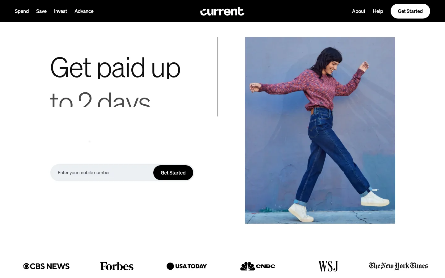
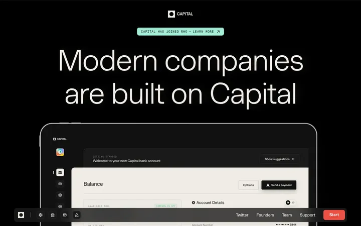
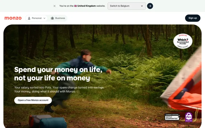
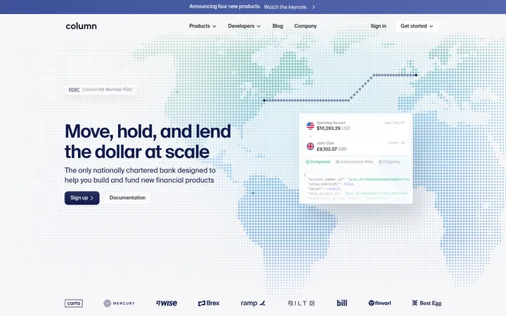
Current 首页以宽阔的白色画布和轻盈的大标题为主,搭配醒目的黑色导航与行动按钮。生活方式摄影和鲜活的金融插画为页面增添亲和力,同时保留克制、清晰的编辑式节奏。
North star · Keep the page predominantly white and editorial, using black for structure and conversion while confining colour to product imagery and a precise footer accent.
The visual system is built around a white canvas and high-contrast black typography, with nearly all content sections staying light rather than alternating through colour bands. A compact black header anchors the page, while a black conversion band near the footer provides a second strong focal point. Söhne’s broad range of light weights supports large, calm headlines; heavier weights are reserved for navigation and controls. Content is arranged in spacious split layouts and a three-column benefits row, with generous separation between feature stories. Lifestyle photography is framed as rectangular editorial imagery, while product benefits use bright, playful illustrations that remain contained within their image areas. Outlined pill buttons handle secondary actions; filled black pills mark primary conversion. A restrained grey is used for muted footer copy and pale grey for subtle interface fills. The warm-to-purple gradient appears as a narrow footer accent, not a general page background.
配色
点色块复制色值。用途说明来自对页面的实测位置(背景、文字、描边、按钮)与截图判读。
品牌色
强调色
表层色
中性色
功能色
页面底色 · Gallery White表层 · Current Ink主文字 · Current Ink次要文字 · Slate Muted弱文字 · Gallery White描边 · Footer Divider强调 · Illustration Gold强调 2 · Illustration Orange强调 3 · Electric Violet
Site-wide headings, body copy, navigation, buttons, captions, and disclosures.
角色
示例
字号
字重
行高
字距
特大标题
Oversized hero headline, with very light weight and tight tracking.
Current
90px
100
1
-0.04em
一级标题
Primary feature and section headlines.
Current
72px
300
1.2
-0.001em
二级标题
Secondary feature headlines and major content blocks.
Current
48px
100
1.2
-0.02em
三级标题
Compact feature titles and subsection headings.
The quick brown fox 敏捷的狐狸
24px
100
1.4
-0.02em
正文
Supporting descriptions and explanatory product copy.
The quick brown fox 敏捷的狐狸
20px
300
1.6
0
辅助文字
Small labels, footnotes, and disclosure text.
The quick brown fox 敏捷的狐狸
12px
400
1.4
-0.013em
按钮
CTA and secondary action labels.
The quick brown fox 敏捷的狐狸
18px
100
1.6
0
导航
Header navigation and high-emphasis menu labels.
The quick brown fox 敏捷的狐狸
16px
700
1.4
-0.01em
间距与布局
基准单位 8px · 密度:宽松
120px版块间距
24px元素间距
—卡片内边距
1344px内容最大宽度
4px
5px
8px
14px
16px
20px
24px
40px
48px
80px
120px
Use a centered content area with a measured maximum width of 1344px and a spacious density. The hero balances headline and lifestyle image across two columns; later sections alternate split feature layouts with a three-column benefits row and testimonial columns. Align most content to the left, reserving centered alignment for the reviews heading. Maintain generous section rhythm (measured section gap 120) and clear separation between editorial blocks. The footer expands into a dense legal area beneath a compact navigation region.
圆角与层次
按钮 · 9999px
卡片 · 9999px
xl · button
The page is predominantly flat: white sections rely on whitespace and contrast rather than cards or prominent shadows. Use thin black outlines for secondary pill buttons and subtle grey hairlines in the footer. The black header and CTA band create depth through solid colour blocks; reserve the measured soft shadow for raised conversion controls only when matching the reference.
组件
下面的预览按实测的按钮、输入框、徽标、卡片样式重建(字体用替代字体)。
Black navigation bar
Full-width black header with white brand mark, bold white navigation, and a white pill-shaped Get Started CTA.
Hero signup
Large lightweight headline beside rectangular lifestyle photography, with a pale mobile-number field and black pill CTA.
Outlined secondary button
White or transparent pill with a 2px black border, bold black label, and measured 9999px radius.
Feature story
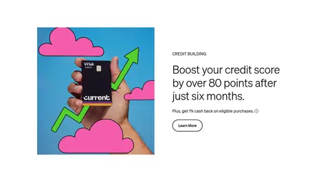
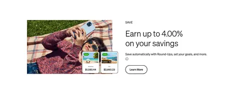
Editorial split layout pairing a large headline and short copy with product imagery or an illustration; include a small category label where shown.
Benefits row
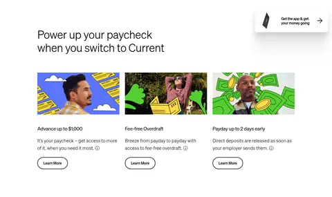
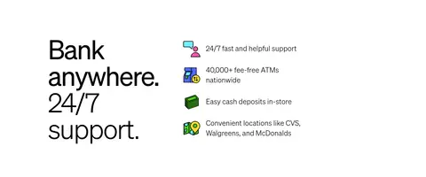
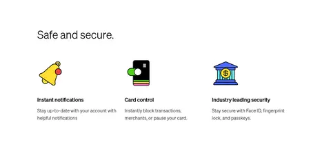
Three evenly aligned benefit items with compact illustrations, short titles, and supporting copy.
Testimonial columns
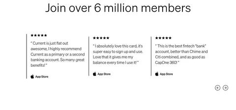
Three review columns with star ratings, quote text, and App Store attribution, separated with fine vertical rules.
Footer conversion band
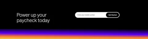
Black CTA section with a white headline and light signup field, finished with a narrow yellow-to-orange-to-violet gradient accent.
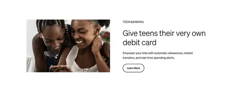
Imagery · Use rectangular lifestyle photography for the hero and teen banking feature, with the person or product clearly visible against simple backgrounds. Product-benefit assets are colourful, graphic illustrations and mockups, including cards, money, and app screens; keep their colour contained within their frames. The page also uses a restrained row of media logos and small security-themed icons. Avoid applying colour treatments to the surrounding white canvas.
Keep the main canvas white and sections visually open.
Use Söhne-like light typography for large headlines.
Reserve black fills for primary calls to action and strong anchors.
Use outlined pills for secondary actions.
Give photography and illustrations their own clear rectangular frames.
Keep the warm-to-violet gradient as a narrow footer detail.
✕ 不该做
Do not alternate every section with coloured backgrounds.
Do not make large headlines heavy or tightly boxed.
Do not use vivid accent colours as general text or page surfaces.
Do not turn every feature into a floating card.
Do not replace the spacious editorial rhythm with dense grids.
Do not add prominent shadows to ordinary content sections.
给 AI 的提示词
想快速出一个同风格的新页面,把这段话连同 DESIGN.md 一起发给 AI。
Build a new fintech page in Current’s restrained editorial style. Use a white Gallery White (#ffffff) canvas, Current Ink (#000000) for headings, body text, primary buttons, and structural bands, and Slate Muted (#737582) only for secondary footer copy. Set headings in a light Söhne-like sans serif and reserve bold weights for navigation and controls. Compose the page from spacious split feature sections, a compact three-column benefit area, and clear left-aligned copy. Pair rectangular lifestyle photography with contained, colourful product illustrations rather than tinting whole sections. Use outlined rounded pills for secondary actions and filled black pills for primary conversion. Keep borders subtle with Footer Divider (#dfe5ec); use Cloud Fill (#f3f6f8) for light inputs. Confine Illustration Gold (#f4cb45), Illustration Orange (#f47635), and Electric Violet (#5900f5) to imagery or a narrow footer gradient.