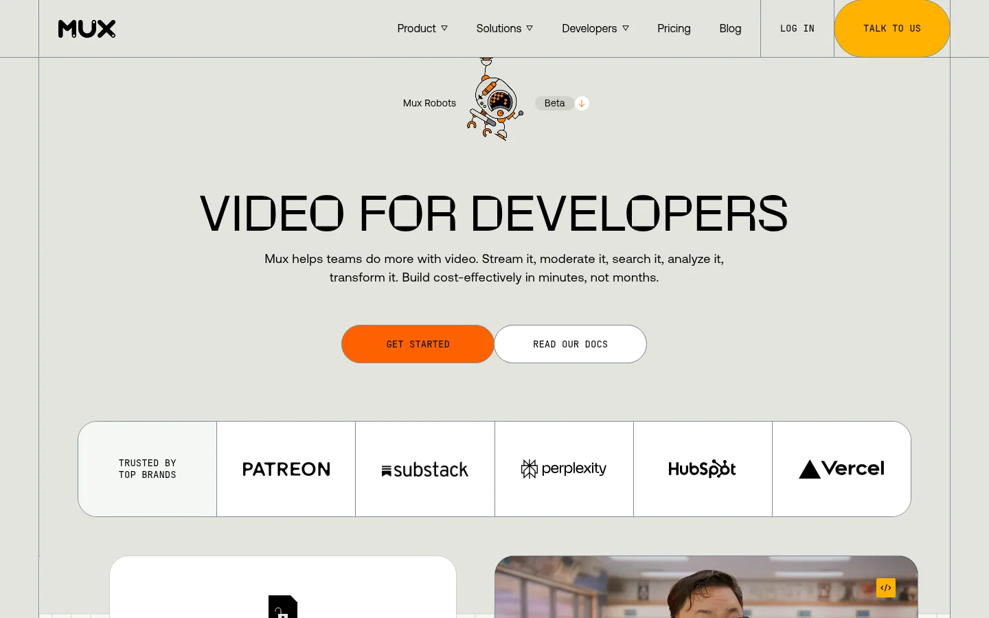
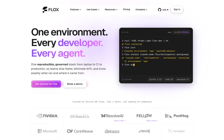
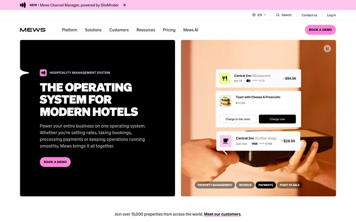
North star · Keep a warm, restrained canvas and crisp technical typography, then make product demos and orange actions the focal points.
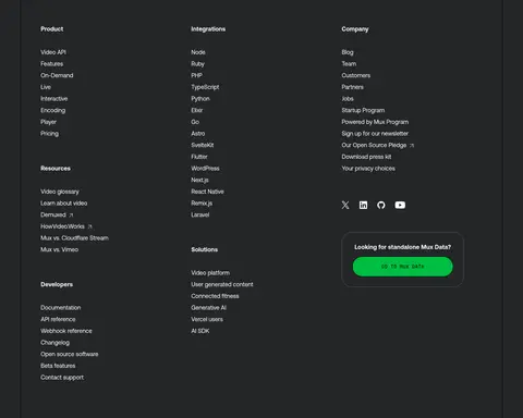
The visual system is anchored by a muted warm-gray canvas (#e2e4dd), with near-black type and outlined boundaries giving the page a restrained, technical character. Pale surfaces distinguish interactive demonstrations, while charcoal panels create strong contrast for code examples, AI workflows, testimonials, and the footer. Amber appears as a large CTA band and selected demo accents; orange is reserved for the primary hero action and small markers. Typography combines Aeonik’s clean, friendly sans-serif for navigation and reading with JetBrains Mono for labels, code, and compact uppercase controls. A distinctive display face shapes the oversized hero headline. The layout moves between centered hero content, modular demo grids, split editorial features, and dark testimonial cards. Rounded CTA pills and generous card corners soften the precise grid, while thin gray rules keep navigation, logo cells, and panels visually connected. Product imagery and robot illustrations add personality without changing the restrained base palette.
Main interface and reading face for body text, navigation, headings, links, and buttons.
Aa 设计
JetBrainsMono
网络字体 · 字重 400 · 占比 20%
免费替代:JetBrains Mono
Monospaced labels, code, captions, and compact uppercase CTA text.
角色
示例
字号
字重
行高
字距
一级标题
Oversized centered hero headline, in a distinctive display face.
Mux
50px
400
1.2
0.02em
二级标题
Primary feature and testimonial section headings.
The quick brown fox 敏捷的狐狸
24px
700
1.15
0
三级标题
Product demo card titles and subsection headings.
The quick brown fox 敏捷的狐狸
21px
700
1.15
0
正文
Supporting copy, feature descriptions, and explanatory text.
The quick brown fox 敏捷的狐狸
16px
400
1.5
0.02em
辅助文字
Monospaced technical labels, timestamps, and compact captions.
The quick brown fox 敏捷的狐狸
14px
400
1.6
0
按钮
Bold labels for prominent actions and interface controls.
The quick brown fox 敏捷的狐狸
16px
700
1.5
0.02em
导航
Header navigation and primary site links.
The quick brown fox 敏捷的狐狸
16px
400
1.5
0
链接
Inline feature links and calls to explore product content.
The quick brown fox 敏捷的狐狸
16px
400
1.5
0.02em
代码
Code snippets and technical examples in demo panels.
const style = 1;
14px
400
1.6
0
间距与布局
基准单位 4px · 密度:适中
56px版块间距
28px元素间距
—卡片内边距
1328px内容最大宽度
4px
7px
14px
28px
42px
56px
84px
The page uses a centered content frame measured at a 1328px maximum width, with a comfortable density and clear separation between major sections. The hero is centered and spacious; subsequent content switches to multi-column, card-based demonstrations and six-column editorial splits. The AI workflow area becomes a denser twelve-column composition, while testimonials use three columns. Sections follow a measured 56px rhythm, with 28px element spacing. Thin rules align the header, logo strip, and page edges; preserve generous breathing room around headings and primary actions.
圆角与层次
按钮 · 9999px
卡片 · 28px
图片 · 2px
徽标 · 9999px
没有测到阴影:页面是扁平的,层次靠底色和描边区分。
The page is mostly flat: no measured shadows are present. Separate content with thin cool-gray borders, contrasting section fills, and card boundaries instead of floating elevation. Rounded demo cards and pill-shaped controls create softness, while layered video and interface overlays provide depth within product mockups.
组件
下面的预览按实测的按钮、输入框、徽标、卡片样式重建(字体用替代字体)。
Primary CTA
Bright orange pill button with black uppercase monospaced text; pair it with a white outlined secondary action in the hero.
Header navigation
Warm-gray header with black Aeonik links, a logo at left, fine rules, and a prominent amber contact pill.
Logo cloud
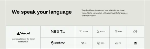
White horizontal brand strip divided into equal cells by thin gray rules, with partner marks centered in each cell.
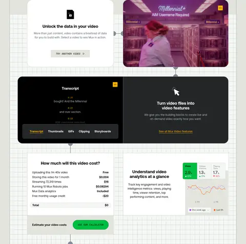
Interactive demo card
Rounded product panel combining explanatory text, video or analytics UI, and small mono labels or action controls.
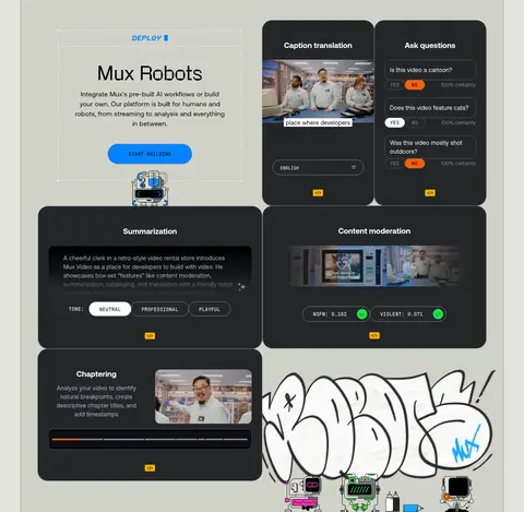
Dark product panel
Charcoal rounded card with white text, fine cool-gray outlines, and embedded code, transcript, or AI workflow content.
Testimonial grid
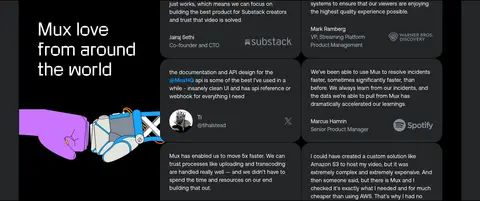
Dark band with a large illustrated title tile alongside compact charcoal quote cards and subdued attribution details.
Closing CTA band
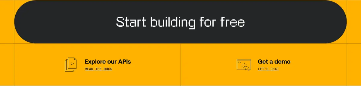
Full-width amber section with a large charcoal pill action and two smaller utility links beneath.
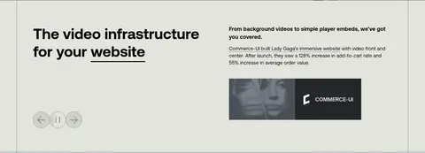
Imagery · Use real video stills and interface captures as evidence of the product, framed within rounded demo panels and occasionally paired with explanatory cards. The page also uses playful robot and hand-drawn graffiti illustrations, which add character without defining the core palette. Keep imagery integrated with the grid, retain recognizable playback or code overlays, and use darker media panels where contrast helps interface content read clearly.
Reserve orange for prominent actions and small highlights.
Use JetBrains Mono for labels, code, and compact controls.
Build product stories from rounded cards and clear grid divisions.
Alternate pale content sections with charcoal product panels.
✕ 不该做
Do not introduce unmeasured palette colors.
Do not add drop shadows to otherwise flat panels.
Do not make every section dark or card-heavy.
Do not use orange as the dominant background outside the CTA band.
Do not replace product evidence with generic decorative imagery.
Do not use monospaced type for long-form body copy.
给 AI 的提示词
想快速出一个同风格的新页面,把这段话连同 DESIGN.md 一起发给 AI。
Build a new Mux page in the same restrained, developer-focused visual language. Use Warm Canvas (#e2e4dd) as the main field, Signal Ink (#000000) for text, Gallery White (#ffffff) and Mist Surface (#f4f6f4) for light cards, and Charcoal Panel (#242628) for dark product modules. Apply Mux Amber (#ffb200) to a standout CTA area and Action Orange (#ff6100) sparingly to primary actions or interface markers. Set reading and navigation in Aeonik or a close sans-serif substitute; use JetBrains Mono for code, captions, and uppercase utility labels. Compose centered editorial introductions with modular, rounded product demonstrations, thin borders, and generous measured rhythm. Prefer real product UI, video stills, and restrained playful illustrations. Keep the page flat, aligned, and clear rather than adding shadows or decorative effects.