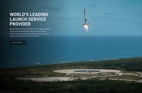
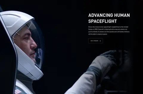
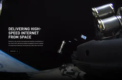
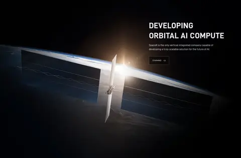
North star · Keep the interface nearly invisible: one black canvas, sharp uppercase messaging, and cinematic media doing the expressive work.
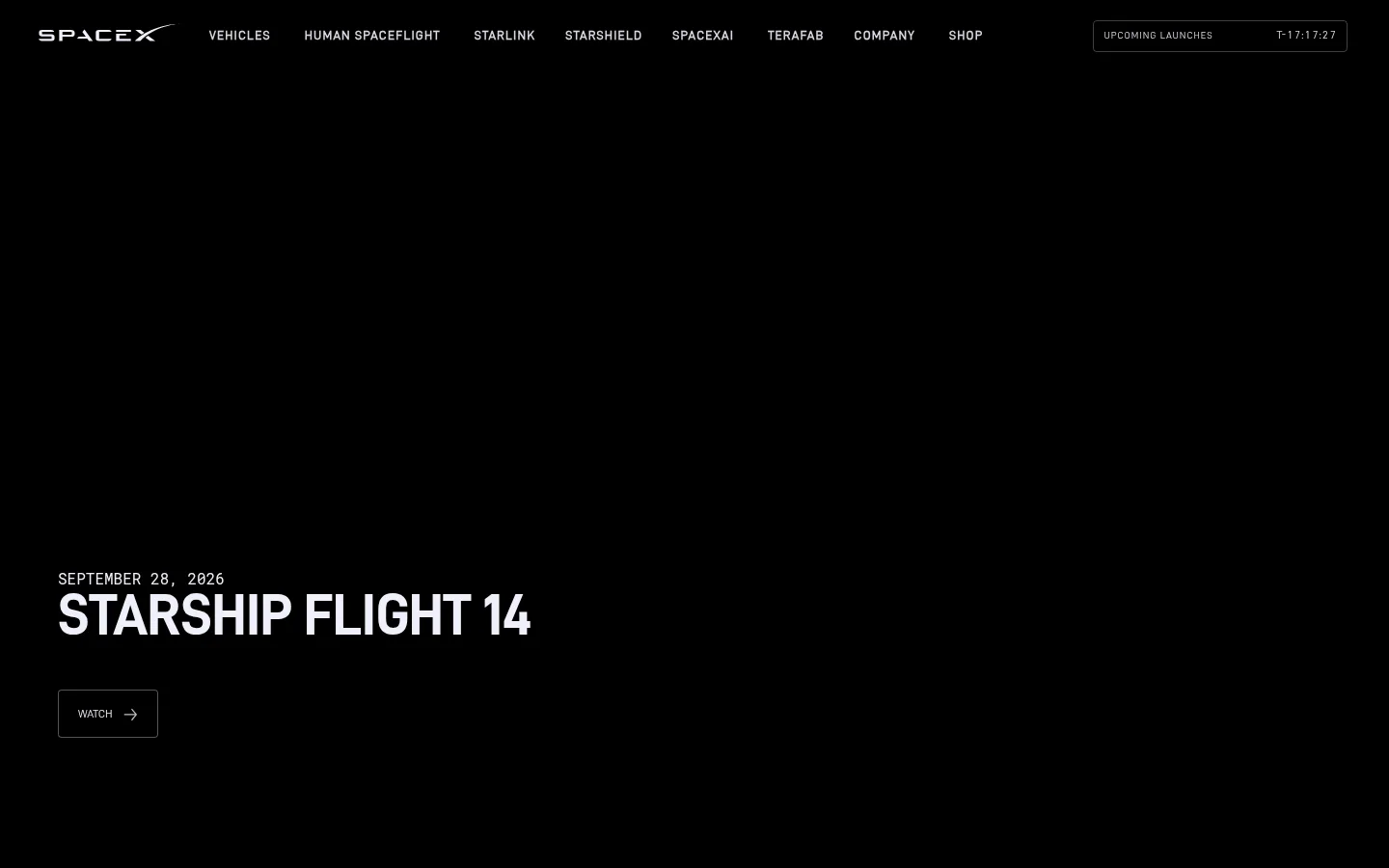
The page is built on a uniform #000000 canvas, with no alternating section bands; full-bleed video and photography supply nearly all visual variation. Headings and navigation use uppercase forms in the custom D-DIN family, creating a compact, technical voice against the imagery. Large display headlines sit close to short supporting copy and a small outlined action, with the content anchored toward a lower corner or one side of each frame. The page moves through tall, single-column media sections, alternating text placement to keep the repeated structure from feeling static. White text (#f0f0fa) carries the main message, while muted navigation text and restrained gray hairlines remain secondary. The content is spacious rather than card-dense: there are no prominent cards, shadows, or decorative containers. Treat the photographs and videos as the page’s color and texture; keep interface chrome minimal so the launch, spacecraft, and human imagery remain dominant.
Navigation, body copy, and outlined action labels.
Aa 设计
D-DIN-Bold
网络字体 · 字重 400 · 占比 12%
免费替代:Barlow Condensed
Display headlines and section headings.
Aa 设计
Roboto Mono
网络字体 · 字重 400 · 占比 1%
免费替代:Roboto Mono
Code-style role, measured as a minor typographic accent.
角色
示例
字号
字重
行高
字距
特大标题
Oversized uppercase display treatment for prominent campaign headlines.
SpaceX
80px
400
0.95
0.02em
一级标题
Primary section headline, as in the opening Starship Flight announcement.
SpaceX
60px
400
0.9
-0.017em
二级标题
Large uppercase feature headings across media-led sections.
SpaceX
48px
400
1.25
0.02em
正文
Short explanatory copy beneath feature headlines.
The quick brown fox 敏捷的狐狸
16px
400
1.5
0
辅助文字
Compact uppercase date and metadata labels.
The quick brown fox 敏捷的狐狸
13px
700
0.94
0.09em
导航
Small uppercase labels in the global navigation.
The quick brown fox 敏捷的狐狸
12px
400
0.94
0
眉题
Emphasized uppercase lead-in or supporting label.
The quick brown fox 敏捷的狐狸
13px
700
0.94
0.09em
代码
Monospaced uppercase utility text; not visually prominent in the screenshots.
const style = 1;
16px
400
1.4
0
间距与布局
基准单位 2px · 密度:适中
—版块间距
16px元素间距
—卡片内边距
—内容最大宽度
3px
4px
10px
12px
13px
15px
16px
18px
20px
24px
30px
36px
40px
Use a single-column sequence of tall, full-bleed media sections rather than a card grid. Keep each section’s text block anchored to one side, shifting left and right between features as the imagery allows. The first viewport has a slim horizontal navigation above a large, open hero field; headline and action sit low on the left. Sections repeat a calm rhythm of headline, brief copy, and one action. The measurements provide no page max-width, so do not impose an invented fixed content width.
圆角与层次
按钮 · 4px
导航 · 4px
没有测到阴影:页面是扁平的,层次靠底色和描边区分。
The interface is predominantly flat: no measured shadows, cards, or elevated panels. Separate controls from the canvas with thin gray outlines and subtly rounded corners. Use the full-bleed media and dark gradient fades for depth and text legibility, not stacked UI surfaces or decorative borders.
组件
下面的预览按实测的按钮、输入框、徽标、卡片样式重建(字体用替代字体)。
Global navigation
Compact uppercase links across the top over the black canvas, with light primary text and muted secondary labels; keep it visually subordinate to the hero.
Launch timer
A narrow outlined utility control at the upper right, using restrained gray border detail and small muted uppercase text.
Media hero
Full-bleed opening frame with a small uppercase date, bold headline, and a single outlined WATCH action positioned low on the left.
Feature section
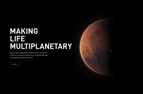
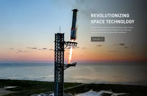
Tall media-led section with an uppercase heading, brief copy, and a compact action aligned to one side of the image.
Outlined action
Text-first control with a thin #545457 outline, small corner rounding, white label, and a directional arrow where shown.
Footer links
Small, widely spaced uppercase utility links at the end of the media sequence, kept quiet against the black background.
Imagery · Use cinematic video or photography of rockets, spacecraft, Earth, and crew as the dominant content. Images span the section and are framed as environmental scenes rather than isolated product cutouts. Preserve dark areas for legible text, with subtle black gradient overlays where needed. Warm planetary light and blue launch scenes are visible within the media, not part of the measured interface palette; avoid adding decorative illustrations.
Let full-bleed spaceflight media dominate each section.
Set major headlines in uppercase, bold, condensed-looking sans-serif.
Keep supporting copy brief and subordinate to the heading.
Use outlined actions with restrained gray borders.
Alternate feature text placement when the imagery supports it.
✕ 不该做
Do not introduce bright interface colors beyond the measured palette.
Do not turn feature sections into cards or boxed panels.
Do not add drop shadows or decorative elevation.
Do not crowd the navigation with oversized treatments.
Do not place dense paragraphs over busy image areas.
Do not treat colors inside photographs as interface palette colors.
给 AI 的提示词
想快速出一个同风格的新页面,把这段话连同 DESIGN.md 一起发给 AI。
Build a new SpaceX-style page as a sequence of tall, full-bleed media sections on Mission Black (#000000). Use Flight White (#f0f0fa) for uppercase, bold, compact headlines and primary navigation; keep supporting copy short and quiet. Set feature headings beside or over cinematic rocket, spacecraft, Earth, or crew imagery, alternating text alignment between sections where appropriate. Preserve generous open areas in each frame and use subtle black fades only where text needs contrast. Actions should be small, text-led outlined controls with Graphite Line (#545457), not filled promotional buttons. Use Orbit Gray (#d8d8e1) for secondary navigation labels and keep Control Gray (#404040) to minor interface detail. Avoid cards, shadows, extra colors, dense grids, and ornamental UI; the media should provide the page’s drama.