Mr. Pops 用超大展示字体搭配沉浸式冰淇淋摄影。暖桃色底色与莓红点缀,为以影像为主角的店铺首页增添活泼气息。
North star · Let expressive, full-bleed ice-cream photography and oversized Cervo type lead, keeping controls light and secondary.
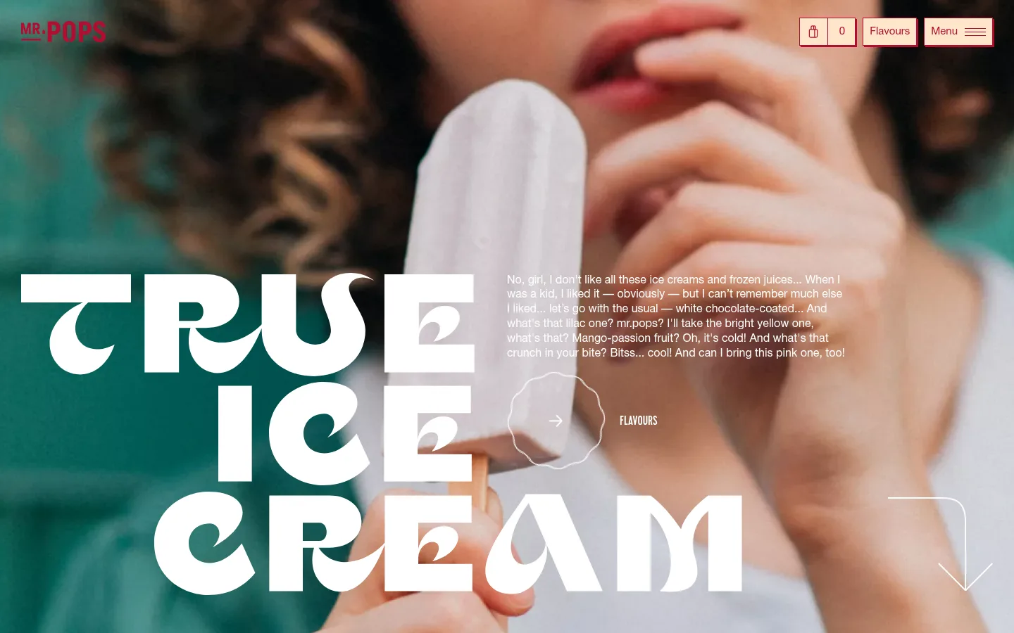
The visual strategy puts full-bleed portrait photography first: close crops of people tasting ice cream fill the opening screen, with the product and face creating an immediate focal point. The measured page canvas is warm peach (#fee5ca), while the screenshot shows photography carrying much of the visible color and mood. Deep berry red (#b00e2f) identifies the wordmark and navigation, and white (#ffffff) provides contrast for the oversized headline, supporting copy, outlines, and small controls. Cervo display lettering is set in uppercase with unusually large scale and compact line spacing, arranged as a bold, staggered stack. HelveticaNeueCyr handles navigation and conversational body text in a quieter voice. The hero layers copy and a small flavour link over the photograph rather than boxing them into cards. Full-width imagery and restrained interface chrome keep the page energetic and editorial; spacing remains comfortable, with simple, flat controls rather than shadowed panels.
Conversational product storytelling and descriptive copy.
The quick brown fox 敏捷的狐狸
16px
400
1.3
0
辅助文字
Small supporting labels and flavour-related details.
The quick brown fox 敏捷的狐狸
15px
400
1.4
0
导航
Header links, menu labels, and compact store controls.
The quick brown fox 敏捷的狐狸
15px
400
1.3
0
间距与布局
基准单位 4px · 密度:适中
36px版块间距
20px元素间距
—卡片内边距
1380px内容最大宽度
8px
9px
10px
16px
20px
30px
36px
58px
The opening section combines a full-bleed image with an overlay composition: the oversized headline anchors the left and lower area, while a narrow block of story copy and a flavour link sit to the right. Header controls span the top edge, with the wordmark at left and store navigation at right. The measured page max width is 1380px, with a comfortable density and a six-column section reading. A second full-bleed image continues the visual narrative. Keep text aligned to clear zones within photography and preserve open breathing room around controls.
圆角与层次
没有测到阴影:页面是扁平的,层次靠底色和描边区分。
The measured system has no shadows, gradients, or card treatments. Keep the interface visually flat: use photography for depth, white outlines for delicate separation, and fine borders on compact header controls. Text and navigation sit directly over the image or canvas rather than on elevated panels.
组件
下面的预览按实测的按钮、输入框、徽标、卡片样式重建(字体用替代字体)。
Wordmark
Place the compact Mr. Pops mark at the upper left in berry red, over the hero image.
Header controls
Arrange the cart count, Flavours link, and Menu control along the upper right; use light surfaces, berry-red text, and fine outlines.
Display headline
Set the hero statement in uppercase Cervo, oversized and stacked across the lower-left area of the photograph.
Story copy
Overlay conversational white HelveticaNeueCyr text in a compact block to the right of the headline.
Flavour link
Pair a small uppercase white label with a simple outlined circular arrow treatment over the hero image.
Scroll cue
Use a fine white down-arrow outline near the lower-right edge to signal continuation into the next image section.
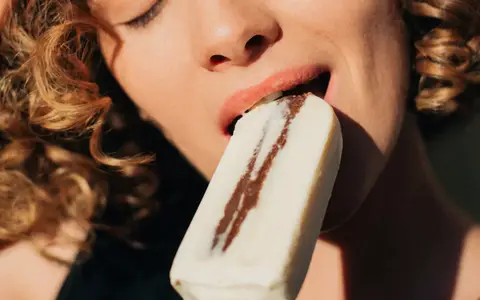
Imagery · Use full-bleed, close-cropped lifestyle photography centered on people tasting ice cream. Faces, hands, and the product occupy most of the frame; the opening image places a pale ice pop against a teal-toned scene, while the next image shifts to a direct tasting moment. Treat imagery as immersive and edge-to-edge, with text layered over it and no decorative illustration competing for attention.
Use full-bleed lifestyle photography as the dominant visual layer.
Set the main display statement in oversized uppercase Cervo.
Use Peach Cream (#fee5ca) as the measured canvas color.
Reserve Berry Ink (#b00e2f) for the wordmark and navigation accents.
Use Vanilla White (#ffffff) for contrast over photography.
Keep supporting copy conversational and visually secondary.
Keep controls flat, outlined, and unobtrusive.
✕ 不该做
Don't put the hero inside a bordered card.
Don't replace the lifestyle photography with decorative illustrations.
Don't add shadows or gradients to interface elements.
Don't use berry red for large blocks of hero text.
Don't make supporting copy compete with the display headline.
Don't crowd the edge-to-edge image with extra controls.
给 AI 的提示词
想快速出一个同风格的新页面,把这段话连同 DESIGN.md 一起发给 AI。
Build a new page in the Mr. Pops visual style: energetic, editorial, and led by full-bleed lifestyle photography of people enjoying ice cream. Use Peach Cream (#fee5ca) as the measured canvas, Berry Ink (#b00e2f) for the wordmark and navigation accents, and Vanilla White (#ffffff) for high-contrast copy and fine outlines. Set the primary statement in oversized uppercase Cervo or a close display substitute, with tight line spacing and a staggered composition. Use HelveticaNeueCyr or a close sans-serif substitute for conversational copy and controls. Layer text directly over the image in distinct zones; keep navigation compact at the top edge. Prefer flat, lightly outlined controls and generous breathing room. Avoid cards, shadows, gradients, and decorative clutter.