North star · Keep the storefront calm and legible, then use expressive serif headlines and intimate imagery to add sensuality without clutter.
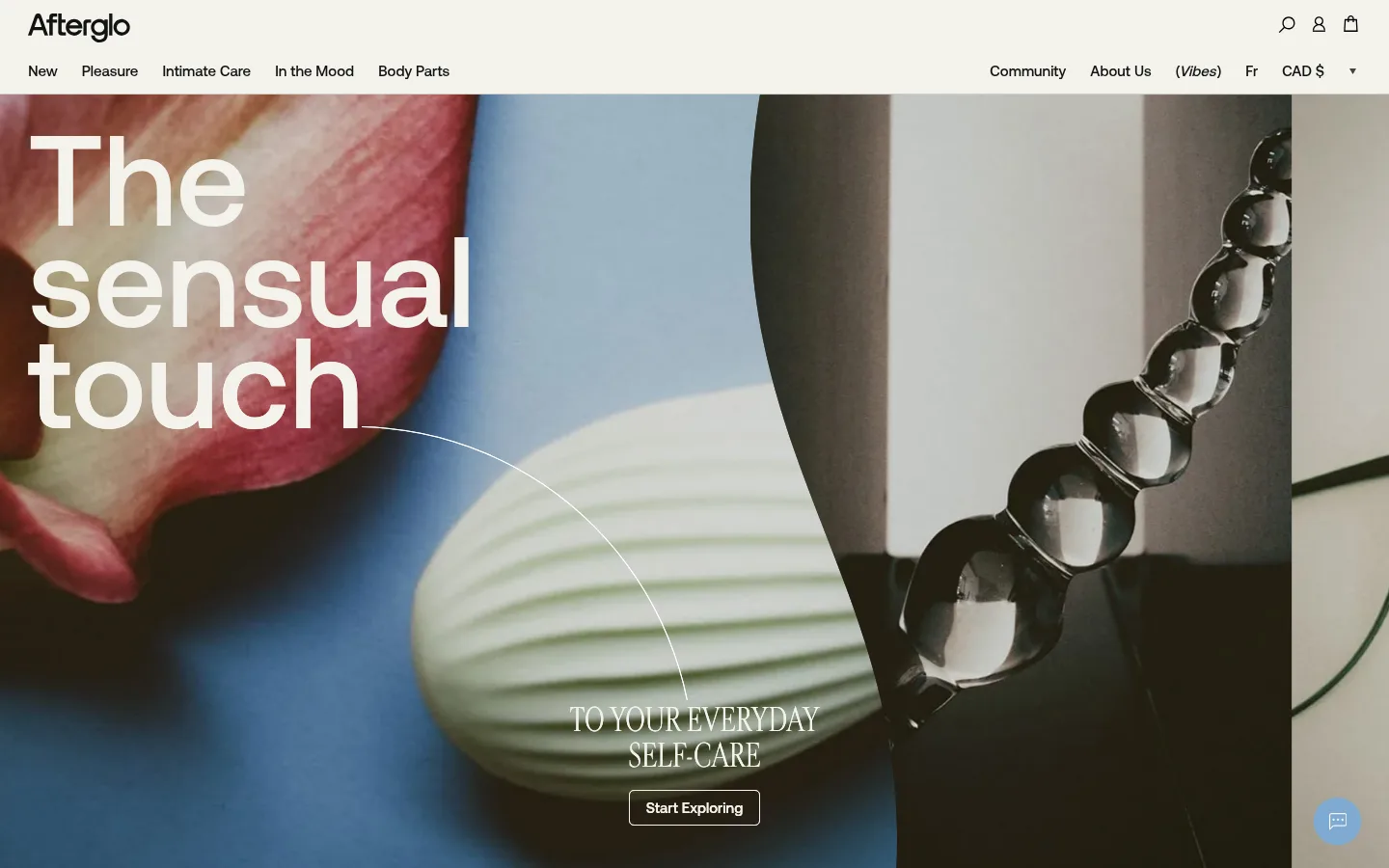
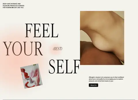
The visual identity is built on a pale, warm canvas (#f3f2ec) and soft gray-green (#e3e4df), with near-black text for crisp navigation, product names, and compact buttons. A muted taupe band (#cbc9bd) distinguishes the community editorial section, while coral accents appear sparingly in the footer glow rather than defining the core interface. Aeonik handles navigation, body copy, labels, and product information with a practical, modern voice; Cardinal Fruit brings a sensual editorial contrast to selected headlines. The hero uses oversized, high-impact type over full-bleed intimate still-life photography, while subsequent sections alternate spacious brand storytelling with dense product carousels. Product imagery sits in clean, pale blocks with minimal framing. The overall rhythm is comfortable and open: restrained interface chrome, large image-led moments, concise captions, and occasional bold typographic gestures keep commerce legible without losing warmth.
Navigation, body copy, product titles and details, labels, buttons, and sans-serif display headings.
Aa 设计
Cardinal Fruit
网络字体 · 字重 400 / 500 · 占比 8%
免费替代:Cormorant Garamond
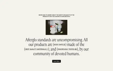
Editorial display headlines, including the hero subheading and selected brand-story and standards copy.
角色
示例
字号
字重
行高
字距
特大标题
Oversized uppercase editorial display moments, especially expressive hero lettering.
Afterglo
187px
400
1
0
一级标题
Large sans-serif hero headline and primary page statement.
Afterglo
132.5px
500
0.9
0
二级标题
Editorial section headlines and prominent storytelling copy.
Afterglo
54px
400
1.1
0
三级标题
Bold sans-serif collection and feature headings.
Afterglo
50px
500
0.8
0
四级标题
Uppercase serif subheads and compact editorial headings.
Afterglo
41.5px
400
1
0
正文
Paragraphs, product descriptions, and general supporting copy.
The quick brown fox 敏捷的狐狸
15px
500
1.3
0
辅助文字
Uppercase micro-labels, product metadata, and small section identifiers.
The quick brown fox 敏捷的狐狸
12.5px
500
1
0
按钮
Shop, contact, and editorial CTA labels.
The quick brown fox 敏捷的狐狸
15px
500
normal
0
导航
Header navigation and footer link text.
The quick brown fox 敏捷的狐狸
15px
500
1.3
0
间距与布局
基准单位 1px · 密度:适中
33px版块间距
—元素间距
—卡片内边距
1382px内容最大宽度
1px
3px
4px
5px
8px
10px
13px
17px
25px
29px
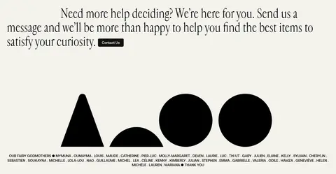
The page uses a broad, centered storefront canvas with a measured maximum width of 1382px. A full-width photographic hero leads into a single-column brand story, then wide product collections arranged in a dense 12-column carousel grid. Editorial content shifts into a two-column layout on a taupe field, followed by an open contact section and a full-bleed newsletter footer. Keep the section rhythm comfortable and let large headings, image blocks, and whitespace create variation.
圆角与层次
按钮 · 5px
徽标 · 5px
inset · text
inset · input
The interface is predominantly flat, relying on background changes and image composition rather than card shadows. Use thin pale hairlines where needed, clean product image fields, and small rounded corners on buttons and badges. Layering is reserved for hero type over photography and the inset pale newsletter panel over the colorful footer background.
组件
下面的预览按实测的按钮、输入框、徽标、卡片样式重建(字体用替代字体)。
Header navigation
Compact two-row header on a pale background, with the wordmark and utility icons above or alongside concise category and community links.
Editorial hero
Full-bleed intimate still-life imagery, oversized layered headline, smaller serif supporting line, and a pale outlined CTA.
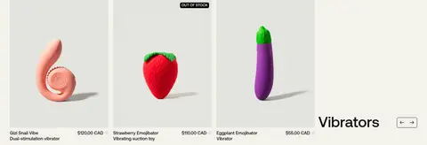
Product collection carousel
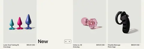
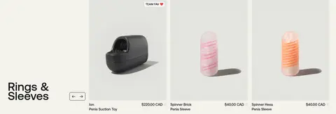
Wide collection bands with a large sans-serif category title, product tiles, concise names and prices, and simple previous/next controls.
Product badges
Small uppercase badges such as stock status or team favorite, set in compact Aeonik and lightly rounded.
Editorial community feed
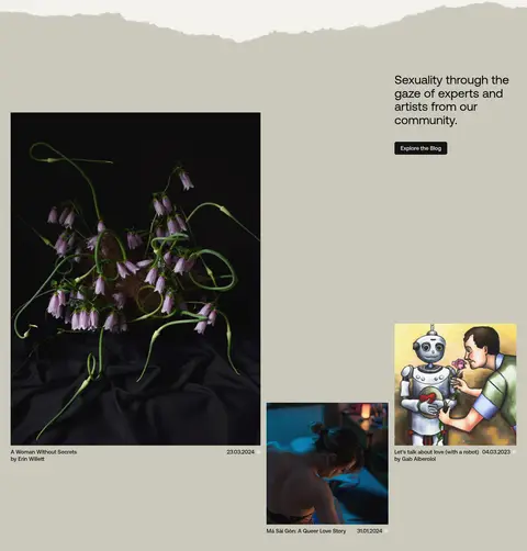
A taupe section pairing a short community introduction with varied story images and compact titles and dates.
Newsletter footer
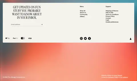
Full-bleed warm gradient behind an inset pale panel containing an uppercase serif newsletter prompt, email field, and grouped navigation links.
Imagery · Use tactile, close-cropped still-life and product photography with intimate, art-directed subjects. The hero is a full-bleed collage-like photograph with the headline layered over it; product collections use isolated objects against pale, quiet backgrounds. Editorial imagery can be darker, more documentary, or illustrative, while the footer uses a bright, atmospheric gradient. Avoid treating measured screenshot colors from photos as interface palette.
Use Warm Gallery (#f3f2ec) as the principal page canvas.
Keep Soft Ink (#131313) text crisp against pale surfaces.
Pair practical Aeonik UI text with selective Cardinal Fruit editorial headlines.
Let product photography carry color while interface surfaces stay restrained.
Use Stone Taupe (#cbc9bd) to distinguish community editorial content.
Make collection browsing clear with compact captions and simple carousel controls.
✕ 不该做
Do not turn coral into the dominant interface color.
Do not add heavy shadows or layered card chrome to product tiles.
Do not use decorative display typography for navigation or product metadata.
Do not crowd the hero with extra controls or supporting copy.
Do not treat colors sampled from product photographs as brand palette.
Do not force every section into the same grid or visual density.
给 AI 的提示词
想快速出一个同风格的新页面,把这段话连同 DESIGN.md 一起发给 AI。
Build a new Afterglo-style ecommerce page with a calm, editorial storefront rather than a conventional promotional template. Use Warm Gallery (#f3f2ec) as the main canvas, Soft Ink (#131313) for navigation, body copy, and dark CTAs, and Stone Taupe (#cbc9bd) for a distinct editorial band. Reserve Coral Ember (#f68e6d) and Peach Glow (#ffaa8e) for a restrained footer atmosphere. Use Aeonik or a close sans-serif for interface and product content; use Cardinal Fruit or a similar expressive serif for selected headlines. Lead with tactile, intimate photography and confident layered type, then provide legible product collections with clean pale image fields, concise captions, and simple carousel controls. Keep surfaces flat, use small rounded buttons and badges, and vary section layouts between story, product, community, contact, and newsletter content.