My Brentano以温暖浅底色、大幅标题和自然护理产品影像,营造舒缓的品牌气质。简洁导航、紧凑商品信息与实用页脚,让首页兼具编辑感和购物功能。
North star · Let warm empty space and expressive dark typography lead, while keeping product imagery natural and interface details thin and understated.
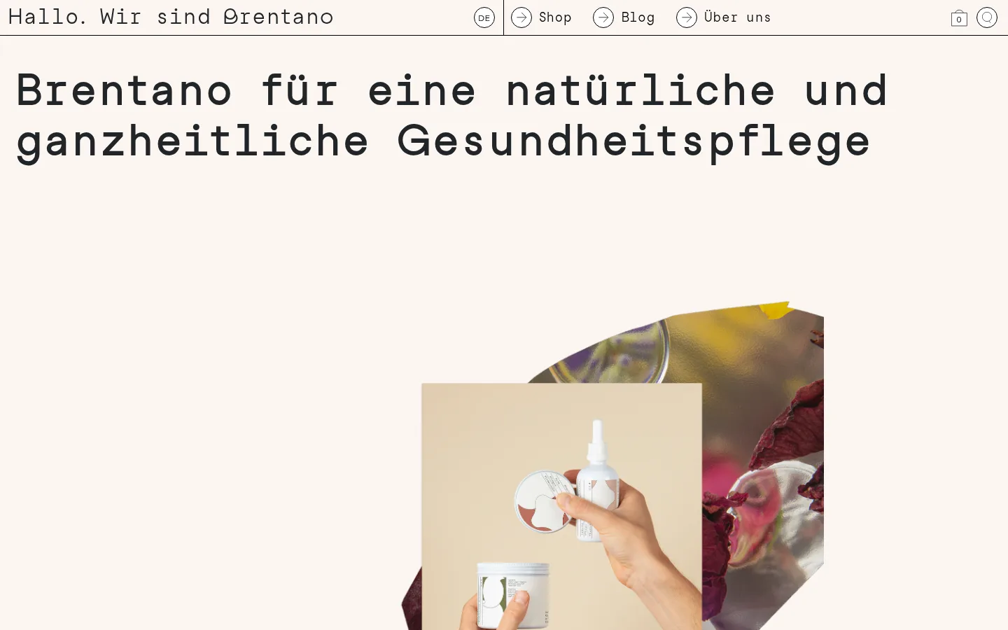
The page is built on a nearly continuous warm off-white canvas, #fbf5f1, with dark charcoal and black reserved for text, outlines and controls. The palette stays deliberately restrained; richer beige, brown and yellow tones belong chiefly to the photographic collage rather than interface chrome. Studio Feixen Sans provides the everyday text, while Studio Feixen Sans Writer gives the display and navigation a distinctive, typewriter-like character. A very large, left-aligned hero statement sits above a centered, layered product-and-nature composition, leaving generous open space around both. Further down, a narrow text block, two outlined product cards and a dense multi-column footer create a clear shift from editorial storytelling to shopping and utility. The overall rhythm is comfortable and spacious, with simple square-edged cards and thin black rules. Circular outlined header controls and buttons add small graphic accents without introducing shadows or heavy surfaces.
Display headings, navigation, links and product-interface labels
角色
示例
字号
字重
行高
字距
特大标题
Large expressive hero statement in typewriter-like bold.
My Brentano
60px
700
1.2
0
一级标题
Primary page heading and prominent introductory text.
My Brentano
30px
400
1.2
0
二级标题
Editorial section and product titles.
The quick brown fox 敏捷的狐狸
25px
400
1.2
0
正文
Natural-care story and supporting descriptions.
The quick brown fox 敏捷的狐狸
15px
400
1.2
0
辅助文字
Compact uppercase labels and secondary metadata.
The quick brown fox 敏捷的狐狸
12px
400
2.5
0
导航
Header navigation and prominent site identity.
The quick brown fox 敏捷的狐狸
18px
400
1.67
0
链接
Product names and inline navigation actions.
The quick brown fox 敏捷的狐狸
15px
400
1.2
0
间距与布局
基准单位 2px · 密度:适中
50px版块间距
—元素间距
—卡片内边距
1400px内容最大宽度
5px
10px
30px
40px
A centered site canvas with a measured maximum width of 1400px and a comfortable, open density. The header is a slim horizontal strip, followed by a left-aligned, near-full-width hero title and a centered collage. Later content narrows into a single-column story, then opens into a two-column product row and a four-column footer. Preserve generous section separation and avoid crowding the text or imagery.
圆角与层次
按钮 · 50%
导航 · 50%
没有测到阴影:页面是扁平的,层次靠底色和描边区分。
The interface is predominantly flat, with no measured shadows or gradients. Separate product cards and the header with thin black outlines or hairlines rather than raised surfaces. The hero collage creates visual depth through overlapping image planes, not UI shadows; circular controls remain outlined and light.
组件
下面的预览按实测的按钮、输入框、徽标、卡片样式重建(字体用替代字体)。
Header navigation
A narrow top row with the brand greeting at left, language and primary links near the center, and compact circular cart and search controls at right.
Editorial hero
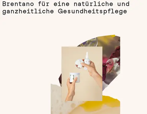
A large, left-aligned dark statement sits above a centered, layered photographic collage on the warm canvas.
Natural-care story
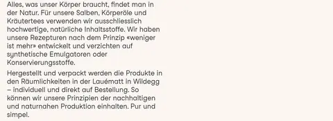
A compact, left-aligned block of body copy explains ingredients and production, with broad open space around it.
Product cards
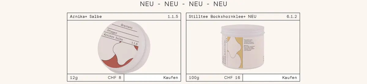
Two side-by-side product listings use thin black outlines, product photos, concise names, variants, CHF prices and simple purchase links.
Circular controls
Small white controls use black outlines and fully rounded shapes for language, navigation, cart and search actions.
Footer and newsletter
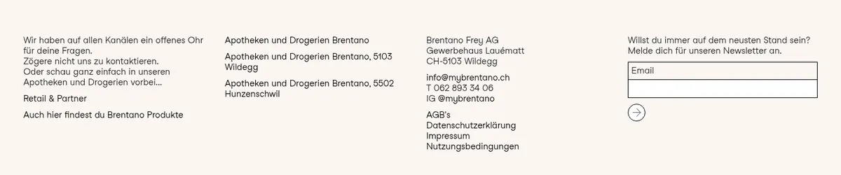
A dense four-column utility area combines contact details, retail information, legal links and a compact email signup.
Imagery · Use photographic imagery of products, ingredients and hands, assembled as a layered collage rather than a rigid hero banner. Keep cutout-like image edges and overlapping rectangular crops visible against the pale canvas. Warm beige and botanical tones may appear in the photos, but should not become additional interface colours; favor natural light and unforced, tactile product presentation.
Set expressive, left-aligned display text in the Writer-style face.
Keep large open areas around hero copy and photography.
Use natural product photography with layered crops.
Outline cards and controls with thin black rules.
Keep shopping details compact and easy to scan.
✕ 不该做
Do not introduce saturated interface colours.
Do not add shadows, gradients or raised card effects.
Do not turn the hero into a dense text-and-image grid.
Do not use rounded cards; reserve circular rounding for controls.
Do not treat photographic beige and brown tones as brand UI colours.
Do not crowd the editorial copy with product controls.
给 AI 的提示词
想快速出一个同风格的新页面,把这段话连同 DESIGN.md 一起发给 AI。
Build a new page in My Brentano’s calm natural-care style. Use Porcelain Blush (#fbf5f1) as the continuous canvas, Soft Charcoal (#212529) for headings and body copy, and Ink Black (#000000) for strong text, fine outlines and controls. Keep Clean White (#ffffff) limited to small control or input surfaces. Pair a readable sans-serif body face with a typewriter-like display and navigation face. Compose a narrow header, a spacious left-aligned headline, and tactile product photography in overlapping crops. Keep story copy compact, then present products in simple thin-outlined cards with clear prices and purchase actions. Favor open space, flat surfaces and clear section transitions. Avoid gradients, shadows, saturated accents and decorative rounded containers; circular outlines belong only on small controls.