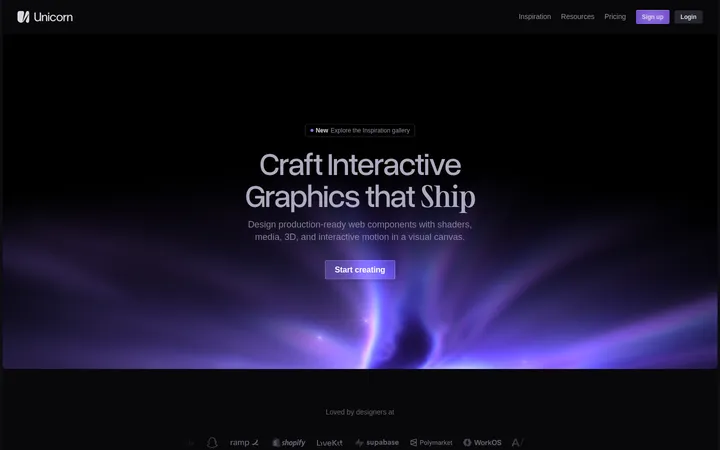
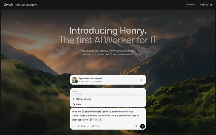
North star · Keep the interface on a near-black violet canvas and use color, imagery, and fine borders to make the workflow story legible without adding visual clutter.
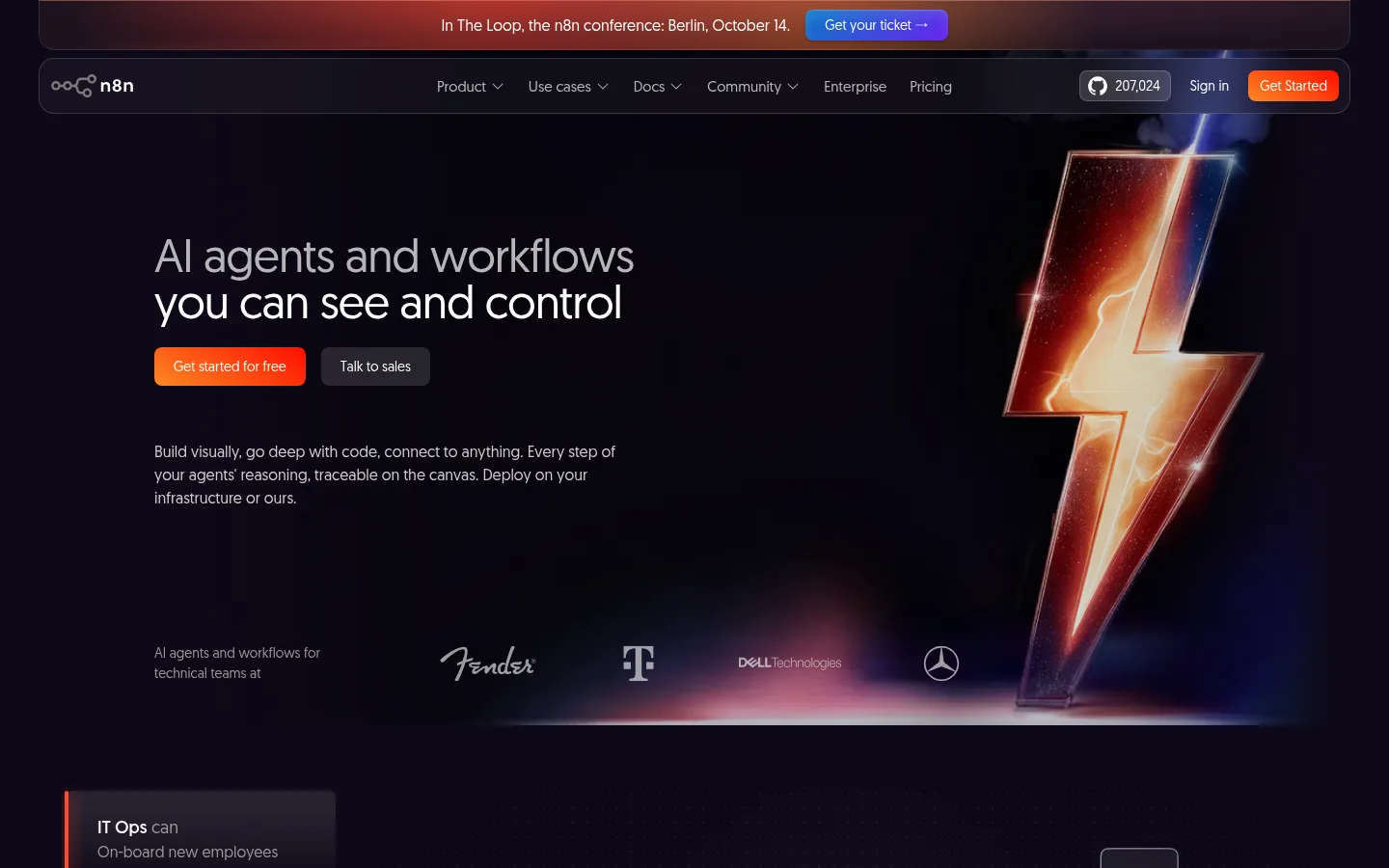
The page is anchored by a nearly black violet canvas, #0e0918, which lets product imagery and warm accent lighting carry the visual drama without making the interface feel crowded. White headings create clear hierarchy; pale gray body copy stays readable but secondary. Surfaces use closely related dark purples, with muted violet-gray hairlines outlining cards and navigation rather than heavy shadows. Geomanist’s rounded, open sans-serif forms keep the technical product approachable. The hero pairs large left-aligned copy and calls to action with a dramatic lightning-bolt visual and customer marks. Farther down, centered headings introduce integration marks, workflow cards, case studies, and social proof. Sections have generous breathing room even as individual cards remain compact. Orange-red and blue-violet gradients appear selectively in calls to action, feature artwork, and the footer glow; brighter hues inside product illustrations should not be mistaken for global interface colors.
Primary face for headings, navigation, body copy, buttons, and links.
Aa 设计
geomanist-book
网络字体 · 字重 400 · 占比 14%
免费替代:Jost
Book-style supporting face used for a smaller share of site text.
角色
示例
字号
字重
行高
字距
一级标题
Hero headline; large, light-feeling and closely tracked.
n8n
54px
400
1
-0.02em
二级标题
Major section headings, often centered.
n8n
48px
400
1
-0.02em
三级标题
Feature and subsection headings.
The quick brown fox 敏捷的狐狸
24px
300
1.5
0
四级标题
Card titles and smaller supporting headings.
The quick brown fox 敏捷的狐狸
20px
400
1.5
0
正文
Main explanatory copy and product descriptions.
The quick brown fox 敏捷的狐狸
16px
400
1.5
0
辅助文字
Compact labels, quotes, and secondary metadata.
The quick brown fox 敏捷的狐狸
14px
400
1.5
0
按钮
Short CTA and action labels.
The quick brown fox 敏捷的狐狸
15px
400
1
0
导航
Header and announcement-bar navigation text.
The quick brown fox 敏捷的狐狸
14px
400
1.5
0
链接
Inline links and card actions.
The quick brown fox 敏捷的狐狸
14px
400
1.5
0
间距与布局
基准单位 8px · 密度:紧凑
32px版块间距
8px元素间距
—卡片内边距
1120px内容最大宽度
4px
8px
10px
12px
14px
16px
20px
24px
32px
40px
44px
48px
64px
The page uses a centered content frame with a measured maximum width of 1120px, while hero media and selected feature sections feel full-bleed. A 12-column grid supports broad integration rows and tighter two-column story or feature layouts. Most section backgrounds remain on the same canvas, so rhythm comes from generous vertical gaps, shifts in alignment, and alternating centered headings with left-aligned copy. The overall density is compact inside cards but spacious between major blocks.
圆角与层次
按钮 · 6px
卡片 · 24px
图片 · 50%
导航 · 8px
链接 · 8px
inset · link, nav
inset · card, nav
inset · other, card
sm · button
The interface stays mostly flat against the dark canvas. Cards and navigation rely on low-contrast hairline borders and related plum surfaces for separation, with rounded corners rather than pronounced drop shadows. Inset highlights and subtle dark shadows appear on selected controls; ambient gradients and glow provide depth in hero, feature artwork, and footer areas.
组件
下面的预览按实测的按钮、输入框、徽标、卡片样式重建(字体用替代字体)。
Announcement bar
A slim, centered event notice sits above the navigation with pale text, warm ambient color, and a compact blue-violet ticket action.
Navigation
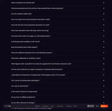
Rounded dark header with the n8n mark, grouped links, GitHub star count, sign-in, and a bright warm Get Started action.
Hero
Large left-aligned headline, warm primary CTA and subdued sales link balance a dramatic lightning visual and customer logos.
Feature cards
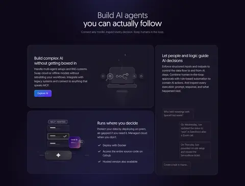
Dark plum product cards use rounded corners, thin outlines, compact copy, and workflow or interface imagery.
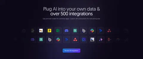
Integration grid
A centered heading and supporting line sit above a dense matrix of app marks and a compact browse link.
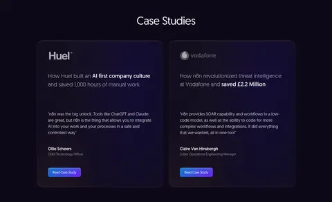
Case study cards
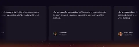
Two outlined cards combine customer identity, a concise outcome, quote, attribution, and a small gradient action.
Footer
A broad dark panel overlays warm atmospheric glow and arranges brand details, grouped site links, and a separated legal row.
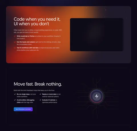
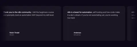
Imagery · A cinematic lightning-bolt hero visual supplies the strongest focal point, with customer logos along its base. Product screens and workflow diagrams appear in dark, rounded panels, while integration marks form a dense, orderly grid. Case studies and testimonial cards prioritize text over photography. Artwork uses glow, gradients, and dark framing; vivid illustration hues are localized to the depicted media rather than the interface palette.
Keep primary text white and supporting copy pale gray.
Separate cards with subtle plum surfaces and fine borders.
Reserve vivid gradients for calls to action and selected artwork.
Alternate centered section introductions with left-aligned feature copy.
Use rounded cards to frame product details and customer proof.
✕ 不该做
Do not replace the dark canvas with bright section bands.
Do not use accent colors as large, flat backgrounds.
Do not make card borders brighter than their contents.
Do not crowd major sections together.
Do not treat illustration colors as the site's core palette.
Do not use heavy shadows to define every surface.
给 AI 的提示词
想快速出一个同风格的新页面,把这段话连同 DESIGN.md 一起发给 AI。
Build a new page in n8n's dark, technical style. Set Midnight Violet (#0e0918) as the dominant canvas; use Shadow Plum (#1a1624) and Deep Aubergine (#1f192a) for cards, with Violet Slate (#322e3a) hairlines. Use Clean White (#ffffff) for headings and Soft Fog (#d1cece) for supporting text. Choose a Geomanist-like sans serif with open, approachable shapes and restrained tight tracking on large headings. Compose within a centered content frame, mixing full-width media with compact two-column features and centered section introductions. Frame product screenshots and workflow diagrams in rounded dark cards. Use orange-red or violet-blue gradients sparingly for CTAs and atmospheric artwork, not as broad interface fills. Keep generous gaps between sections and keep card copy concise.