North star · Keep the interface spacious and monochrome, using blue sparingly for high-priority actions and photography for warmth and context.
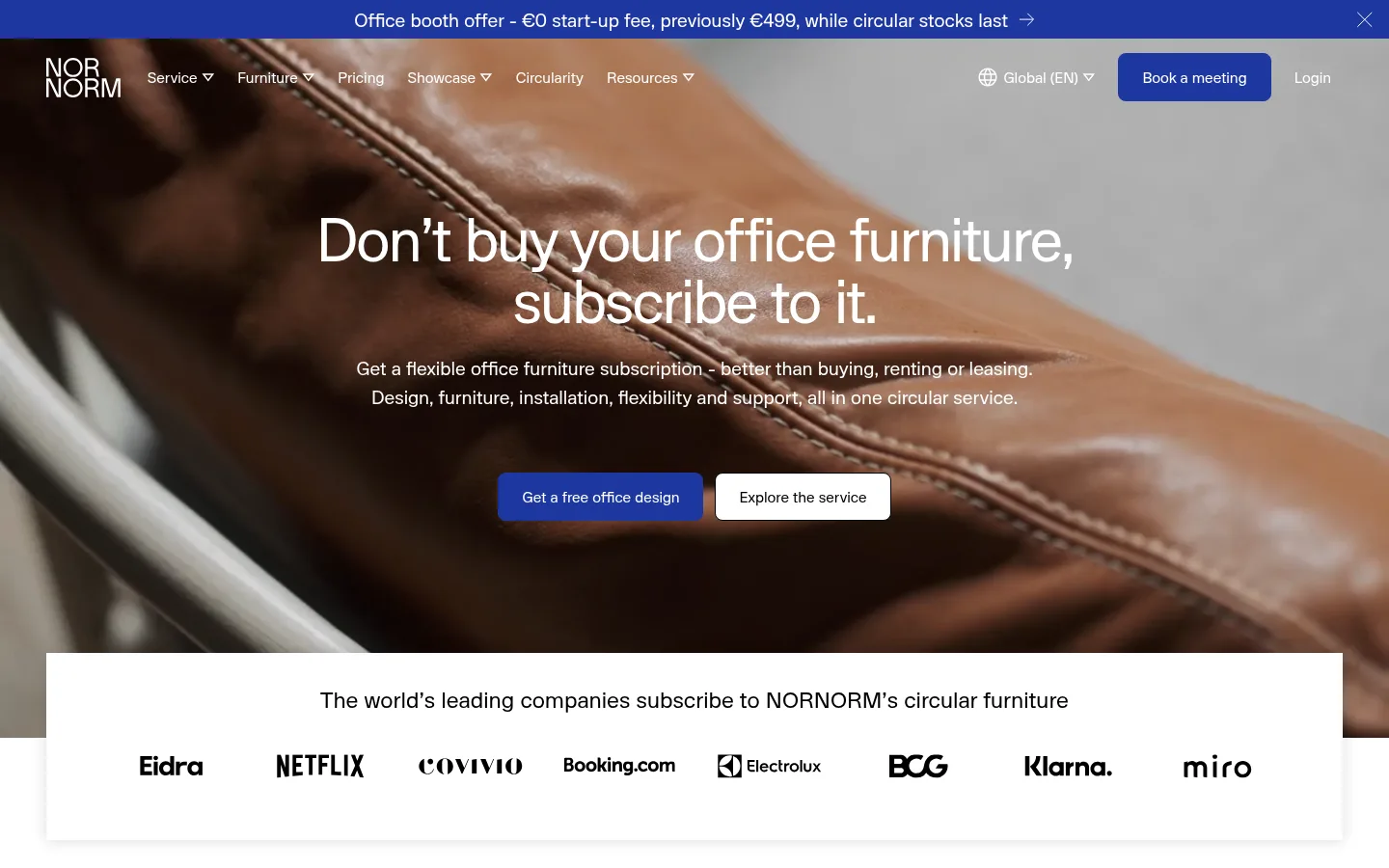
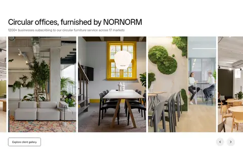
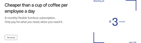
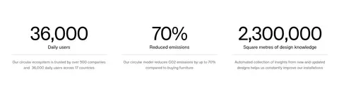
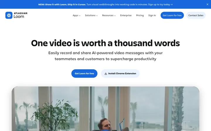
The page is built on a white canvas with near-black text, muted gray supporting copy, and a concentrated royal-blue accent for the announcement strip and primary actions. The blue is a navigational signal rather than a broad decorative wash. Lunar sans-serif gives the page a consistent voice: large, tightly tracked headings contrast with calm, readable body copy. The first screen layers white navigation and centered messaging over a full-bleed office image; below it, the composition settles into open white bands, logo proof, benefit cards, service imagery, pricing, statistics, and FAQs. Photography supplies the warmth and material character, with plants, furniture, and real workspaces balancing the otherwise minimal interface. Content generally aligns to a broad page grid, alternating centered and left-aligned blocks instead of using a dense, uniform card system. Buttons and controls remain simple, while thin rules and subtle shadows provide just enough separation.
Site-wide headings, body text, navigation, labels, links, and buttons.
角色
示例
字号
字重
行高
字距
特大标题
Oversized statement headings for high-impact hero or editorial moments.
NORNORM
112px
500
1
-0.03em
一级标题
Main hero headline and the strongest page-level heading.
NORNORM
80px
500
1
-0.03em
二级标题
Major section titles such as benefits and circular furniture.
NORNORM
64px
500
1
-0.03em
三级标题
Subsection headings and prominent feature titles.
NORNORM
48px
500
1.3
-0.03em
四级标题
Smaller feature headings and supporting content titles.
NORNORM
32px
500
1.3
-0.03em
正文
Primary explanatory copy, descriptions, and FAQ answers.
The quick brown fox 敏捷的狐狸
16px
400
1.5
0
辅助文字
Compact image notes, footnotes, and secondary metadata.
The quick brown fox 敏捷的狐狸
14px
400
1.5
0
导航
Header links and footer navigation labels.
The quick brown fox 敏捷的狐狸
16px
400
1.5
0
链接
Text links and secondary calls to explore or learn more.
The quick brown fox 敏捷的狐狸
16px
400
1.5
0
间距与布局
基准单位 8px · 密度:适中
32px版块间距
16px元素间距
—卡片内边距
1344px内容最大宽度
4px
8px
12px
16px
24px
32px
40px
48px
A broad, responsive content frame uses a measured maximum width of 1344px, with full-bleed photography reserved for the hero and mission statement. Sections alternate between centered introductions, left-aligned editorial content, two-column splits, and card or gallery grids. The page feels comfortable rather than dense, with a measured 8px base spacing unit and generous section breathing room. Use the measured 4–48px spacing scale for component rhythm; keep content hierarchy clear across long white bands.
圆角与层次
按钮 · 50%
导航 · 8px
链接 · 8px
md · section
Most sections sit flat on white, with separation created by whitespace rather than containers or heavy shadows. The logo panel overlaps the hero edge and uses a subtle measured shadow. Keep outlines and hairlines restrained; buttons and links are mostly clean shapes, with rounded navigation and pill-like controls where the interface uses them.
组件
下面的预览按实测的按钮、输入框、徽标、卡片样式重建(字体用替代字体)。
Announcement bar
A narrow Signal Cobalt (#1e37a0) strip at the top with centered white promotional copy, a directional cue, and a close control.
Overlay navigation
White NORNORM wordmark and Lunar navigation sit over the hero image; include locale, a prominent blue booking action, and login.
Hero actions
Centered white headline and supporting copy over full-bleed photography, followed by a blue primary action and a light secondary action.
Customer logo panel
A white, subtly elevated panel overlaps the hero boundary, with a centered sentence and a single horizontal row of customer logos.
Benefit cards
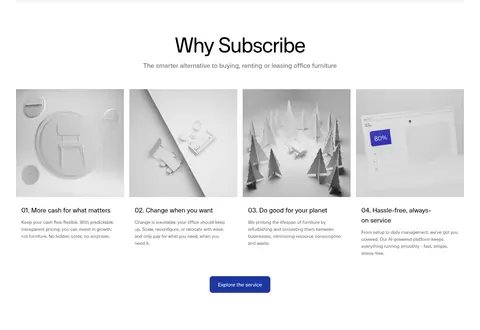
A four-column benefit section uses image-led cards, numbered titles, compact gray descriptions, and a centered blue service link.
FAQ accordion
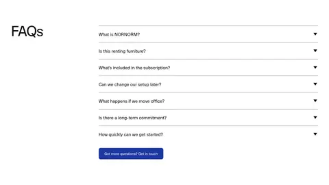
A two-column FAQ block pairs a large left heading with right-side question rows, thin gray rules, and disclosure chevrons.
Primary action button
Use a cobalt-filled, white-text CTA for key actions; secondary actions are light or text-led. Measured button radius values vary by component.
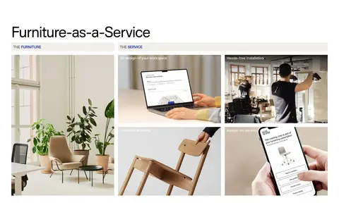
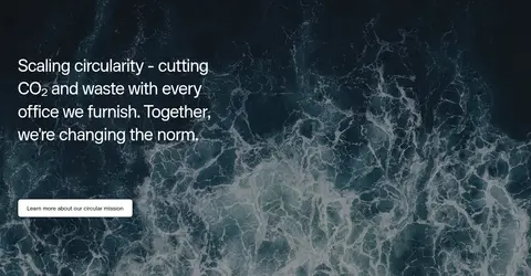
Imagery · Use photographic office interiors as the emotional anchor: warm timber, plants, furniture, and people at work. The hero image fills the background behind white copy, while later sections use rectangular workspace and service photographs in tidy grids. Sustainability messaging receives a full-bleed ocean image. Small conceptual illustrations appear in feature cards, but they are supporting material, not the brand’s main visual language.
Reserve cobalt for primary actions and announcements.
Set headings in Lunar with tight tracking.
Use real office photography to add warmth.
Let whitespace separate long page sections.
Keep supporting copy muted and concise.
✕ 不该做
Do not invent extra brand colors.
Do not turn every section into a card.
Do not use gradients as a recurring surface.
Do not overuse cobalt for decoration.
Do not add heavy shadows or thick borders.
Do not crowd the page with dense copy.
给 AI 的提示词
想快速出一个同风格的新页面,把这段话连同 DESIGN.md 一起发给 AI。
Create a new NORNORM-style page with a calm, editorial furniture-subscription aesthetic. Use Gallery White (#ffffff) for the main canvas, Furniture Ink (#000000) for primary text, and Soft Graphite (#6a6a6a) for secondary copy and rules. Apply Signal Cobalt (#1e37a0) sparingly to key actions and announcement details; Quiet Silver (#b2b2b2) may appear only as a subtle divider. Use Lunar or a close sans-serif substitute, with large tightly tracked headings and readable, untracked body copy. Build a broad responsive grid with generous whitespace, alternating centered and left-aligned sections, and selective two-column layouts. Use warm, realistic workspace photography for hero and feature content; keep controls simple and use shadows only for meaningful overlap. Preserve clear CTA hierarchy and avoid decorative gradients or dense card framing.