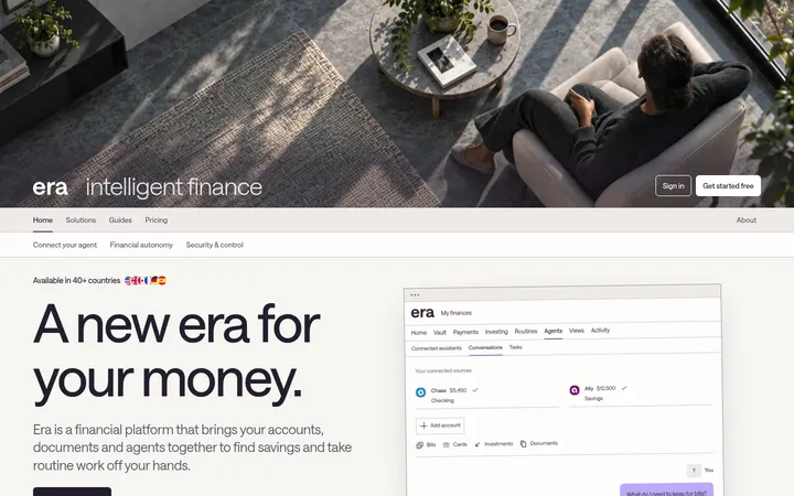
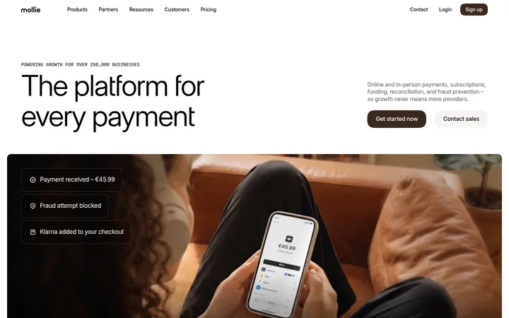
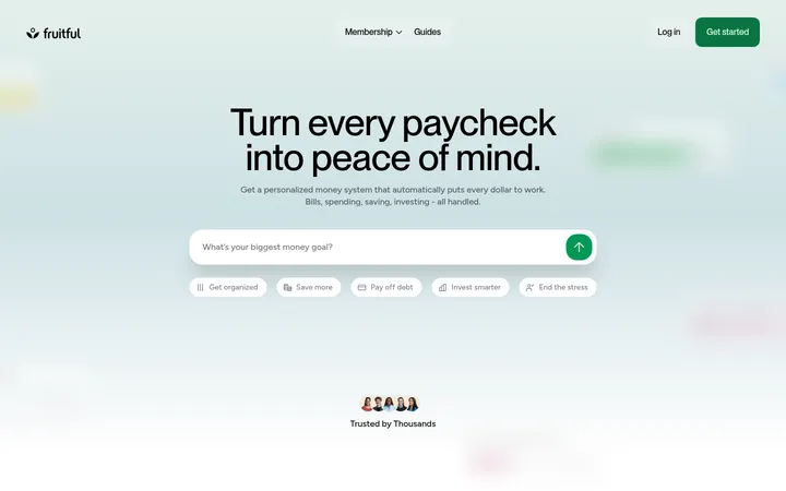
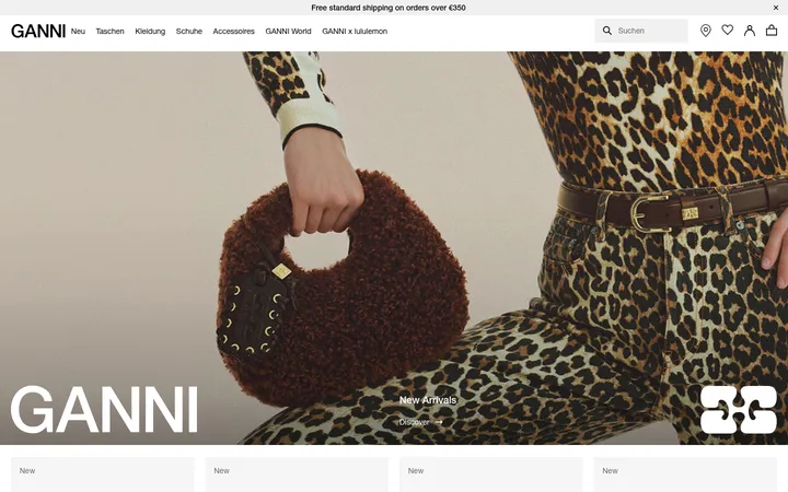
North star · Let broad pastel colour fields and clear, oversized type make self-custody feel calm, direct, and approachable.
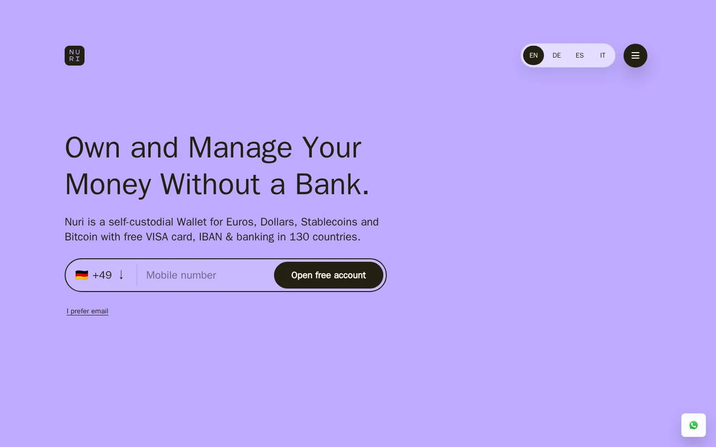
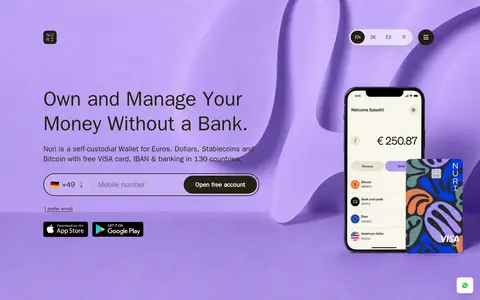
The visual identity pairs a warm, pale canvas (#fffdf2) with deep olive-charcoal ink (#222013), avoiding the clinical white-and-blue language common in finance. Large lavender panels carry the hero, closing CTA, and partner marks; alternating lilac, peach, and warm-white feature bands give the long page a steady colour rhythm. System sans-serif typography keeps oversized, light-weight headlines approachable, with compact supporting copy and strong dark pill CTAs. Layouts are spacious and mostly single-column feature splits: text and a recurring wallet illustration or phone mockup alternate sides across broad sections. The hero keeps its signup form and country selector prominent beside product imagery. Hairline borders are subdued, while rounded controls and media edges soften the interface. Shadows are restrained to floating navigation and buttons; most sections rely on colour fields and generous separation rather than cards.
Site-wide headings, body copy, navigation, and buttons.
角色
示例
字号
字重
行高
字距
特大标题
Large promotional display headings, especially brand statements.
Nuri
68px
400
1.22
0
一级标题
Hero headline, set lightly with compact line spacing.
Nuri
66px
200
0.84
0
二级标题
Feature-section headlines across the alternating bands.
Nuri
61px
400
1.22
0
三级标题
Secondary feature or content headlines.
Nuri
58px
400
1.05
0
四级标题
Smaller editorial or supporting section headings.
Nuri
52px
400
1.05
-0.02em
正文
Feature descriptions and hero supporting copy.
The quick brown fox 敏捷的狐狸
16.5px
400
1.29
0
辅助文字
Compact legal notes, labels, and secondary interface text.
The quick brown fox 敏捷的狐狸
14.5px
400
1.55
0
按钮
Prominent account-opening CTA labels.
The quick brown fox 敏捷的狐狸
18.5px
800
normal
0
导航
Header navigation and language selector text.
The quick brown fox 敏捷的狐狸
17px
400
1.29
0
间距与布局
基准单位 4px · 密度:宽松
80px版块间距
58px元素间距
—卡片内边距
1180px内容最大宽度
4px
5px
8px
12px
13px
14px
16px
18px
20px
24px
26px
32px
40px
48px
58px
72px
The measured content max width is 1180px, with spacious density and broad section intervals. The page is a long vertical sequence of mostly single-column feature splits, alternating text and imagery from side to side. Hero and closing CTA sit on full-width lavender fields; intervening sections use full-width colour bands. Text is left-aligned, with generous breathing room around headlines and product visuals. The measured spacing system uses a 4px base unit and an 80px section gap; preserve the relaxed rhythm rather than compressing the page.
圆角与层次
按钮 · 9999px
图片 · 32px
导航 · 9999px
链接 · 24px
lg · button
lg · nav
lg · nav
The design is mostly flat: pastel section fields, clean text, and quiet hairline borders do most of the structural work. Dark, pill-shaped controls contrast directly against their background. Use measured large soft shadows only for floating navigation or CTA treatments where appropriate; do not turn feature sections into stacked elevated cards.
组件
下面的预览按实测的按钮、输入框、徽标、卡片样式重建(字体用替代字体)。
Hero signup form
A rounded outlined phone-entry field combines country selection, mobile-number input, and a dark pill account CTA; an email alternative sits below.
Primary CTA
Use a dark #222013 pill with #fffdf2 text; the hero label is bold, while the lower-page account CTA is also strongly weighted.
Language selector
Compact rounded language control sits in the top-right navigation, with the active option emphasized in a dark circular pill.
Feature split
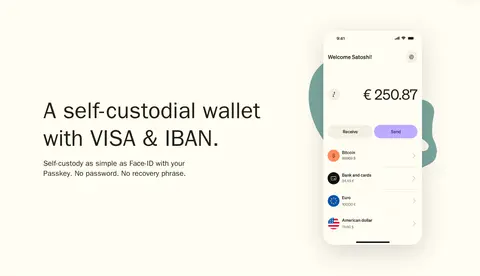
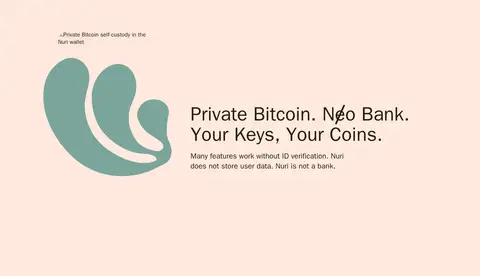
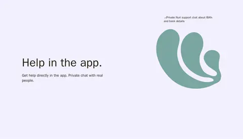
A full-width pastel band pairs a large left-aligned heading and concise copy with phone imagery or the recurring teal brand mark.
Closing CTA
A lavender full-width panel uses an uppercase money-control headline, short supporting copy, a dark pill CTA, and partner/payment marks.
Footer
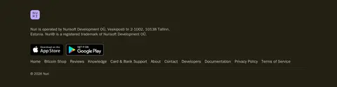
A dark #222013 base contains the brand mark, company details, app-store badges, and a compact row of navigation and legal links.
Imagery · Product imagery focuses on phone-wallet UI and card mockups, alongside a repeated teal abstract Nuri mark. The hero uses larger, layered phone and card visuals against its lavender backdrop; feature sections give the recurring mark generous space beside concise text. Imagery feels clean and illustrative rather than photographic, with rounded media framing and soft contrast. Treat incidental colours inside product artwork as illustration details, not new brand palette colours.
Use #beaaff as the signature hero and closing CTA colour.
Alternate warm-white, lilac, and peach feature bands.
Keep headlines large, light, and left-aligned.
Use dark olive ink for high-contrast primary actions.
Give each feature block generous breathing room.
Use product mockups and the teal brand mark as imagery.
✕ 不该做
Do not introduce a generic blue fintech palette.
Do not crowd the feature sections with dense card grids.
Do not make all section backgrounds the same colour.
Do not use heavy borders to divide every content block.
Do not let product illustration colours redefine the brand palette.
Do not use sharp-cornered buttons in place of pill CTAs.
给 AI 的提示词
想快速出一个同风格的新页面,把这段话连同 DESIGN.md 一起发给 AI。
Build a new Nuri-style fintech page with a warm, spacious editorial feel. Use Nuri Lavender (#beaaff) for a bold opening or closing panel, Warm Canvas (#fffdf2) as the light base, and Mist Lilac (#f3f0ff), Pale Iris (#ebe3ff), and Peach Veil (#ffe9dd) to alternate feature sections. Set text in Olive Ink (#222013) using a clean system sans-serif, with oversized light headlines and concise supporting copy. Use left-aligned feature splits with a phone-wallet mockup or recurring abstract brand illustration opposite the text. Make primary actions dark, rounded pills, and keep hairlines subtle. Maintain a calm vertical rhythm, generous whitespace, compact navigation, and a restrained footer. Keep cards and shadows secondary to colour bands and clear typography.